Website footers often play a critical yet underrated role in the overall user experience. They serve valuable purposes without which users cannot do things such as providing navigation, displaying vital information about the site, and helping to elicit the necessary response from the target audience.
This article will focus on the essential elements of good footers of websites, analyze some of their adequate components, such as in the footer, and present some designs of footers that are in extensive use on the web to assist in the creativity of the rest of the pages in our portfolio. We will also look at various website footer examples to illustrate these best practices.
However, regardless of whether you are constructing a new website or making changes or improvements to the current design of a website at the initial stages – it is necessary to comprehend how the website footer should look for it will make your site more usable as well as more visually appealing to the visitors of the site.
What Is a Website Footer
A website footer is the last section of a web page containing miscellaneous and navigation information. This section, which may be termed a page, becomes visible as one scrolls down whether the pages are new or old.
Source: clay.global
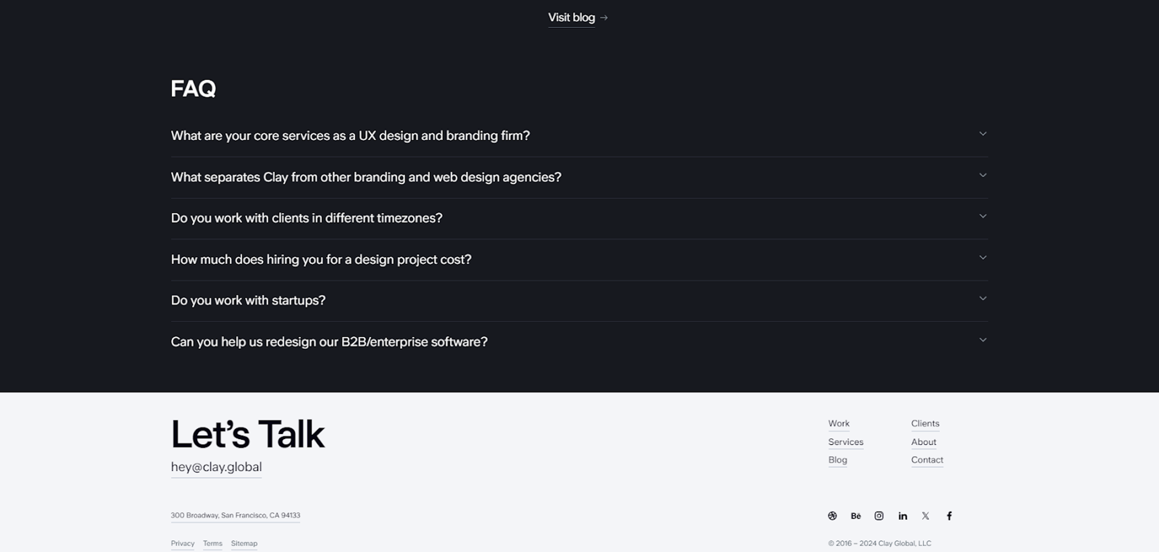
The common footer constituent includes copyright notices, contact information, a link to a site’s privacy policy and terms, social icons, and links for additional menus that may be unavailable in significant menus.
In this respect, such website pages have pivotal details that, when placed in footers, enhance the users’ experience, promote browsing of such pages, and enhance the website’s usability.
Purpose of Website Footers
A website’s footer does more than extend the site’s geographical boundaries. Put more appropriately, it enhances the user’s interaction with the site or the site’s operation in general. And here are the root points to look at:
- As a Navigation Aid: Footers serve as an extra step for navigation, enabling website visitors to find critical areas of the site quickly when reaching the end of a particular page.
- Information Hub: It is a place where pertinent details, including contacts, company details, and other legal details, are located so that a user need not get lost.
- Trust and Credibility Builder: Ambitious web design includes privacy policies, terms and conditions, and copyright information in any site, which boosts the site’s trustworthiness and aids in building trust with visitors.
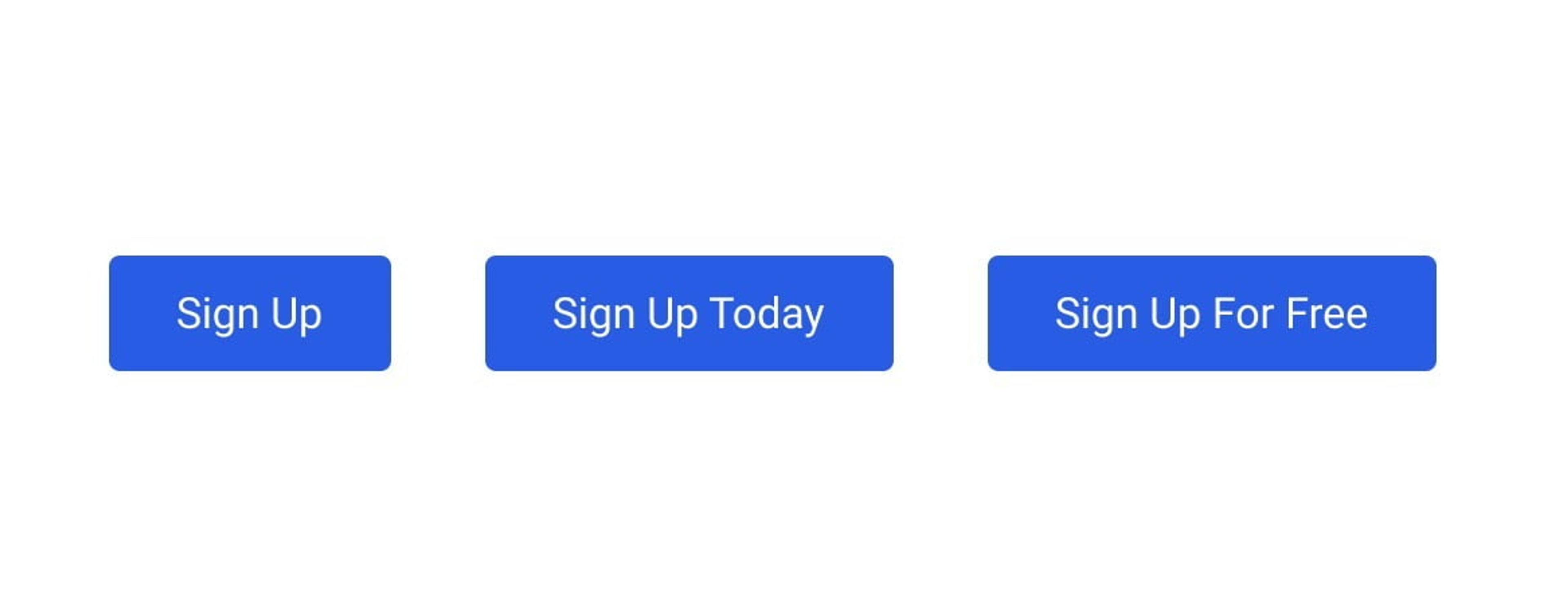
- Embedding CTAs: Images of call-to-action buttons or links, for instance, asking users to subscribe to newsletters, engage in promotions, or visit other crucial parts of the site, can also be embedded in the footers to ensure users take action, leading to increased interaction or customer conversion.
Source: goodtoseo
Essential Elements of an Effective Footer
When designing a website, some crucial elements should be considered if the goal is to make a footer that works and brings something to the website. An appropriate design of the footer not only beautifies the site but also increases its usability and user interaction.
A well-designed footer template can significantly enhance user engagement and interaction. The following explains the most relevant features to address:
Contact Information
Facilitate communication by prominently providing contact information such as email, telephone, and postal address. This is because users will find it easy to get in touch with the business/service for any inquiries, assistance, or feedback, and these details allow it.
This openness builds trust and gets users to act by making it clear that there is a way to reach out to the business/service that can be relied upon. Including an email sign up form in the footer can help retain customers by keeping them informed with relevant updates.
Navigation Links
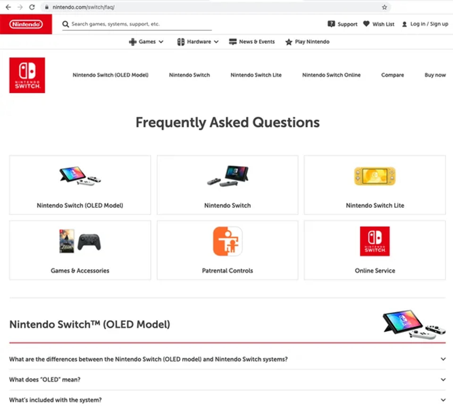
Static links to essential site segments such as ‘About Us’, ‘Services,’ ‘FAQs,’ and others or to some sitemap considerably eliminate a search for additional essential details out of the web pages in a more convenient form.
This option benefits the audience that has already reached the bottom of the page, hoping to find something exciting and not wanting to scroll back up. This way, you improve the site’s usability by making it easier for the users to find their way around it and keep them busy with more content from your site.
Source: blog.hubspot
Social Media Icons
Adding social links to the footer extends the website to social media profiles, thereby helping to reach out to visitors on all fronts. Not only does this strengthen the website, but it also assists in creating a fan base for the brand. This improves the chances for repeated actions and loyalty to the brand since it is easy for users to follow or contact you through social networks.
Copyright Notice
A copyright notice is a legal information about the user's content and what they hold or own on this site. Including a copyright notice helps dispel fears of possible theft of the ideas and concepts presented in the document. It brings a good level of professionalism to the site and shows the audience that the user put effort into the material on the website.
Privacy Policy and Terms of Service Links
Displaying a well-articulated Privacy Policy and Terms of Usage is essential for a business. These documents elaborate on using the user's data and outline what the users may expect when using the company's site.
These boundaries promote the privacy of users and respect adopted by many organizations to law requirements such as GDPR. The more transparent you are with your policies, the more confidence you build for your audience.
These fundamental features placed in the footer will markedly improve the usability of your website while forming an all-new and more pleasant user experience. An appealingly designed footer works insightfully to help users seek further information, enhancing their satisfaction and retention.
Types of Website Footers
Website footers come in various styles, each serving different purposes and catering to different needs. Understanding these types can help you choose the best footer design for your site. Here are some common types of website footers:
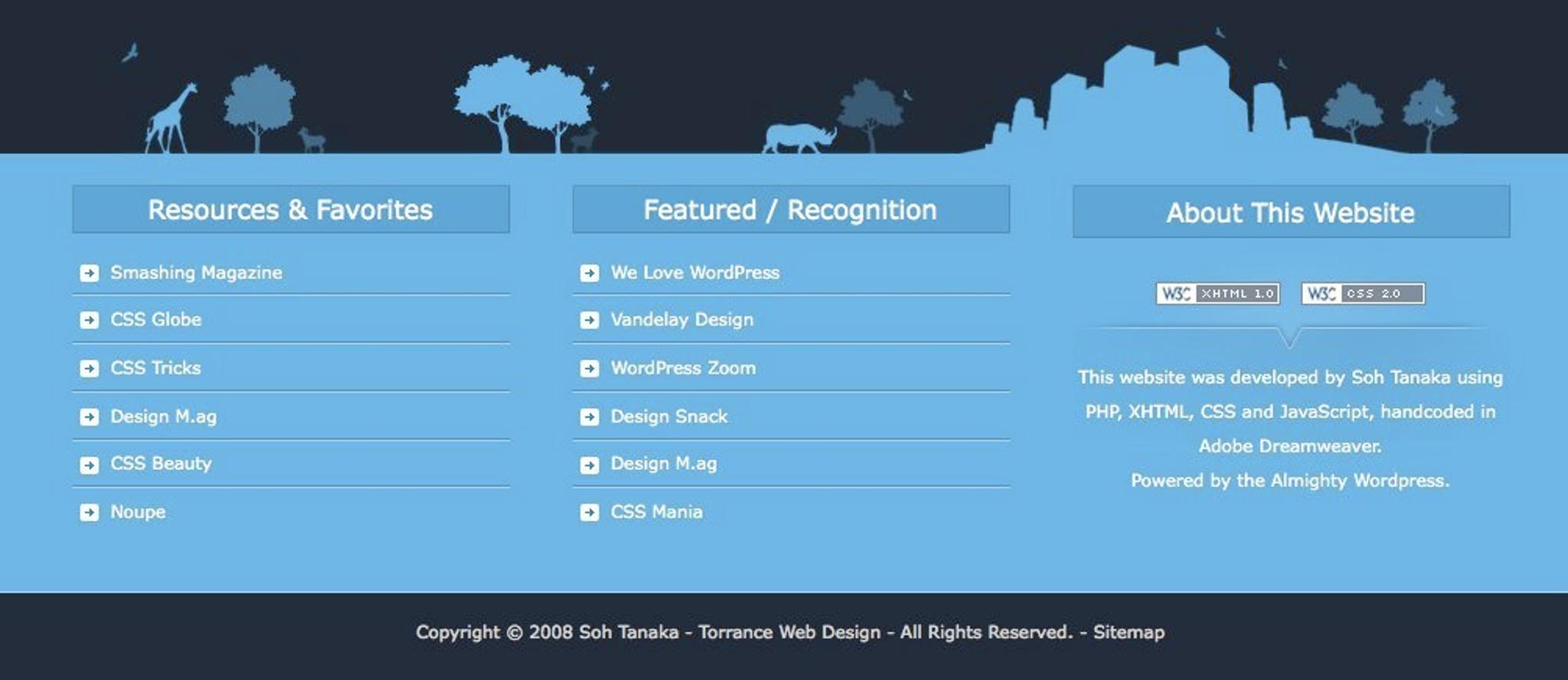
- Fat Footer: A fat footer is packed with a wide range of information, including contact details, social media links, and navigation links. This type of footer is ideal for content-rich websites that need to provide users with easy access to different sections of the site. By offering a comprehensive overview, fat footers enhance user navigation and engagement.
Source: ui-patterns
- Narrow Footer: In contrast to the fat footer, a narrow footer is more compact and includes only the most essential information, such as contact details and social media links. This minimalist approach is perfect for websites that aim to maintain a clean and simple look while still providing necessary information.
- No Footer: Some minimalist websites opt for a no-footer design, creating a clean and uncluttered look. This approach can be effective for sites that want to focus solely on their main content without any distractions.
- CTA Footer: A CTA (Call-to-Action) footer encourages users to take specific actions, such as signing up for a newsletter or clicking a button. This type of footer is effective for driving conversions and engaging users.
Source: niceverynice
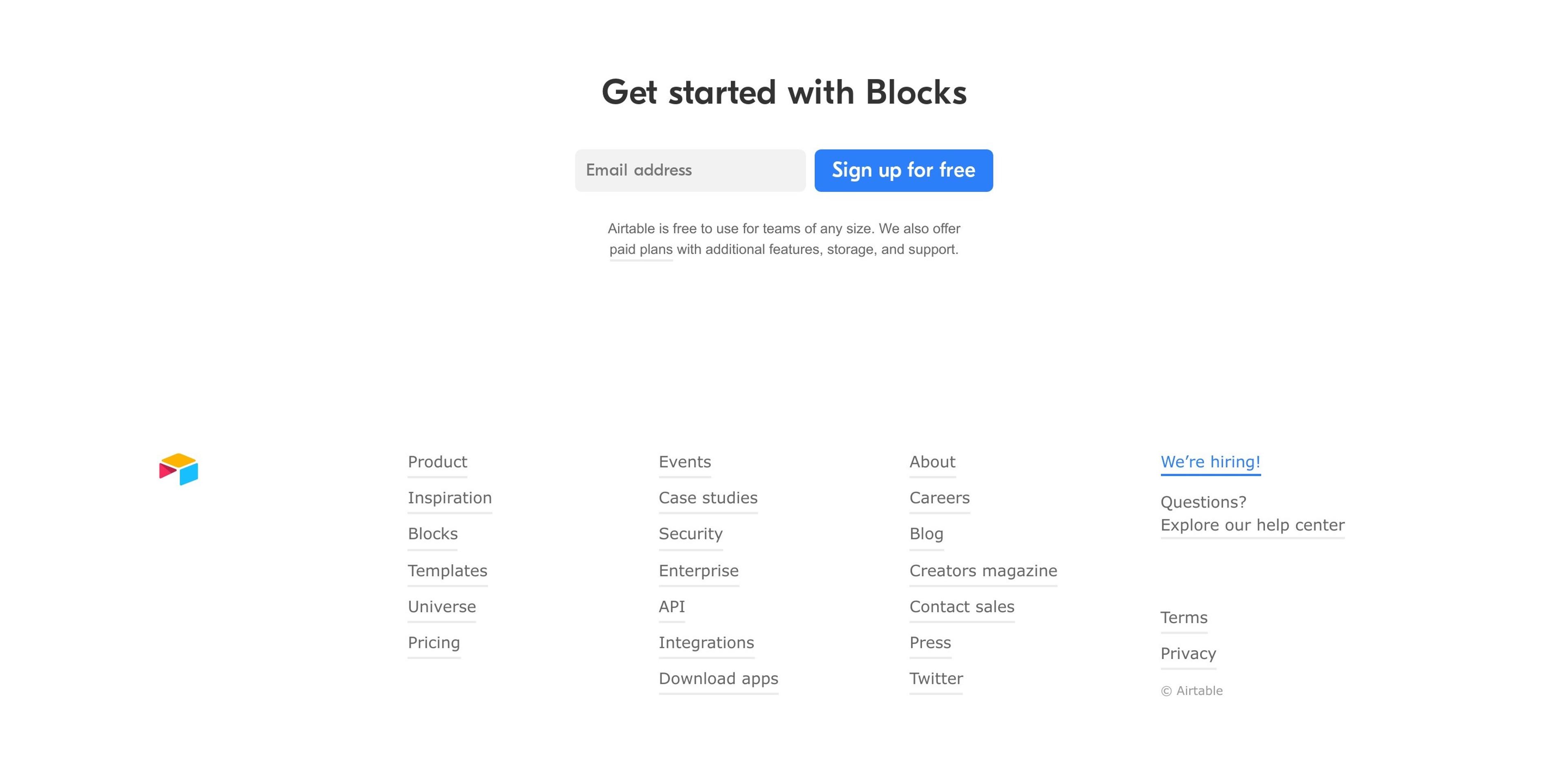
- Site Index Footer: A site index footer includes a list of all the pages on the website, making it easy for users to navigate the site. This type of footer is particularly useful for large websites with extensive content.
By understanding these different types of website footers, you can choose the one that best suits your site’s needs and enhances the user experience.
Best Practices for Footer Design
When creating a footer, it is also essential to consider the design and usability aspects. To do this better, here are some fundamental principles to follow:
Keep It Simple and Organized
A footer that is easy to navigate allows customers or users to easily search for the required information. Headings and sections must be strategically placed and proportioned so that a large amount of information or links does not overload visitors.
Ensure Mobile Responsiveness
More and more users are opening websites through their mobile phones, so always remember to design your footer for any screen size, even for tiny mobile phones. Ensure every button and link is clickable and that the text is visible.
Use Consistent Branding
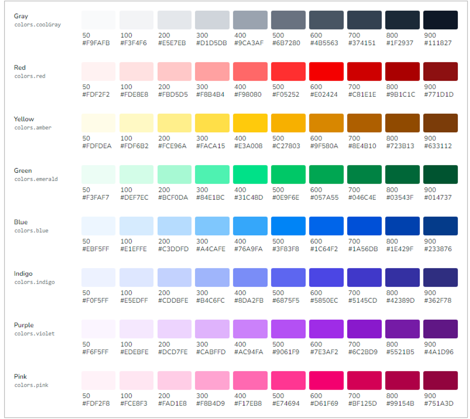
The various components, such as colors, fonts, and logos, such as the footer, should also help achieve the brand's identity. It also improves the overall appeal of the website regarding the visitors.
Source: medium
Include a Back-to-Top Button
By doing this every time any page is scrolled down, apart from adding to the charm of the pages, those pages will be much easier to navigate, for it will be simple for someone to click a button and stand back at the beginning of that page. This small addition will aid great user interaction on such long pages, and hence, definite usage of this function is highly encouraged.
By adopting these measures, you can create an attractive and purposeful footer that enhances your website's operational aspect and positively impacts user experience and satisfaction.
Optimizing Your Website Footer for SEO and User Experience
Optimizing your website footer is crucial for improving both your site’s visibility on search engines and the overall user experience. Here are some tips to help you achieve this:
Footer Links for SEO
Footer links can significantly impact your website’s SEO. Here are some strategies to optimize your footer links:
- Use Descriptive Anchor Text: Ensure that the anchor text for your footer links is descriptive and clearly indicates what the link is about. This helps search engines understand the content of the linked page.
- Incorporate Relevant Keywords: Include relevant keywords in your footer links to improve your site’s SEO. This helps search engines recognize the relevance of your content to specific search queries.
- Utilize Internal Linking: Link to other relevant pages on your website within the footer. Internal linking helps search engines crawl and index your site more efficiently, improving your site’s overall SEO.
- Avoid Over-Linking: While it’s important to include useful links, avoid overloading your footer with too many links. This can appear spammy to search engines and overwhelm users.
Improving User Experience
Enhancing the user experience in your website footer can lead to increased engagement and higher conversion rates. Here are some tips to improve user experience:
- Simplify Navigation: Include clear and concise navigation links in your footer to help users easily find what they are looking for. This improves the overall usability of your site.
- Provide Contact Information: Make it easy for users to get in touch with you by including contact details such as phone numbers and email addresses in your footer. This builds trust and encourages user interaction.
Source: searchenginejournal
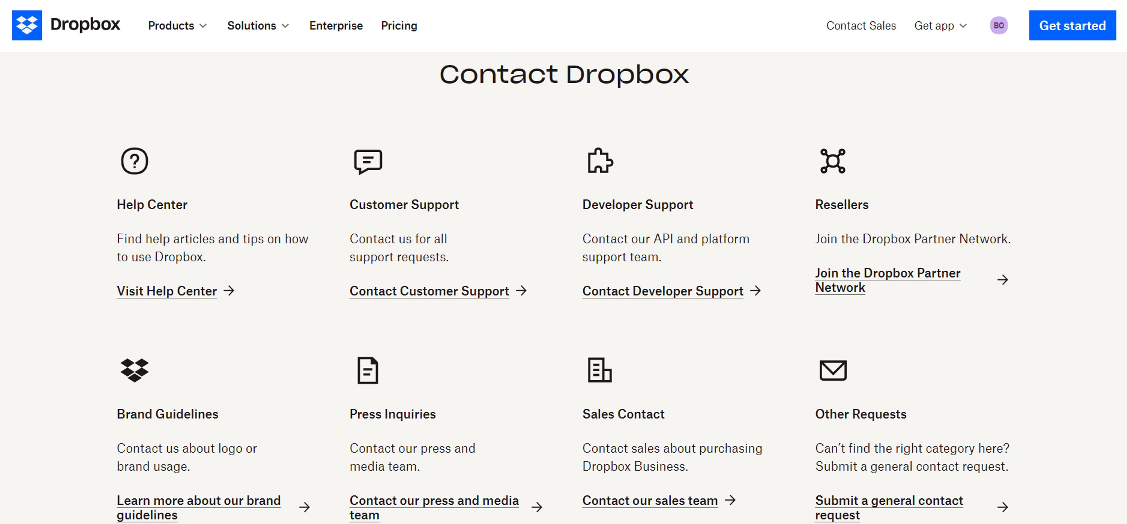
- Include Social Media Links: Add social media links to your footer to allow users to connect with you on various platforms. This can help build a community around your brand and increase user engagement.
- Maintain a Clear and Concise Design: Ensure that your footer design is clean and easy to read. Avoid clutter and use a clear layout to make it easy for users to find the information they need.
By following these tips, you can optimize your website footer for both SEO and user experience, ultimately enhancing your site’s performance and user satisfaction.
Case Studies: Successful Footer Designs
To apply effective designs, it is prudent to look at these elements to understand the lessons and approaches that improve user interaction, as such designs are often neglected.
Although frequently overlooked, footers are essential and informative parts of the site that assist navigation and subscription. Below are some of the exemplary websites in terms of the footer designs:
Mailchimp
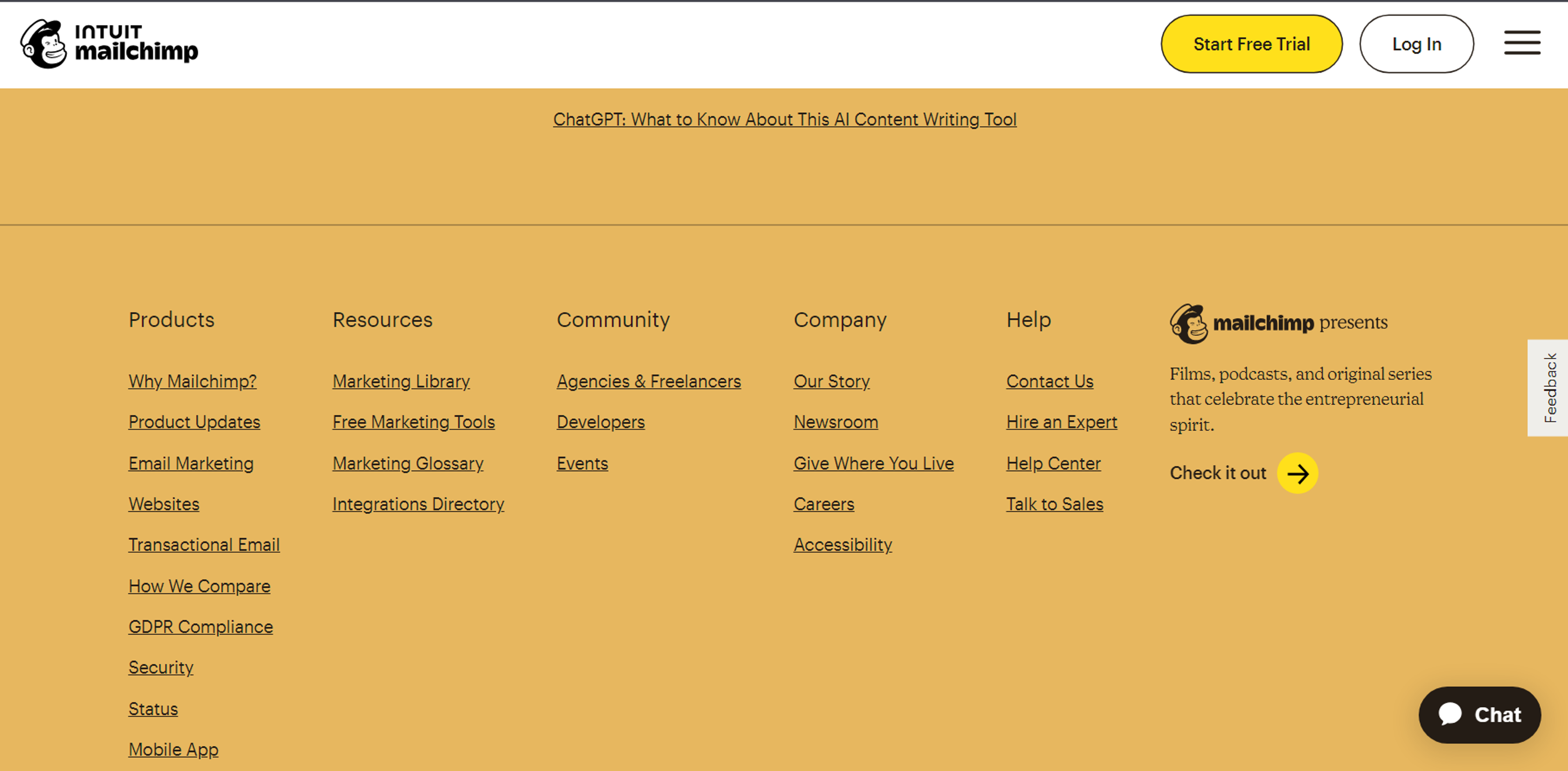
Within the characters of the footer of Mailchimp, much of the illustrations were creatively put into pictures of the footer. This footer exhibits remarkably favorable segmentations in navigation, social networking, and legal requirements, which, however, fulfills the brand's aims in covering everything in a light mood. Colors and typography are essential design features that are aptly applied to direct the users' attention to the correct information at the right time.
Source: mailchimp
Wix
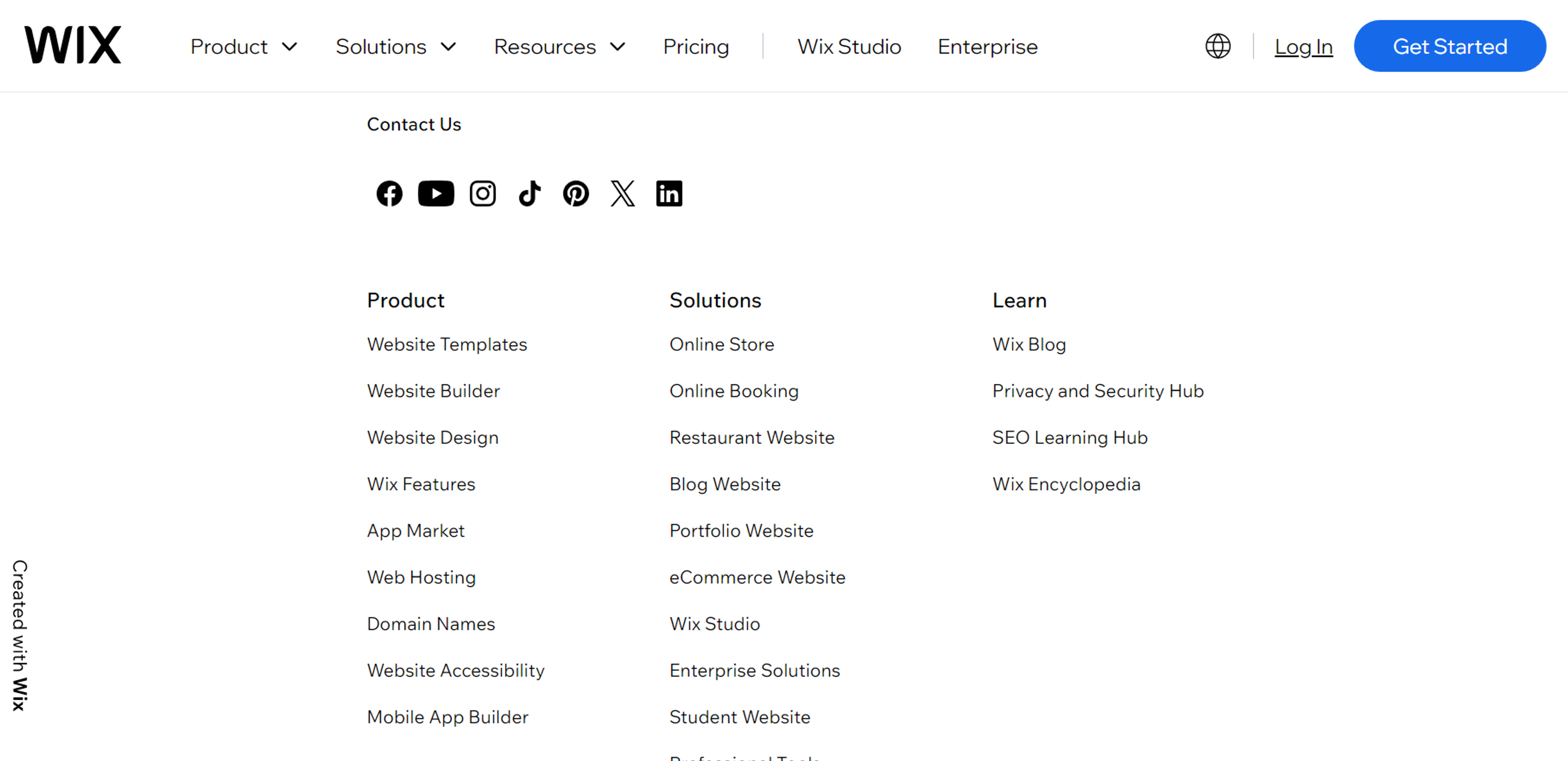
Wix's website also achieves this by creating a simple but effective footer design that is more appealing than the rest of the pages. This footer highlights all essential sections, such as navigation and subscription, while taking advantage of what this website offers by providing a lot of useful buttons. This functionality improves the usability of the overall website by increasing user satisfaction when scrolling on long pages.
Source: wix
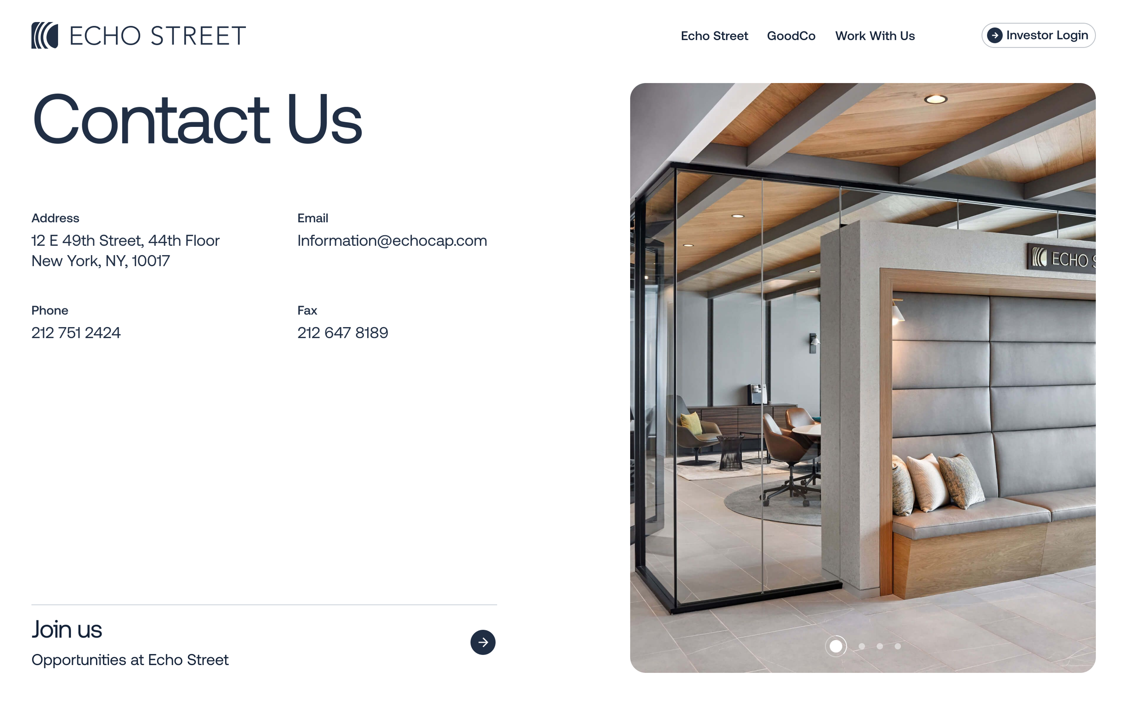
Echo Street
Our Echo Street project focused on creating a modern, engaging website for an asset management firm. Thanks to the intuitive design, we made sure the footer looked simple so anyone could connect with the company.
A key emphasis was placed on showcasing the firm's team and office to inspire user confidence. The site utilized smooth transitions and modern architectural metaphors while ensuring a seamless experience across all devices.
Source: clay.global
These illustrations demonstrate how footer design can augment a site's functionality and usability. By determining the right amount of information to provide and the need for it, these brands ensure that the footings are multi-functional and enhance the website user's experience, hence making them ideal for adoption.
Read more:
Conclusion
To sum up, attaching the meaning of a footer is one of the ways of improving how users interact with the site on the site. The classic mistakes, the best solutions, and the basics should allow you to raise a footer that will not only guide the user around your website but also promote your brand.
You must also test and revise your footer based on users' suggestions to maintain functionality. We invite you to use the acquired knowledge and the strategies presented on this site to create a footer that enhances your site, spends no time searching for users, and ensures they are directed appropriately without altering much of the site.


About Clay
Clay is a UI/UX design & branding agency in San Francisco. We team up with startups and leading brands to create transformative digital experience. Clients: Facebook, Slack, Google, Amazon, Credit Karma, Zenefits, etc.
Learn more

About Clay
Clay is a UI/UX design & branding agency in San Francisco. We team up with startups and leading brands to create transformative digital experience. Clients: Facebook, Slack, Google, Amazon, Credit Karma, Zenefits, etc.
Learn more


