Think back to the days before responsive web design. You would spend hours designing a website, ensuring all elements fit perfectly on the page. But then you would open it on your phone, and half of the content is cut off, or you'd have to scroll sideways to see everything. It was frustrating. But with responsive web design, those days are behind us.
This blog post will examine how responsive web design works and why it's crucial for today's web designers and companies. So let's get started!
Defining Responsive Web Design
Responsive web design (RWD) has become increasingly important as more people access websites on various devices. This type of web design means creating content that is responsive to the width and orientation of the visitor's device.
Source: Stéphanie Walter
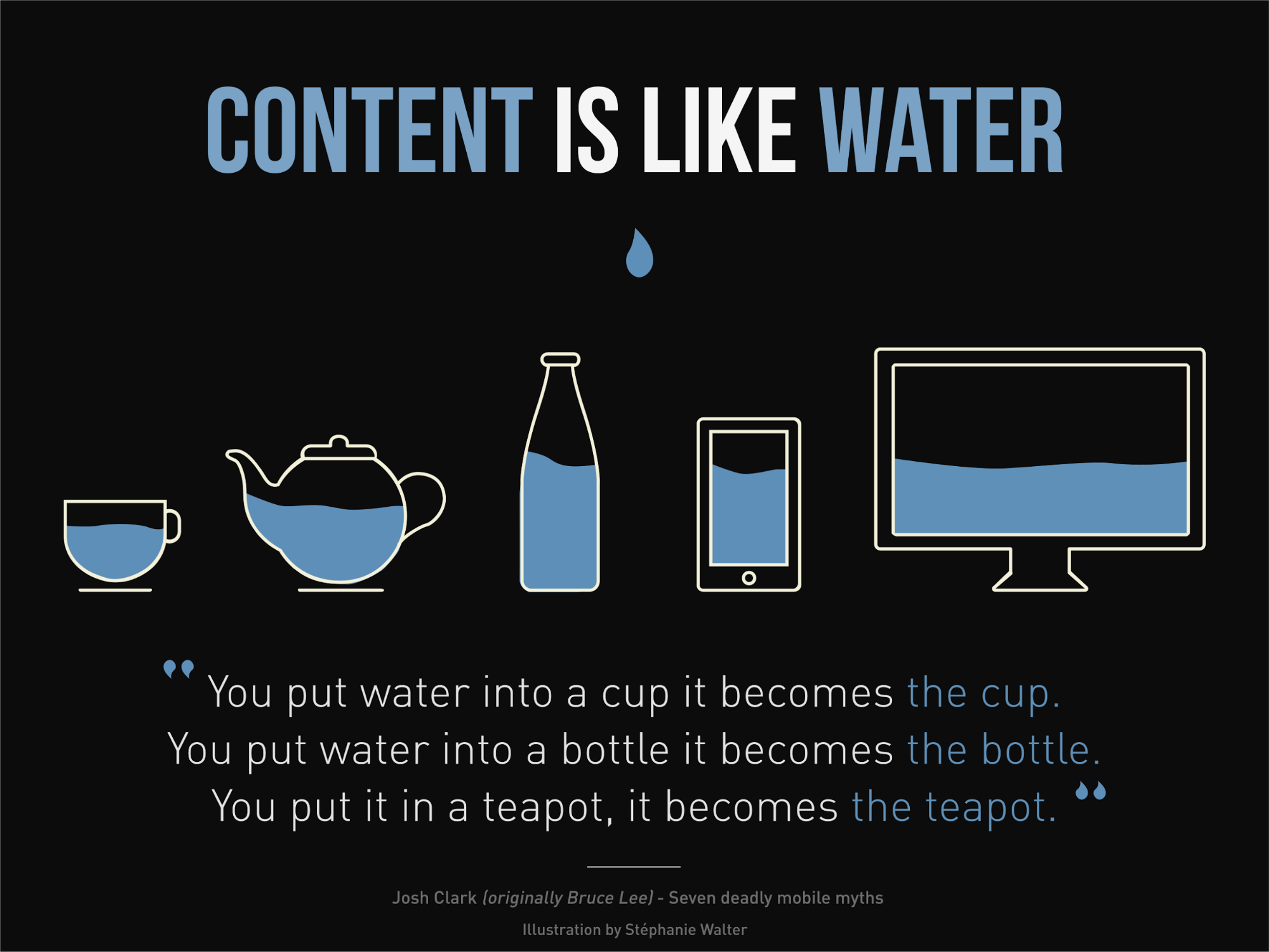
With responsive design, your website is transformed to fit your viewing environment. It is done using several tools such as flexible images and CSS3 media queries, which are extensions of the @media rule. Furthermore, fluid proportion-based grids are also used to ensure that all users can easily view your web pages no matter what device they use.
Everything from responsive images, text, layout, and menus must change sizes to fit different screen resolutions. Responsive design ensures that visitors have access to the same content regardless of their device.
In other words, responsive design adapts to any desktop or mobile device, which increases customer engagement and satisfaction with your website. With responsive web design, you only need one site that responds perfectly to all screens: no more separate URLs or complicated coding!
4 Main Features of Responsive Web Design
In 2010, Ethan Marcotte revolutionized the world of web design by introducing "Responsive Web Design" (RWD) to designers and developers across the globe. In essence, responsive websites are defined by three main characteristics:
Media Queries
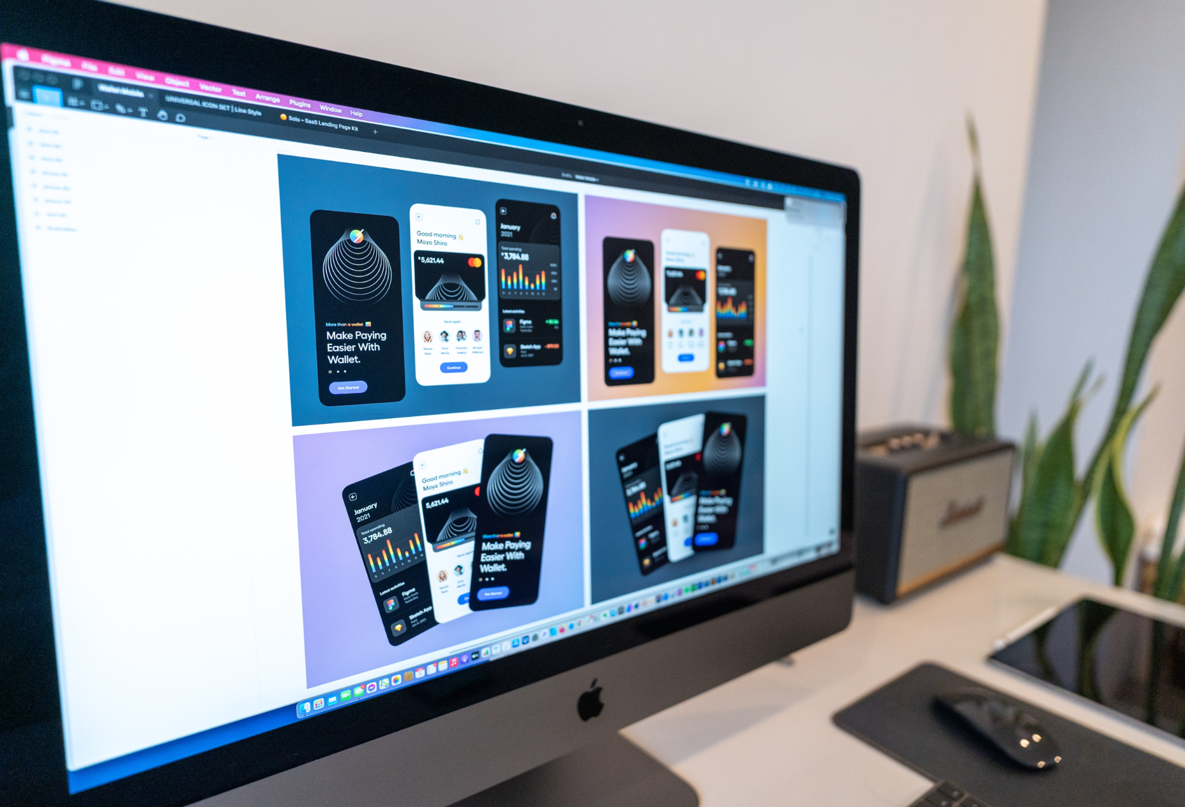
Media query lets us tailor our web designs to the user's device instead of defining limits in HTML/CSS. By using condition checks, we can target specific classes of devices and even inspect their physical properties. This improved approach provides users with a tailored experience based on their device needs.
A media query allows us to target not only certain device classes but also to actually inspect the physical characteristics of the device rendering our work.
Source: Tran Mau Tri Tam ✪ on Unsplash
The media query encompasses a media type (screen) and the actual inquiry inside parentheses. This inquiry includes an explicit media feature (max-device-width), in tandem with its assigned value of 480px, employed to assess compatibility.
Even though browsers consistently support media queries, there are still some older versions of browsers that aren't compatible. To guarantee this issue is addressed, you can use the css3-mediaqueries.js JavaScript library to allow these outdated web browsers to accept this feature and stay up-to-date with modern web standards.
Fluid Grids
With responsive design using CSS, your website's columns will rearrange themselves to fit the size of the user's browser window or mobile device — whether it be a 21-inch desktop computer, a 13-inch laptop, a 9.7 tablet, or a 5.5 mobile phone!
This gives users ultimate control over their viewing experience and saves time and money for designers, as they can update one version instead of multiple versions.
As Marcotte puts it:
Fluid layouts [….] put control of our designs firmly in the hands of our users and their browsing habits.
Ethan Marcotte proposed a legacy layout technique that was widely used in the past decade. At its core, this method utilized a straightforward mathematical formula to scale up or down grid elements: target size/context = relative size.
This equation formed the foundation for determining and adjusting element sizes and spacing throughout your design framework — all of which were calculated using relative units and could be amended when necessary. While this system proved dependable most of the time, some flaws were still associated with it.
Source: Domenico Loia on Unsplash

Remember to optimize your design for various screen sizes, but also keep device orientation in mind — people love the freedom of flipping their devices between portrait and landscape. Flexibility is essential here. Every element must work together seamlessly so that users can access information optimally.
With such flexibility comes continuous consistency across all devices utilizing just one design layout - allowing you to focus on what matters most: providing an optimal viewing experience that is visually appealing yet functionally efficient for visitors!
Flexible Visuals
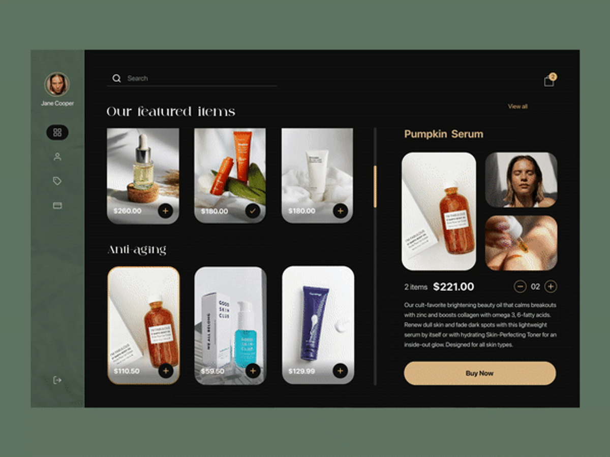
Marcotte discusses the utilization of code that restricts rich media files from exceeding their containers and viewports. He states that when the "flexible container resizes," it carries over to the inner visuals, too.
Since there are now over 8 billion unique devices on Earth, this feature allows teams to create designs that can adjust automatically and fit flawlessly into any device — small or large in size and shape!
Source: Dribble
Responsive Typography
When it comes to content, the king deserves its due attention. That's why we're introducing our fourth and final key feature: responsive typography. You may think that some features are optional - but they certainly aren't if you want your website to be universally accessible in every situation.
Responsive web design is all about providing a quality experience no matter what device or browser users might have, so don't underestimate how important this quartet of features truly is.
Unfortunately, there is a common misconception that bigger screens always require larger typefaces and vice versa. While this often holds true, it isn't an absolute rule - in some cases, shrinking or enlarging the font size can do more harm than good!
Source: Markus Spiske on Unsplash

When it comes to small screens such as cell phones, the font size should be increased for better readability. Apple suggests making the typeface at least 16px instead of 12px, which is usually expected.
The same idea applies to large monitors and TVs; you need to find the optimal font size that will provide your audience with an enjoyable reading experience without having an infinite increase in text size.
The Benefits of Responsive Web Design
Responsive web design is a gift from the gods! With responsive design, websites are designed to adjust automatically to the viewer's device and screen size. It eliminates the need for separate mobile sites, allowing businesses to maximize their traffic regardless of device.
The responsive web also ensures that customers have a seamless transition when they switch between devices, improving user experience and increasing customer engagement. All this boils down to one key thing: responsive web designs make life easier - both for companies that build and maintain websites and for their customers who access those websites.
However, it has its drawbacks, such as:
- not being fully optimized;
- slowing performance;
- potential web browser incompatibility;
- making advertising or targeting campaigns harder to build;
- offering different experiences to users depending on the device's difficulty.
Source: Luke Chesser on Unsplash
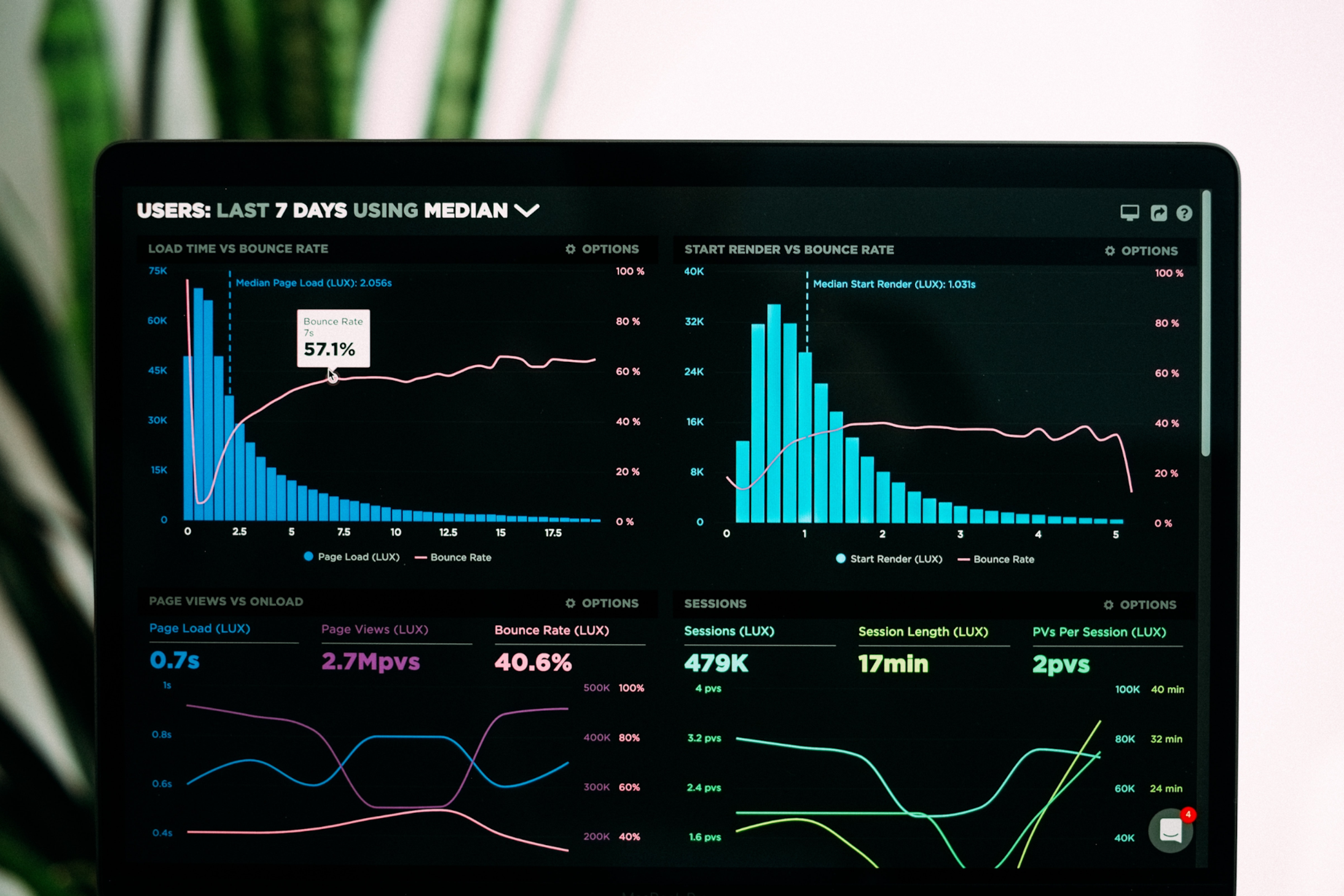
However, these disadvantages are fully covered by the important benefits of responsive design. To better understand why responsive web design is critical, let's explore some of the top reasons for its importance:
- Google prioritizes websites that are easy to view and navigate on mobile devices. Therefore, since 2015, it has been essential for those who want good rankings in search engines to ensure their website follows a responsive design with mobile-friendly behavior.
- A well-built mobile website creates strong trust and recognition with your consumers. Statistics reveal that users are likelier to recommend companies with an aesthetically appealing and optimized mobile site.
- A seamless user experience across all devices encourages customer engagement, amplifies lead generation, and drives sales and conversions. Research shows that after a poor mobile experience, more than half of consumers leave for the competition's website.
An Example of an Excellent Responsive Website
A responsive web design creates an enjoyable user experience, no matter what device they use. GitHub is an impressive responsive website example.
GitHub offers a smooth, uninterrupted journey across all devices. Although there are slight discrepancies between the desktop and tablet experience, when shifting from desktops to tablets, the upper section changes its two-column layout into one column with a copy situated on top of the signup form instead of beside it.
Additionally, while GitHub's login form is positioned at center stage on laptops and tablets, only an action button appears for mobile users. As such, customers must select this prompt to unveil the enrollment field below it.
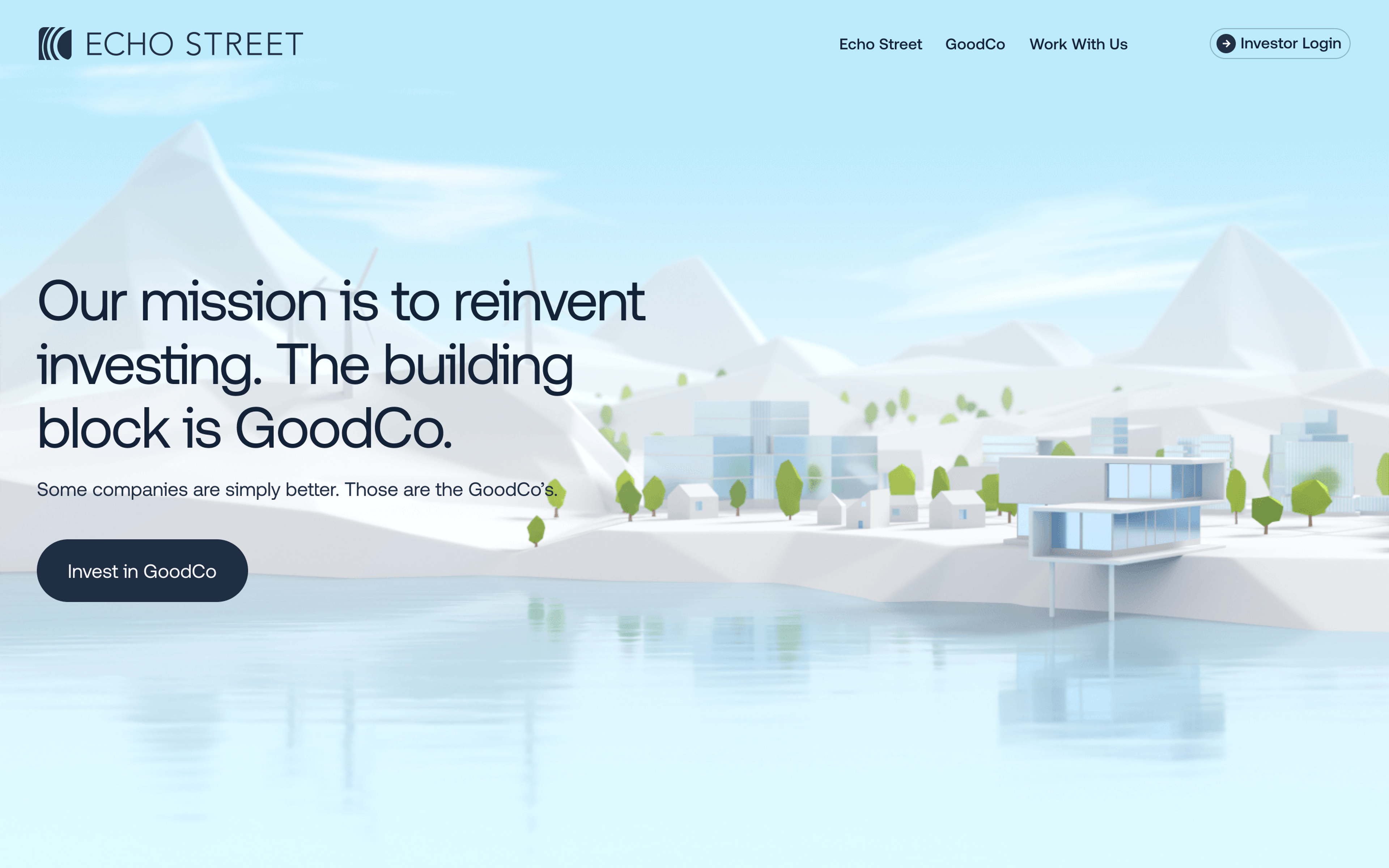
Our project for Echo Street involved creating an immersive, responsive website for a modern asset management firm. The design emphasizes minimalism and a unique "Echo Effect" that increases brand awareness. Key features include a 3D presentation to showcase sustainable investments, a focus on the team, and a user-friendly experience across all devices.
The frontend design utilized out-of-the-box solutions such as shaders to make the mobile version as engaging as the desktop version. This responsive design increases user engagement and satisfaction by adapting perfectly to any screen size.

Tips for Creating a Responsive Design
Together, these three types of functionality allow designers to craft a responsive design.
If you're looking to create a responsive website, there are several essential tips to remember. First, start with responsive design principles rather than jumping straight into the visual design of your website - responsive design must come before cosmetics.
Web Pages Layout Elements
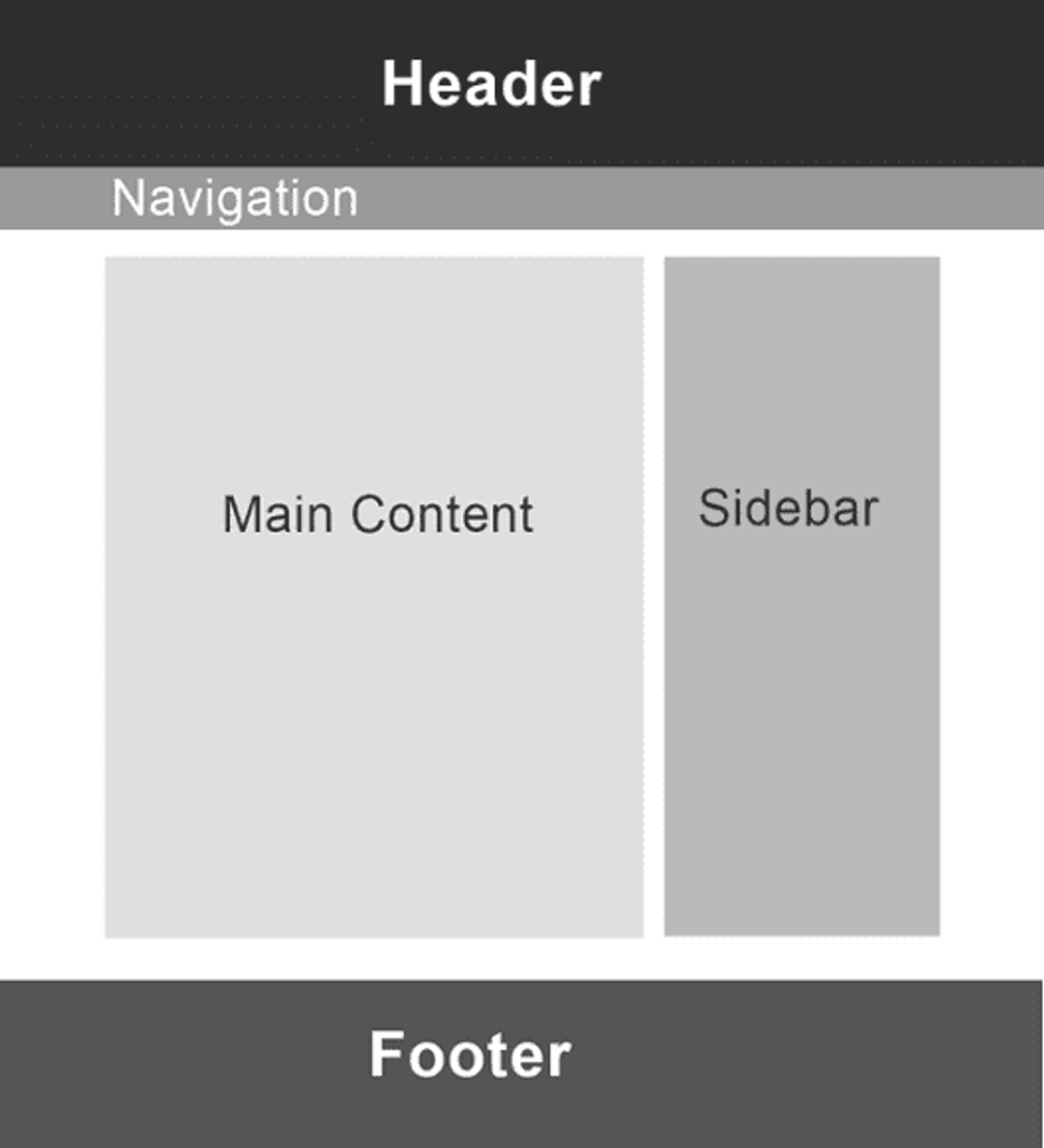
When creating a website, the first and foremost step is to customize different sizes for layout components dependent on media query or breakpoint. The amount of containers you'll need will vary based on your design but typically center around these elements:
1.
Header2.
Navigation3.
Content4.
Sidebar5.
Footer
Source: Devwares
Be sure that elements like navigation menus, headings, responsive images, and content blocks will resize automatically across mobile devices and browsers. Next, ensure your site is optimized for mobile devices, minimizing the text entry needed for users and removing any unnecessary elements.
Common Resolutions for Desktop and Mobile Devices
Finally, use media queries wisely - these requests allow different CSS styling to be applied depending on the screen size of each device. With these tips in mind, responsive websites are within anyone's reach!
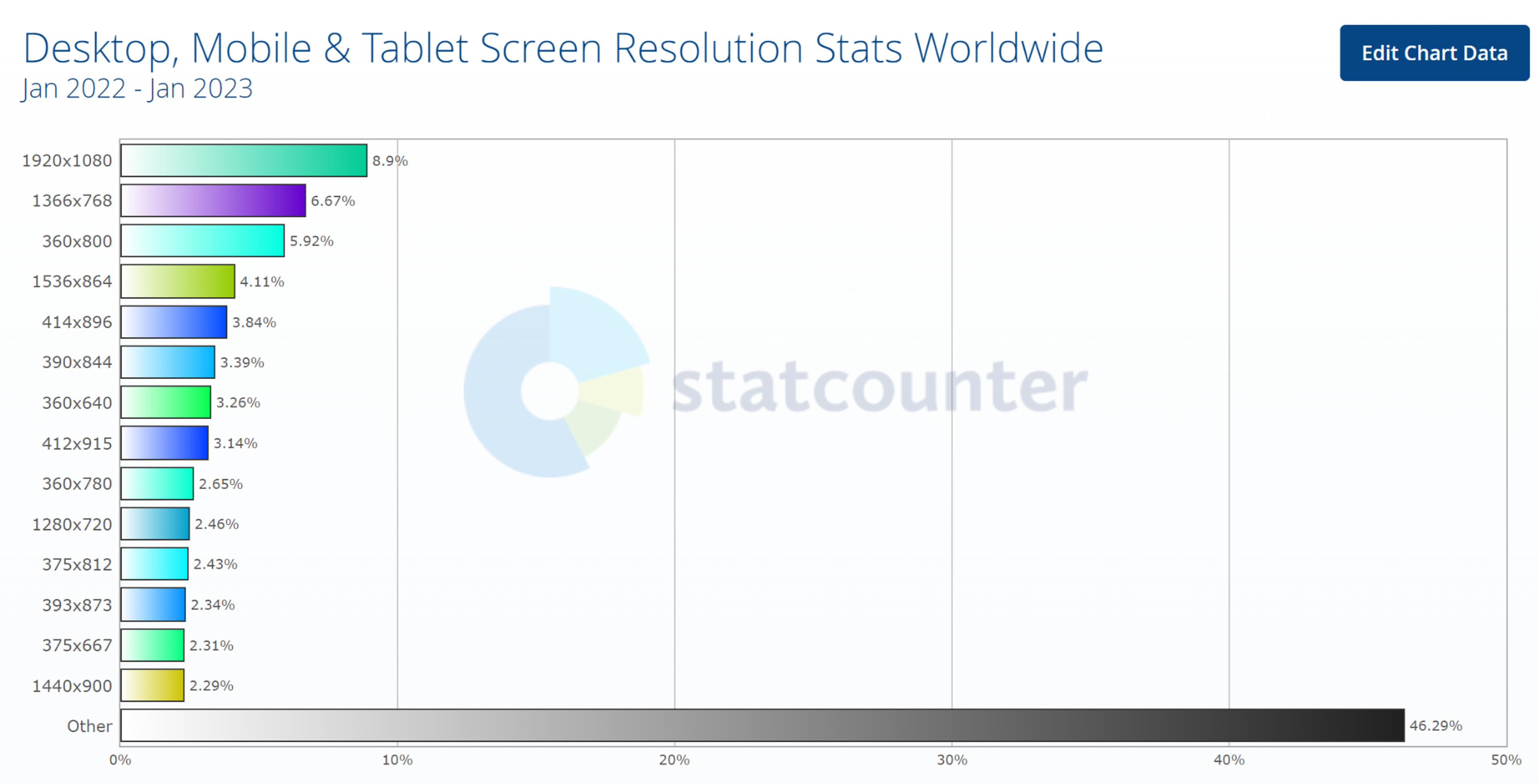
According to the Worldwide Screen Resolution Stats, these have been determined as the most frequent resolutions across mobile, desktop, and tablet devices:
- 1920×1080 (8.9%)
- 1366×768 (6.7%)
- 360×800 (5.9%)
- 1536×864 (4.1%)
- 414×896 (3.8%)
- 390x844(3.3%)
Test Responsiveness
Take the first step to a successful mobile-ready website by running Google's Mobile-Friendly Test. Just enter your site's URL and press "Test URL" for quick and comprehensive results that will help you create an optimized, user-friendly experience.
Source: freestocks on Unsplash
Read more
Conclusion
As you can see, responsive design is a handy and powerful tool for any website. It's easy to understand, intuitive for user experience, and has many benefits – from improved UX to higher search rankings.
Plus, in a world where most browsing is now done on mobile devices, ensuring your site is as mobile-friendly as possible is just plain wise. It can be daunting at first if you don't know where to start, but once you get the hang of it, you should find that designing a responsive site isn't too tricky.
All that matters is that your site looks great no matter what device someone views it on! So whether you're creating a new website or need to update an existing one, make sure you include some basic RWD principles.
And if you want to read further on the subject, feel free to check out our other articles on how best to use RWD features and utilize various UI elements so your site looks professional yet fun!


About Clay
Clay is a UI/UX design & branding agency in San Francisco. We team up with startups and leading brands to create transformative digital experience. Clients: Facebook, Slack, Google, Amazon, Credit Karma, Zenefits, etc.
Learn more

About Clay
Clay is a UI/UX design & branding agency in San Francisco. We team up with startups and leading brands to create transformative digital experience. Clients: Facebook, Slack, Google, Amazon, Credit Karma, Zenefits, etc.
Learn more
