
Explore the 7 fundamental practices that ensure effective mobile web design. Learn essential techniques to create mobile-friendly sites that boost user experience and engagement.
Is My Website Mobile Friendly?
Given that the majority of online traffic comes from mobile devices, having a mobile-optimized website is crucial for engaging and retaining users. A business's overall performance improves when a website has a mobile-friendly layout, as it functions properly on both smartphones and tablets. But how do you know if a website is mobile-optimized or not?
Undoubtedly, a mobile responsive website enables users to access content without the need to zoom in on the device's screen for clarity. It should also accurately cater to the dimensions of various devices, such as mobile phones and tablets.
Source: RichMedia
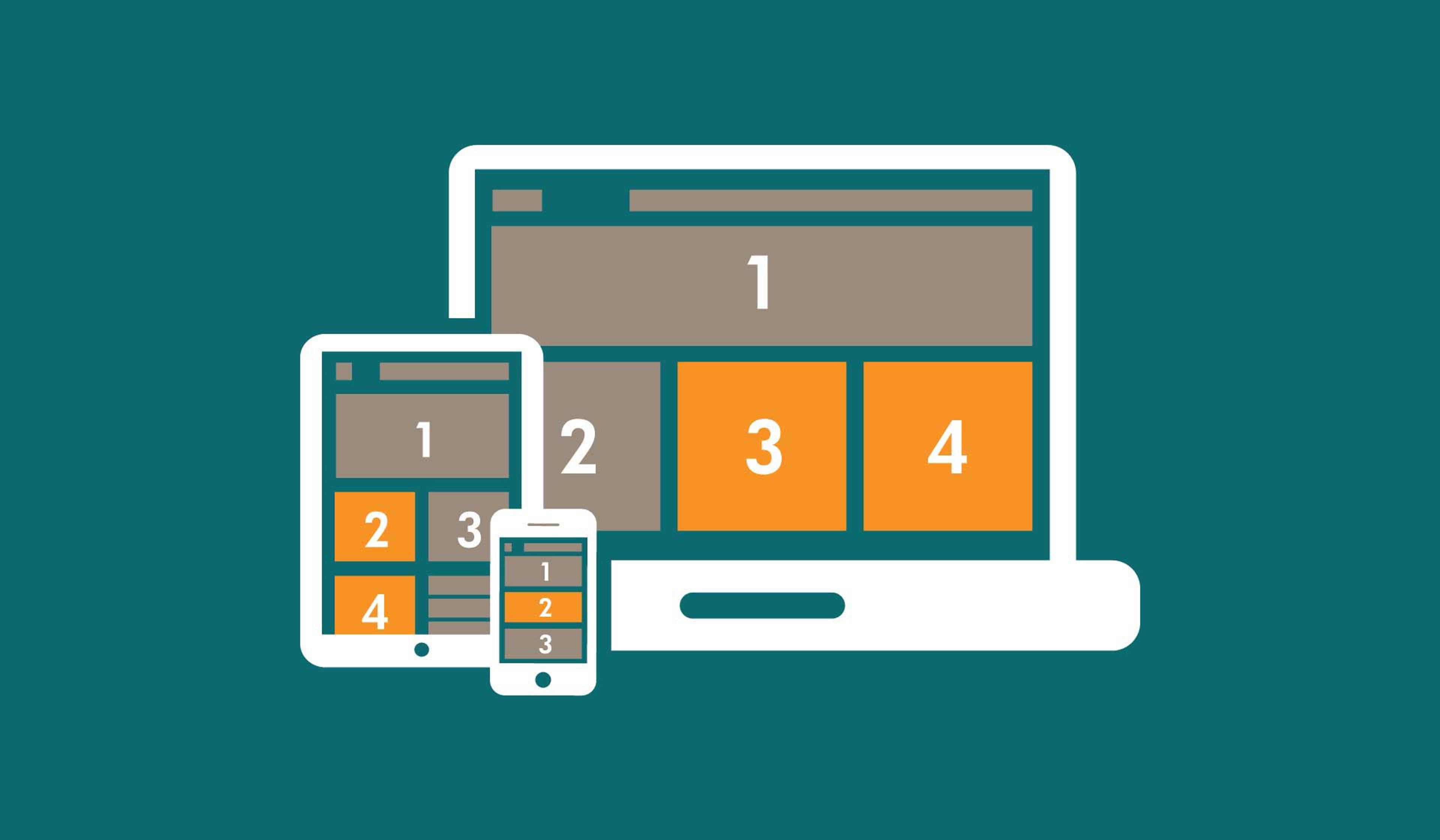
Also, a website should set design guidelines that allow tabs and buttons to be easily accessible on smaller screens. Images should also be adjustable and remain proportionate to the page's overall layout.
You can use Google's Mobile-Friendly test and tools like PageSpeed Insights to review your website's performance on mobile devices. These tools identify poor loading speed, low touch responsiveness, or content overflowing on smaller screens as some issues requiring specific modifications.
If your website is not mobile-friendly, consider updating it by optimizing your images, removing redundant code, improving server response time, or adopting a mobile-first approach to design. An optimized mobile website goes beyond making web pages user-friendly, which is critical in today's digital economy.
Why Is Mobile Website Design Important?
A mobile business website can be resourceful and usable only when enough time and effort are allocated to designing it.
Mobile business websites are substantially different from desktop websites because the screen size is significantly smaller, the method of interaction is Touch instead of Click, and the device capabilities vary considerably in speed and power.
Although making your website mobile-friendly is very challenging, it is a requirement and no longer an option.
Google Prioritizes Mobile-Friendly Websites
Mobile-optimized websites rank higher than others on search engines, such as Google. Google has made sequential updates through the years that have aimed to boost the visibility of mobile-friendly websites, like mobile-first indexing.
Google crawls and ranks websites based on their mobile versions. A website not fully optimized for mobile can risk lower ranks or being excluded from the top search results, which can hurt the website speed and visibility.
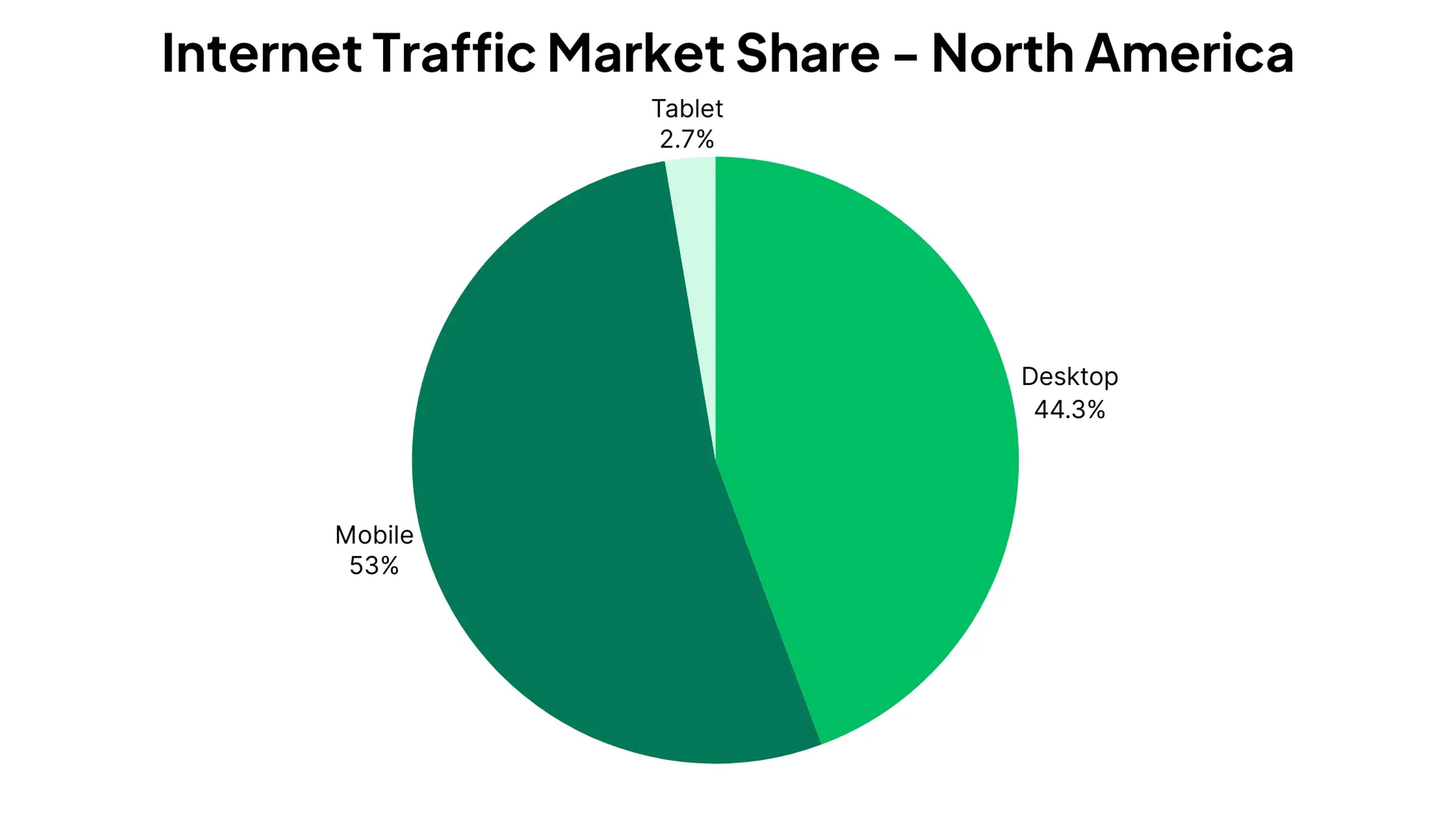
The Rise of Mobile Web Traffic
Web browsing through mobile devices has become the norm, accounting for most web traffic. Failure to make your website responsive and mobile-friendly means you miss out on this vast audience.
Even with an excellent marketing plan, you can risk losing potential customers if they cannot access or navigate your website through their phones.
Source: mobiloud
Enhanced User Experience & Engagement
In addition, having a mobile-optimized website means your users can effortlessly enjoy their experience. A mobile-friendly website is specifically designed for smaller screens and touch devices.
This guarantees smooth scrolling, readable texts, fast loading times, and much more. When more people engage with the site, the bounce rates are lower, encouraging visitors to stay longer, which can lead to more conversions.
We live in a world driven by mobile devices, meaning that having a fully optimized and responsive website is essential for engagement and long-term success.
Explore 7 Best Mobile Web Design Practices
When designing a website, it’s important to follow mobile web design practices to ensure a great user experience on any device.
Mobile layouts play a key role in responsive and adaptive designs, ensuring desktop layouts scale down effectively for smaller screens.
These techniques improve web page layout, functionality, and user experience. An app design company will likely use these practices.
1. Simplicity
You need to keep your website simple and make it easy for your users to use your website. It should be easy to use no matter what mobile device the user is on. If there is something that your website has but doesn't need, then you should get rid of it.
A website can simplify many things, including forms, which can be shorter, more straightforward, and easier to fill in.
There are many benefits to simplifying your website, and these benefits include the following:
- The website becomes easier to navigate
- Loading times will be faster, so people are less likely to leave the website while waiting
- Users can 'scan' the content on the website
- Easier to create and maintain a website
These are the main reasons why simplifying your website is a great design practice that will improve your website and give users a better experience. Many mobile app and web design agencies use this design practice frequently.
2. Use Hamburger Menus
These should be utilized on mobile devices instead of traditional website navigation bars. While navigation bars are helpful and provide users with a straightforward way to find what they’re looking for, mobile devices present unique challenges due to their limited-screen real estate.
This constraint means less content can be displayed simultaneously, which is where the hamburger menu comes into play. A hamburger menu can effectively house navigation links in a more organized and aesthetically pleasing user interface, allowing for a smoother browsing experience.
Source: Wix
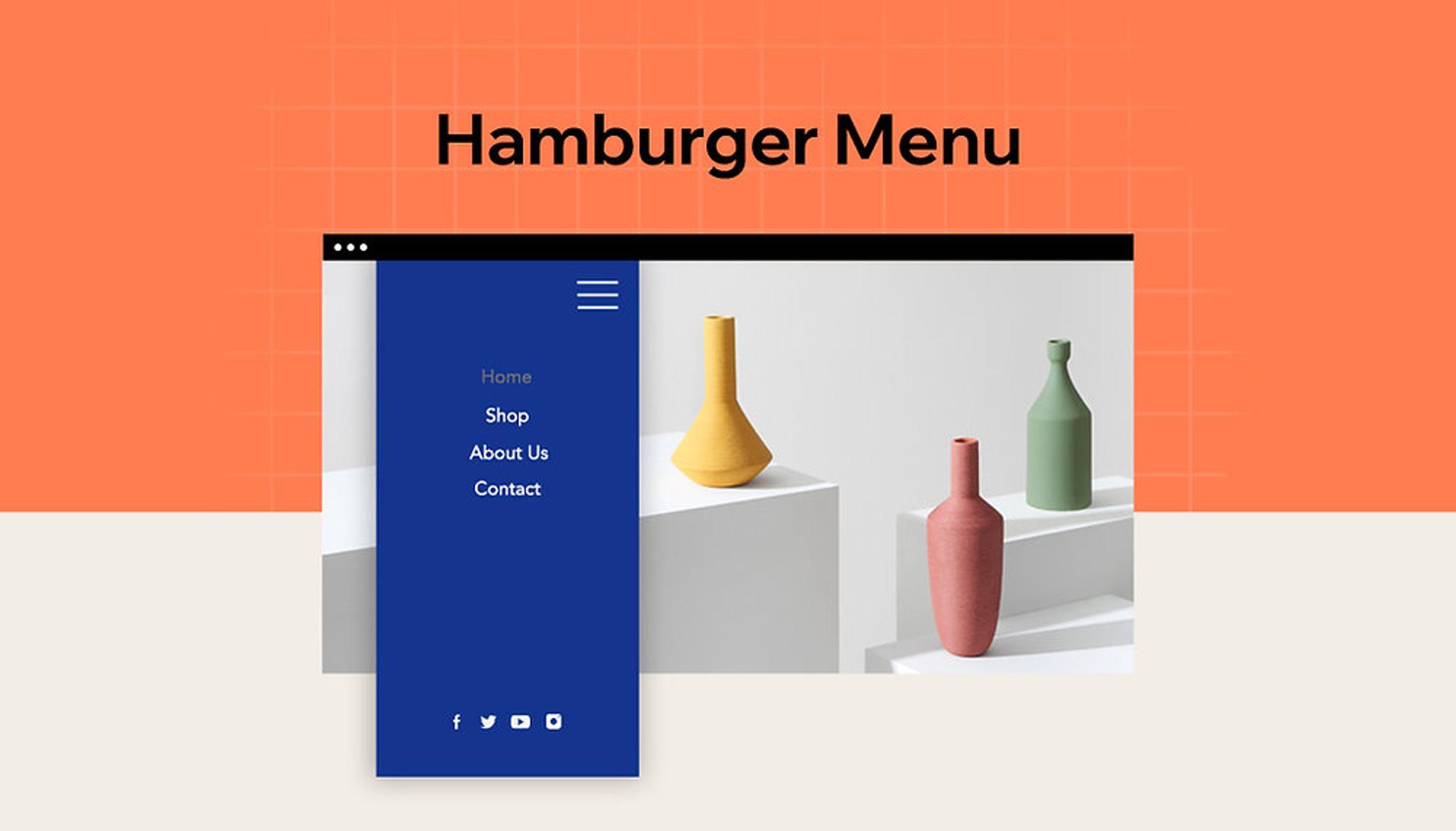
When designing your hamburger menu, include only the essential navigation links users frequently access. This approach results in a cleaner and more streamlined appearance and minimizes the risk of overwhelming users with rarely used options.
3. Using Different Types Of Content
Incorporating images and videos to complement your text is a powerful way to capture your user's attention, ultimately enhancing your website's engagement and retention rates.
Visual elements can break up long blocks of text, making the content more digestible and appealing. It's essential, however, that the images and videos you choose are eye-catching and relevant to the website's content and themes, as this will create a more cohesive user experience.
On the flip side, while images and videos can significantly enrich your content, they can also slow down your website if not managed properly. Large file sizes can lead to longer loading times, frustrating visitors and driving them away.
Therefore, it's crucial to consider the size of the images and videos you use to optimize images, and their potential impact on your website's performance.
To mitigate this issue, you should compress your images and videos before uploading them, ensuring they are smaller without sacrificing quality. Various tools and software are available for this purpose, making balancing visual appeal and site performance easier.
4. Disable Popups
Popups can be incredibly frustrating for users, especially when searching for information on mobile phone websites. These intrusive elements often obstruct the content users want to access, leading to a negative experience that can drive them away from test websites. It’s essential to recognize that popups diminish the user experience and harm your website's reputation.
Source: Privy
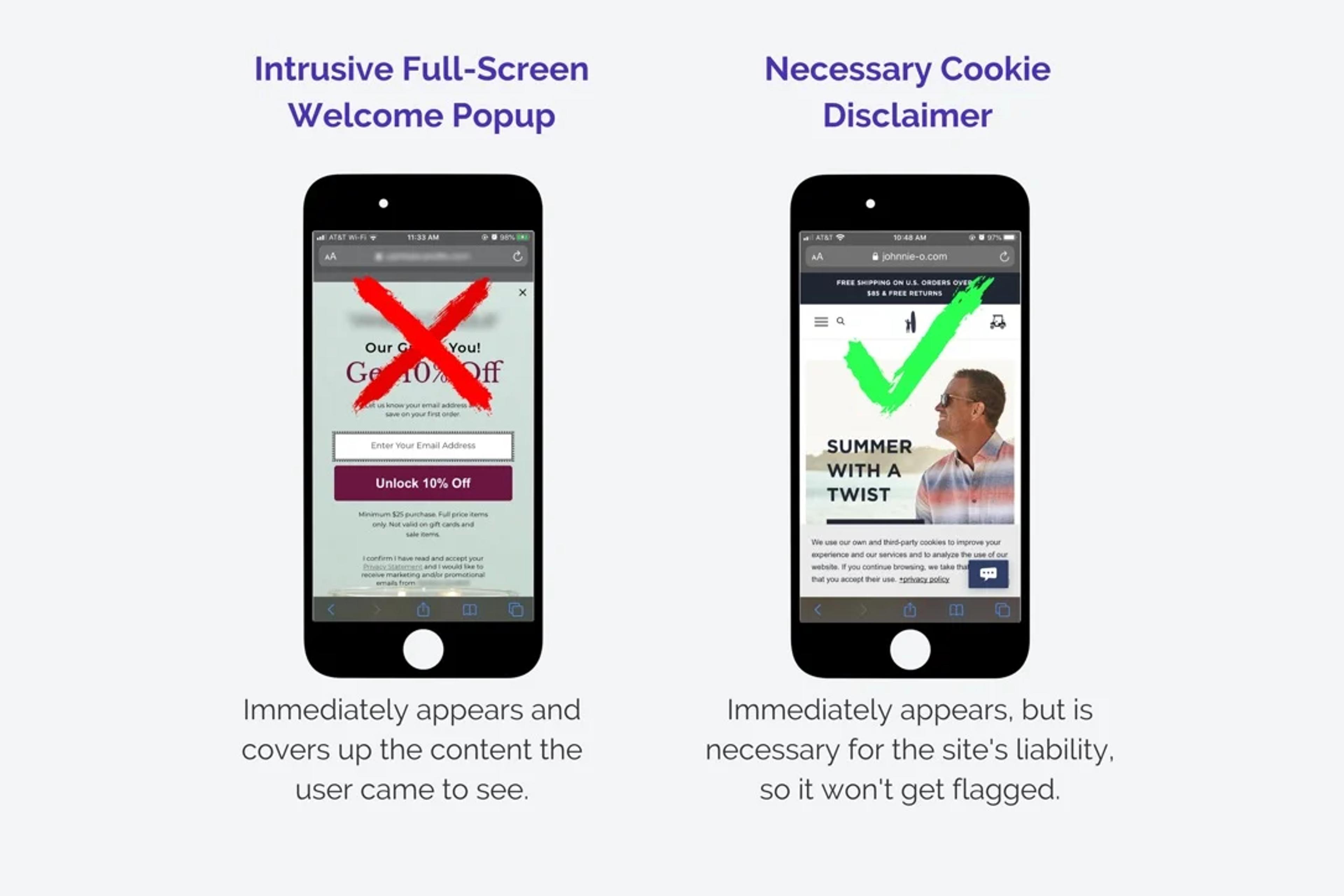
Moreover, search engines like Google penalize websites with excessive or disruptive popups, impacting their rankings. This can lead to decreased visibility and traffic over time, further exacerbating the issue.
Eliminating popups from your mobile website creates a smoother, more enjoyable browsing experience. This simple adjustment can enhance user satisfaction, encourage longer visits, and increase conversion rates.
5. Highlight Important Elements
People do not want to search for what they desire. They want it delivered instantly. To meet this expectation, it is crucial to ensure that only the critical functions essential elements and content users seek are readily accessible to everyone.
The easier users find and access this content, the better their overall experience will be. A seamless and efficient experience enhances user satisfaction and increases the likelihood that hey will return to the website in the future, fostering loyalty and encouraging repeat visits.
Source: laetro

Creating an environment where users can quickly obtain what they need is vital for maintaining engagement and building a strong online community.
6. Comfortable Positioning Of Elements
Users often rely on one hand when navigating their mobile phones, highlighting the importance of designing mobile websites with this in mind. To enhance usability, it’s crucial to ensure that all interactive elements are easily accessible within the natural reach of the user's thumb.
This means placing buttons, links push notifications, and essential features within the lower part of the screen, allowing for smooth navigation without straining the hand. By prioritizing this ergonomic design, you can create a more user-friendly experience that caters to the convenience and comfort of mobile users.
7. Link Contact Information
Contact information should be easily linked to enhance user experience and accessibility. For instance, if your business features a phone number on its website, this number must be clickable, allowing users to tap it and instantly launch their phone's calling app.
This seamless process saves users the hassle of manually dialing the number or switching back and forth between different applications to save contact information.
By streamlining this aspect, you make it convenient for potential customers to reach out and reflect a user-centric approach in your design. This practice is crucial in today's digital landscape, and any reputable mobile app design and-design company will emphasize the importance of integrating such functionalities to improve overall usability.
Mobile Website Design Examples
Looking for inspiration to create a sleek, user-friendly mobile website? Check out these standout mobile website design examples that combine functionality with great visuals.
Grayscale
Let's take one of the case studies we covered in class: Grayscale. The redesign focuses on a sleek, user-centric design that beautifully integrates the traditional finance lens with the modern world of crypto.
Some key highlights are clear layouts, clever graphics, and flexible device designs.
With reusable and adaptable components, businesses can maintain a certain level of uniformity and designation while easing management tasks and adapting to new market changes.
This approach improves user engagement. Additionally, all desktop features are mobile-friendly and easily accessible, ensuring an efficient user experience across all devices.
Our expertise in the crypto space extends beyond Grayscale. At Clay, we specialize in crafting user-friendly, visually striking websites for crypto businesses, ensuring they stand out in a competitive market while providing seamless experiences for users across all platforms.
Grayscale website design by Clay

ActiveCollab
One of the best project management software, ActiveCollab, has updated its website and application interface to capture the essence of its latest features and urbanized branding. This focus on usability is a given in modern web design, and user experience has greatly benefited from it, making it a prime example for mobile web design.
The website's choice of colors is welcoming and soothing. The background is light orange; it looks good and feels warm and welcoming. At the same time, the purple web elements grab the user's attention, which is a plus for usability. The combination provides a simple and elegant user interface that captures the user's attention without excess complexities.
Source: optimizepress
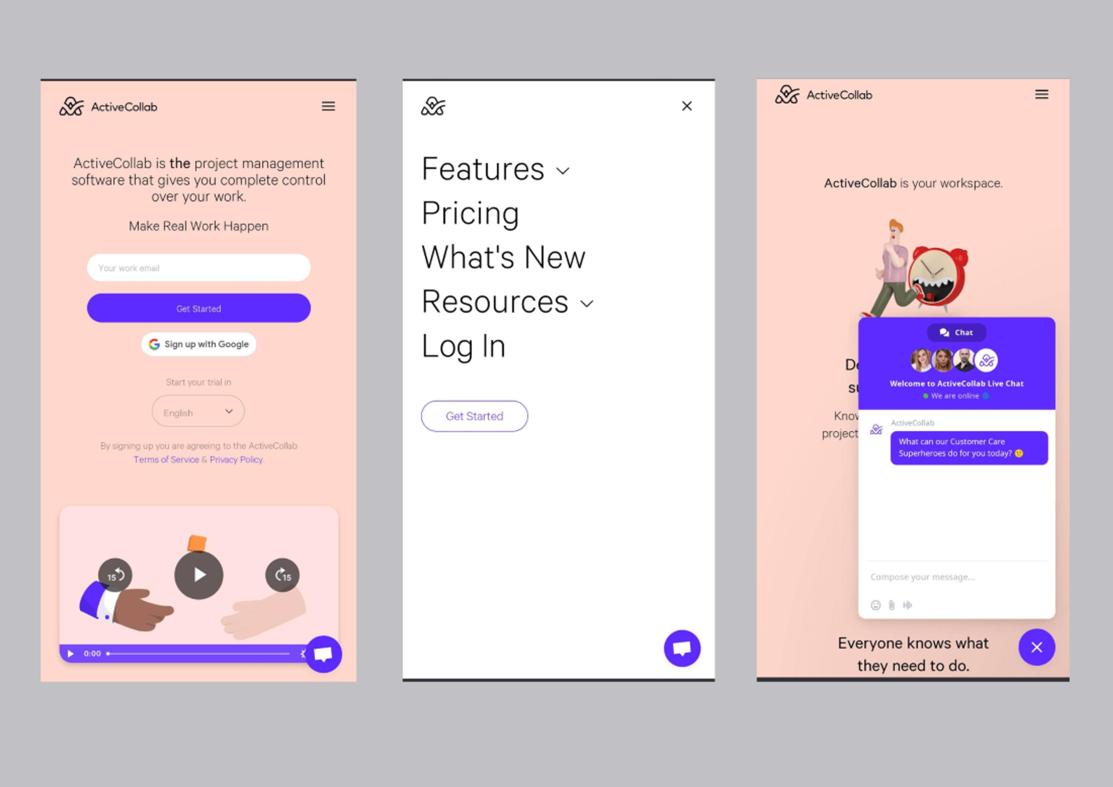
When it comes to navigation, ActiveCollab goes for simplicity. The large, bold menu fonts are also easier to read and help improve the overall outlook. This makes the site feel less deserted, which is great for effortless navigation among mobile users.
A notable feature that is easy to use is the floating action button with live chat assistance at the bottom right corner of the screen. Hence, if the user uses one hand, they can easily reach the button without any problems.
Yang’s Place
The website of Yang's Place, a Chinese restaurant, is aesthetically appealing and well-designed. Functions are easily accessible, and the logo on the website's url side serves a dual purpose: it builds brand identity and functions as a clickable button that redirects users back to the homepage. This is a vital feature for mobile users and is very helpful in improving their UX.
However, what makes Yang's Place unique is its ability to present authenticity and mastery with its highly appealing pictures. Each dumpling served is a piece of art that is high quality, beautifully photographed, and presented in a hand-drawn vector for the brand and the restaurant, which makes it very attractive yet still friendly. This presentation separates the business from others and enhances its brand identity like a boutique shop.
Source: wix
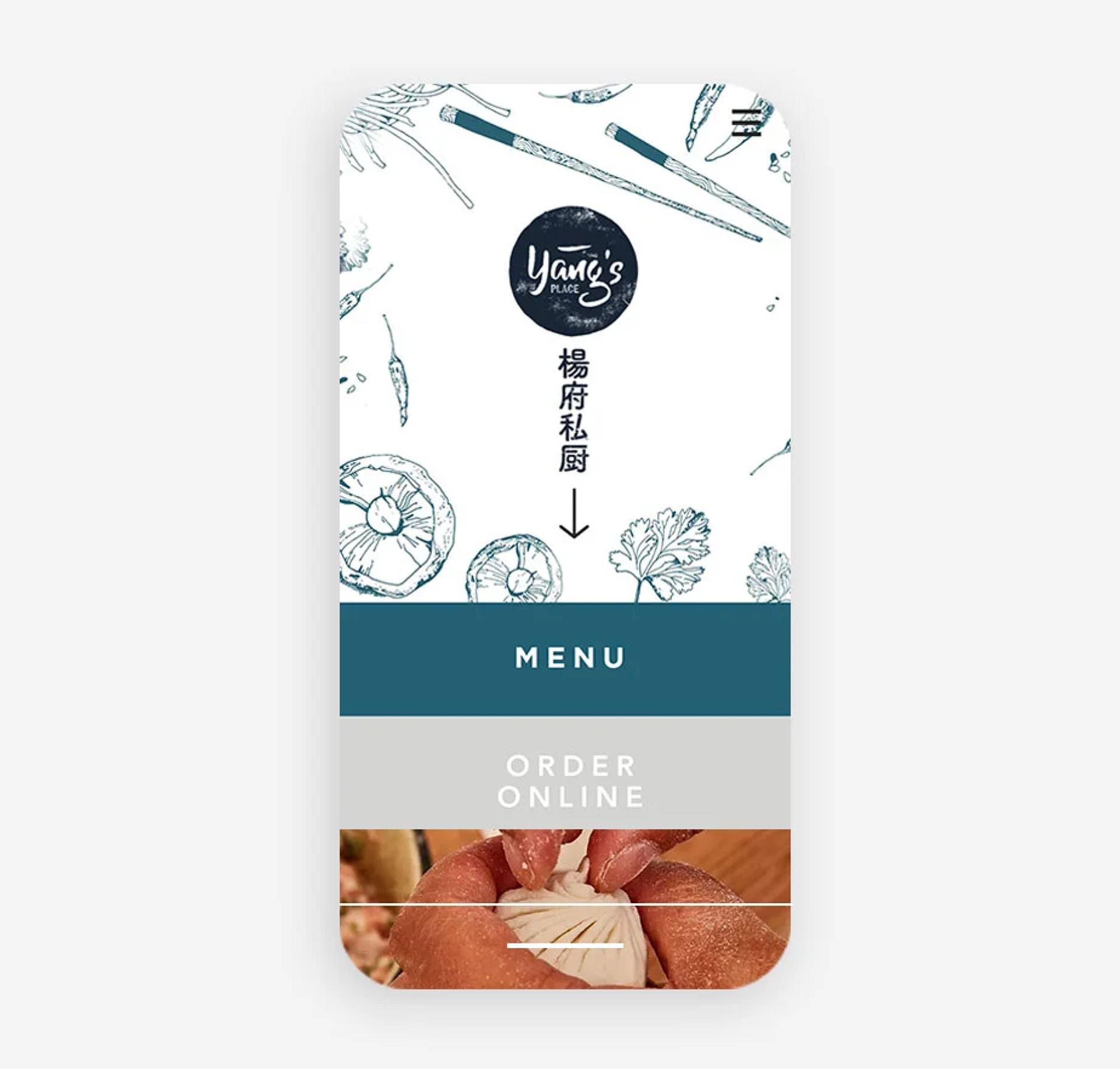
The strategic position of the so-called 'Menu' and 'Order Online' buttons enables users to navigate directly to the most important thing - the food. The new website layout is so tantalizing that it exemplifies Yang's Place's dedication to quality and tradition and transforms website visitors into restaurant patrons. With one glance at their dishes, every individual will be overcome by a powerful taste craving.
Read more
Conclusion
In conclusion, implementing these best practices in mobile web design is crucial for ensuring a seamless and enjoyable mobile user experience. A well-designed mobile website makes navigation easier and enhances engagement and conversion rates by prioritizing user needs.
As mobile internet usage continues to outpace desktops, investing time and resources into optimizing your site for mobile devices is more important than ever.
By focusing on simplicity, effective use of space, and user-friendly elements, you can build a mobile web experience that meets the expectations of today's on-the-go consumers. Embracing these mobile design best practices will position your business for success in an increasingly competitive digital landscape.

About Clay
Clay is a UI/UX design & branding agency in San Francisco. We team up with startups and leading brands to create transformative digital experience. Clients: Facebook, Slack, Google, Amazon, Credit Karma, Zenefits, etc.
Learn moreAbout Clay
Clay is a UI/UX design & branding agency in San Francisco. We team up with startups and leading brands to create transformative digital experience. Clients: Facebook, Slack, Google, Amazon, Credit Karma, Zenefits, etc.
Learn more