Just think about visiting a website where you cannot find anything. It is cluttered and frustrating. Then think about going to a website that leads you directly to what you need, holds your attention with its content, and leaves you with a good, lasting impression. The difference between these two experiences frequently comes down to the web layout.
A well-designed homepage and layout are the backbone of any successful website because they affect user experience (UX) and business success. This article will break apart the components and best practices for creating the perfect web layout.
Understanding Web Layout Basics
But what exactly does “web layout” mean before we get into it? A web layout refers to how different design elements on a webpage are arranged or structured visually. It includes where headers are placed, navigation menus go, content areas live, sidebars sit, and footers rest.
Good layouts should make it easy for people to move throughout your site while understandably presenting the information. This is particularly important for crypto and Web3 platforms, as users need to navigate complex data and transactions seamlessly. A clear, intuitive layout helps demystify these technologies, making them more accessible to a broader audience.
Often, people do not realize just how important a good design is until after their site has been developed — but this shouldn’t be so! You must always remember that users interact with your website through its pages.
They take action only when they understand what path they should follow next… So always design around visitors’ needs instead of assuming they’ll adapt themselves accordingly because chances are… they won’t!
When creating any page layout, designers must apply basic principles such as balance, contrast, unity, and visual hierarchy. These principles will help them create visually appealing and functional page layouts that guide user attention and enhance the overall experience.
Source: CommonNinja
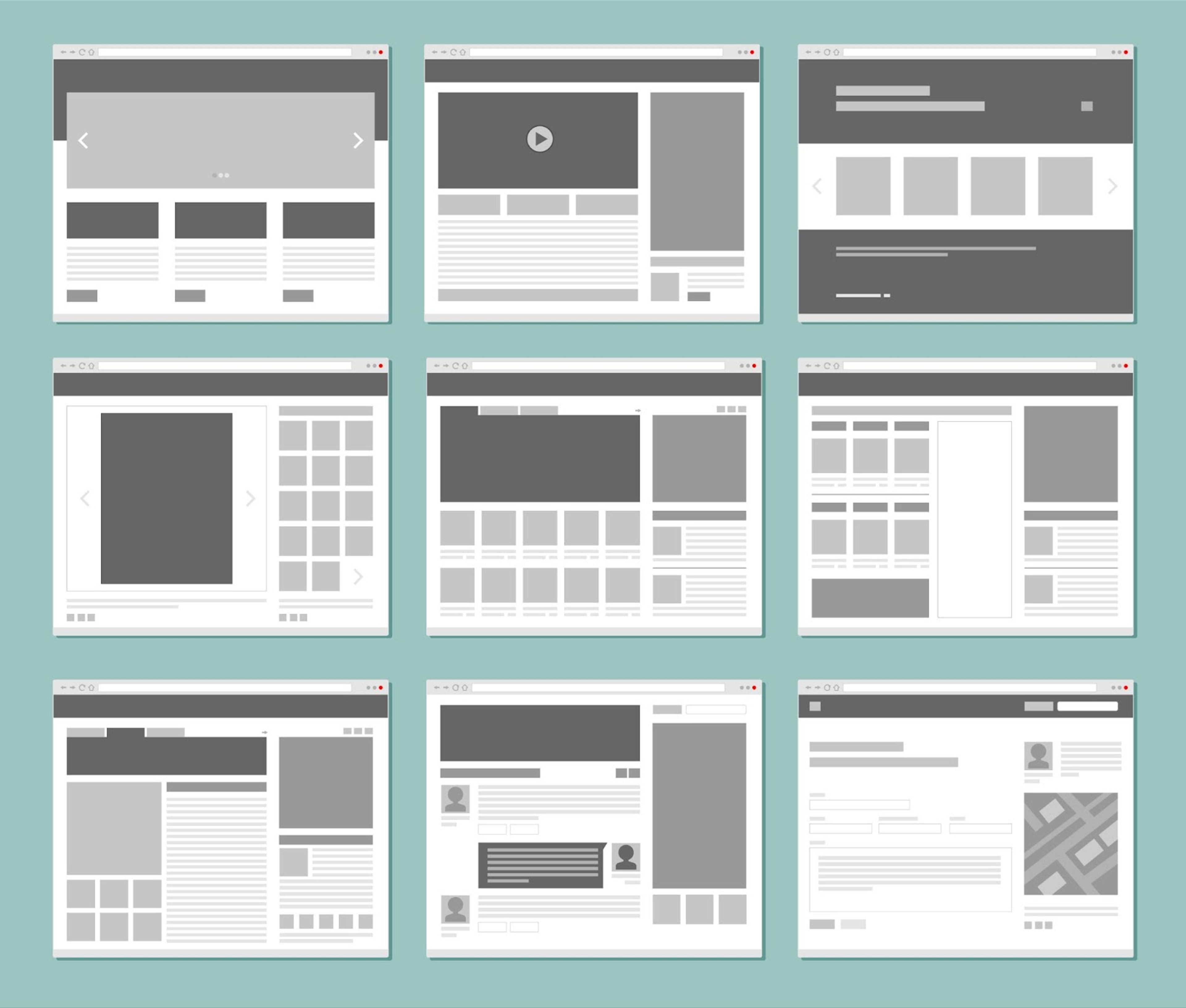
Essential Web Page Elements of a Perfect Web Layout
Let's break down the key components that form the anatomy of a perfect web layout.
Header
When users visit a website, the header is usually the first thing they see. It establishes brand identity and offers quick access to main navigation. A good header design must be visually appealing, have a prominently displayed logo, and include intuitive navigation options. For example, Airbnb or Apple websites have strong branding with clear and concise navigation systems.
Navigation
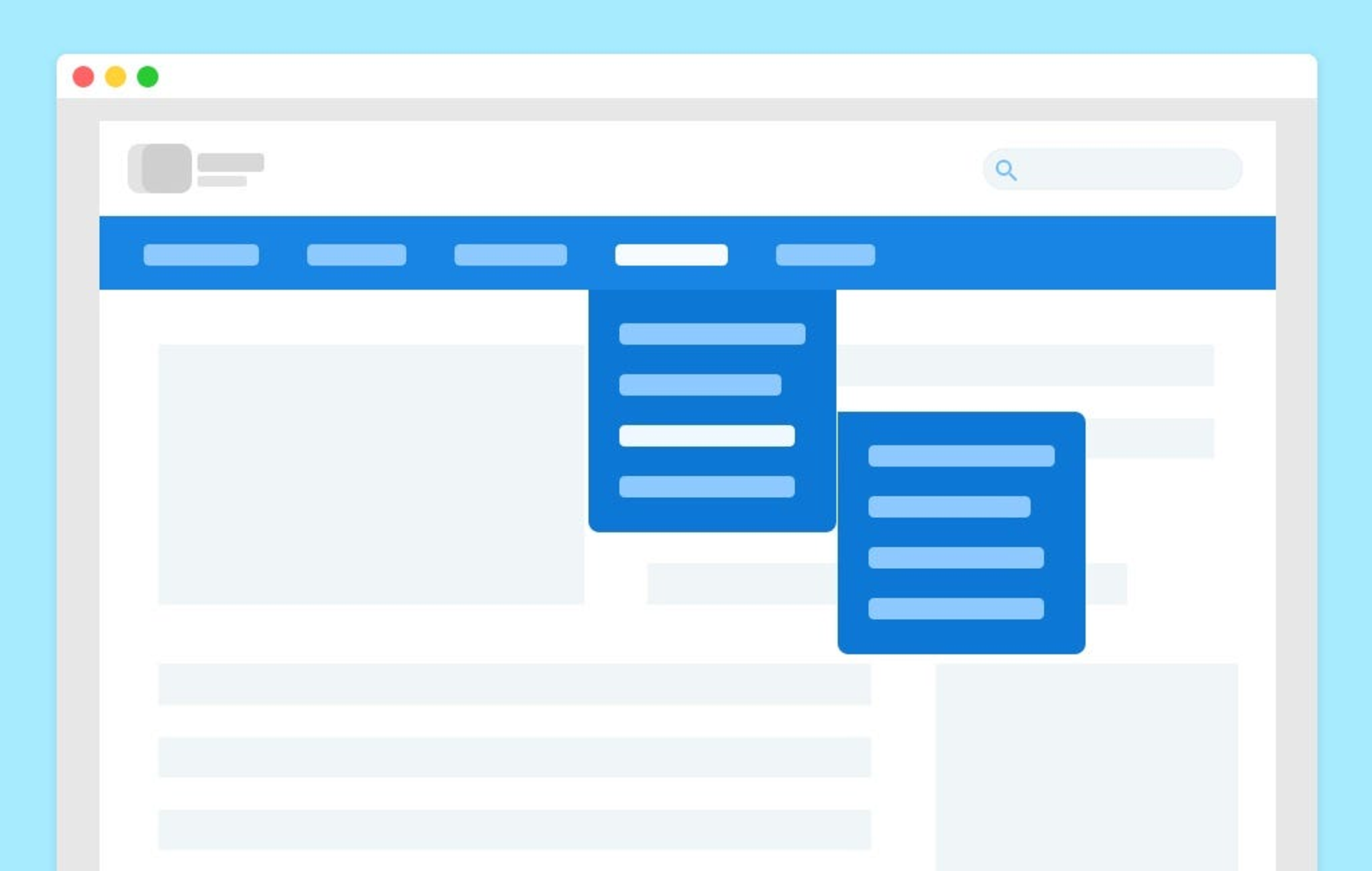
Intuitive navigation is important because it directs people around your site and helps them find what they want fast. Navigation menus can be placed at the top, side, or hidden behind a hamburger icon for mobile devices. Some best practices in navigation design include using clear, descriptive labels, organizing menu items logically, ensuring consistency across the entire site, etc.
Source: UX Bootcamp
Content Area
The content space is the main section of a website where all information is displayed. Designers should use headings, subheadings, paragraphs, and lists to organize interesting, easy-to-read content.
White space and visual hierarchy can help users follow along better and quickly digest what they are looking at. Including high-definition images or videos can also break up text blocks nicely while adding extra appeal.
Sidebar
Sidebars are optional sections on web pages that display additional information to support the main content, such as related posts, ads, or secondary navigation.
When deciding whether or not you need a sidebar, consider whether the information will be useful for users and add value to their experience. If you decide to use a sidebar, ensure it does not overpower the rest of your design but complements it.
Footer
The footer is usually located at the bottom of every webpage. It contains links like Contact Us, About Us, sitemap, etc., and social media icons for easily connecting with online platforms. A good footer design should be organized so visitors can find any page quickly without having to scroll through menu after menu.
Most Popular Website Layouts
Multiple Column Layout
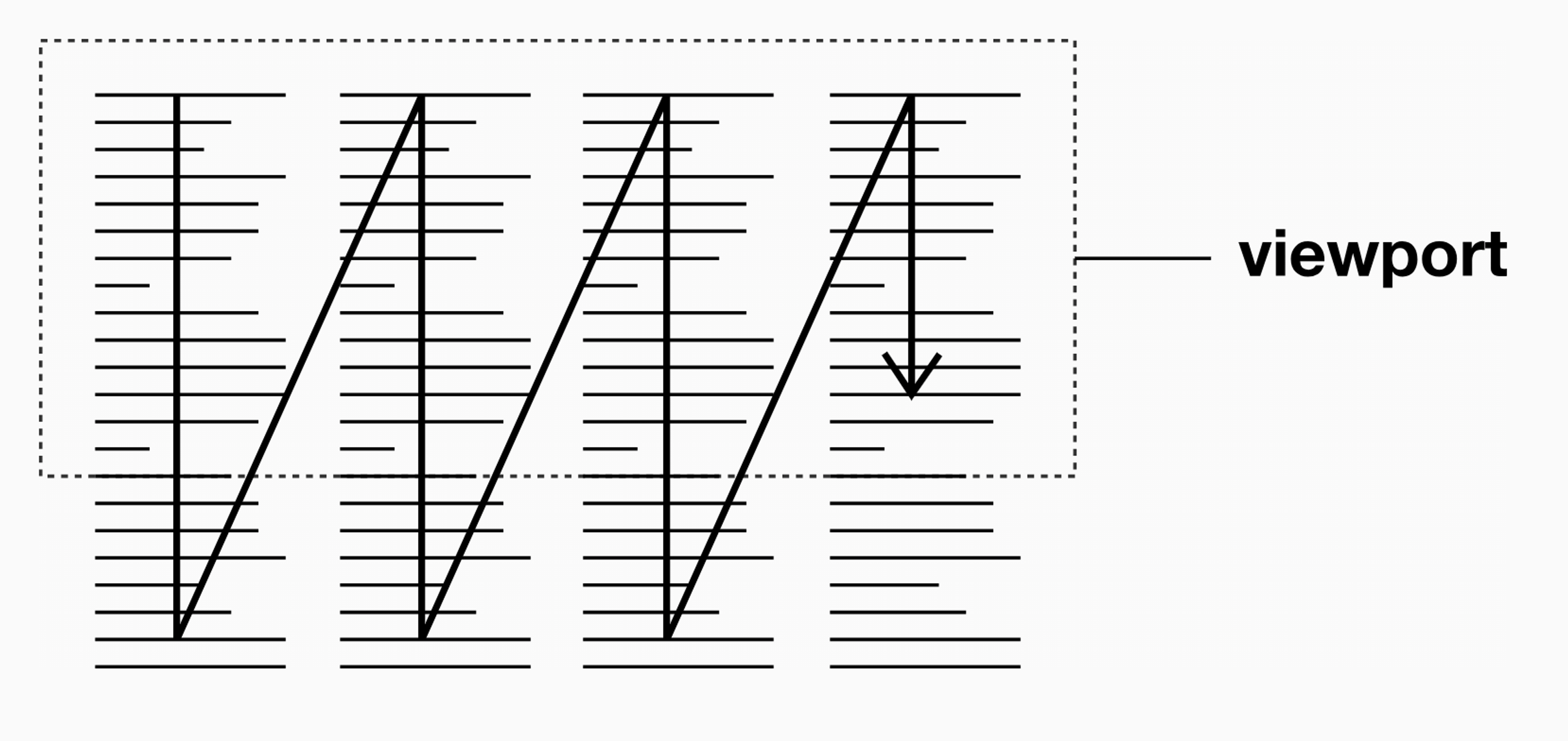
Many websites now opt for multiple-column layouts instead of single-page/single-column designs. This allows designers more control over how information is presented on screen by dividing it into two or three vertical sections (columns). There are several benefits of using this type of layout, which we will discuss below:
Source: EveryLayout
Benefits of Multiple Column Layouts
- Better Organization of Content: Multiple columns help segregate various types of content so that users can easily scan and locate what they are looking for.
- Improved Visual Hierarchy: When content is split into columns, designers can establish a strong visual hierarchy that directs attention to the most significant aspects.
- More Compact Content: Multiple columns allow more information to be shown above the fold, thus reducing the need for excessive scrolling.
- Design Flexibility: If designers use more than one column, different parts of websites can be arranged and styled in unique ways to create interesting designs.
Asymmetrical Layouts
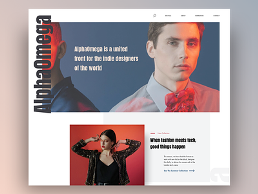
Unconventional grid-based structures, known as asymmetrical arrangements, provide an alternative method for designing websites with distinctive visual impact. These setups intentionally disturb balance by misplacing elements, creating visually dynamic experiences.
Source: Dribbble
Benefits of Asymmetrical Layouts
- Dynamic interest: When we talk about asymmetrical layouts, it is important to note that they break the uniformity associated with symmetrical designs, grabbing attention and providing a memorable visual experience.
- Highlighting key elements: By putting them in unusual places, off-center or elsewhere, apart from the conventional areas where things like CTA buttons are usually located, designers can easily direct users’ attention toward particular contents within a website.
- Freedom to be creative: With asymmetric web designers, they have more room to experiment with non-traditional solutions and create distinctive websites tailored specifically to brands.
Full-Screen Layouts
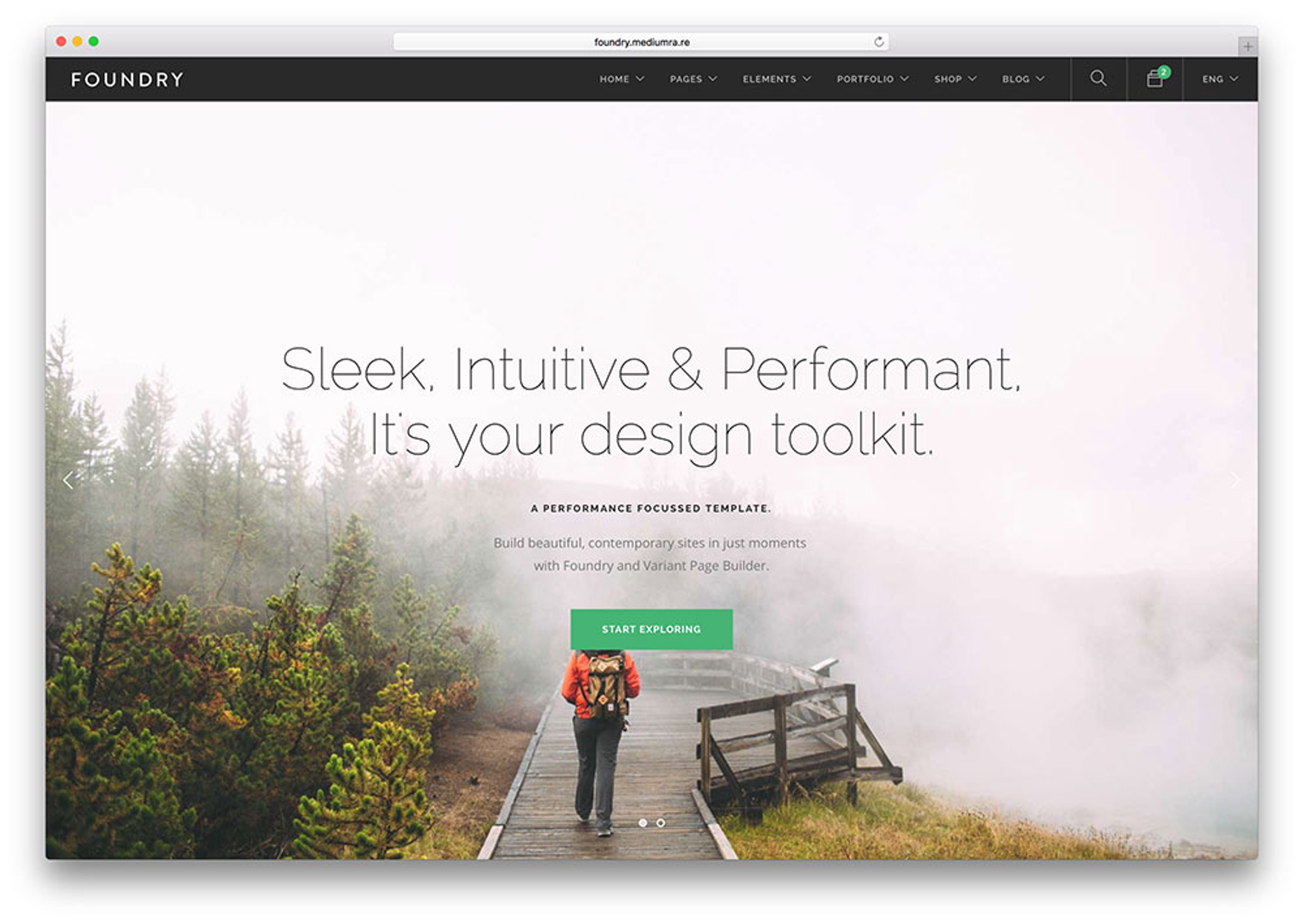
Full-screen web design templates utilize every inch of screen space to create an immersive user experience. Such designs often include large, high-resolution images that cover the entire width and height of screens, as well as videos accompanied by minimal text and navigation elements.
Source: Colorlib
Benefits of Full-Screen Layouts
- Complete Attention: Users can pay full attention to the content without distractions because full-screen layouts are completely immersive.
- Emotional Response: When stunning images or videos are large enough, they can provoke strong emotions and remain memorable for longer periods among users.
- Simple Navigation: Minimalistic navigation, often used in full-screen layouts, is simplified and clutter-free so that users can concentrate on what matters most—the main message or story being told.
Modular Layouts
Modular designs organize information into separate units called modules/cards/grids. Each module/card/grid may contain different types of content like articles, products, videos, features, etc., which are easy to move around or add to a page layout.
Source: Vanseo Design
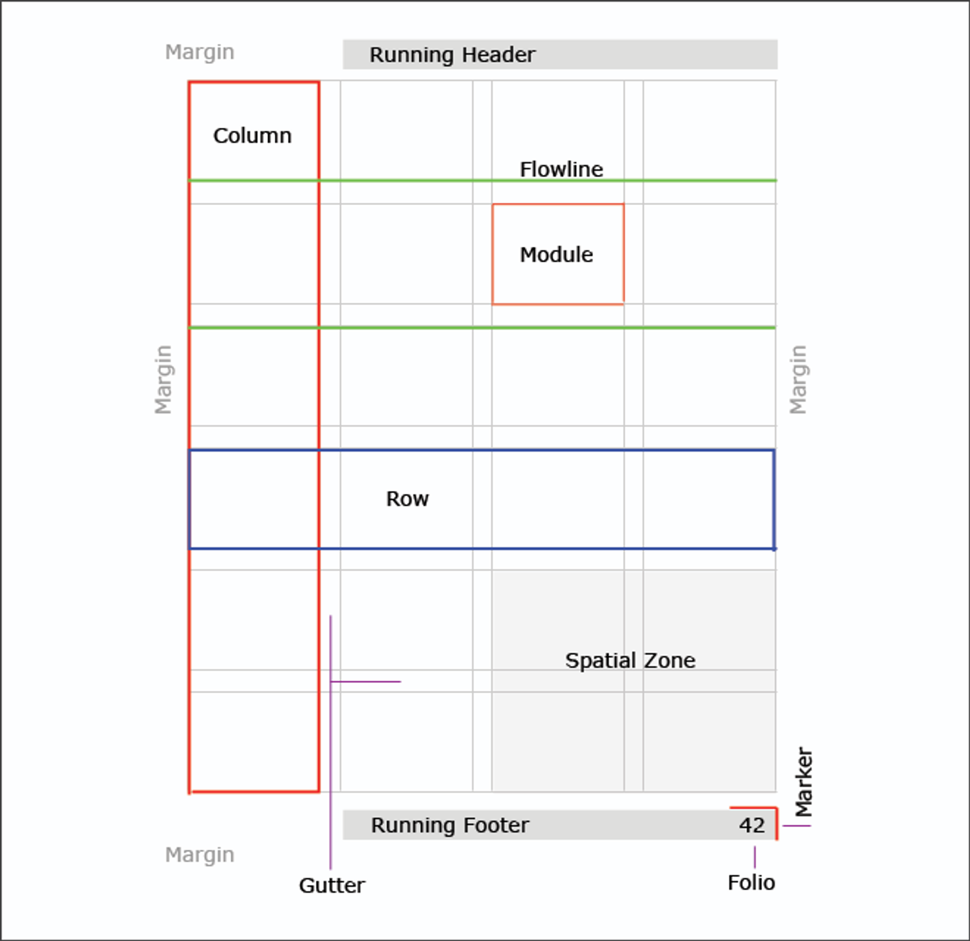
Benefits of Modular Layouts
- Adaptability and Size: Modular designs allow for easy expansion, elimination, or rearrangement of content modules, thereby simplifying website updating and expansion over time.
- Uniform User Experience: Using uniform module design throughout the site ensures that users have a consistent and predictable experience.
- Improved Readability: Partitioning information into easily digestible portions enhances legibility, enabling readers to scan through texts quickly for what they want.
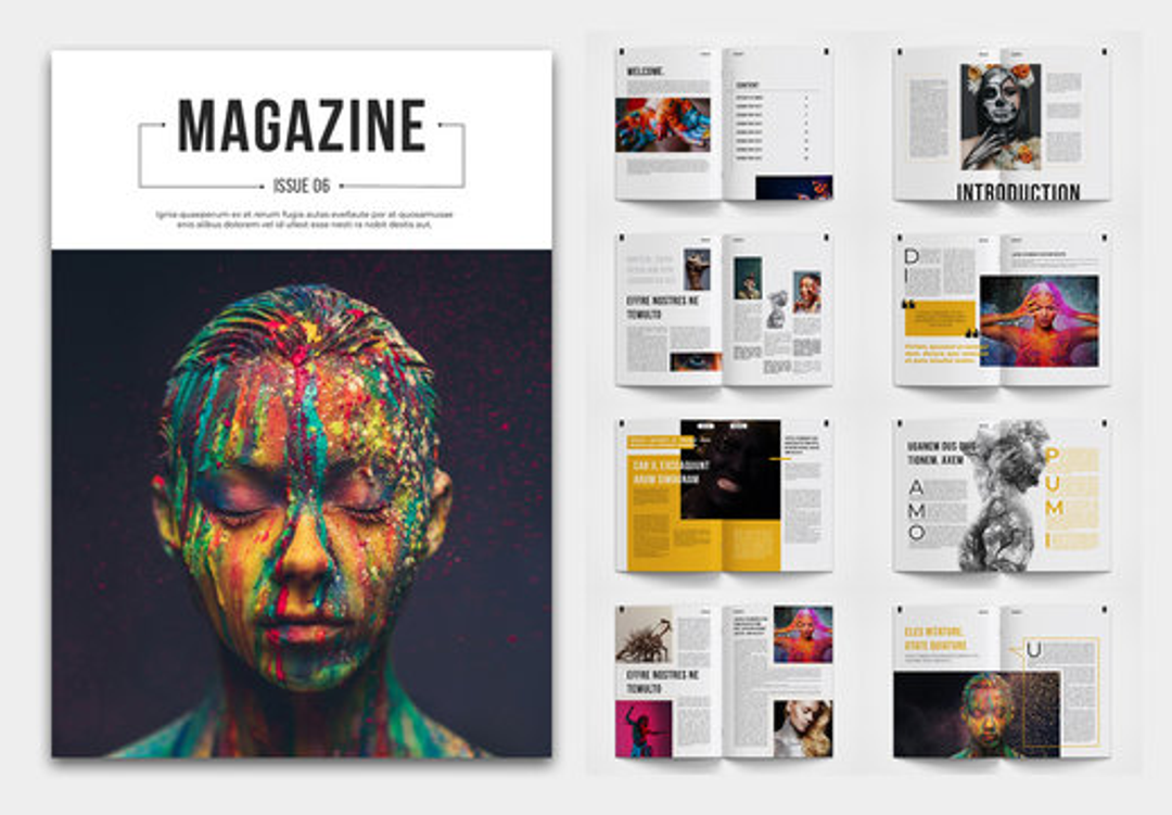
Magazine Layout
The term magazine layout refers to the organization and arrangement of visual elements on the pages of a publication, such as pictures, text, and white space.
It dictates how contents are presented, which guides readers in navigating through different sections and contributes greatly to the overall perception of its appearance. For a magazine layout to be successful, there must be a balance between creativity, functionality, and adherence to brand consistency.
Source: Adobe Stock
Benefits of Magazine Layout
- Strengthening Visual Appeal: People cannot ignore a well-thought-out magazine layout.
- Increasing Readability: Magazines layouts make reading easier. Designers can make the text legible and easily read by using correct typography, font sizes, and line spacing.
- Directing Reader Attention: Good magazine layouts strategically direct reader attention toward the most important parts of a page. Designers can highlight key content such as headlines, pull quotes, and featured images with visual hierarchy.
- Reinforcing Brand Identity: Magazine layouts provide an opportunity for brands to strengthen their identity visually and create consistency across all pages. Designers should incorporate brand colors, fonts, and graphic elements throughout the layout consistently so that brand recognition is enhanced while giving it a unified look and feel.
- Improving Content Organization: When designers organize content in a way that makes sense within magazines, it becomes much easier for readers to navigate through the information they want. Good layout groups related content together and uses visual cues showing relative importance levels among different sections, allowing readers to find their way around the publication easily.
F Layout
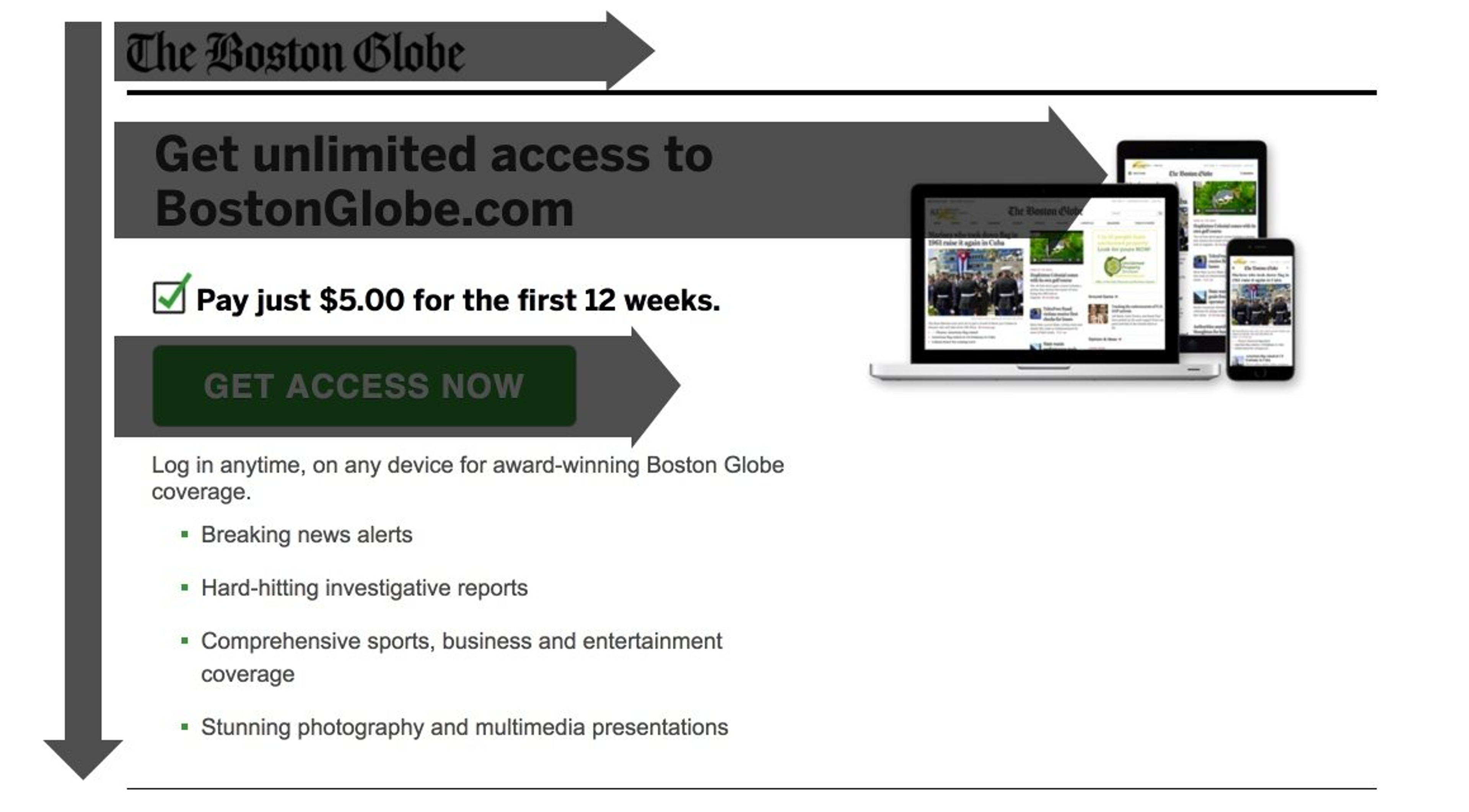
The F pattern is a design convention used on web pages that mimics natural eye movement when people read information from computer screens. Users tend to scan rather than read word-by-word on websites; thus, this pattern takes advantage of users’ scanning behavior by placing important information along an imaginary F line formed by eye movement.
How the F Layout Works
Usually starting at the headline or first paragraph, which is normally placed at the top horizontal bar of content, users quickly scan this part before moving down slightly to read the subheading or beginning of the next paragraph located on the second horizontal bar
After those two bars have been exhausted user's eyes move leftwards, scanning vertically until they find what they were looking for e.g. keywords or bullet points
Source: Instapage
Benefits of the F Layout
- More Readable: By following users’ natural reading patterns, the F layout arranges information so that it is easy to understand.
- Easier to Scan: Placing important details along the horizontal and vertical lines of an “F” shape allows readers to skim through a page and locate what they need quickly.
- Greater Involvement: The F layout engages users by establishing an obvious hierarchy of information and directing attention towards key points.
- Higher Conversion Rates: Designers can encourage desired user actions by placing calls to action (CTAs) and other critical elements along the shape of an “F.”
Z Layout
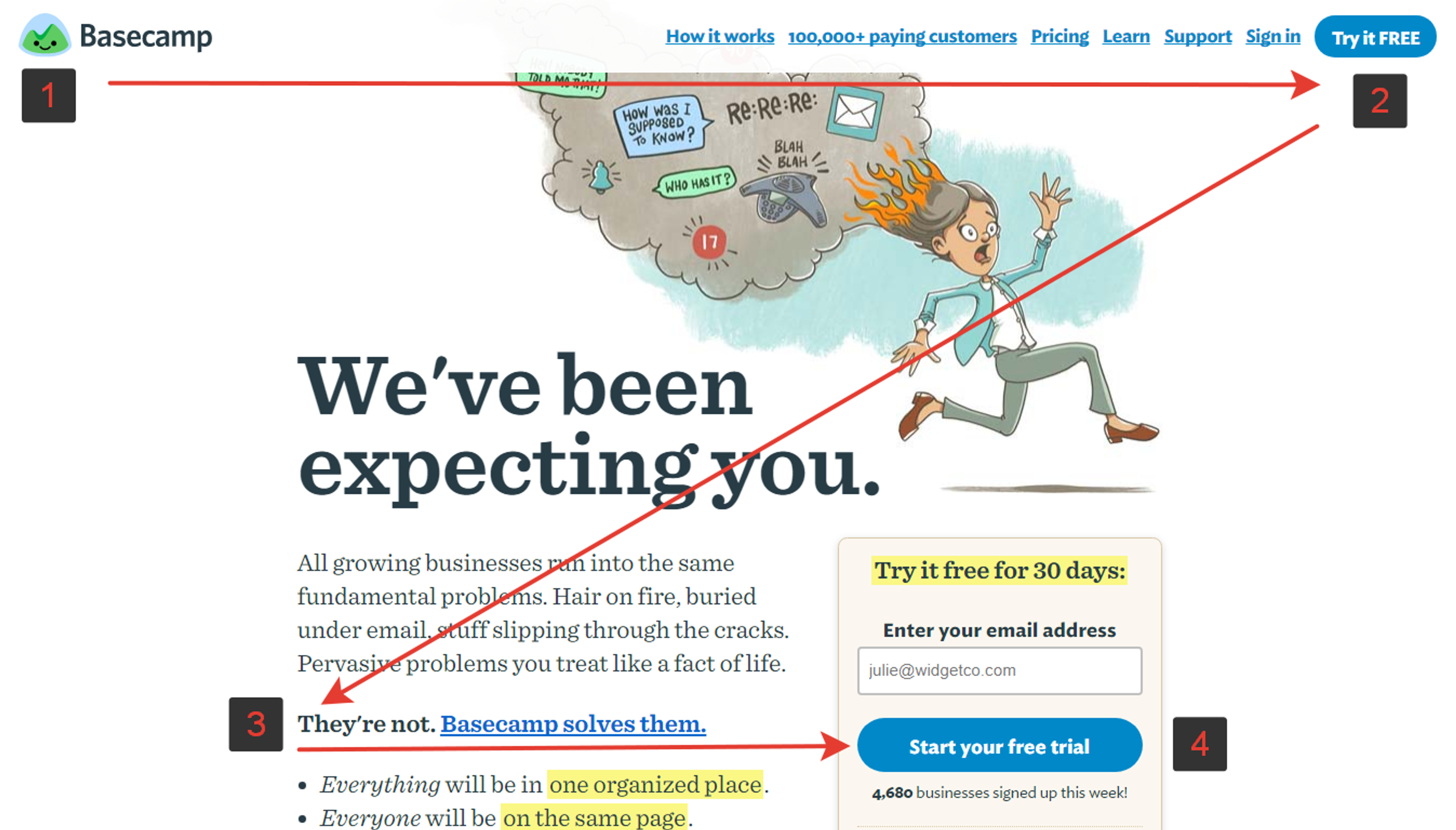
The Z layout is a design pattern that mirrors people’s tendency to scan pages diagonally. It creates a shape resembling the letter “Z” that guides their eyes across the content. This layout is particularly useful for storytelling, landing pages, or other designs that funnel users toward specific actions.
How the Z Layout Works
1.
Users’ eyes are initially drawn to the top-left corner of a page, where the most important information/branding elements are often located.2.
Their vision then moves diagonally rightwards, following their natural reading direction.3.
From here, the placement of a CTA or any other significant element at the bottom-right corner of a page captures users' attention.4.
Finally, their gaze sweeps horizontally leftwards, completing the “Z” shape and possibly crossing additional content or secondary CTAs.
Source: UX Planet
Benefits of the Z Layout
- Attention Guiding: The Z pattern directs users' attention down the page so that they see key information and CTAs in a logical order.
- Storytelling Flow: Designers can tell a story by creating a natural flow using this 'Z' shape, gradually revealing information and building towards the desired action.
- Increased Conversions: Positioned at the bottom right corner, where user attention naturally falls, CTAs are more likely to be noticed in this layout, thus boosting conversions.
- Branding Reinforcement: Brand identities can be strengthened by placing logos, taglines, or other elements at the top left corner of any ‘Z’ shaped design, thereby enhancing brand recognition.
Best Practices for Web Page Layout Design
To create a perfect web layout, designers should follow these best practices:
Responsive Design
With the advent of smartphones and tablets with varying screen sizes, it’s important to ensure your site responds well on different devices. Use flexible grids or media queries to make your website look good across all desktops and mobiles.
Consistency
Aim for a uniform design language throughout your website—it helps keep things clean-looking while guiding people through content easily. Use the same typefaces, color scheme, etc., wherever possible; also include style guides if necessary so that every part of the site remains consistent during the development stage.
Accessibility
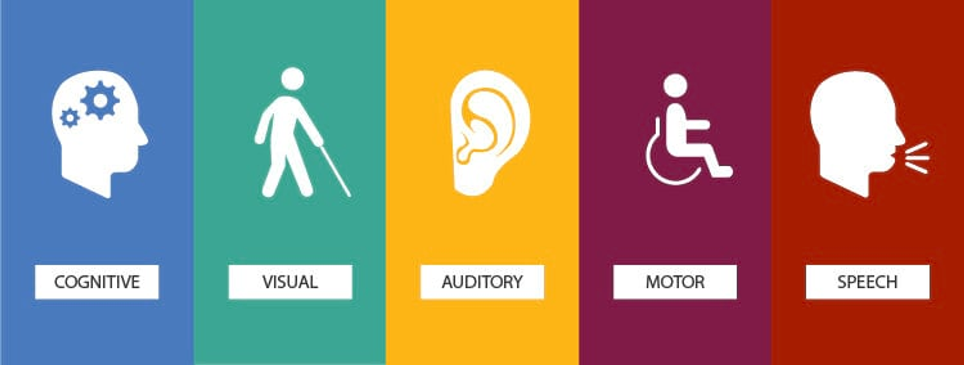
Make sure everyone can access everything! Ensure there is enough contrast between background font colors; use appropriate sizes for text headings, etc., provide alternative tags, descriptions images that cannot be seen by those unable or unwilling to view them; allow navigation via keyboard only.
Source: Esri
Performance
Your website's performance has a direct impact on user experience. Pages that take a long time to load can be annoying and result in high bounce rates. Some techniques that designers can use to optimize page performance include image optimization, lazy loading, and minimizing HTTP requests.
Advanced Tips for Web Layout Design
To take your web layouts to the next level, consider these advanced tips:
Typography
The choice of fonts and font sizes can greatly affect how readable and visually appealing your website is. It is recommended that you use only a few font families and ensure enough contrast between text and background color, such as using appropriate sizes for different elements.
Color Scheme
Colors employed in your web layout can stir feelings and influence users' actions. While selecting a color palette, consider the psychological effects of different colors and choose one that matches the brand identity and desired customer journey. For instance, Adobe Color or Coolors might come handy when creating complementary color schemes.
Visual Elements
Adding high-quality images, videos, or other media types during web design can help improve its overall look. However, this should be done sparingly so as not to clutter interface space unnecessarily. Best practices here involve optimizing pictures for web usage, employing vector graphics whenever possible, and ensuring that all visuals blend well with the surrounding context.
Source: Austin Distel on Unsplash
Case Studies and Examples of Well-Structured Web Pages
To illustrate the principles and best practices discussed, let's analyze a few examples of well-designed web layouts.
Good Examples
Here are some real-life examples of well-designed web layouts:
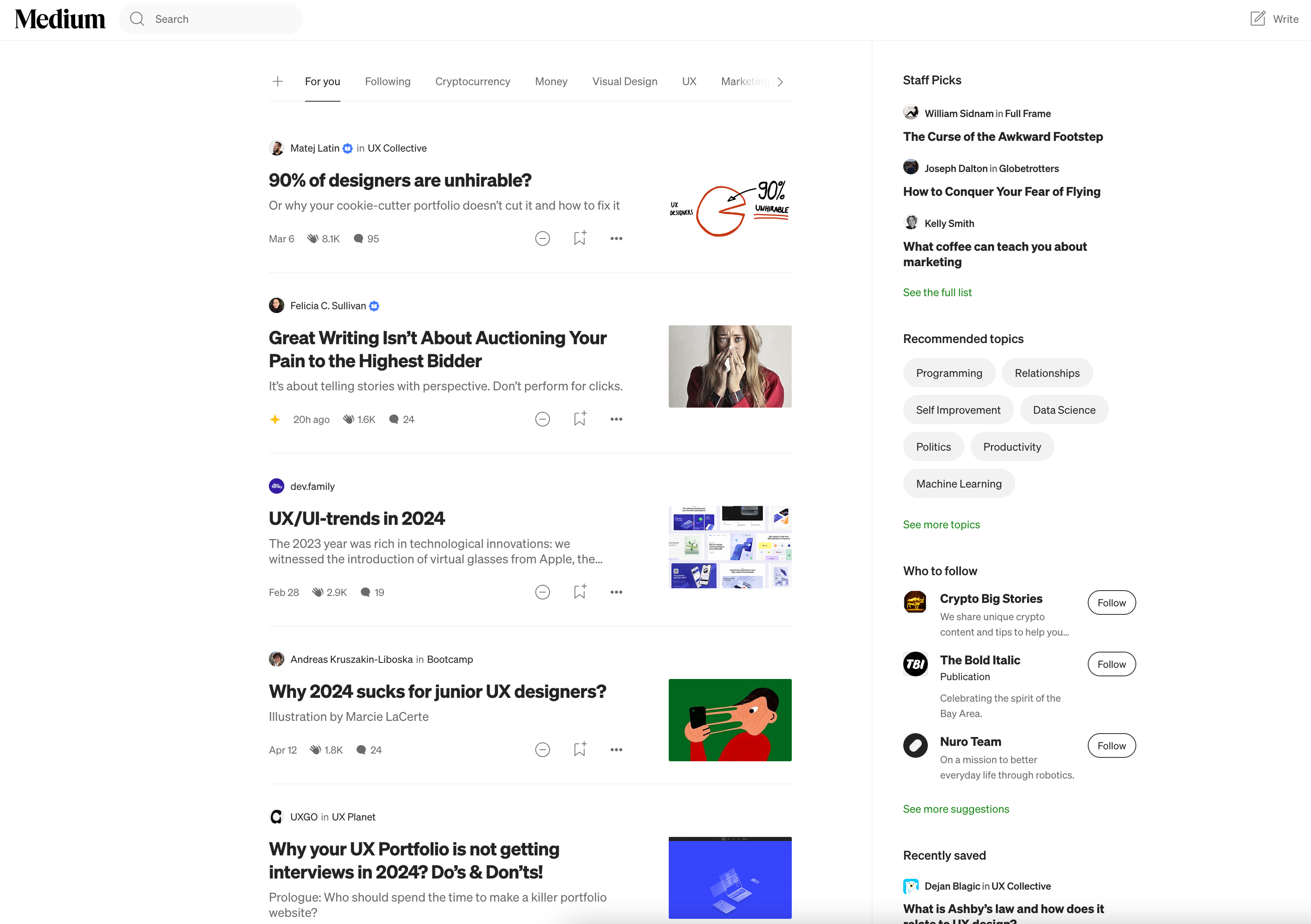
Medium: A widely used digital publishing platform, “Medium” has a very neat, content-oriented layout. The home page provides featured stories, trending topics, and personalized recommendations for the user based on their interests.
Article pages are designed so that there is no distraction to reading long-form content, which is facilitated by enough whitespace; this makes it easy on the eyes, too. Carefully selected typography enhances readability, while images and pull quotes add much-needed visual interest.
Source: Medium
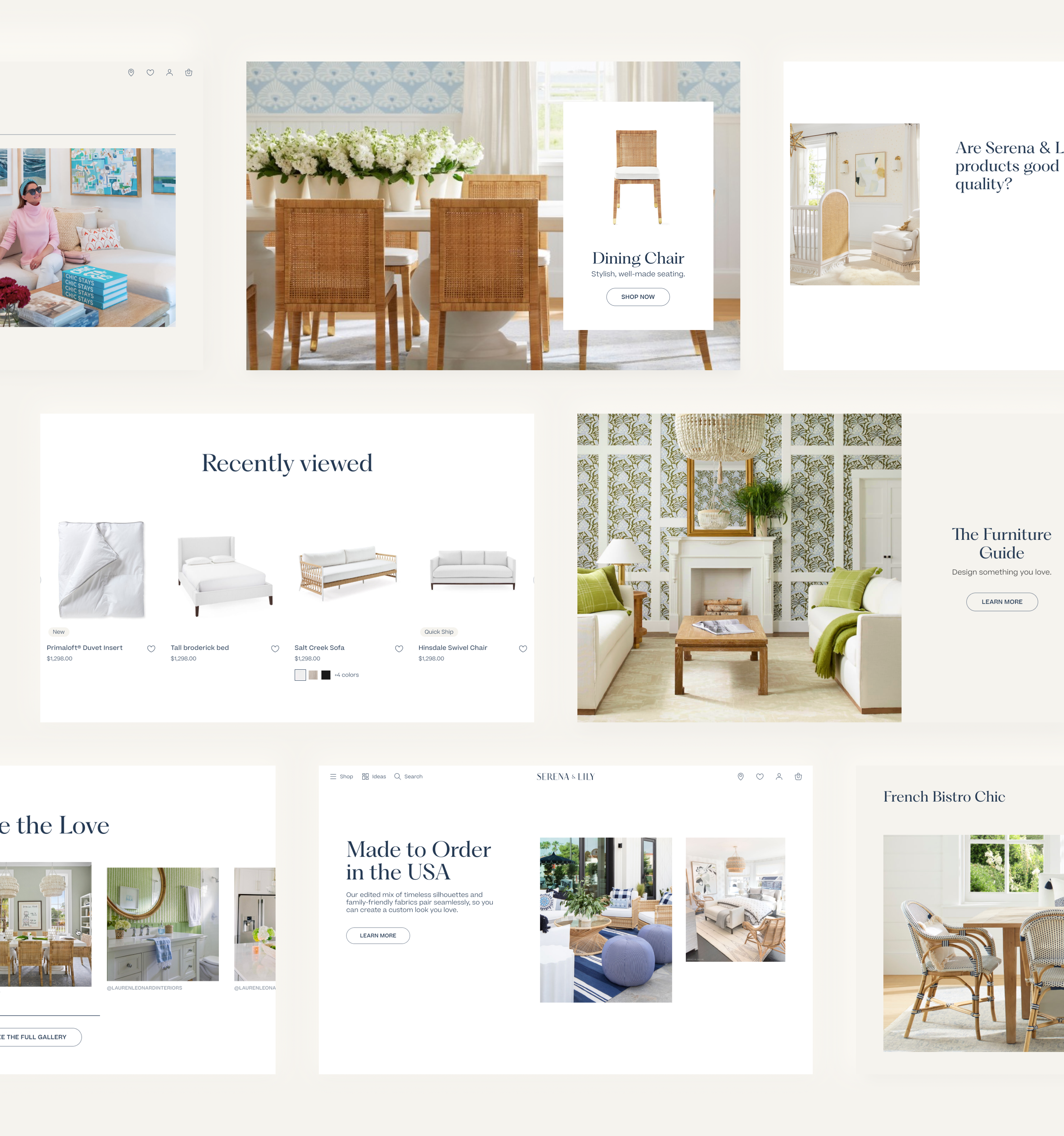
Similarly, the Serena & Lily website showcases a clean and organized layout. We balanced imagery and text, using whitespace effectively to prevent clutter. The design ensures that product information is easy to navigate, enhancing the overall user experience and visual appeal.
Serena & Lily layout by Clay
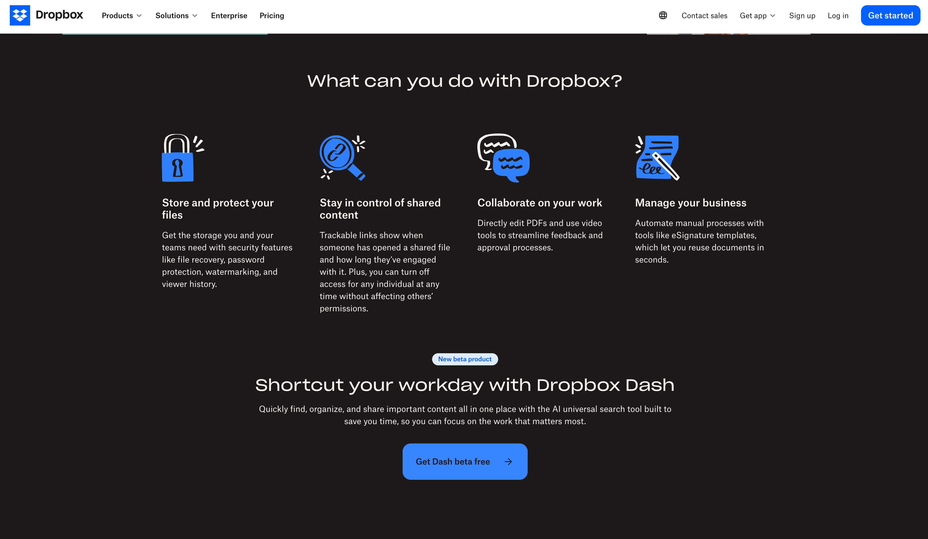
Dropbox: Dropbox’s website has a clean, professional feel; this design effectively communicates file storage and collaboration features offered by the service provider. On the top level pages (i.e., homepage), they use a combination of illustrations and icons supported by brief texts showing what each one means — all these work together towards driving point home fast without overwhelming visitors’ cognitive resources or making them feel lost in space.
The navigation menu structure follows best practices, ensuring the user can easily find their way around different products offered by the company and other online resources. They have also applied consistent color schemes throughout various sections, thus giving an impression of simplicity and ease of use.
Source: Dropbox
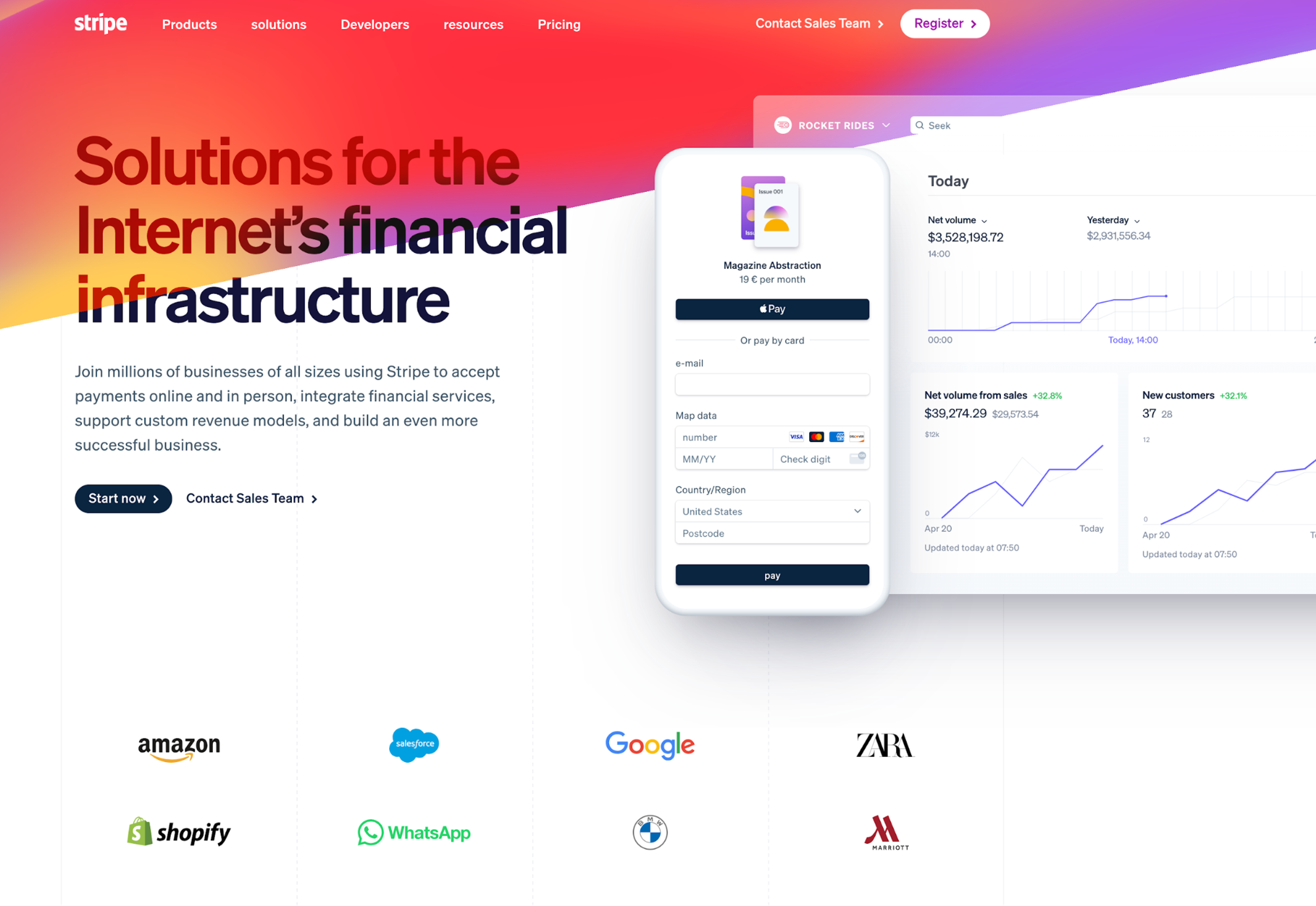
Stripe: This payment processing platform boasts a modern, visually appealing website layout design where everything seems right where you’d expect it to be! Key elements include a bold headline statement located at the upper part of the centermost region – this acts like a summary describing exactly what the business does plus who its customers are likely going to be followed by a clear value proposition beneath, which should make sense even if a person does not read rest text then large call-to-action button placed right below so that potential customers can sign up immediately after grasping offer terms concisely conveyed before necessary details follow suit further down the main page.
Source: Stripe
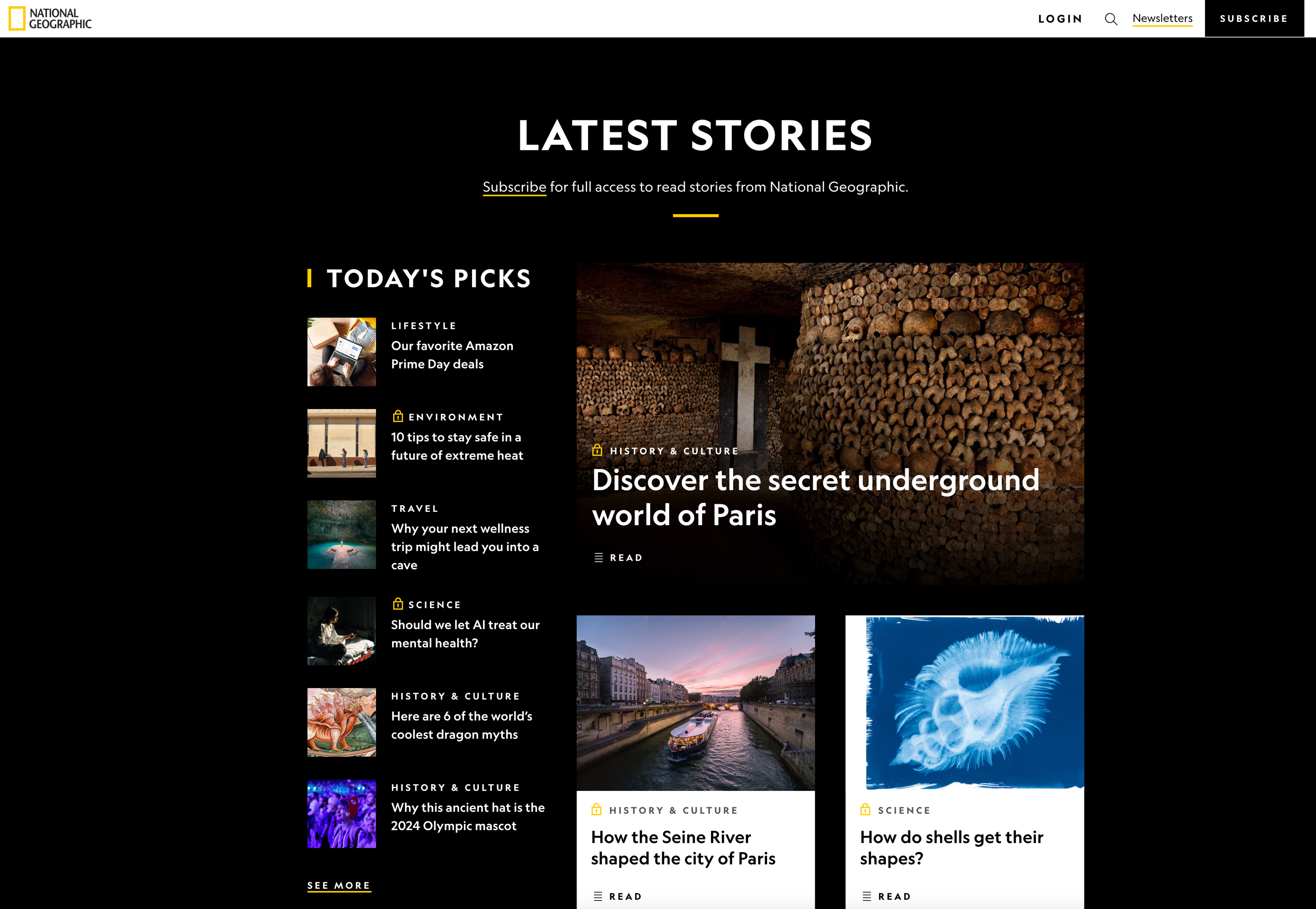
National Geographic: The website has an extremely visually stunning layout that, among other things, helps users immerse themselves in exploration, science, and storytelling. Each of the sections on the homepage is accompanied by a big full-width slider with attractive images and catchy headings.
For example, below this are featured stories, videos, interactive experiences, and more. Users are provided with rich, immersive experiences through high-quality images, engaging typography, and responsive grid layouts.
Source: National Geographic
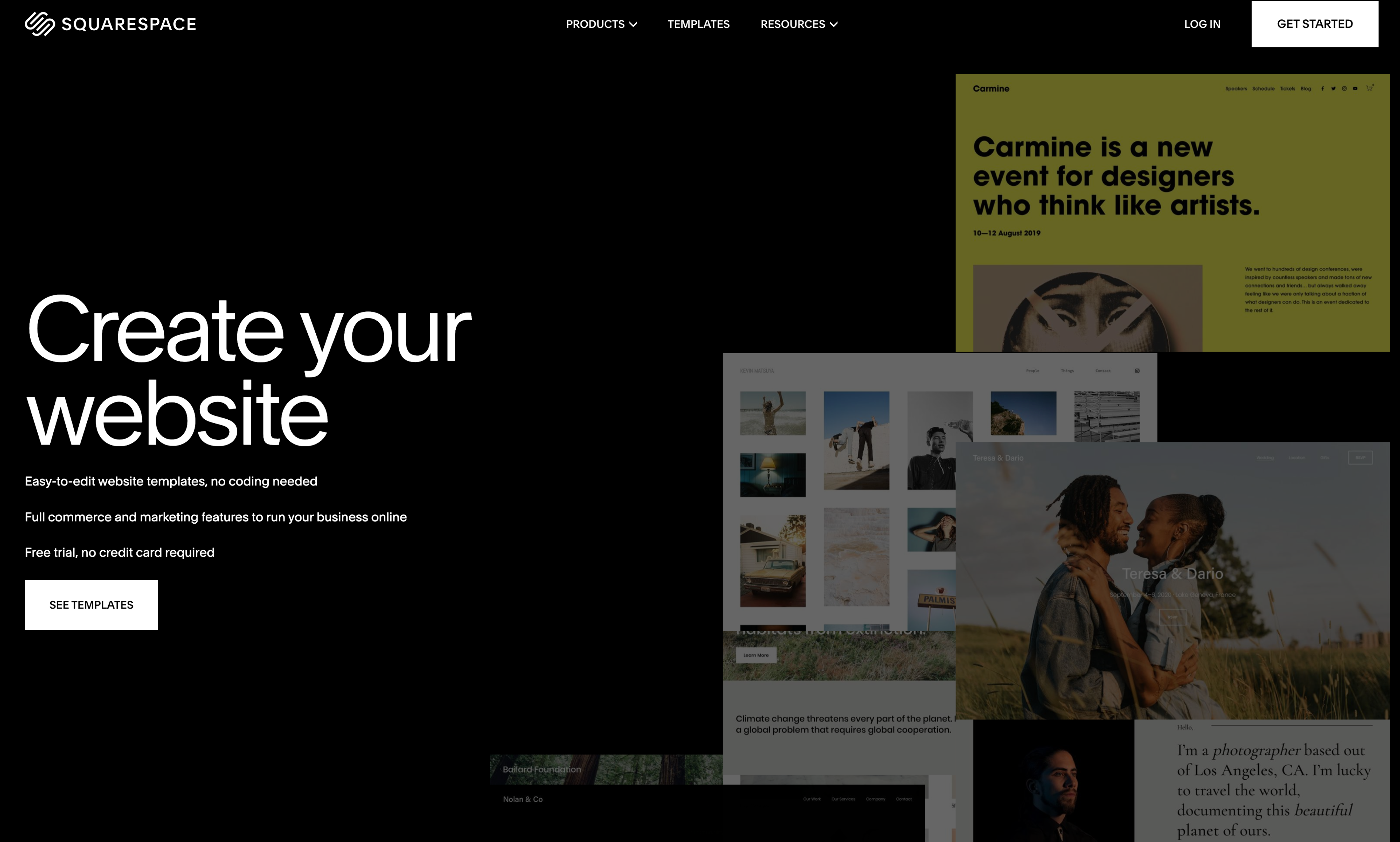
Squarespace: Squarespace’s homepage design features a sleek, modern appearance with a focus on design and creativity, too! A full-screen video background showcases different website templates and designs, which change as you scroll down.
Key features are shown after scrolling further down, along with customer examples, before finally seeing a clear call to action for starting a free trial. Whitespace usage, clean typography, and consistent color scheme create a sophisticated, professional look.
Source: Squarespace
These are just some examples of good web layouts we have discussed, but many other equally valid ones exist. These sites commonly employ visual hierarchy, whitespace, and typography—all contributing to making them engaging, user-friendly experiences. Also, they prioritize simplicity, clarity, and consistency within their layout(s) so anyone can easily navigate it or find what he/she needs.
Common Mistakes
Mistake 1: Cluttered and Overcrowded Layout
One common mistake when designing web page layouts is creating a cluttered interface where everything seems jumbled up together, overwhelming users who struggle to navigate or find relevant content.
Mistake: Overloading the page with excessive text, images, and widgets leads to visual clutter and confusion. Solution: Prioritize content; remove unnecessary elements (de-clutter); use whitespace effectively to create clean/uncluttered layout(s); present important information clearly/organized, i.e., leave only what’s necessary.
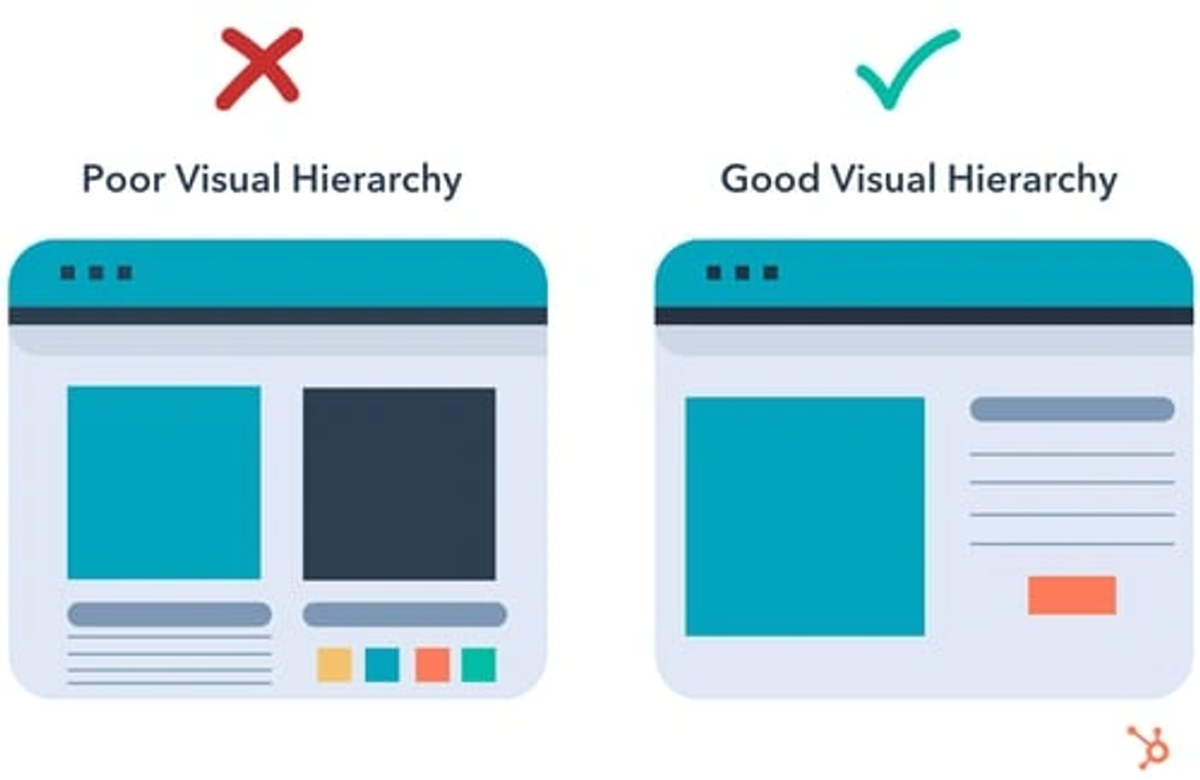
Mistake 2: Poor Visual Hierarchy
Visual hierarchy is defined as the arrangement and emphasis of design elements that guide users’ attention to different sections of content on a page. If this is not clear, it can cause confusion among users, who may not know where exactly they should concentrate their efforts.
Mistake: Lack of contrast, inconsistent sizing, improper placement, etc., makes understanding/deciphering information difficult for users since there are no visual cues to indicate relative importance. Solution: Use contrasting colors/sizes/positions such as headlines or call-to-action buttons; emphasize key areas to direct the user’s eye accordingly; create awareness about what matters most, etc.
Source: Hubspot
Mistake 3: Inconsistent Layout and Branding
When designing website layouts, consistency is essential. Different pages with dissimilar formatting or branding elements can easily confuse users, making the site seem disjointed and unprofessional.
Mistake: Several website pages have various layouts, color schemes, and typography styles. Solution: Create a consistent layout template and style guide that specifies where each element should be placed, the color palette used, and font sizes, among other things. Keep these standards throughout the entire website to achieve coherence and professionalism.
Mistake 4: Neglecting Responsive Design
Not considering responsive design is a huge mistake, especially now that many people use mobile devices to access websites. Failing to make designs that adjust according to screen sizes will negatively impact user experience, leading them to leave your site.
Mistake: Creating non-responsive or non-mobile-friendly design structures where contents become hard to read or interact on smaller screens. Solution: Employ responsive design techniques like having flexible grids, using media queries, and employing adaptive images so that they can seamlessly adapt different types of gadgets with varying display dimensions while still maintaining their usability.
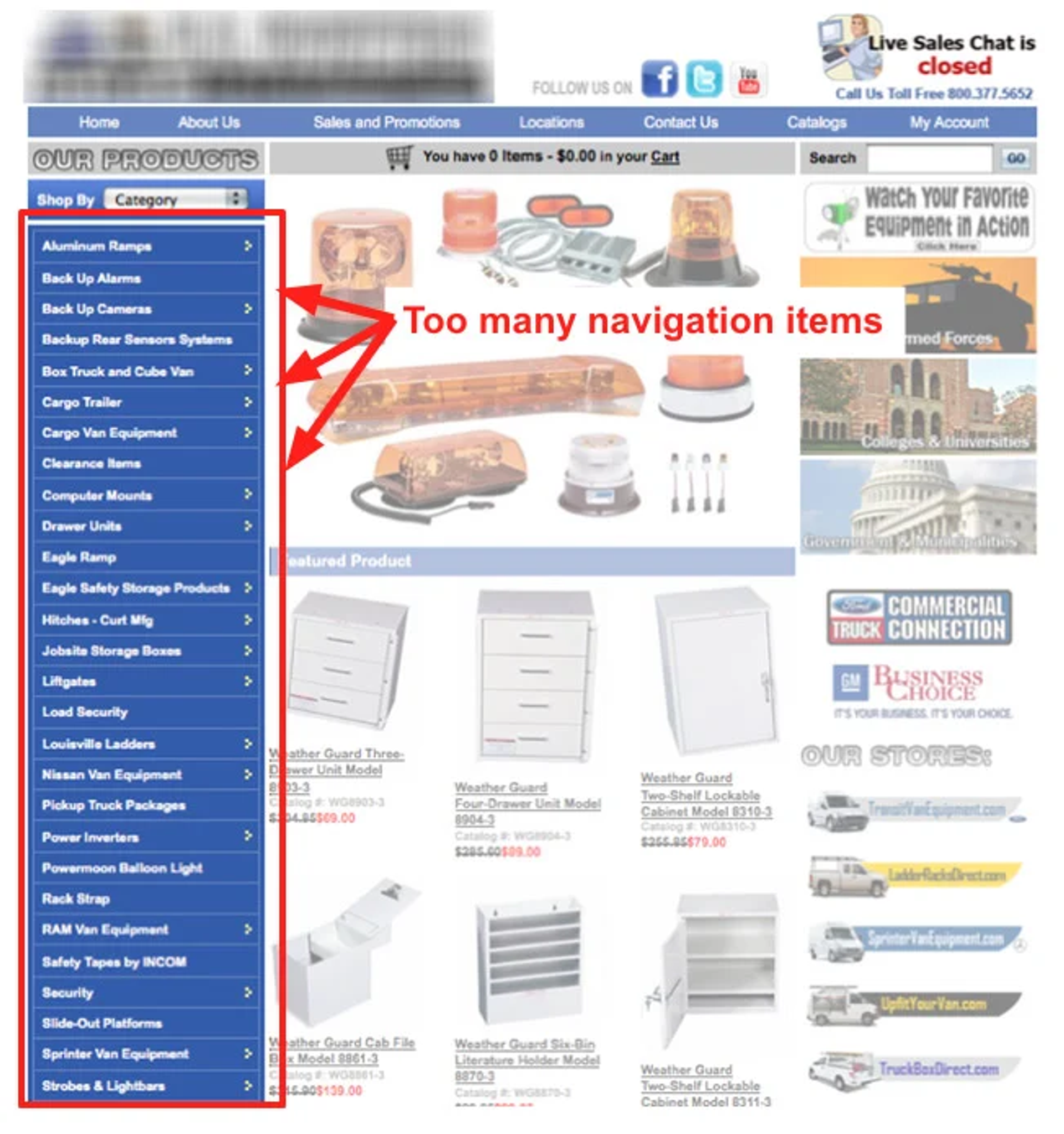
Mistake 5: Poor Navigation and Information Architecture
Navigation systems are important in guiding users through the website to easily find what they are looking for. Poor navigation and unclear information architecture may result in high bounce rates and frustrated visitors.
Mistake: Employing confusing or inconsistent navigation menus; not labeling enough or too deep information hierarchy. Solution: Make navigation menus clear and intuitive. Logical categories and labeling should be used for easy understanding by users who visit your site frequently. Breadcrumbs ought also show visitors their current location within the site. Always remember to organize content shallowly so that it becomes easy even for beginners to navigate different sections of your webpage.
Source: Neil Patel
Mistake 6: Ignoring Accessibility
Accessibility is paramount when designing a web page's layout. Not making layouts usable for people with disabilities excludes a significant part of the audience and violates accessibility guidelines.
Mistake: Users with visual impairments or mobility problems cannot use this site because of its small fonts, low color contrasts, and no support for keyboard navigation. Remedy: Ensure that all users can perceive, operate, and understand your design by following such standards as WCAG (Web Content Accessibility Guidelines), which makes website layouts robust enough for all users regardless of their abilities; also ensure appropriate sizes of fonts are used along with adequate color contrast levels plus alternative methods should be provided for navigation.
Mistake 7: Overuse of Animations and Pop-ups
Animations and pop-ups can effectively attract users’ attention or convey important information, but using them excessively may ruin the user experience.
Mistake: Overusing animations, slideshows, or popups that distract from the main content and make navigating difficult. Solution: Use animation sparingly only where necessary so that they do not distract but rather enhance user experience; also provide clear options either dismissible or controllable by users themselves regarding any appearing & disappearing elements on the screen, especially those created using Javascript libraries like jQuery.
Mistake 8: Slow Loading Times
Slow load times can frustrate visitors, leading to high bounce rates. Poorly optimized designs, comprising large file sizes, uncompressed images, and too many scripts, among other things, greatly affect a website's performance.
Flaw: Pages take long periods to load due to the usage of unoptimized images, which are big and thus consume more bandwidth during downloads. At the same time, multiple HTTP requests required further slow down loading time, coupled with heavy scripts attached to various sections within each page.
Solution: Optimize pictures meant for online viewing, i.e., compress them appropriately, thereby reducing their sizes without necessarily affecting quality aspects; also minimize HTTP requests as well as employ techniques like lazy loading plus caching so that only required files get fetched initially while streamlining layout removes unnecessary elements impacting the speed of page loads.
Source: Mike van den Bos on Unsplash

Mistake 9: Lack of Whitespace
Whitespace, or negative space, is a crucial design component that helps balance the layout, improves readability, and creates a visual ‘breathing’ room. Failing to use whitespace makes everything look crowded.
Mistake: Overstuffing too much information into little space leaves no or very few areas for whitespace, hence making the design appear messy. Answer: Create harmony and visual hierarchy by embracing white spaces. Readability can be enhanced by using proper margins, padding, and spacing between elements, thus creating a better aesthetic experience.
Mistake 10: Failing to Test and Iterate
Designing a web page layout is an iterative process that involves testing and refining. Neglecting to test the layout with real users and collecting feedback may lead to a design that does not meet user expectations or needs.
Mistake: Not doing user testing or collecting feedback before launching a website will create a layout that does not resonate with its target audience. Solution: Conduct usability tests with representative users to gain insights into what works best for them; this will also help identify where improvements can be made. Continuously improve on it through analytics data based on how users interact with different parts of your site until you achieve perfect satisfaction from all of them.
Read more
Conclusion
Creating an effective web layout requires understanding design principles and user requirements, among other things. Designers can engage users and drive business success by focusing on headers, navigation content areas, and footers and applying responsive design consistency accessibility performance optimization best practices.


About Clay
Clay is a UI/UX design & branding agency in San Francisco. We team up with startups and leading brands to create transformative digital experience. Clients: Facebook, Slack, Google, Amazon, Credit Karma, Zenefits, etc.
Learn more

About Clay
Clay is a UI/UX design & branding agency in San Francisco. We team up with startups and leading brands to create transformative digital experience. Clients: Facebook, Slack, Google, Amazon, Credit Karma, Zenefits, etc.
Learn more