
At its most basic level, website typography is about selecting and styling text on a website to create an attractive, legible design. Many factors are involved in web design typography, including typeface selection, text hierarchy, and readability.
Using website typography correctly can have many benefits for website design. It can improve your website’s look and feel, communicate essential information more effectively, and help you engage with viewers. Good web typography makes your website easier to use by improving navigation and search engine optimization (SEO) rankings.
What Is Website Typography?
Website typography refers to the art and technique of arranging types on a website. It’s not just about choosing pretty fonts; it’s a crucial element that significantly impacts the digital user experience. Good typography enhances readability, improves user retention, facilitates easy skimming of content, and plays a vital role in shaping brand perception.
Unlike print typography, website typography faces unique challenges. It must be legible across various devices and adapt seamlessly to different screen sizes, from large desktop monitors to tiny smartphone screens.
This adaptability ensures a consistent and enjoyable user experience across all platforms. Google Fonts is a valuable resource for enhancing web typography, offering a diverse range of fonts that are free to use and easy to integrate into web design.
Typography Terminology
Source: CreativeMarket
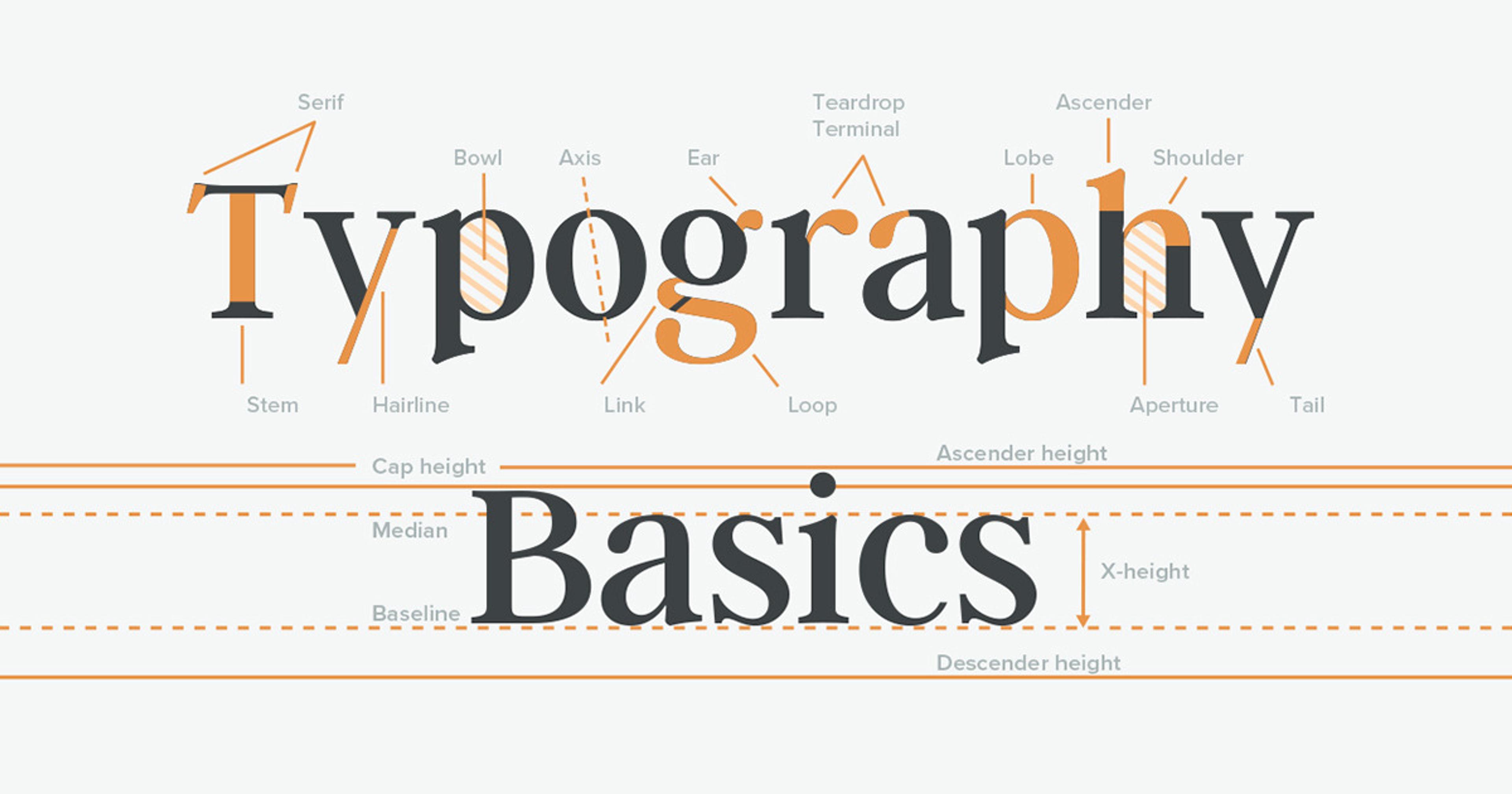
To discuss typography effectively, it’s important to understand some key terms:
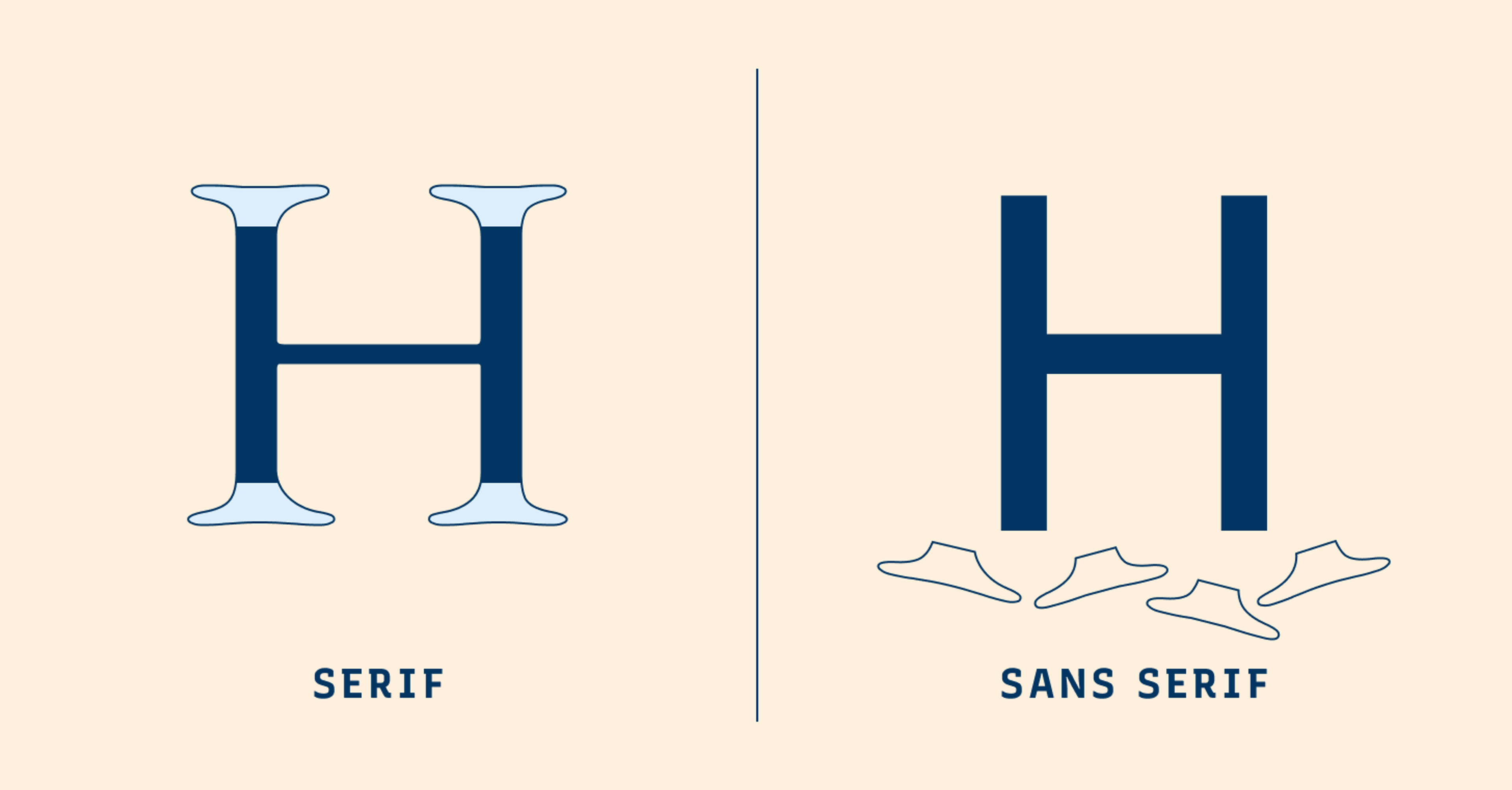
- Serif: A small line or stroke regularly attached to the end of a larger stroke in a letter or symbol within a particular font.
- Sans-serif: A typeface that does not have the small projecting features called "serifs" at the end of strokes.
- Kerning: The process of adjusting the spacing between characters in a proportional font.
- Leading: The distance between the baselines of successive lines of type.
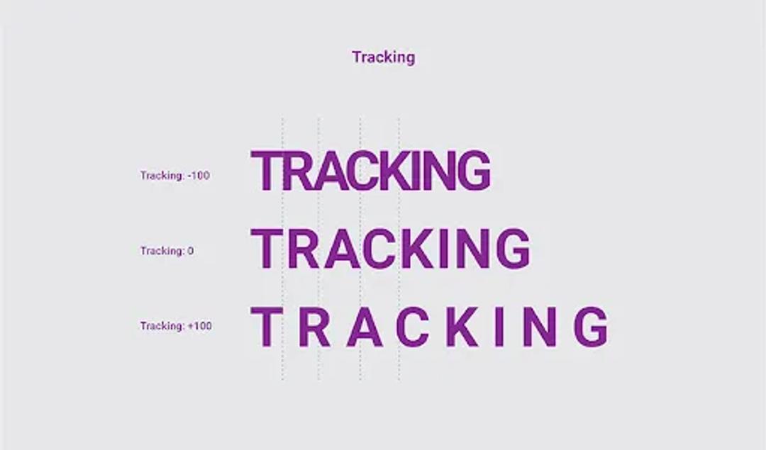
- Tracking: The uniform adjustment of spacing between characters in a complete section of text.
- Web fonts: Fonts that are specifically designed for use on websites. They can be integrated via Google Fonts or self-hosted, and various CSS techniques can be used to optimize text appearance on different devices. Choosing web-safe and accessible typefaces is crucial for readability and overall user experience.
Typeface vs. Font
These terms are often used interchangeably, but they have distinct meanings. A typeface is the overall design or style of the text (e.g., Helvetica or Times New Roman), while a font refers to a specific size, weight, and style within that typeface (e.g., Helvetica Bold 12pt).
Source: Kontra Agency
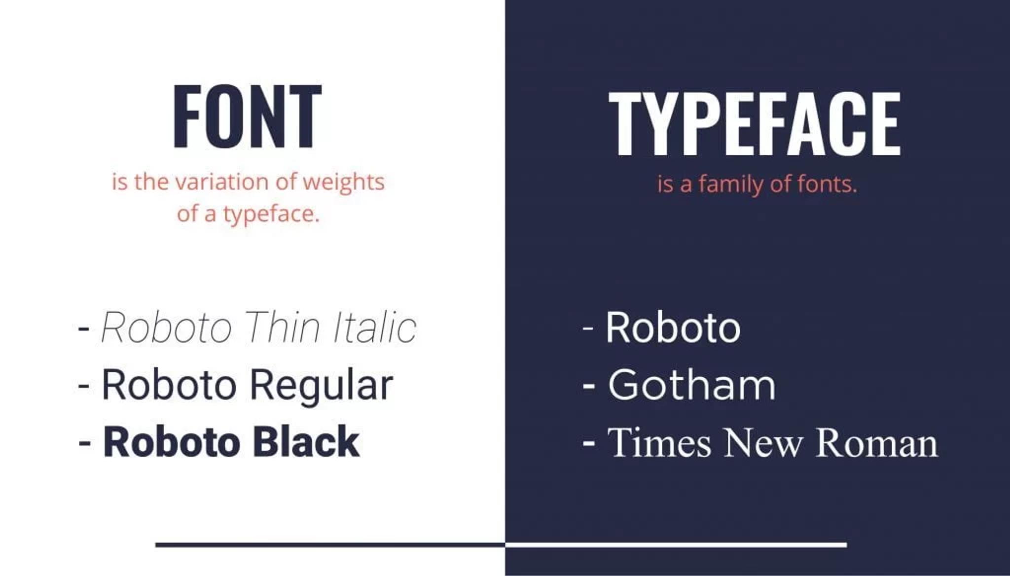
To further clarify:
- A typeface is like a family of related fonts. It encompasses all the variations of a particular design.
- Fonts are specific instances within a typeface. For example, "Arial" is a typeface, while "Arial Bold 14pt" is a font.
Serif vs. Sans Serif
Serif fonts have small lines or strokes attached to the end of a larger stroke in a letter or symbol. Times New Roman is a classic example. Sans-serif fonts, like Arial or Helvetica, lack these extra strokes, resulting in a cleaner, more modern look. In digital environments, sans-serif fonts are often preferred for their improved screen readability.
Source: Typogram
Additional points to consider:
- Serif fonts are often associated with tradition, formality, and elegance. They're commonly used in print media and for long-form content.
- Sans-serif fonts are perceived as modern, clean, and minimalist. They're popular in digital design and for short, punchy text.
- The choice between serif and sans-serif can significantly impact the mood and readability of your content.
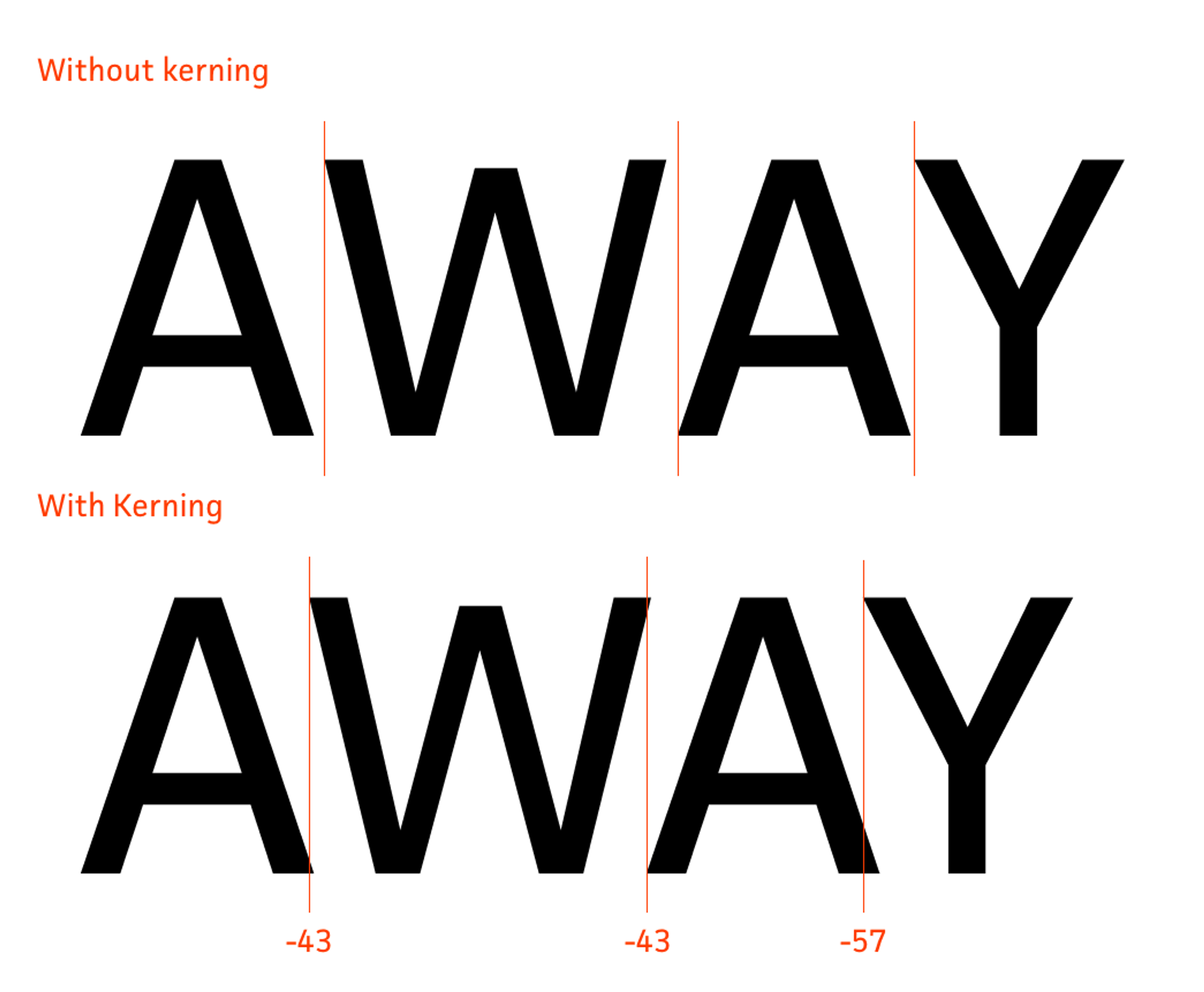
Kerning, Tracking, and Line Spacing
These terms refer to the spacing in typography:
- Kerning is the process of adjusting the space between individual letters. Good kerning ensures that letter pairs like "AV" or "To" appear visually balanced.
Source: Adobe Typekit Blog
- Tracking refers to the overall spacing between groups of letters. It affects the density of text and can be adjusted to make text appear looser or tighter.
Source: Creatype Studio
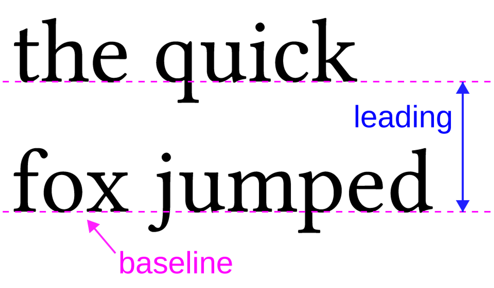
- Leading (pronounced "ledding") is the vertical space between lines of text. It's named after the lead strips that were once used to separate lines of type in printing presses.
Source: Particia Gomez
Proper adjustment of these elements can significantly improve your text's readability and aesthetic appeal.
Additional Typography Terms
To further enhance your typography vocabulary:
- X-height: The height of lowercase letters in a font, typically measured by the height of the lowercase 'x'. Fonts with larger x-heights tend to be more readable at small sizes.
- Baseline: The invisible line upon which most letters sit. Understanding the baseline is crucial for aligning text and creating a cohesive design.
- Ascender and Descender: Ascenders are the parts of lowercase letters that extend above the x-height (like in 'h', 'k', 'l'). Descenders are the parts that extend below the baseline (like in 'g', 'j', 'p'). These elements contribute to the overall character of a typeface.
- Weight: Refers to the thickness of a font's strokes. Common weights include light, regular, medium, bold, and heavy. Varying weights can create contrast and hierarchy within your design.
- Contrast: In typography, contrast refers to the difference between thick and thin strokes within a typeface. High-contrast fonts (like Bodoni) have dramatic differences between thick and thin strokes, while low-contrast fonts (like Arial) have more uniform stroke widths.
- Ligature: A character consisting of two or more letters combined into a single glyph. Ligatures are often used to improve the appearance of certain letter combinations, like 'fi' or 'fl'.
For Cornerstone, we made colorful typography to enhance the user experience. By carefully selecting and implementing fonts, we ensure that the site’s content is readable and visually appealing. The typography complements the overall design, reinforcing the brand’s identity and enhancing navigation. This thoughtful approach to typography, combined with other design elements, creates a cohesive and compelling web experience that meets the needs of both the business and its users.
Cornerstone Typography by Clay
Understanding these terms will allow you to communicate more effectively about typography and make more informed decisions in your web design process. Remember, good typography balances these elements to create a harmonious, readable, and visually appealing design.
Principles of Good Web Typography
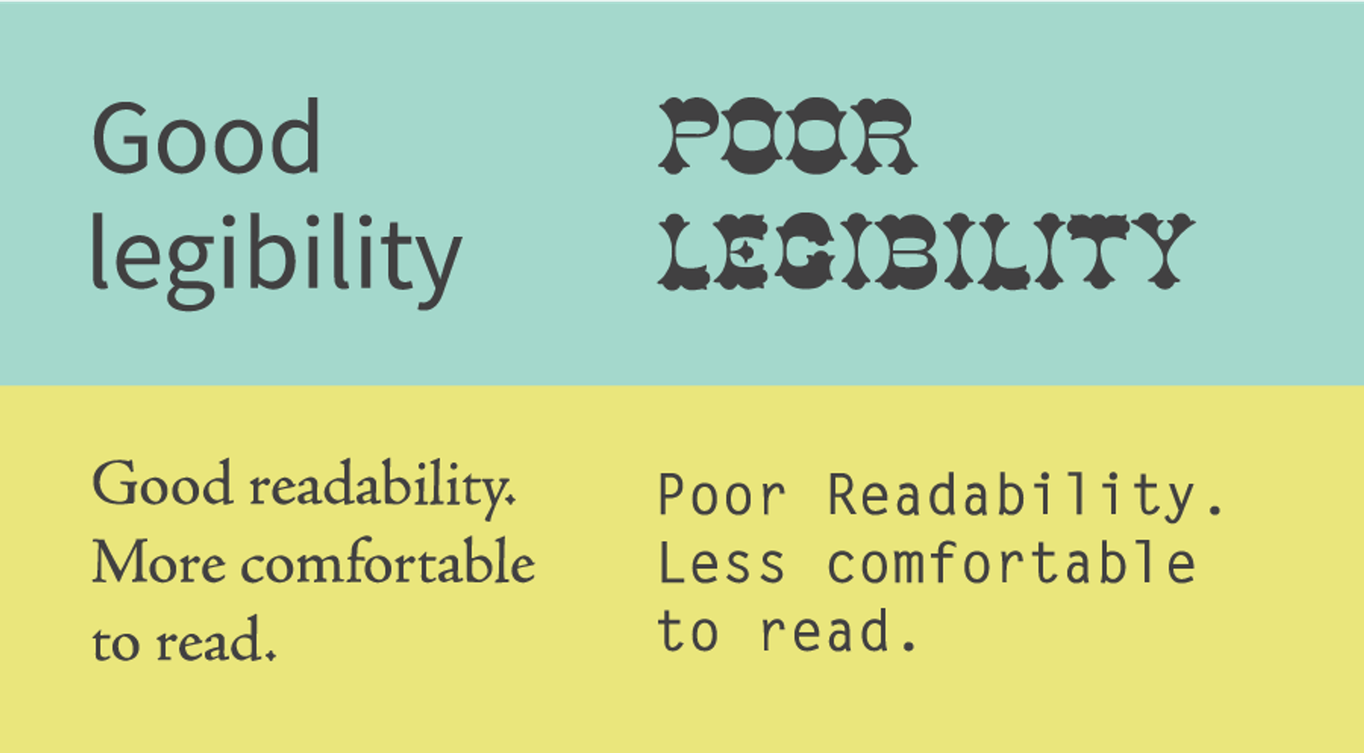
Readability and Legibility
The primary goal of typography is to make text easy to read. An optimal line length, ideally between 40 and 80 characters, is crucial for enhancing readability by preventing eye strain and maintaining reader engagement.
For body text, sans-serif fonts like Arial, Helvetica, or Verdana are often recommended due to their clean lines, which render well on digital screens. The font size should be large enough to read comfortably – typically 16-18px for body text on most devices.
Source: Emotive Brand
Visual Hierarchy and Structure
A clear typographic hierarchy guides users through your content. Use different heading styles (H1, H2, etc.), sizes, and font weights to create a visual structure. This helps users quickly scan and understand the organization of your content.
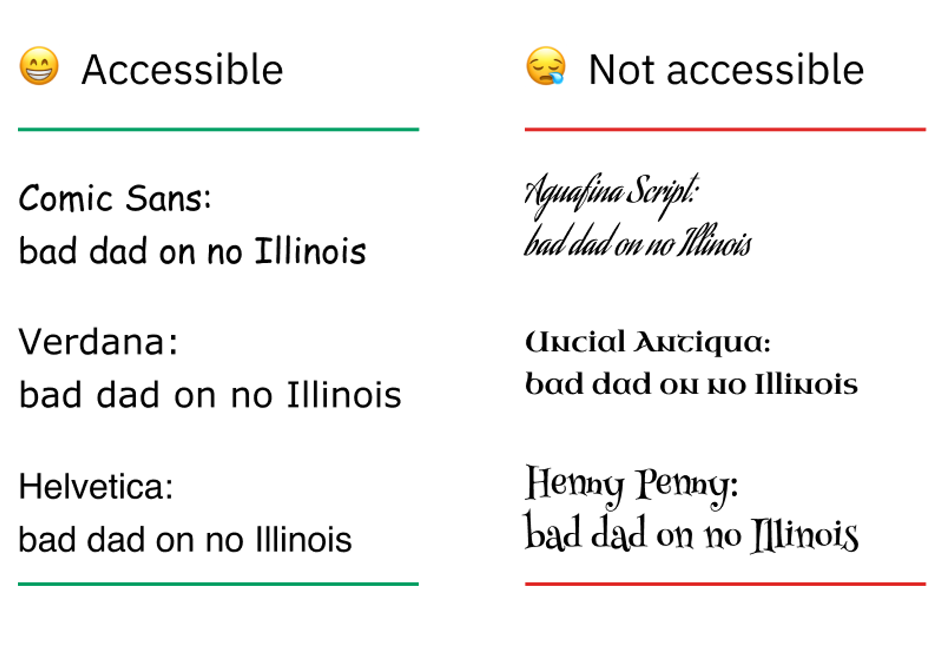
Accessibility
Ensuring your typography is accessible to all users is crucial. This includes using adequate font sizes, maintaining sufficient contrast between text and background colors, and ensuring your design is responsive to accommodate users on different devices or with different visual abilities.
Source: Medium
Font Choices and Best Practices
Selecting the right fonts and implementing them effectively is crucial for creating a visually appealing and user-friendly website. Here are some expanded best practices to guide your typography choices:
Web-Safe Fonts
Web-safe fonts are universally compatible across browsers and devices. Examples include Arial, Helvetica, Times New Roman, and Verdana. Using these fonts ensures that your design remains consistent for all users. Additionally, organizing fonts in a CSS file enhances consistency and maintainability across multiple pages.
Source: Litmus
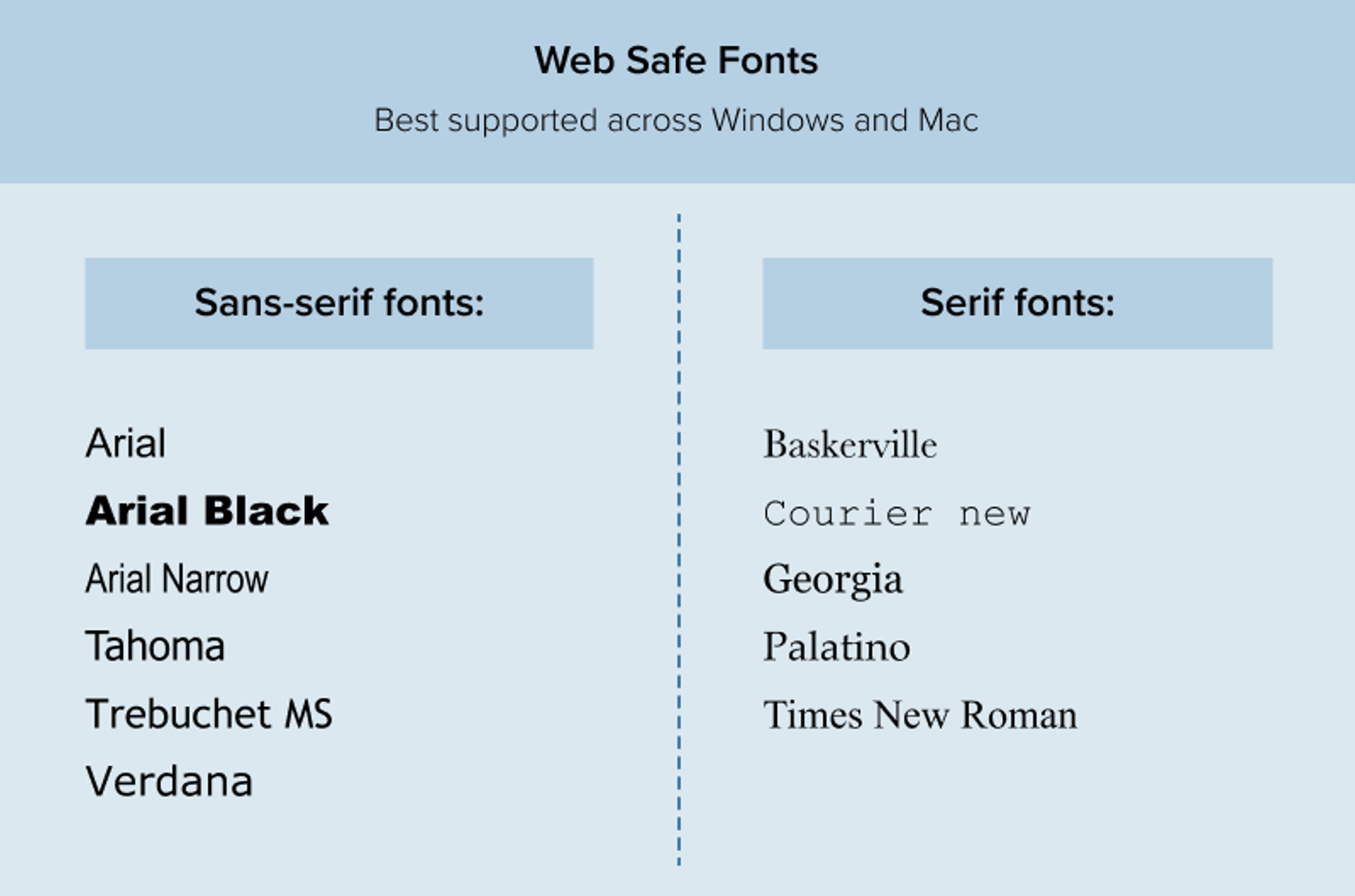
Additional considerations for web-safe fonts:
- While web-safe fonts guarantee consistency, they may limit your design options.
- Consider using web-safe fonts as fallbacks for more unique font choices.
- Some other widely supported web-safe fonts include Georgia, Courier New, and Trebuchet MS.
Limit Font Usage
To maintain visual harmony, using no more than two or three typefaces across a website is generally recommended. This prevents the design from becoming cluttered or overwhelming.
Tips for combining fonts:
- Choose fonts with complementary characteristics. For example, pair a serif heading font with a sans-serif body font.
- Ensure sufficient contrast between your chosen fonts to create a clear visual hierarchy.
- Consider using different weights or styles within the same typeface family for variety without introducing a new font.
Appropriate Font Sizing
While specific sizes can vary based on the typeface and design, a general rule of thumb is to use 16-18px for body text. Headings should be proportionally larger, with the main heading (H1) being the largest.
Additional sizing considerations:
- Use relative units (em or rem) instead of fixed pixel sizes to ensure better device responsiveness.
- Consider implementing a modular scale for consistent and harmonious size relationships between different text elements.
- Don't forget about line height (leading). A good starting point is 1.5 times the font size for body text.
Source: Type-Ed
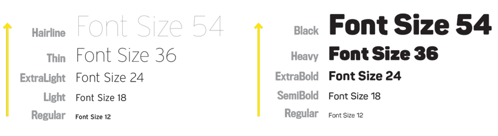
Font Weight and Style
Varying font weights and styles can help create hierarchy and emphasis:
- Use bold weights for headings and important information.
- Italic styles can be used for emphasis or to denote specific types of content (like quotes or citations).
- Be cautious with light font weights, especially for body text, as they can be difficult to read on some screens.
Color and Contrast
The color of your text plays a crucial role in readability:
- Ensure high contrast between your text and background colors. The Web Content Accessibility Guidelines (WCAG) recommend a contrast ratio of at least 4.5:1 for normal text.
- Be cautious with light text on dark backgrounds, as it can cause eye strain over long periods. If used, consider slightly increasing the font weight.
- Remember that some users may have color vision deficiencies. Avoid relying solely on color to convey information.
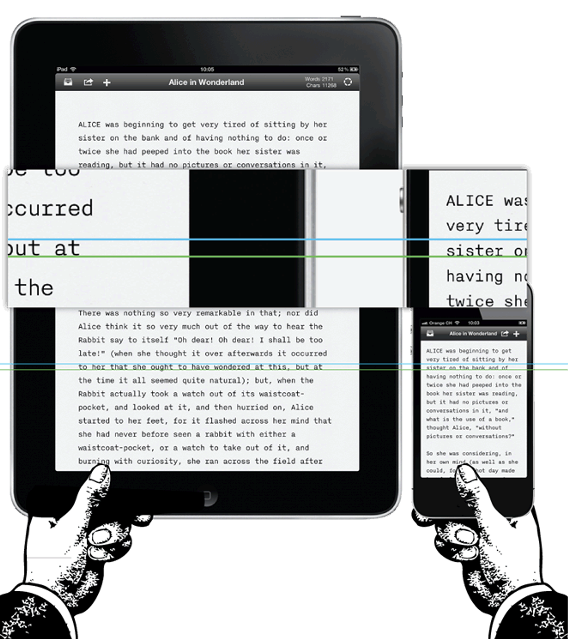
Responsive Typography
As users access websites on various devices, your typography should adapt accordingly:
- Use media queries to adjust font sizes, line heights, and even typefaces for different screen sizes.
- Consider larger font sizes for mobile devices to compensate for the typically shorter reading distance.
- Test your typography across various devices and screen sizes to ensure readability and aesthetic appeal.
Source: iA
Whitespace and Layout
The space around your text is just as important as the text itself:
- Use ample whitespace (padding and margins) to give your text room to breathe.
- Consider the length of your lines. For optimal readability, a good rule of thumb is 45-75 characters per line.
- Break up long blocks of text with subheadings, bullet points, or images to maintain reader engagement.
Structuring content within web pages is crucial for readability and navigation.
Typography in Branding
Typography plays a crucial role in establishing and reinforcing your brand identity. Your font choices can convey your brand's personality, values, and positioning as effectively as your color palette or logo. Here's a deeper look at how to leverage typography in branding:
Reflecting Brand Personality
Your typography choices should reflect your brand's personality. Different font styles evoke different emotions and associations:
- Serif fonts (like Times New Roman or Baskerville) often convey tradition, respectability, and elegance. Luxury brands, academic institutions, and traditional media outlets commonly use them.
- Sans-serif fonts (such as Helvetica or Arial) are perceived as modern, clean, and straightforward. They're popular among tech companies, startups, and brands aiming for a minimalist aesthetic.
- Script fonts can suggest creativity, elegance, or a personal touch. Brands in the fashion, beauty, or creative industries often use them.
- Display fonts, which are more decorative, can be used to create a unique, memorable brand identity, but should be used sparingly and consistently.
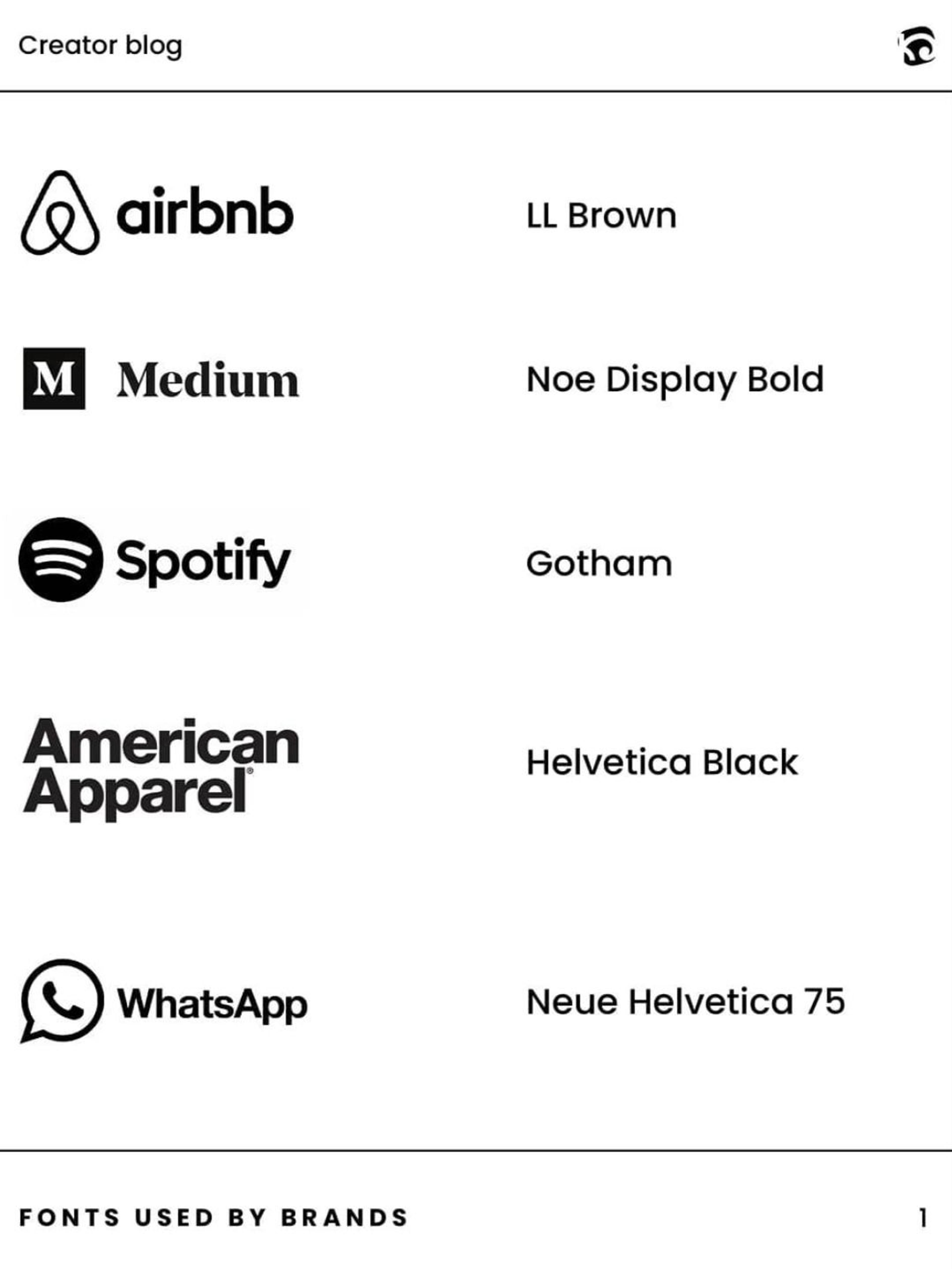
For example, a luxury brand might opt for elegant serif fonts, while a tech startup might prefer modern, minimalist sans-serif fonts. A children's brand might use a playful, rounded sans-serif font to appeal to its target audience.
Creating a Typography Hierarchy
Develop a clear typography hierarchy that aligns with your brand guidelines:
- Primary Font: This is your main brand typeface, often used for headlines and key messaging.
- Secondary Font: Complementary to your primary font, often used for body text or subheadings.
- Accent Font: Optional, used sparingly for special emphasis or call-outs.
Ensure these fonts work well together while providing enough contrast to create visual interest and clarity.
Consistency Across Platforms
Maintain consistency across all your digital platforms to build a recognizable brand identity. This includes:
- Website
- Mobile apps
- Social media graphics
- Email newsletters
- Digital advertisements
- Presentations and documents
Consistent typography helps create a cohesive brand experience, reinforcing brand recognition and professionalism.
Technical Aspects of Web Typography
While typography is an art, implementing it effectively on the web requires some technical know-how. Here's an overview of key technical considerations that can help ensure your typography looks great and performs well across different devices and browsers.
Responsive Typography
In today's multi-device world, your typography needs to be flexible and adaptable. This is where responsive typography comes into play.
Flexible Font Sizes
Rather than using fixed font sizes, web designers often use relative units. These units, such as 'em' or 'rem', allow text to scale based on the user's default font size or the size of the root element. This approach ensures that your text remains proportional and readable across different screen sizes.
For instance, if you set your body text to 1rem and your headings to 2rem, the headings will always be twice the size of the body text, regardless of the device or user settings. This maintains your design's hierarchy while allowing for flexibility.
Fluid Typography
Taking responsiveness a step further, fluid typography allows font sizes to change smoothly as the screen size changes. This creates a more refined reading experience across devices, avoiding abrupt jumps in text size.
Source: Dribbble
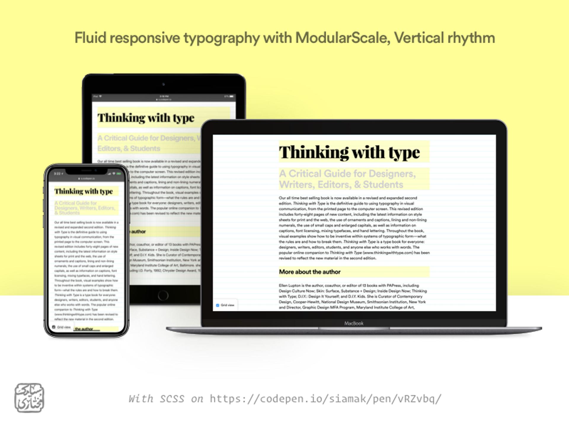
Imagine your text gradually getting larger as you move from a phone to a tablet to a desktop screen. That's the essence of fluid typography. It ensures your text is always at an optimal size for the viewing device.
Adapting to Screen Sizes
For more significant layout changes, designers use breakpoints - specific screen widths where the design adapts more dramatically. At these points, you might adjust not just font sizes, but also line heights, paragraph widths, or even the font itself to ensure optimal readability.
For example, you might use a more compact font on mobile devices to save space, then switch to a more expansive font on larger screens where space is less of a concern.
Font Loading and Performance
While custom fonts can greatly enhance your design, they can also impact your website's loading speed if not managed properly.
The Invisible Text Problem
When a web page loads, there's often a moment where text is invisible while custom fonts are loading. This is known as FOIT (Flash of Invisible Text). It can be jarring for users, especially on slower connections.
Source: Google Fonts
The Unstyled Text Solution
An alternative approach is FOUT (Flash of Unstyled Text), where a fallback font is displayed until the custom font loads. While this ensures content is immediately readable, it can cause layout shifts as fonts change.
Source: Google Fonts

Smart Loading Strategies
Modern web browsers offer ways to control font loading behavior. You can tell the browser to swap in the custom font as soon as it's available, or to only use the custom font if it can be loaded quickly. These strategies help balance between design fidelity and user experience.
Preloading for Speed
For critical fonts, you can tell the browser to start downloading them as soon as possible, even before it has finished parsing the whole page. This technique, called preloading, can significantly speed up font rendering.
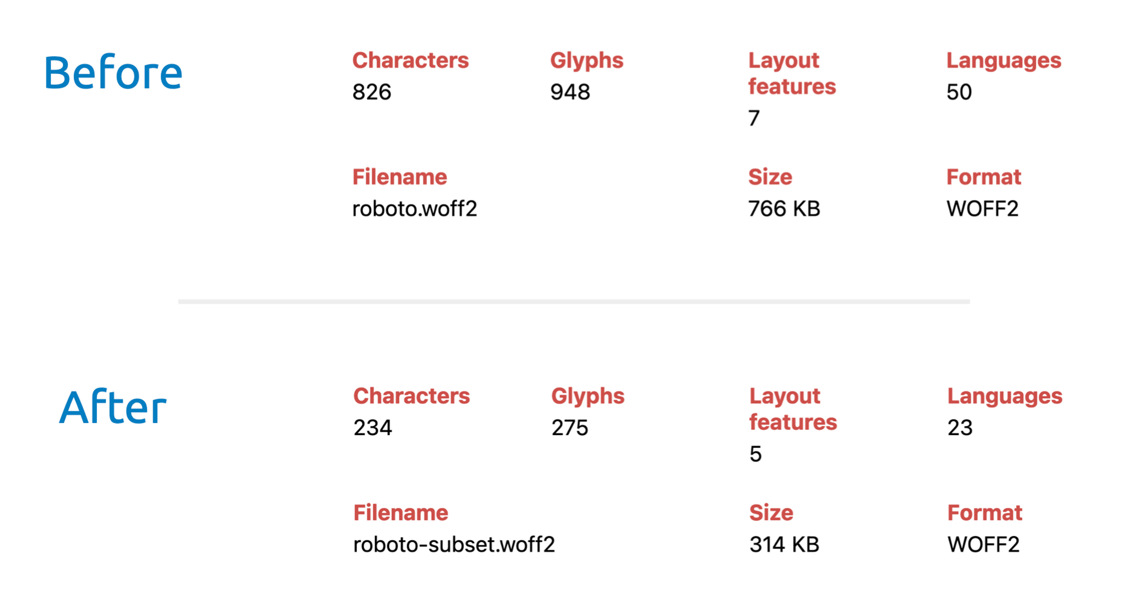
Optimizing Font Files
Another way to improve performance is to optimize the font files themselves. This could involve using more efficient font formats or including only the characters you actually need (a technique called subsetting).
Source: Stephan Jundis Web Development
System Fonts: A Fast Alternative
Some designers choose to use system fonts - the default fonts installed on users' devices. This eliminates the need to download font files altogether, resulting in faster page loads. While this limits your typography options, system fonts have improved significantly in recent years and can still create attractive designs.
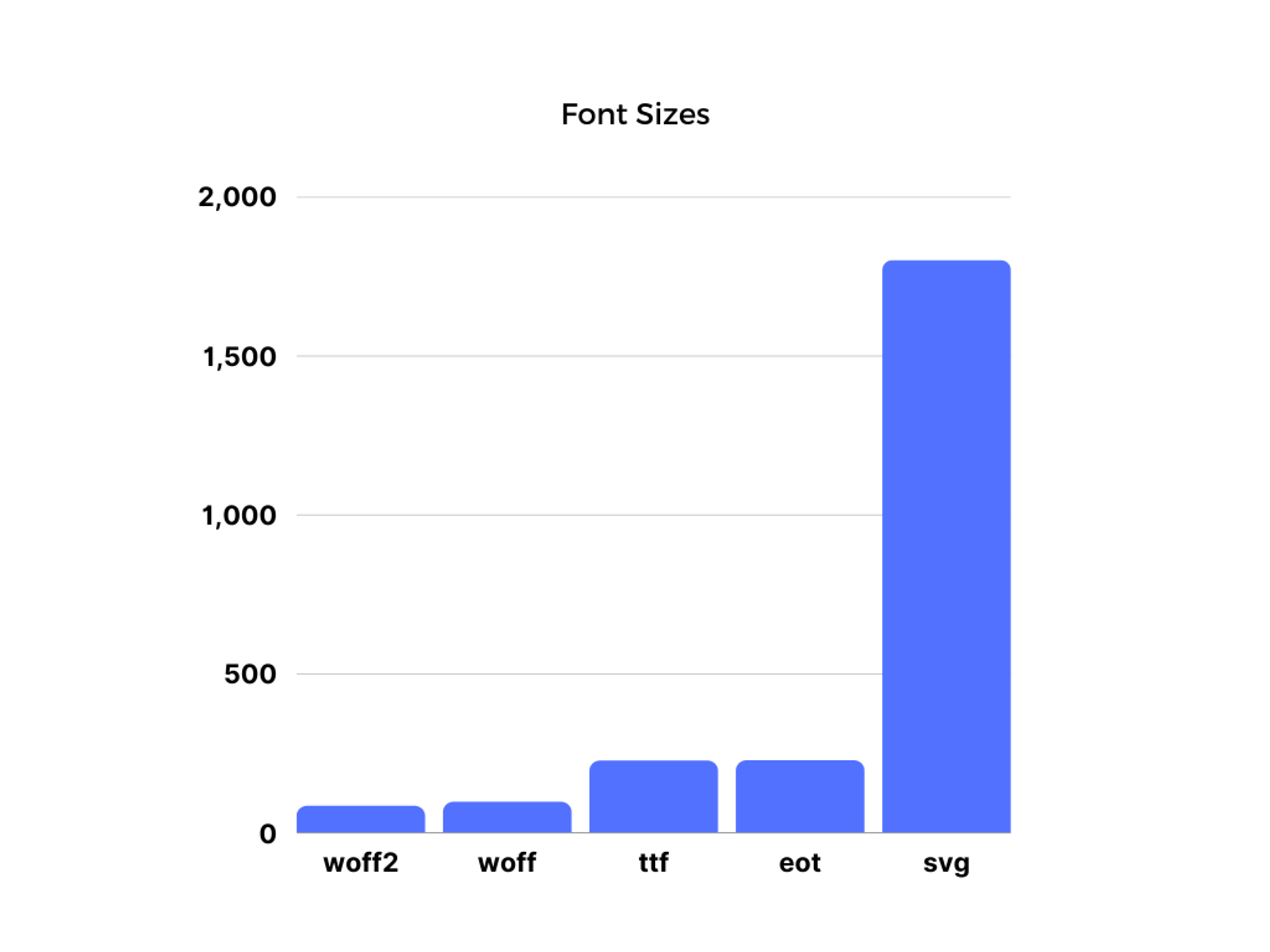
Web Font Formats
Different web browsers support different font formats. To ensure your fonts work for all users, you typically need to provide multiple formats of the same font.
The most widely supported and efficient format is WOFF2, followed by WOFF. You might also need to include TTF or OTF formats for older browsers. Providing multiple options ensures that every user sees your intended fonts, regardless of their browser.
Most Popular Font Sizes
Source: Snapfont
Trends in Web Typography
Typography in web design is constantly evolving, influenced by technological advancements, design philosophies, and changing user preferences. As of 2024, several key trends are shaping the landscape of web typography:
Minimalism and Sans-Serif Dominance
Minimalist sans-serif fonts like Inter, Roboto, and Open Sans continue to dominate web design. Their clean, modern look aligns well with the current preference for uncluttered, user-friendly interfaces. These fonts offer excellent readability across devices and sizes, making them a go-to choice for body text and user interface elements.
The Serif Renaissance
While sans-serif fonts remain popular, we're witnessing a resurgence of modern serif fonts, particularly for headings and display text. Designers are leveraging serifs to add personality and sophistication to their designs without compromising readability. Fonts like Merriweather, Playfair Display, and custom serifs designed specifically for digital use are becoming increasingly common.
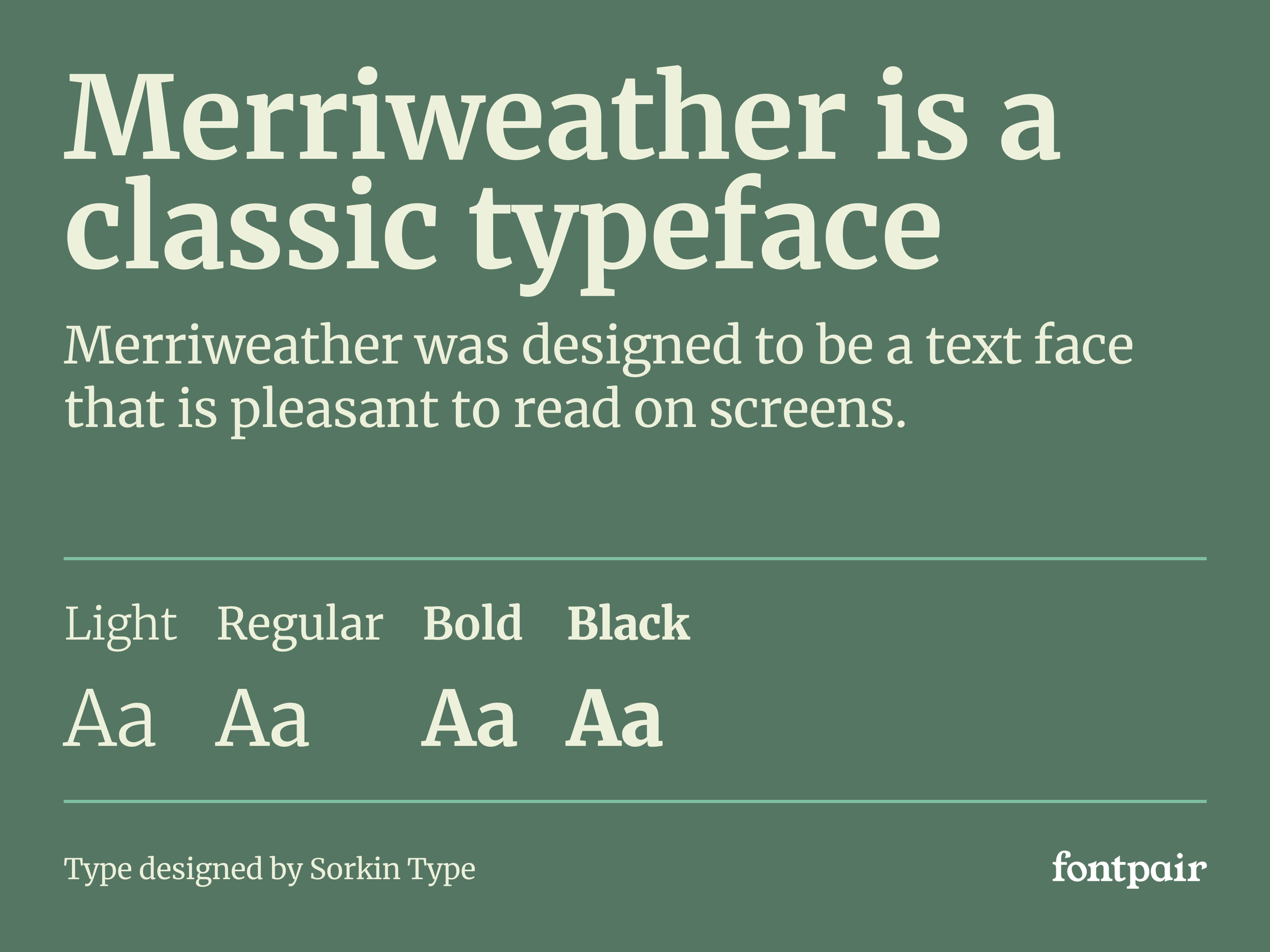
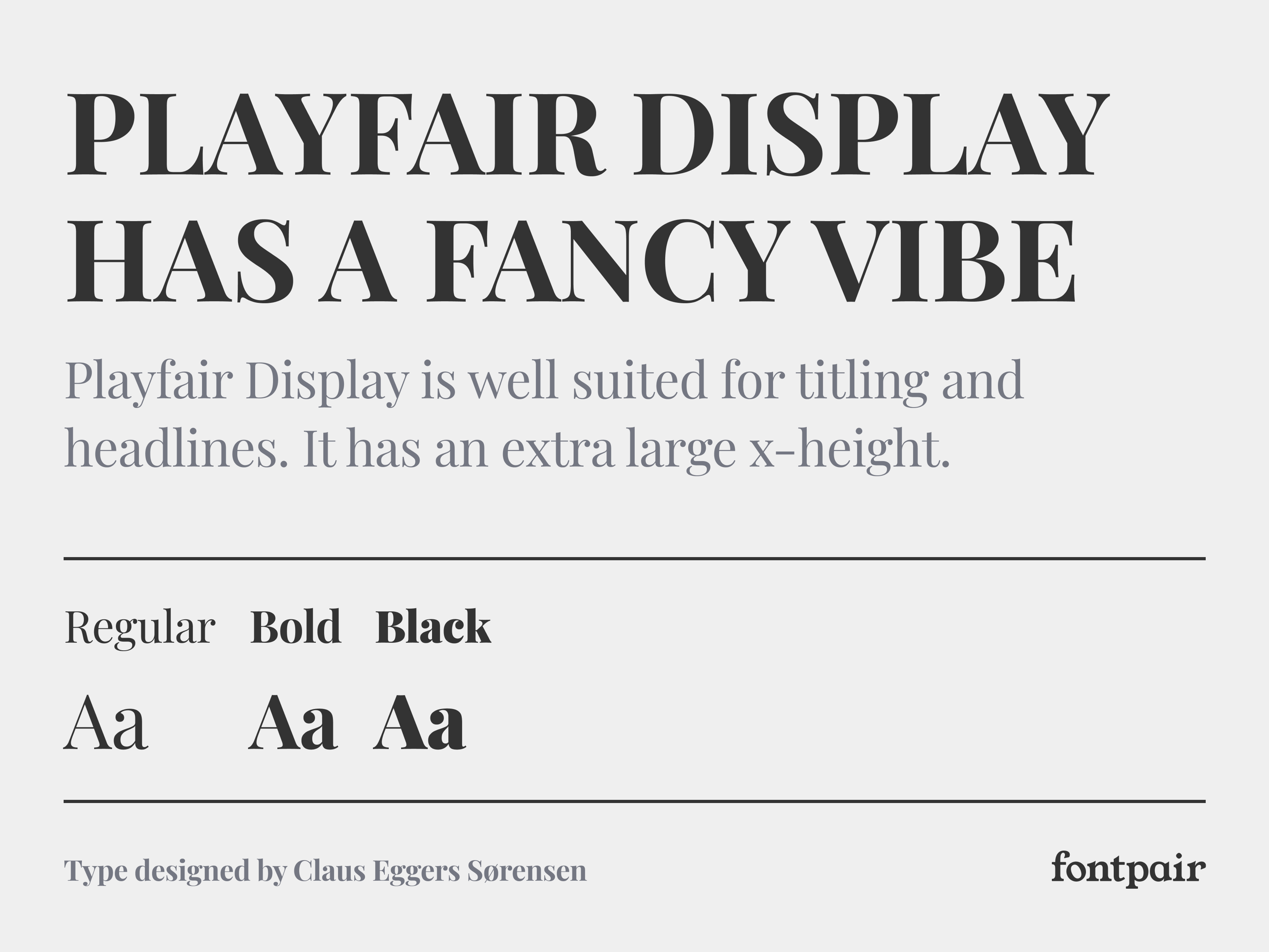
This trend reflects a desire to balance the sleek modernity of sans-serifs with the warmth and character often associated with serif typefaces. It's not uncommon to see websites pairing a serif font for headlines with a sans-serif for body text, creating a pleasing contrast.
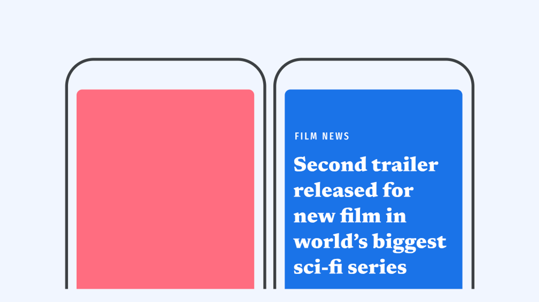
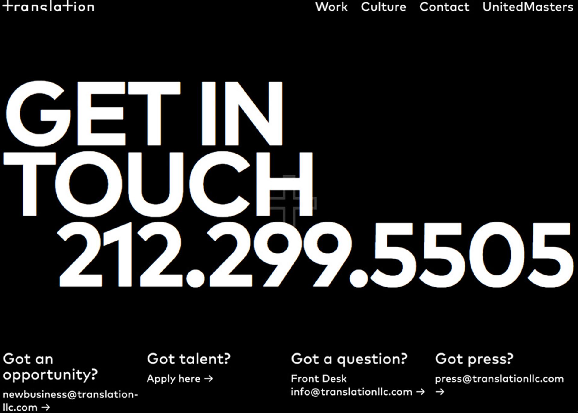
Oversized Typography
Bold, large-scale typography is becoming a staple in web design. Designers are using oversized text not just for impact, but as a central design element. This trend is particularly evident in hero sections of websites, where giant, attention-grabbing headlines set the tone for the entire site.
Source: Awwwards
Experimental and Artistic Typography
As browsers become more capable and users more accustomed to innovative designs, we're seeing an increase in experimental typography. This includes creative uses of animation, unconventional layouts, and even the integration of typography with illustrations or photos. While this trend is more common in artistic or brand-focused websites, it's pushing the boundaries of what's possible with web typography.
Accessibility-Driven Choices
With an increased focus on web accessibility, designers are making more conscious choices about typography. This includes selecting fonts with clear letterforms, ensuring sufficient contrast, and providing ample sizing and spacing. Fonts designed specifically for improved legibility, like Atkinson Hyperlegible, are gaining popularity.
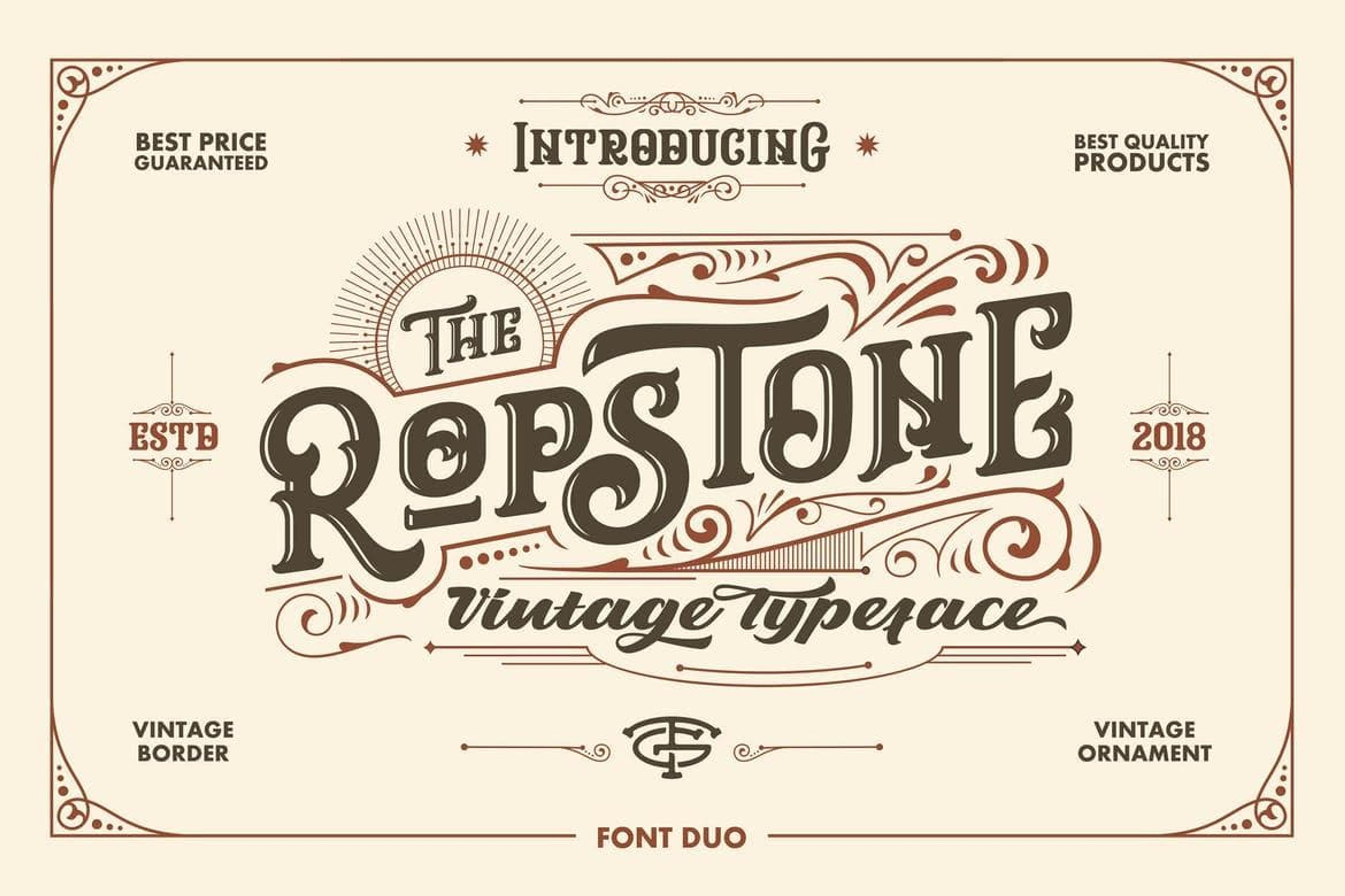
Retro and Nostalgic Fonts
In contrast to the minimalist trend, some designers are embracing retro-inspired typography. This includes revivals of classic serif and slab serif fonts, as well as playful, nostalgic display fonts that evoke specific eras or styles.
As we move forward, we can expect these trends to evolve further, driven by advancements in web technologies, changing design philosophies, and the ever-present need to balance aesthetics with functionality and accessibility.
Source: Creatopy
Web Typography and SEO
While typography might not be a direct ranking factor in search engine algorithms, its impact on user experience makes it a crucial indirect factor in SEO (Search Engine Optimization). Here's a deeper look at how typography influences SEO:
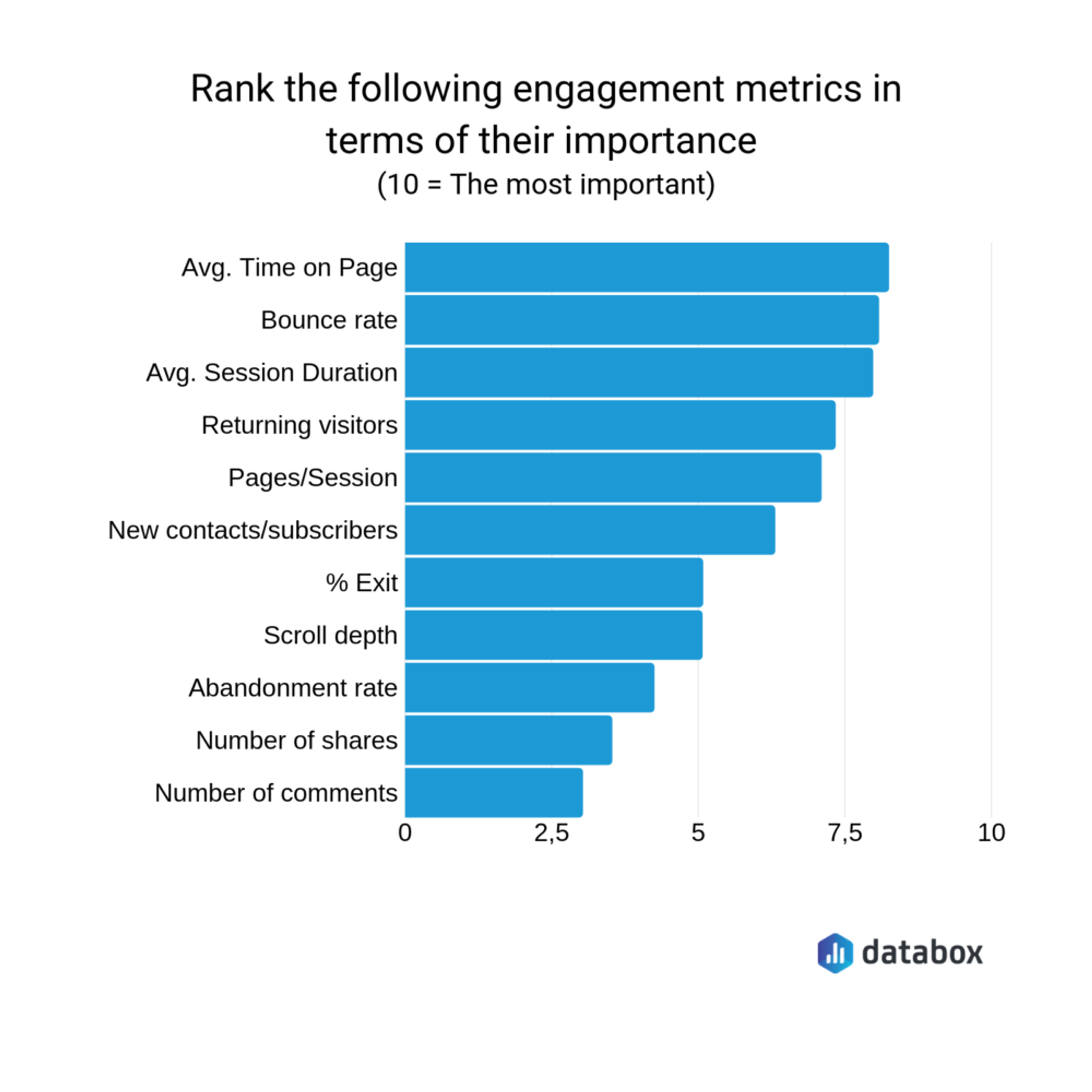
User Engagement Metrics
Search engines like Google use user engagement metrics as indicators of a page's quality and relevance. Well-designed, readable typography can significantly improve these metrics:
1.
Bounce Rate: If users find your text easy to read, they're more likely to stay on your page rather than immediately leaving (bouncing). A lower bounce rate signals search engines that your content is relevant and valuable.2.
Time on Page: Legible, well-structured text encourages users to spend more time reading your content. Increased time on page is another positive signal to search engines.3.
Pages per Session: When typography enhances readability and navigation, users are more likely to explore multiple pages on your site, increasing pages per session.
Source: Databox
Content Accessibility
Search engines aim to provide the best possible results to users, which includes considering accessibility. Typography plays a key role in making your content accessible:
1.
Readability: Clear, legible fonts and appropriate sizing make your content accessible to a wider audience, including those with visual impairments. This aligns with search engines' goal of promoting inclusive content.2.
Structured Content: Proper use of headings (H1, H2, etc.) improves readability and helps search engines understand the structure and hierarchy of your content.
Mobile Optimization
With mobile-first indexing, how your typography performs on mobile devices is crucial for SEO:
1.
Responsive Design: Typography that adapts well to different screen sizes ensures a good user experience across devices, which is a key factor in mobile SEO.2.
Loading Speed: Optimized font files and efficient loading strategies can improve page speed, a known ranking factor for both mobile and desktop searches.
Read more
Conclusion
Thoughtful typography choices are essential for creating a positive user experience, reinforcing your brand, and ensuring your content is easily readable.
Remember, good typography often goes unnoticed because it allows users to focus on the content without distraction. Don't be afraid to test different options and iterate based on user feedback to find the perfect typography for your website.

About Clay
Clay is a UI/UX design & branding agency in San Francisco. We team up with startups and leading brands to create transformative digital experience. Clients: Facebook, Slack, Google, Amazon, Credit Karma, Zenefits, etc.
Learn moreAbout Clay
Clay is a UI/UX design & branding agency in San Francisco. We team up with startups and leading brands to create transformative digital experience. Clients: Facebook, Slack, Google, Amazon, Credit Karma, Zenefits, etc.
Learn more