SEO considers keyword density, word count, internal coding, and visual appearance. All major search engines–think Google, Bing, and Yahoo–consider these aspects and many more when ranking their search engine.
The World Wide Web is the busiest advertising space in today’s hyperconnected world. Almost everyone on earth spends a few minutes, if not hours, on the Internet per day. This global communication platform is home to billion-dollar websites, and doing everything to improve visibility is vital. Search Engine Optimization (SEO) is key to climbing the ladder and letting people notice you.
But what things are SEO looking at? How can you make your website more appealing to Google searches? There are a few things to consider. For example, first-time visitors always look for a website’s overall performance and design. If users leave the site too quickly, search engines will see this as a sign that the site is old, inactive, poorly designed, or has inaccurate search terms. In this case, they will rank it lower, giving less visibility to the site. Using Google Search Console to analyze individual pages' performance and submitting a sitemap can help improve indexing and visibility.
For this reason, websites need to pay attention to the basics to ensure they appeal not just to users but also to search engines. The design, the code, the internal SEO, and many other aspects will have an impact. SEO-friendly web design is crucial for improving site visibility and search rankings. Here, we will describe ten ways to improve SEO when a site is built.
Source: Myriam Jessier on Unsplash

Keep the Layout Simple
Simplicity in website design goes beyond aesthetics. It’s about creating an intuitive and user-friendly experience that keeps visitors engaged. Here’s why a simple layout is crucial for both user experience and SEO:
- First Impressions Matter: In today’s fast-paced digital world, users form opinions about a website within seconds of landing. A clean, straightforward layout creates a positive first impression, encouraging visitors to explore and engage with your content. Conversely, a cluttered or overwhelming design can lead to user frustration and a higher bounce rate (the percentage of visitors who leave a website after viewing only one page).
- Cognitive Clarity: People naturally gravitate towards layouts that are easy to understand and navigate. A simple design minimizes distractions and lets users focus on the content you want them to see. This cognitive clarity is essential for users to find the information they need quickly and efficiently.
- Improved Readability: Simple layouts often incorporate ample white space and clear typography. This makes it easier for users to read your content, regardless of their device or screen size. This is especially important for users with visual impairments or browsing on mobile devices.
- SEO Benefits: Search engines consider user experience as a ranking factor. Websites with a simple and user-friendly layout will likely have lower bounce rates and longer dwell times (the amount of time users spend on a page). These positive user engagement metrics can contribute to a higher SEO ranking. Additionally, internal links help search engines understand a site's structure and improve user navigation by providing clear paths to related content.
- Following Design Trends: While there’s no single “one size fits all” approach, staying informed about current design trends can inspire you to create a simple yet effective layout. One popular trend is the single-page layout, which presents all the information on a single, continuous webpage. This format is ideal for websites with concise content and allows for smooth scrolling navigation. However, the best approach depends on the type of website and the information you need to convey.
Mobile-Friendly Design is a Must
Source: Solen Feyissa on Unsplash

In today’s mobile-dominant world, designing a website solely for desktop viewing is akin to shutting your doors on a vast audience. Here’s why prioritizing a mobile-first web design and SEO strategy is essential for SEO and overall business success:
- Mobile User Dominance: Statistics show that most web browsing occurs on mobile devices. By neglecting mobile users, you’re missing out on a significant portion of your target audience. A mobile-friendly website ensures everyone has a seamless experience, regardless of their device.
- SEO Ranking Factor: Google and other search engines now use mobile-first indexing, meaning they primarily consider the mobile version of your website for ranking purposes. A website that delivers a poor mobile experience will likely be penalized in search engine results pages (SERPs). Additionally, page speed plays a critical role in web usability and search engine optimization, as fast loading times are essential for user experience and can impact bounce rates and Google rankings.
- Responsive Design is Key: Responsive design is key to a successful mobile-first strategy. This approach ensures your website layout adapts and resizes automatically to fit any screen size, from desktops to tablets to sma
Key Mobile Optimization Techniques
Here are some crucial elements for a mobile-friendly website:
- Large Font Size: As mentioned earlier, text needs to be larger on mobile devices to ensure readability.
- Viewport Tag: This essential code snippet instructs the browser to adjust the website's width to match the device's screen size. With it, users could zoom in and scroll horizontally, creating a frustrating experience.
- Fast Loading Speeds: Mobile users are more likely to abandon slow-loading websites. Optimizing images and code for mobile devices is crucial for fast loading times.
- Tappable Buttons: Ensure all buttons and links are large enough for easy tapping on a mobile touchscreen.
- Simple Navigation: Complex navigation menus can be difficult to navigate on small screens. Opt for a simplified and user-friendly mobile menu.
Source: Kenny Eliason on Unsplash

Color Palette Matters
Choosing the right color palette is a strategic decision that goes beyond aesthetics. It's about creating a visual representation of your brand identity and establishing an emotional connection with your target audience. Color psychology is a well-documented field that explores the impact of colors on human emotions and behavior.
- Understanding Color Psychology: Red is often associated with excitement, energy, and urgency. It can be a powerful choice for calls to action or highlighting important information. Blue evokes feelings of trust, security, and professionalism. It's a popular choice for websites in the finance or tech industries. Green represents nature, growth, and harmony. It's a calming color that can be used to create a sense of peace and well-being.
- Leveraging Color Theory: The color wheel is a tool that helps designers understand the relationships between colors. Complementary colors (opposite each other on the wheel) can create a high-contrast and visually striking design. Analogous colors (neighboring each other on the wheel) create a more harmonious and cohesive feel.
- Memorable Brand Identity: Think of some of the most recognizable brands in the world. Coca-Cola's red, McDonald's yellow, or Tiffany's blue - these colors are instantly associated with their respective brands. You can build brand recognition and strengthen your brand identity by selecting a strategic color palette and using it consistently across your website, marketing materials, and social media presence.
Source: Christina Rumpf on Unsplash

- Simplicity is Key: While color can be a powerful tool, it's important to use it strategically to avoid overwhelming visitors. Limiting your color palette to two or three main shades will create a clean and visually appealing design. Use a neutral color for your background and accentuate it with pops of your chosen brand colors. This approach focuses on your content while still incorporating your brand identity.
Get Rid of the Double Sidebar
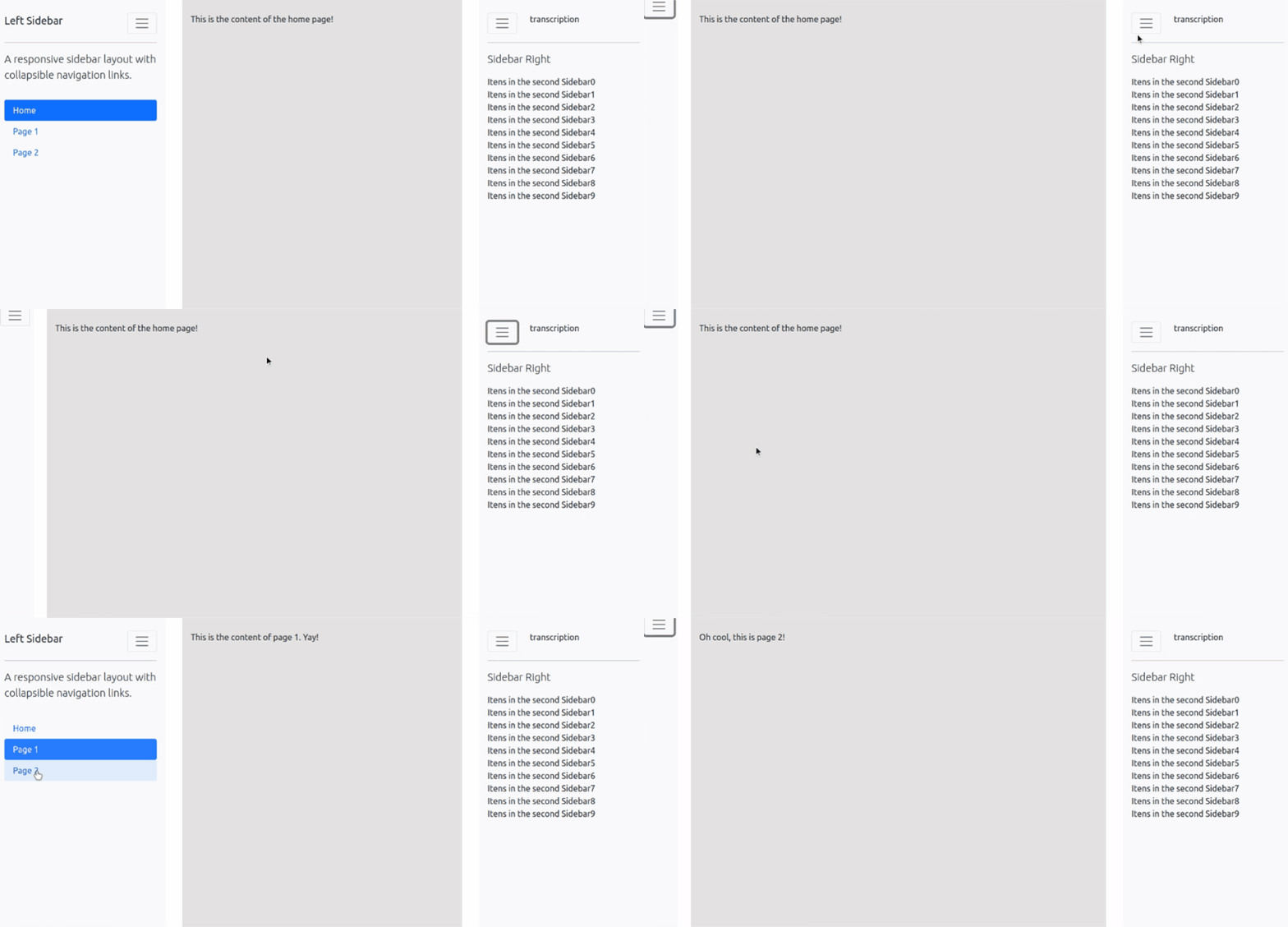
The double sidebar design trend, once a popular website choice, has fallen out of favor for several reasons. Here's why it's best to ditch the double sidebar and embrace a cleaner layout:
- SEO Impact: Double sidebars often contain significant content, including additional links and media files. This can bloat your website's code and slow download speeds. Search engines prioritize fast-loading websites, so a double sidebar can negatively impact your SEO ranking.
- Mobile Friendliness: In today's mobile-first world, a website needs to be responsive and function flawlessly on all devices. Double sidebars often translate poorly to smaller screens, leading to a cluttered and frustrating user experience on mobile devices.
- Usability Issues: Double sidebars can push the main content of your website toward the center, making it difficult for users to find what they're looking for. This can lead to higher bounce rates and lower user engagement.
- Cleaner Design: A minimalist approach with a single or no sidebar creates a cleaner and more modern website design. This allows your main content to take center stage and provides a more focused user experience.
Source: Plotly
Welcome Minimalism in Design
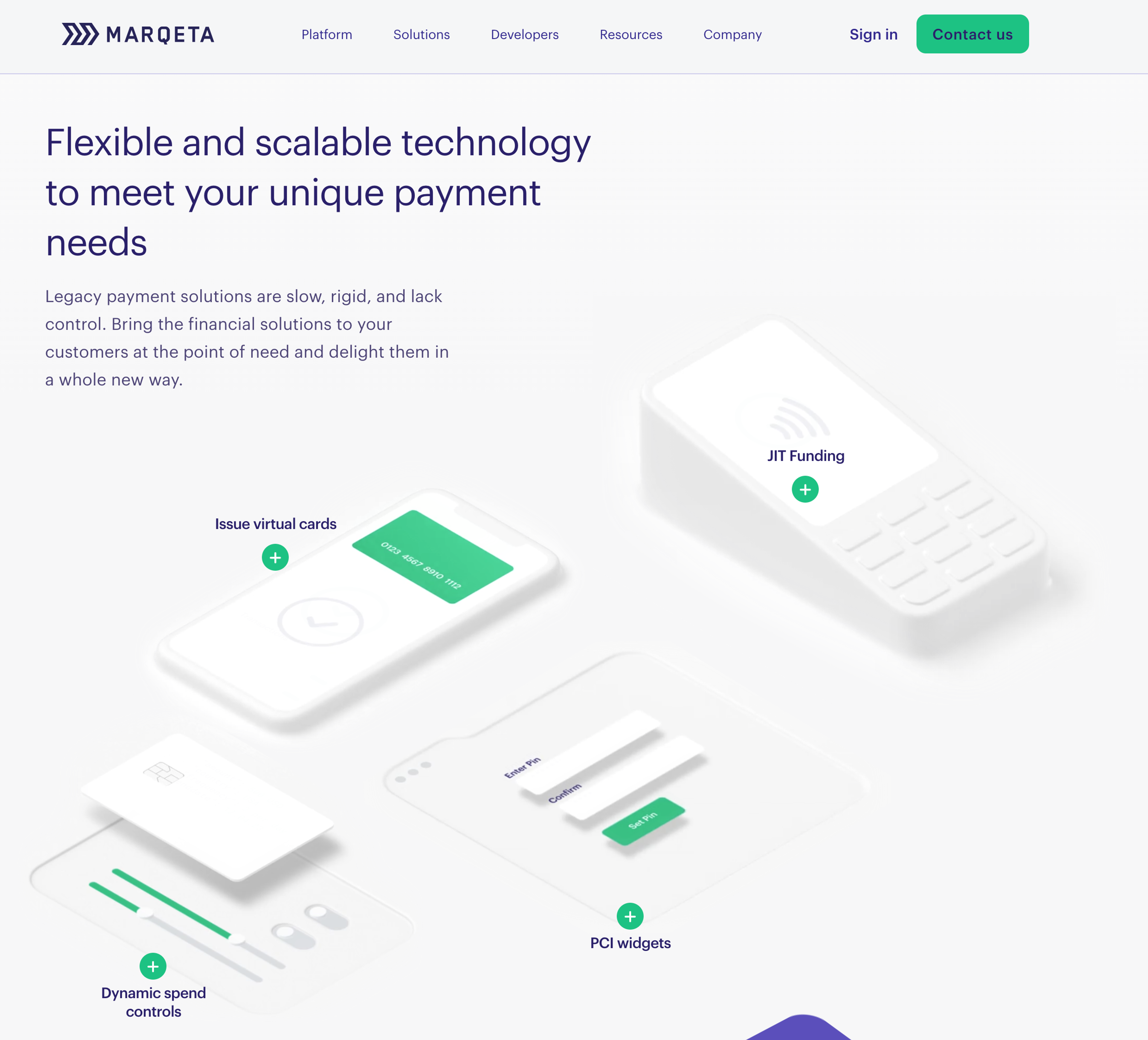
Minimalist web design principles are about creating a clean, uncluttered website that is easy to navigate. This approach prioritizes user experience and caters to how users consume information online. Here's how minimalism benefits both SEO and user experience:
- Improved User Experience: Visitors to your website are more likely to stay engaged and find the information they need if it's presented clearly and concisely. The minimalist design eliminates distractions and allows users to focus on the content.
- Faster Loading Speeds: Websites with a minimalist design typically have fewer elements and require less code. This translates to faster loading speeds, which is crucial for user experience and SEO. Search engines prioritize websites that load quickly.
- Enhanced Readability: By using ample white space and clear typography, minimalist design makes it easier for users to read the content on your website. This is especially important for users with visual impairments or browsing on mobile devices.
- Focus on Content: Minimalism allows your content to take center stage. Well-written and informative content is the foundation of a strong SEO strategy. When users can easily find and consume your content, it increases the time they spend on your website and encourages them to return for more.
By embracing minimalist design principles, you can create an aesthetically pleasing website that provides a positive user experience and helps you achieve your SEO goals.
Source: Marqeta
Compress CSS
Like a well-maintained exterior enhances a building's curb appeal, compressing your website's CSS files contributes to a faster loading speed and a more positive user experience. Here's how CSS compression benefits SEO and website performance:
- Reduced File Size: Compressing CSS removes unnecessary characters like whitespace, comments, and redundant code. This significantly reduces the file size, leading to faster loading times. Search engines prioritize websites that load quickly, giving compressed CSS websites a slight SEO edge.
- Improved Rendering Speed: When a user visits your website, the browser needs to download and interpret the CSS file to style the content. A compressed CSS file downloads faster and allows the browser to render the page layout quicker, resulting in a smoother user experience.
- Enhanced Scalability: As your website grows and you add more content, your CSS file size may also increase. Regularly compressing your CSS ensures it remains lightweight and efficient, regardless of website size. This is crucial for maintaining optimal performance and user experience.
- Easier Maintenance: Compressing CSS can help identify and eliminate duplicate code within your stylesheets. This simplifies code maintenance and makes it easier to troubleshoot any styling issues that may arise.
There are numerous free and paid online tools available to compress CSS files. Integrating CSS compression into your website development workflow ensures that your website consistently delivers a fast and efficient user experience.
Go Easy on JavaScript
JavaScript offers a powerful way to add interactivity and dynamic elements to your website. However, like any tool, it's important to use JavaScript strategically to avoid hindering website performance and SEO. Here's why keeping JavaScript usage in check is crucial:
- Balancing Functionality with Speed: While JavaScript can enhance user engagement, excessive use can lead to bloated code and slower loading times. This can negatively impact SEO and user experience as visitors bounce from slow-loading websites.
- Prioritize Critical Rendering Path: The Critical Rendering Path (CRP) refers to the essential resources a browser needs to render the initial content of a webpage. JavaScript files are not critical for initial rendering and should be loaded asynchronously to avoid delaying page load.
- Leverage Browser Caching: Modern browsers can cache frequently used JavaScript files, reducing the need to download them on subsequent visits. This optimization technique significantly improves website performance for returning users.
- Consider Alternatives: Sometimes, simpler HTML and CSS techniques can achieve the desired visual effects without relying on JavaScript. Evaluate if there are alternative ways to achieve your design goals without compromising website performance.
Source: Markus Spiske on Unsplash

By using JavaScript judiciously and implementing performance optimization techniques, you can leverage its benefits while maintaining a fast-loading website that ranks well in search engines.
Always Run a W3C Code Validation
Imagine building a house with faulty blueprints. The structure might be unstable and prone to problems. Similarly, poorly written website code can lead to display issues, functionality errors, and security vulnerabilities. Here's how using a W3C validator helps ensure clean and SEO-friendly code:
- Catch Errors Early: The W3C validator is a free online tool that scans your website's code and identifies potential errors and inconsistencies. Catching these errors early in the development process saves time and prevents them from later causing problems.
- Improved Rendering and Compatibility: Valid code ensures your website renders correctly across browsers and devices. This consistency is crucial for a positive user experience, regardless of how users access your website.
- Accessibility Compliance: The W3C validator also helps identify accessibility issues within your code. This ensures that your website is usable by everyone, including users with disabilities.
- SEO Benefits: Search engines may penalize websites with broken code or compatibility issues. Validated code demonstrates a well-maintained website and can contribute to a slightly higher SEO ranking.
Source: NPM
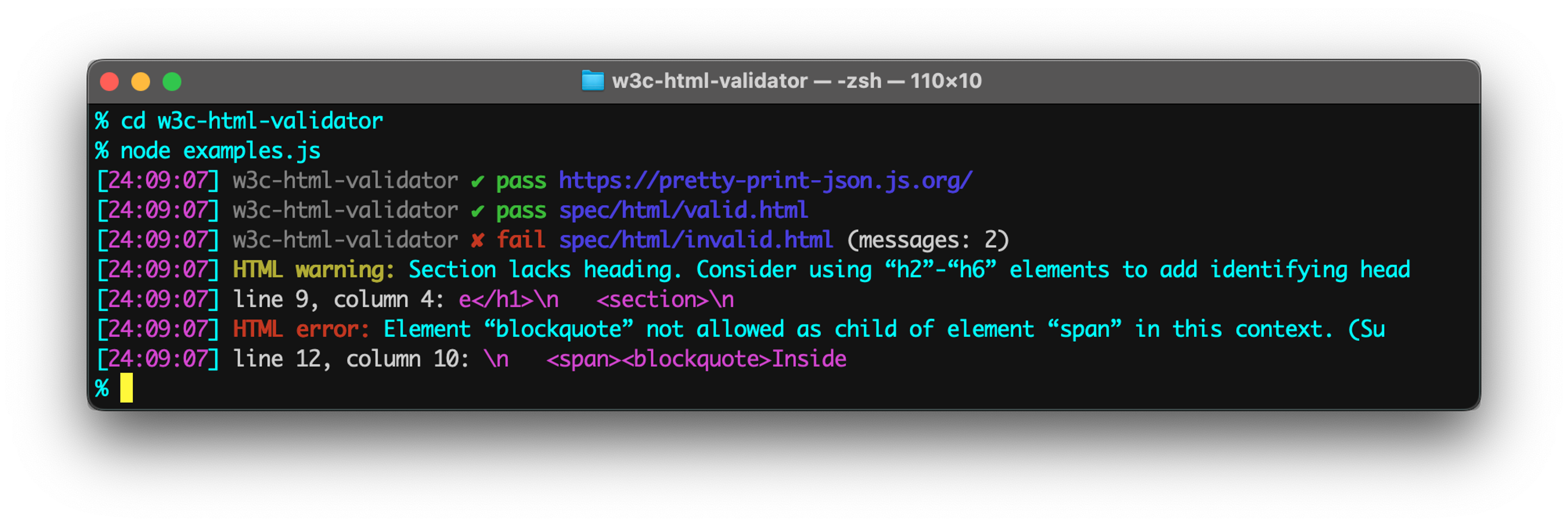
Running your new website and code through the W3C validator is a simple yet effective way to ensure it meets web development standards and avoids potential problems. This proactive approach promotes a smooth user experience and contributes to a strong SEO foundation for your website.
Eliminate Broken Links for Search Engine Optimization
Broken links are like malfunctioning traffic lights on a website - they disrupt the user's journey through a web page and create a frustrating experience. Here's why eliminating broken links is crucial for SEO and user experience:
- Impact on User Trust: Imagine clicking on a link that leads nowhere. This disrupts your browsing flow and damages your website's credibility. If users encounter too many broken links, they're less likely to trust your website or return in the future.
- Search Engine Crawlability: Search engines rely on links to discover and index the content on your website. Broken links can hinder this process, making it difficult for search engines to find and rank your web pages. Search engines may also interpret an abundance of broken links as a sign of a poorly maintained website.
- SEO and Link Juice: Links from high-authority websites act as a vote of confidence and pass on "link juice," which can improve your website's ranking in search results. However, broken links from external websites dilute this link juice and can negatively impact your SEO.
- Proactive Link Checks: Broken links can occur for various reasons, such as typos during content creation, website restructures, or external websites going offline. It's essential to regularly check your website for broken links using free or paid online tools. These tools crawl your website and identify links that lead to error pages or non-existent resources.
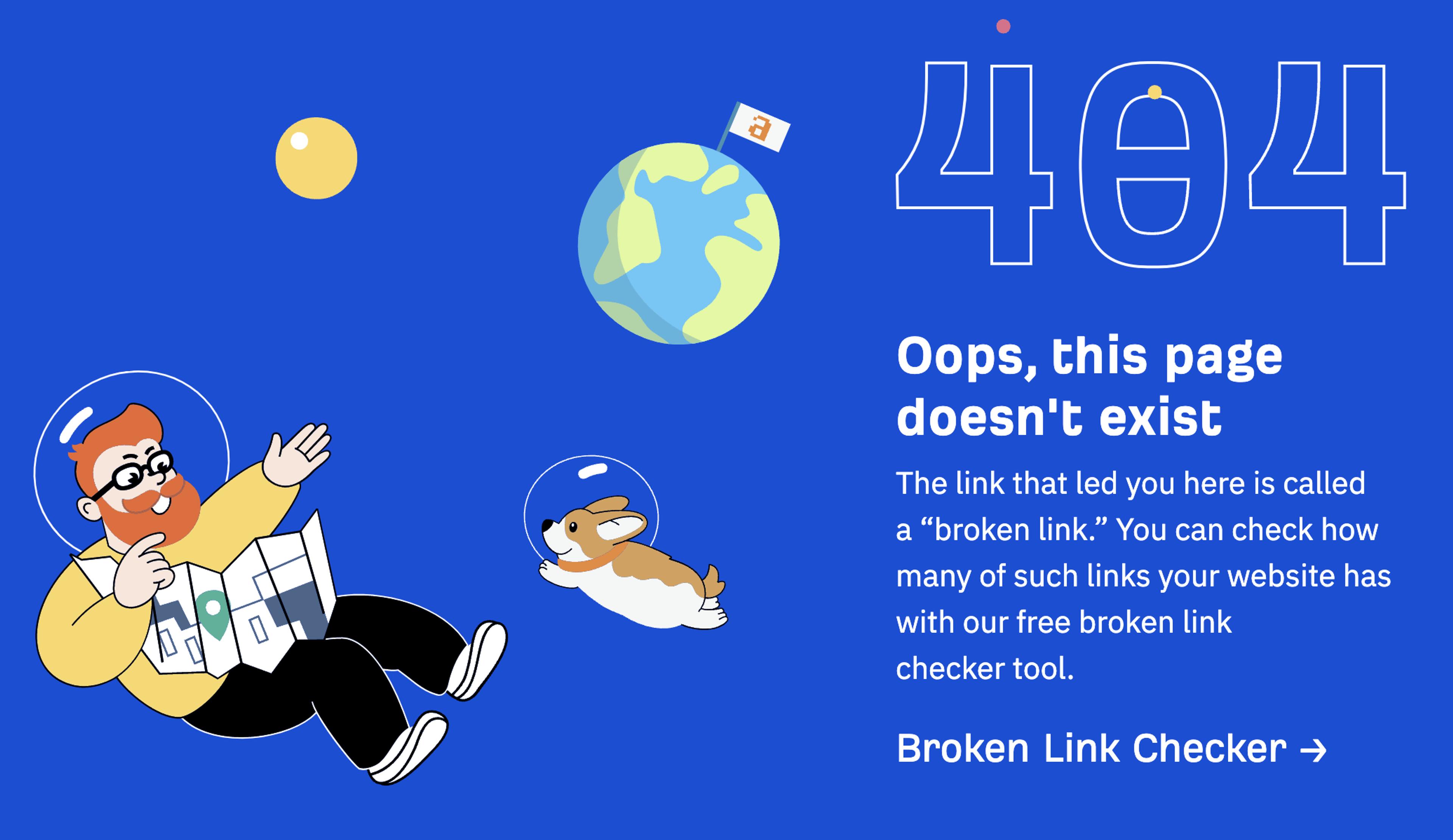
- 404 Error Pages with a Purpose: Even with regular checks, broken links might still occur. It's important to have a user-friendly 404 error page set up. This page should inform users that the link they clicked is broken and offer alternative navigation options, such as a sitemap, search bar, or links to your most popular content. A well-designed 404 page can help minimize the frustration caused by broken links and potentially guide users back on track.
Source: Ahrefs
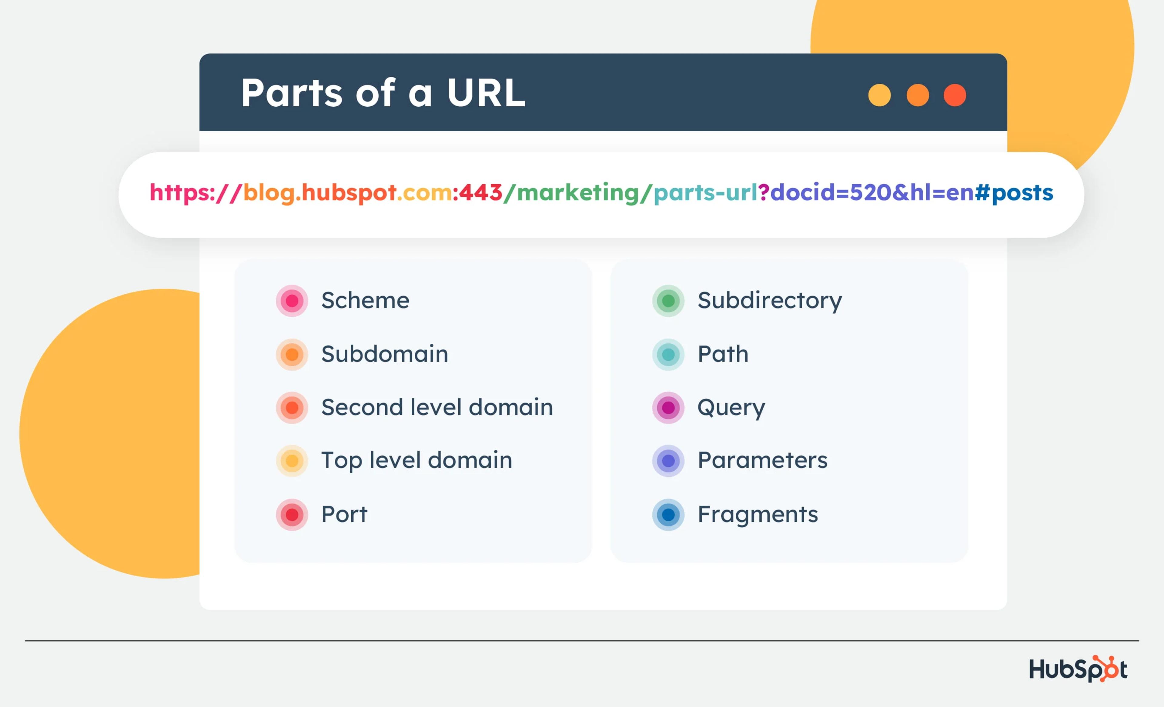
Make the URL Structure Readable
A well-structured URL acts as a clear signpost, guiding both users and search engines to the content of a webpage. Here's how creating user-friendly and SEO-strategic URLs benefits your website:
- Clarity for Users: Readable URLs use descriptive keywords that accurately reflect the webpage's content. For example, the URL "https://domain.com/web-designers/new-york-city" clearly tells users they've landed on a page about website design services offered by your company in New York City. This transparency builds trust and helps users find the information they seek more easily.
- Search Engine Friendliness: Search engines use keywords within URLs to understand the context and content of a webpage. Readable URLs incorporating relevant keywords can positively impact your website's ranking for those search terms. However, avoid keyword stuffing - create a natural-sounding URL that accurately describes the content.
- Improved Click-Through Rates (CTR): Descriptive URLs can be more enticing in search engine results pages (SERPs). Users are more likely to click on a URL that indicates it contains the information they need. This can lead to a higher click-through rate (CTR) and increased website traffic.
- Maintain a Logical Hierarchy: An ideal URL structure follows a clear hierarchy, using subfolders to categorize related content. For example, "https://www.domain.com/blog/seo-strategies-to-implement-for-your-business/" demonstrates a logical hierarchy, moving from the leading website domain to the blog section, then to a subfolder for SEO content, and finally to the specific webpage about website design tips. This structure helps users understand the organization of your website and navigate to relevant content.
- Keep it Concise: While descriptive URLs are beneficial, avoid excessively long or keyword-stuffed URLs. Strive for a balance between clarity and conciseness. Ideally, your URLs should be informative yet easy to read and remember.
Source: Hubspot
Optimize Image Alt Text
Search engines can't decipher the content of images like the human eye can. That's where alt text (alternative text) comes in. It acts like a caption for your images, providing a textual description that search engines can understand and use for ranking purposes. Here's why optimizing alt text is crucial for SEO and user experience:
- Improved Image Search Ranking: Search engines like Google have dedicated image search features. By including relevant keywords in your alt text, you can increase the chances of your images appearing in image search results, driving more targeted traffic to your website.
- Enhanced Accessibility: Alt text is crucial for users with visual impairments who rely on screen readers to access website content. Descriptive alt text allows these users to understand the context and purpose of your images.
- SEO Benefits Beyond Image Search: While image search is important, alt text can contribute to your overall website SEO. Search engines may use the information in alt text to better understand the content of your webpage, potentially improving your ranking in regular search results.
Crafting Effective Alt Text
Here are some tips for writing effective alt text:
- Be Descriptive: Accurately describe the content of the image concisely.
- Use Relevant Keywords: Incorporate naturally relevant keywords into the image and the webpage content. However, avoid keyword stuffing.
- Keep it Concise: Aim for alt text that is around 125 characters or less.
- Be Specific: For example, instead of using generic alt text like "picture of a flower," describe the flower type (rose, daisy, etc.) and its color.
Source: Mangool

Create Compelling Meta Descriptions for Search Engines
Meta description tags and descriptions are those brief snippets of text that appear below your website’s title tag in search engine results pages (SERPs). They act like a mini advertisement for your webpage, enticing users to click and learn more. Here’s why crafting compelling meta descriptions is essential for SEO:
- Increased Click-Through Rates (CTR): A well-written meta description can significantly impact your click-through rate (CTR), the percentage of users who click on your website link in search results. A clear, concise, and informative description that piques users’ interest will lead to more clicks and website traffic.
- Highlighting Value Proposition: Your meta description is your chance to showcase your webpage’s value to users. Communicate what users can expect to find on your page and how it will address their needs or answer their questions.
- Keyword Integration: While not the sole focus, strategically including relevant keywords in your meta description can make your listing more relevant in search engine results. However, prioritize natural language and avoid keyword stuffing.
- Call to Action (CTA): Consider incorporating a subtle call to action (CTA) in your meta description. Encourage users to click and learn more, download content, or take advantage of an offer.
Additionally, integrating SEO web design into your website ensures that it looks appealing and performs well in search engine rankings, attracting organic traffic and improving user experience.
Source: Semrush

Meta Description Best Practices
Here are some guidelines for crafting compelling meta descriptions:
- Target Length: Aim for a meta description between 150-160 characters. This ensures your entire description is visible in most search results.
- Focus on Benefits: Highlight the benefits users will gain by clicking on your webpage.
- Uniqueness Matters: Create unique meta descriptions for each webpage, accurately reflecting the specific content.
- Actionable Language: Use action verbs and strong language to encourage users to click.
Read More
Final Thoughts
Gaining online visibility is not nice but an essential requirement for today’s business world. To achieve it, you need to have a clear and clean code, a simple yet functional layout, and a brand identity through it all–and don’t forget fast loading speeds. Integrating SEO into the website design process from the very beginning is crucial for creating a more optimized site that ranks better in search engines. Both visitors and search engines are looking for the same things. Follow the tips above to ensure you appeal to both and increase your overall visibility.


About Clay
Clay is a UI/UX design & branding agency in San Francisco. We team up with startups and leading brands to create transformative digital experience. Clients: Facebook, Slack, Google, Amazon, Credit Karma, Zenefits, etc.
Learn more

About Clay
Clay is a UI/UX design & branding agency in San Francisco. We team up with startups and leading brands to create transformative digital experience. Clients: Facebook, Slack, Google, Amazon, Credit Karma, Zenefits, etc.
Learn more


