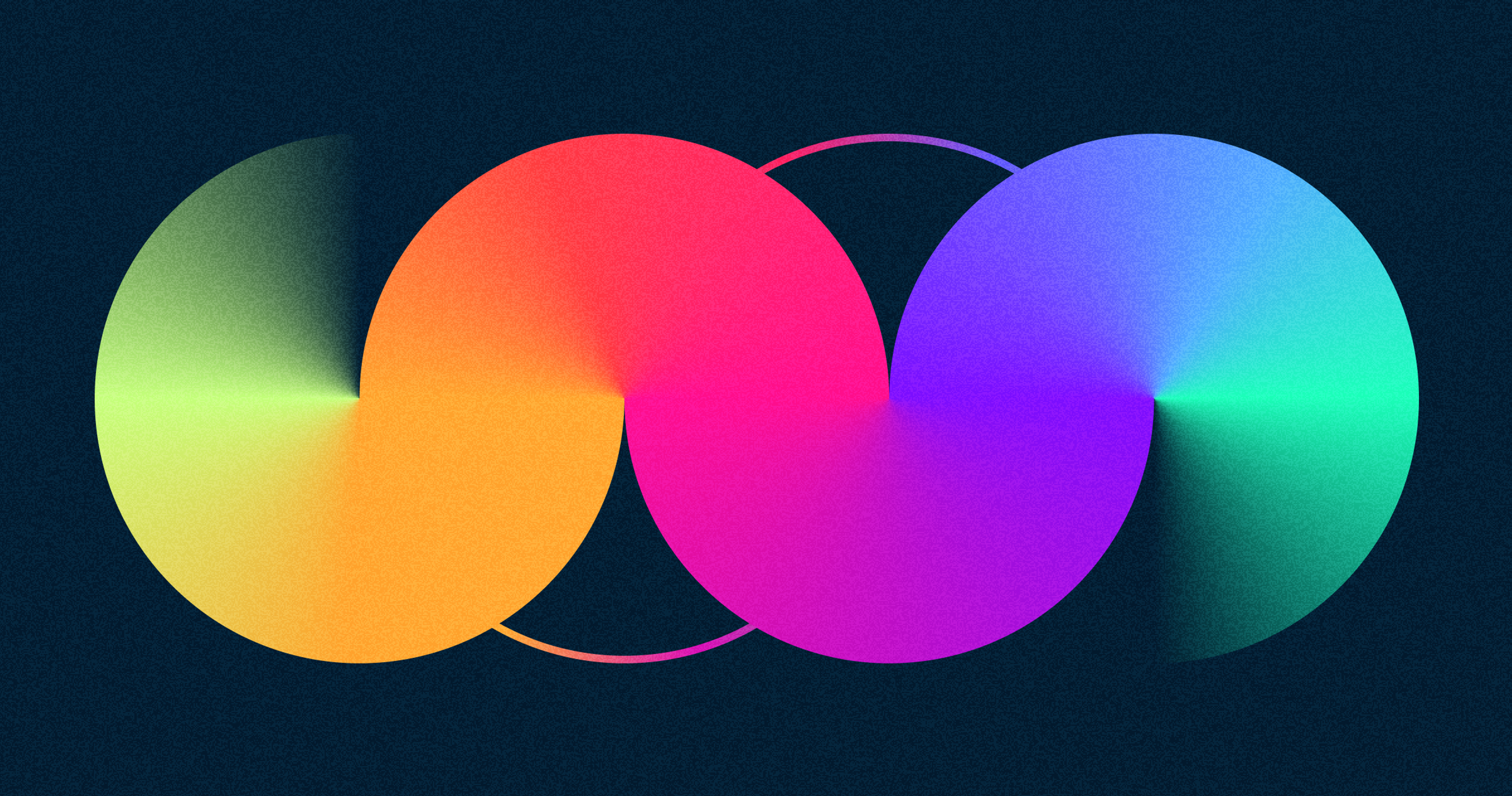
Gradients have become an increasingly popular design trend in web design. The resurgence of the gradient trend can be traced back to the Web 2.0 era, evolving into modern applications that add depth and visual interest. They create a subtle but eye-catching effect and can be applied to any element on the page.
Gradients can draw attention, add depth, create visual balance, and enhance readability. With so many possibilities for gradients in web design, it’s easy to get overwhelmed by all the options available.
This guide will help you understand how best to use gradients in your designs and give you some tips on creating stunning results with them!
Introduction to Gradients in Web Design
What Is a Gradient?
Gradients are powerful design tools used in web design to create visual interest and give depth to an element on the page. A gradient is a gradual transition from one color or shade to another, often with a subtle gradient or multiple colors blended.
CSS gradients are particularly practical for creating these visual effects, as they allow designers to generate gradient code easily and enhance the visual appeal of HTML projects without the need for complex images or plugins.
Gradients can be used for backgrounds, text elements, buttons, images, and more – they’re versatile enough to be applied almost anywhere! When used correctly, gradients can add subtle texture and movement that enhances the overall look of your website.
With so many possibilities when it comes to using gradients in web design, it’s important to understand how best to use them for maximum effect.
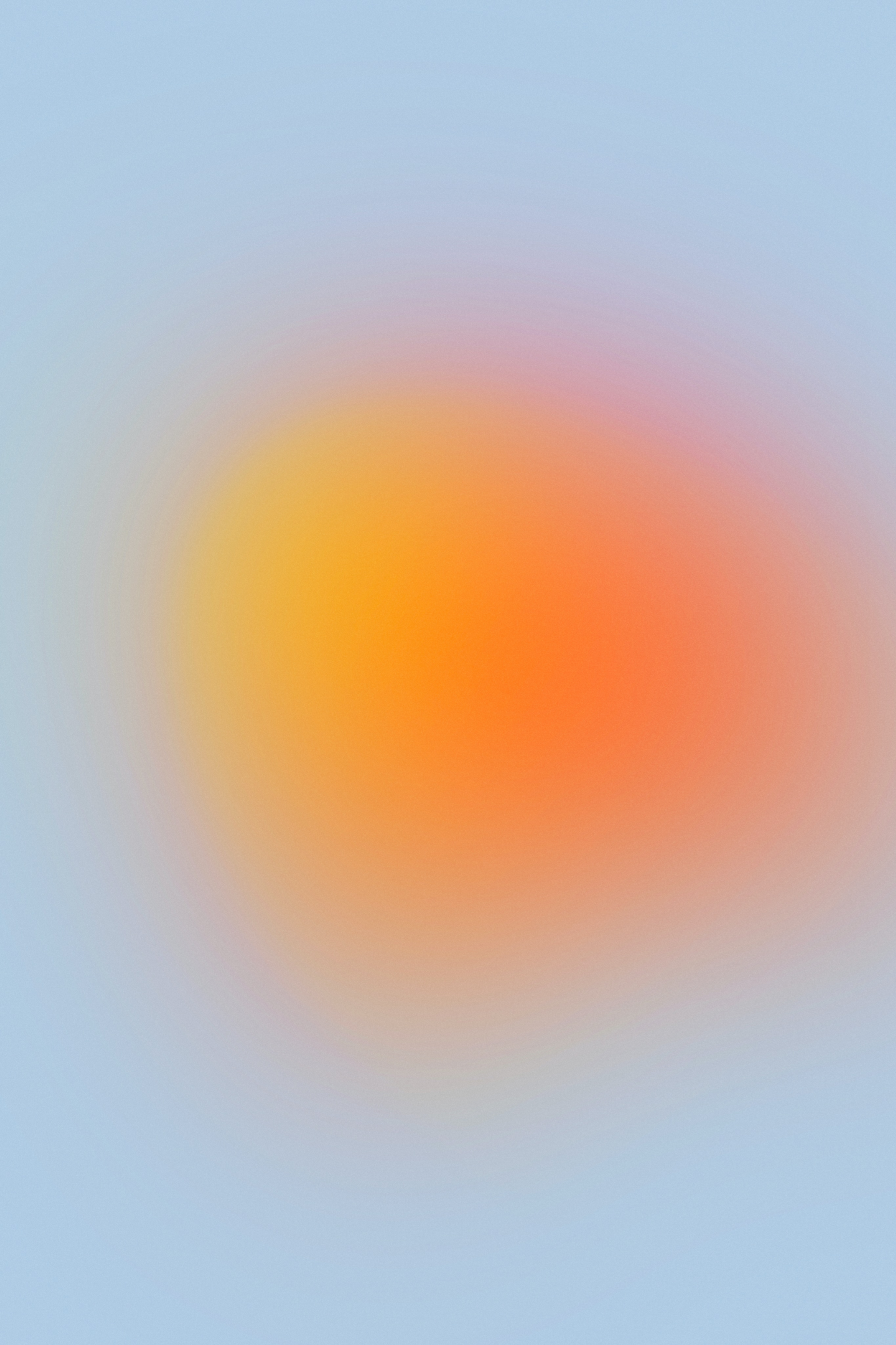
Source: Codioful (Formerly Gradienta) on Unsplash
Benefits of Using Gradients
Gradients can offer many benefits to web design, making them worth considering for any project. They can add subtle texture and movement that helps draw attention to the most important parts of your page while also providing a balanced and organized layout. CSS gradient code simplifies the creation of gradients and provides customization options.
Gradients can be used to create stunning visuals with even the simplest designs by blending colors in unique patterns.
Furthermore, gradients can help reduce visual noise by breaking up large blocks of content on the page, making it easier for viewers to read and find what they’re looking for.
Additionally, gradients can be an accessibility tool as they help users with some forms of color blindness more easily differentiate between elements on the page.
Finally, gradients are often easier to work with than flat colors when creating responsive designs that look great across all devices and resolutions.
Types of Gradients
Linear Gradients
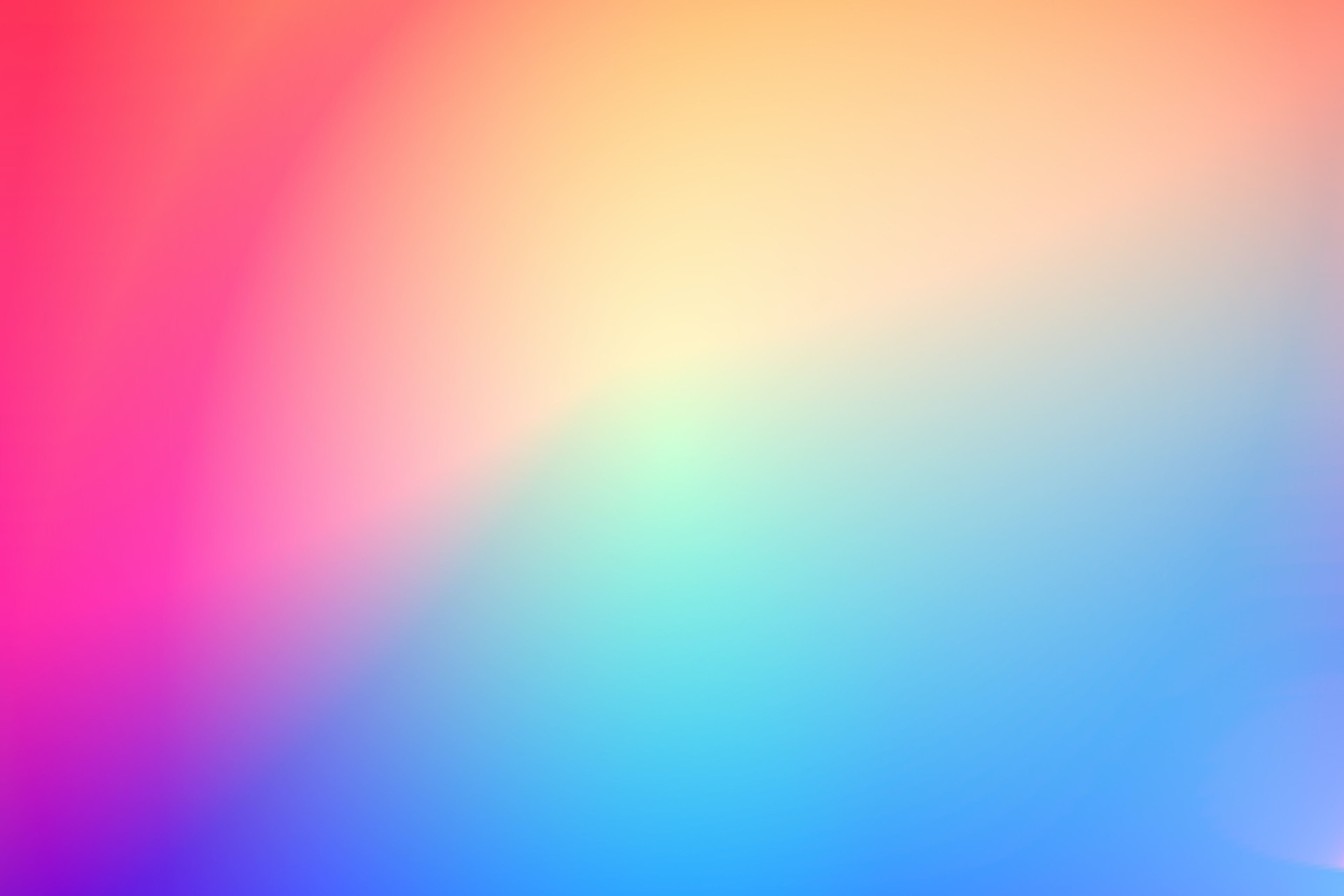
Linear gradients are the most common type of gradient seen in web design. They often consist of two or more colors that gradually blend linearly, creating a smooth transition between two colors on a single element. Linear gradients can be applied to any HTML element, including backgrounds, images, text elements, and buttons.
Source: César Couto on Unsplash

Linear gradients are designed to follow the path of the line they’re placed upon. The result is an eye-catching effect where one color fades into another along the length or height of an element. This technique can create stunning visuals with minimal effort – you only need two or more colors and an area to place them within!
When using linear gradients, it's important to position your colors correctly. For a natural-looking effect, try positioning a gradient color palette with lighter shades at the top and darker shades at the bottom (or vice versa).
You can also position your colors from left to right or right to left for a different look. Experimentation is key when finding what works best for each design! In addition, linear gradients can provide an accessibility boost for those with some forms of color blindness by helping them better differentiate between elements on the page.
Using multiple shades in a linear gradient can also make it easier for viewers to distinguish between objects, as they don't rely solely on color contrasts like solid blocks do.
Overall, linear gradients offer an easy way to add depth and movement to any design without needing complex graphic techniques such as shading, textures, or patterns. With so many possibilities available when working with linear gradients, it’s easy to make any webpage stand out!
Radial Gradients
Radial gradients are a type of color gradient that uses circles or ellipses to transition from one color to another. Unlike linear gradients, which blend colors in a straight line, radial gradients blend the colors in a circular pattern. This creates a stunning effect that looks like a sunburst or an explosion of colors radiating outward from the center.
Like linear gradients, radial gradients can be used for backgrounds, images, text elements, and buttons. However, they are best used in areas with large amounts of white space, as the effect will be much more pronounced when it easily stands out from the rest of the design.
Additionally, radial gradients make great accents throughout your website. They can draw attention to certain parts of your page or even add visual interest where there might be none. When using radial gradients, it's important to understand how the colors will blend. Like linear gradients, you should position your lighter shades at the center and darker shades at the edges (or vice versa).
Doing so will ensure you get an eye-catching effect that stands out on any webpage. It's also important to consider how many colors you want to use in your radial gradient—too many can detract from its impact, while not enough may make it appear flat and dull.
Radial gradients provide web designers with a way to add depth and interest to their designs without using complex graphic techniques. In general, radial gradients are a unique tool for achieving this. With many possibilities available when working with radial gradients, there’s no limit to what kind of visuals you can create!
Angular and Reflected Gradients
Angular and Reflected gradients are a type of gradient that uses shapes and angles to transition from one color to another. Angular gradients often use triangles or diamonds to create a distinctive and attractive effect. The colors used in the gradient should be placed at the corners of the shape, creating an angular look as they transition between each hue.
This technique is perfect for drawing attention to certain parts of your page or adding visual interest where there might be none. Reflected gradients, on the other hand, are designed to reflect light and shadow across a design element. These gradients often feature two or more colors that “reflect” off each other to create an interesting optical illusion.
Source: Milad Fakurian on Unsplash
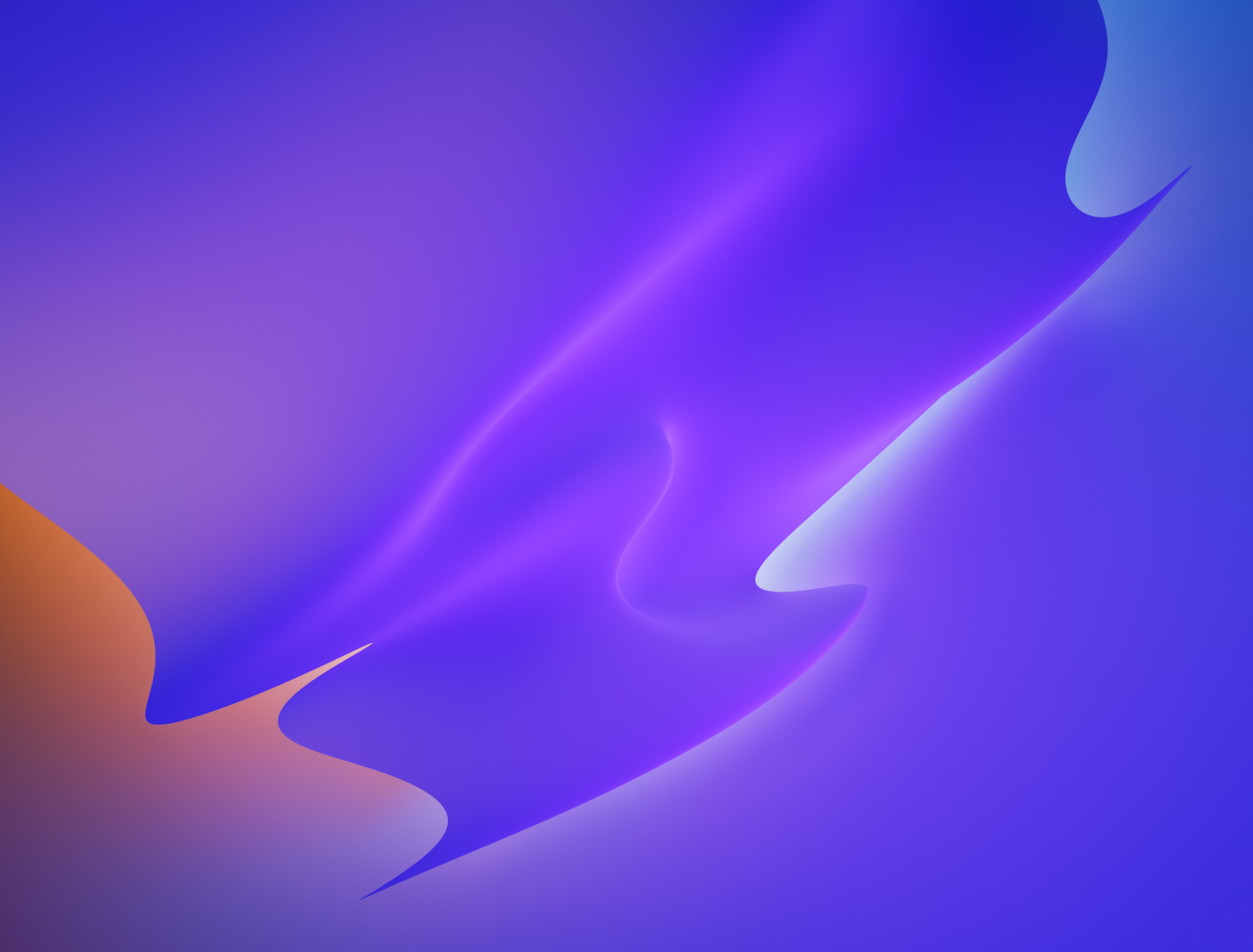
Reflected gradients can be used for backgrounds, images, text elements, and buttons – just like linear and radial gradients – but they look best when used in areas with larger amounts of white space so that their effect can easily stand out from the rest of the design.
Additionally, these gradients offer an accessibility boost for those with some forms of color blindness by helping them better differentiate between objects on the page.
Overall, angular and reflected gradients offer designers countless possibilities for creating stunning visuals without needing complex techniques such as shading, textures, or patterns.
With their eye-catching effects and easy implementation into any web design project, angular and reflected gradients are great tools for web designers looking to make their websites stand out from the competition!
Examples of How to Incorporate Gradients Into Your Design
Gradient Backgrounds
Background images are a great way to add visual interest and depth to any web design project. Gradient backgrounds can be used as images to create stunning visuals that draw the viewer’s attention, emphasizing their aesthetic appeal and functionality.
For example, linear and radial gradients can be used for backgrounds with multiple colors to create a beautiful blend of hues with no hard color transitions.
Due to their flexible nature, gradient backgrounds can easily be adjusted to fit various screen sizes and devices. When using gradients for backgrounds, it's important to choose the right colors that best suit your design needs.
Using a bright or dark color at the beginning or the end of your gradient will create contrast while allowing for a soft transition between each hue. Additionally, you’ll want to ensure enough contrast between the colors so that elements don’t get lost in the background.
Source: UX Planet

Angular and reflected gradients are also great options for background images. They can create interesting optical illusions by reflecting light and shadow across the design element.
Furthermore, these types of background gradients offer an accessibility boost by helping those with some forms of color blindness better differentiate between objects on the page.
Text Effects and Graphics
Gradients can also be used to create stunning text effects and graphics for any web design project. Linear and radial gradients are perfect for adding subtle color transitions between hues, allowing designers to give objects a gradient-like look without using complex techniques such as shading, textures, or patterns.
Angular gradients are especially useful for text effects and graphics; they use triangle or diamond shapes to create an eye-catching effect that transitions from one color to another.
When using angular gradients, it’s important to choose the right colors that best suit your design needs and place them at the corners of the shape so that the transition is seamless.
Reflected gradients can also add depth and detail to logos, icons, and other graphic elements on your page. These types of gradients feature two or more colors that “reflect” off each other to create a beautiful optical illusion; this technique is perfect for giving objects a three-dimensional look without needing complex 3D software.
Source: Dribble
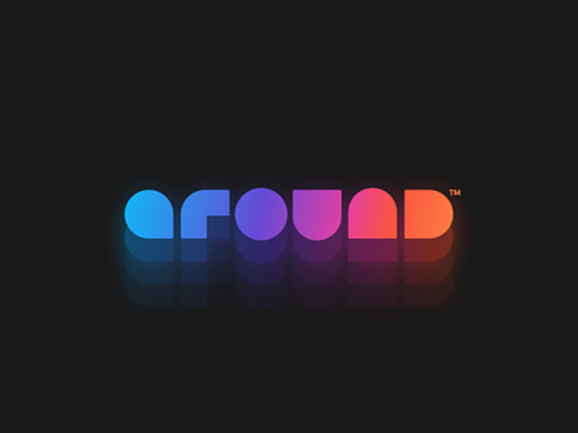
Furthermore, reflected gradients offer an accessibility boost by helping those with some forms of color blindness better differentiate between elements on the page.
In the Streetbeat project, gradients were employed in isometric illustrations to add depth and realism, making the visuals more immersive. These techniques help convey complex investment data clearly and engagingly, aligning with the brand's modern and dynamic identity.
Streetbeat Illustration System by Clay
Tips for Creating Compelling Designs With Gradients
Choose the Right Colors
When creating a gradient design, it is important to choose the right colors that best suit your needs. Choosing the wrong colors can make the design look flat and dull while choosing the right colors can create a stunning visual effect with an enhanced depth of color and contrast.
When selecting colors for a gradient, pick two or more hues that complement each other and work their way into shades of increasing or decreasing brightness as needed.
Additionally, you'll want to ensure enough contrast between the colors so that elements don't get lost in the background. This will help prevent any text from becoming illegible or objects from looking too similar.
Using warm colors such as reds and oranges in conjunction with cool hues such as blues can create an eye-catching effect when blended. Additionally, using bright or dark colors at the beginning or end of your gradient will create contrast while still allowing for a soft transition between each hue.
Source: MagicPattern on Unsplash

It’s also important to consider complementary gradients when choosing colors; these types of color gradients feature two sets of complementary hues (colors opposite each other on the color wheel) mixed to create a stunning visual effect.
Overall, understanding how to choose and mix various hues is key to creating compelling designs with gradients. However, remember that experimentation is also necessary to find the perfect combination of colors for any project! The best way to do this is by blending different palettes until you find something that works well for your needs.
Balance Brightness & Contrast
Balance is an important factor when creating stunning visuals with gradients. It's important to ensure that the colors used in a gradient transition from one to another smoothly, without too much contrast or brightness; otherwise, details and text can be lost in the background.
Additionally, using bright and dark colors at the beginning and end of a gradient color transition creates contrast while allowing for a softer transition between each hue.
Using complementary gradients can also help create a balance between hues. These gradients feature two sets of complementary hues (colors opposite each other on the color wheel) mixed to create a stunning visual effect.
Complementary gradients allow designers to draw attention to certain elements on their web pages while creating an eye-catching overall effect. Furthermore, when utilizing angular gradients, it’s important to place them at the shape's corners to make the transition seamless.
This will help ensure that all elements blend properly and look visually appealing. Reflected gradients also require careful placement since they use two or more colors that “reflect” off each other to create a beautiful optical illusion; likewise, choosing the right colors for this type of gradient effect is essential for creating effective designs.
Source: Awwwards
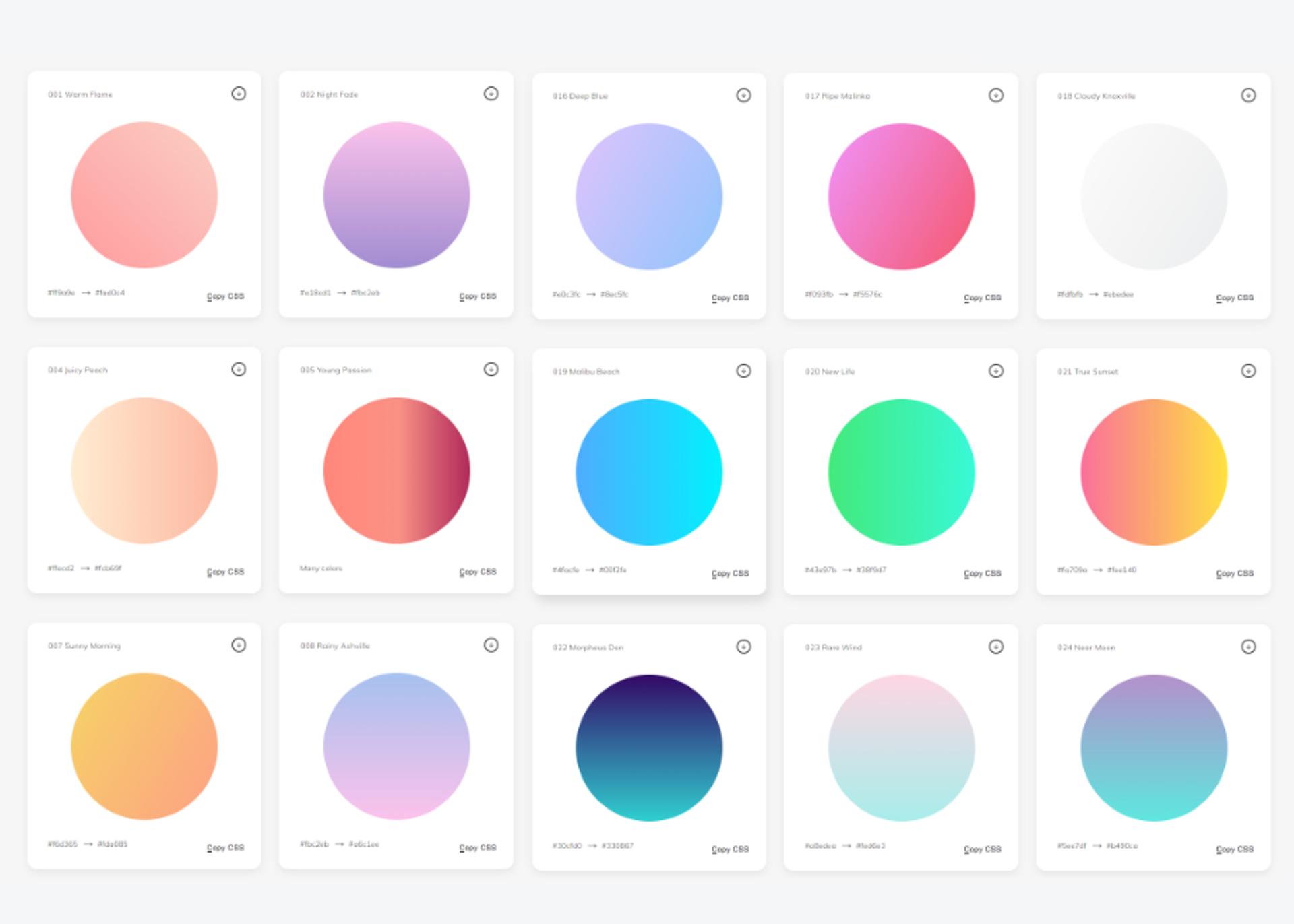
Overall, balancing brightness and contrast within your design plays an integral role in creating compelling visuals with gradients; by carefully choosing and mixing various hues and placing them within your design, you can ensure that all elements are visible and cohesive.
Furthermore, complementary gradients can further enhance a design project by allowing designers to draw attention to specific color points or areas of their webpage while maintaining the balance between colors!
Don’t Overuse Them
When using gradients in web design, it’s important to remember that too much of a good thing can quickly become overwhelming. Gradients can add a visual flair to any webpage, but when used excessively, they can make the page look busy and cluttered. Using one to two gradients per page at most is recommended, as anything more than that will likely overwhelm the viewer.
Additionally, when selecting colors for your gradient, try to choose colors that complement each other. This will help ensure all website elements flow nicely and don’t clash.
Furthermore, it’s also important to consider the positioning of gradients within a design. For example, angular gradients should be placed at the corners of a shape to create seamless transitions; reflected gradients should also be carefully placed since they rely on two or more colors “reflecting” off each other to create an optical illusion.
Source: Daniel Olah on Unsplash
Finally, it's advisable to adjust brightness and contrast accordingly; too much brightness or contrast can make text and objects illegible or difficult to distinguish. Overall, while gradients can be an effective tool for adding visual interest to a webpage design project, it’s important not to overuse them, as doing so can result in a cluttered and overwhelming appearance.
By understanding how to select the right colors and position them properly within your design projects, you can ensure your website looks visually appealing without appearing too cluttered or busy.
Accessibility Tips for Using Gradients in Web Design
Gradients bring visual depth and personality to a website, but to make them truly effective, accessibility must be part of the design process. Ensuring accessible gradients means balancing aesthetics and usability so everyone can enjoy the experience.
One key consideration is color contrast. Imagine a beautiful gradient background that flows from a deep blue to a light teal. This looks stunning, but when adding text on top, it’s essential to ensure it remains readable at every point.
The contrast between the gradient and text should be strong enough for users to distinguish the text clearly, especially for those with color vision impairments. Tools like WebAIM’s Contrast Checker are invaluable here, helping designers fine-tune their color choices to meet recommended contrast standards.
Saturation is another factor that influences accessibility. Highly saturated, intense colors can be visually overwhelming across larger page areas. A subtle, muted gradient may feel less dramatic but provides a friendlier background for reading and browsing. This is particularly important on pages with substantial text or where the user should focus on content rather than color.
It’s a good idea to provide alternative cues for interactive elements like buttons or icons. Gradients alone can sometimes blur an element’s purpose, especially if the gradient is soft or subtle.
Adding a distinct icon or an underline to a gradient button can make it easier for all users to understand its function immediately. This way, even if users don’t perceive the gradient color fully, they still receive visual hints about what to click or tap.
Testing gradients across different devices and accessibility tools can reveal how well the design works for a diverse audience. Gradients might look beautiful on a high-resolution desktop, but the same design could lose clarity on a mobile device.
And while screen readers won’t interpret colors, gradients on important elements should still be navigable for users relying on voice or keyboard commands. Consistent testing ensures that gradients retain their accessibility across all platforms.
Finally, consider where gradients are best suited. Using them as accents rather than overlays can prevent any loss of clarity. For instance, gradients on the edges of a card or as dividers between sections can create a smooth, modern look without overshadowing the main content. Gradients should enhance the experience, not overpower it.
With these mindful choices, gradients can add elegance and inclusivity, creating a visually striking design that’s accessible and enjoyable for everyone.
Read more
Conclusion
In conclusion, gradients can be an effective tool for adding visual interest to web design projects. However, it’s important to remember that too much of a good thing can quickly become overwhelming; when using gradients in your designs, you should strive for balance and use no more than one or two per page.
Additionally, it is essential to choose colors that complement each other and adjust the color palette contrast and brightness accordingly so that all elements are visible and cohesive within the design. Understanding how to select the right hues and place them carefully within your project will ensure all elements flow together nicely without creating a cluttered look.


About Clay
Clay is a UI/UX design & branding agency in San Francisco. We team up with startups and leading brands to create transformative digital experience. Clients: Facebook, Slack, Google, Amazon, Credit Karma, Zenefits, etc.
Learn more

About Clay
Clay is a UI/UX design & branding agency in San Francisco. We team up with startups and leading brands to create transformative digital experience. Clients: Facebook, Slack, Google, Amazon, Credit Karma, Zenefits, etc.
Learn more