User interface (UI) design is critical to creating successful digital products, whether websites, mobile apps, or software applications. UI elements are the fundamental components that designers use to build intuitive, engaging, and visually appealing interfaces.
A deep understanding of UI elements and their best practices is essential for designing user-friendly interfaces that efficiently guide users through their interactions. This comprehensive guide will dive into the most common and important UI elements, discussing their roles, use cases, and design considerations.
Input UI Components
Input elements are crucial for collecting data from users and enabling them to interact with the system. When designing input elements, consider the type of input field, collected data, and the most appropriate input method.
Let's explore some common input elements in more detail and look at real-life examples of input fields and their implementation.
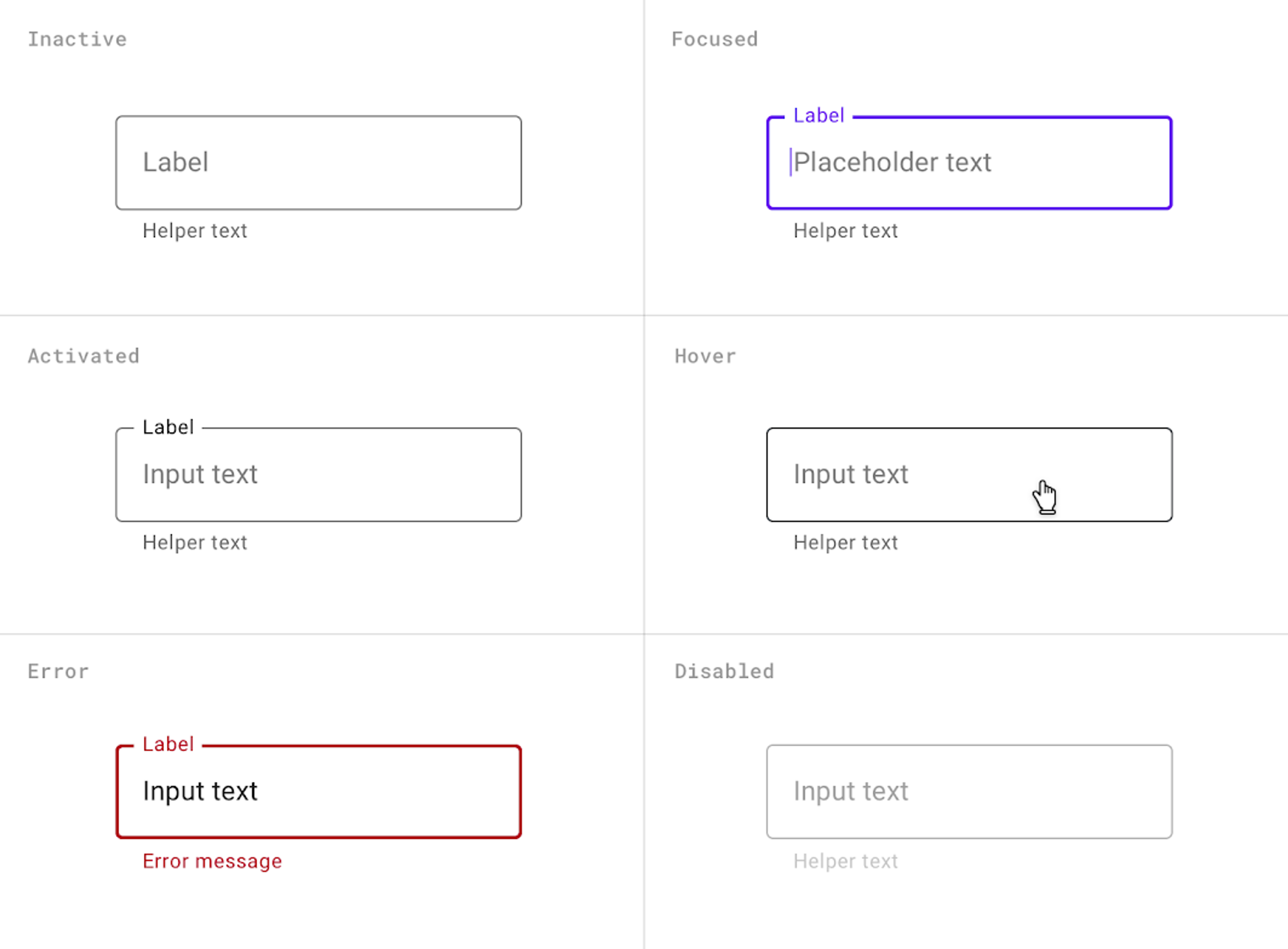
Text fields and text areas are the most basic input elements, allowing users to enter alphanumeric data. They are widely used to capture names, addresses, comments, or search queries. Google's search bar is a prominent text field that allows users to enter their search queries.
Best practices:
- Clearly label text fields to indicate the expected input.
- Use placeholder text to provide examples or hints.
- Validate user input and provide real-time feedback.
- Ensure proper keyboard support and allow for easy navigation between fields.
Source: Material Design
Checkboxes and radio buttons allow users to select one or multiple options from a predefined set of choices. Online surveys often use checkboxes to allow users to select multiple answers, such as "What are your favorite hobbies?" with options like reading, sports, music, etc.
Best practices:
- Use checkboxes when multiple selections are allowed and radio buttons when only one is permitted.
- Clearly label each option and ensure the labels are clickable.
- Group related options together and provide a logical order.
- Consider using toggle switches for binary options (e.g., on/off) to provide a more intuitive interaction.
Source: Terra Design System

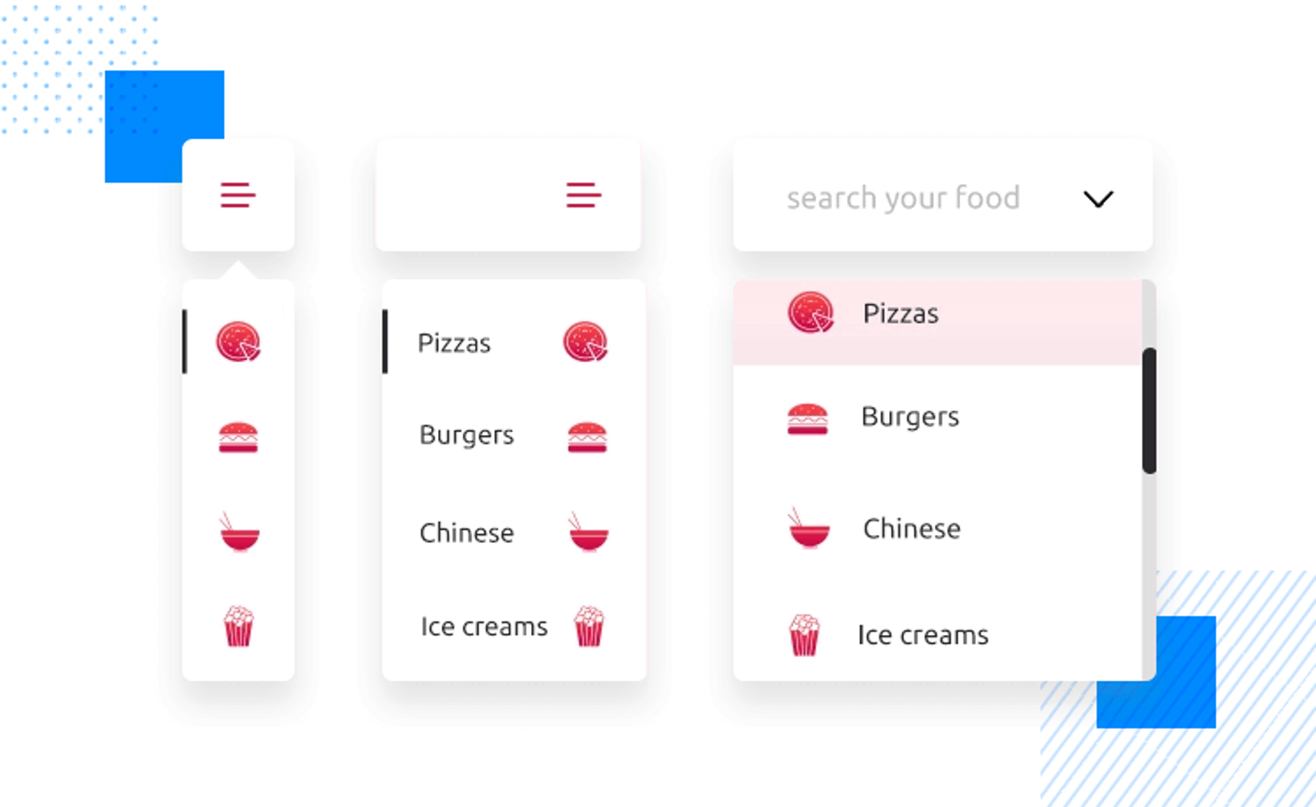
Dropdown menus and select boxes allow users to choose from a list of predefined options, conserving screen space compared to displaying all options simultaneously. E-commerce websites like Amazon use dropdown menus to sort products by price, popularity, or relevance.
Best practices:
- Use clear and concise labels for the dropdown or select box.
- Ensure the options are logically grouped and ordered.
- Provide a default selection when appropriate.
- Consider using autocomplete functionality to enhance usability for large option sets.
Source: Justinmind
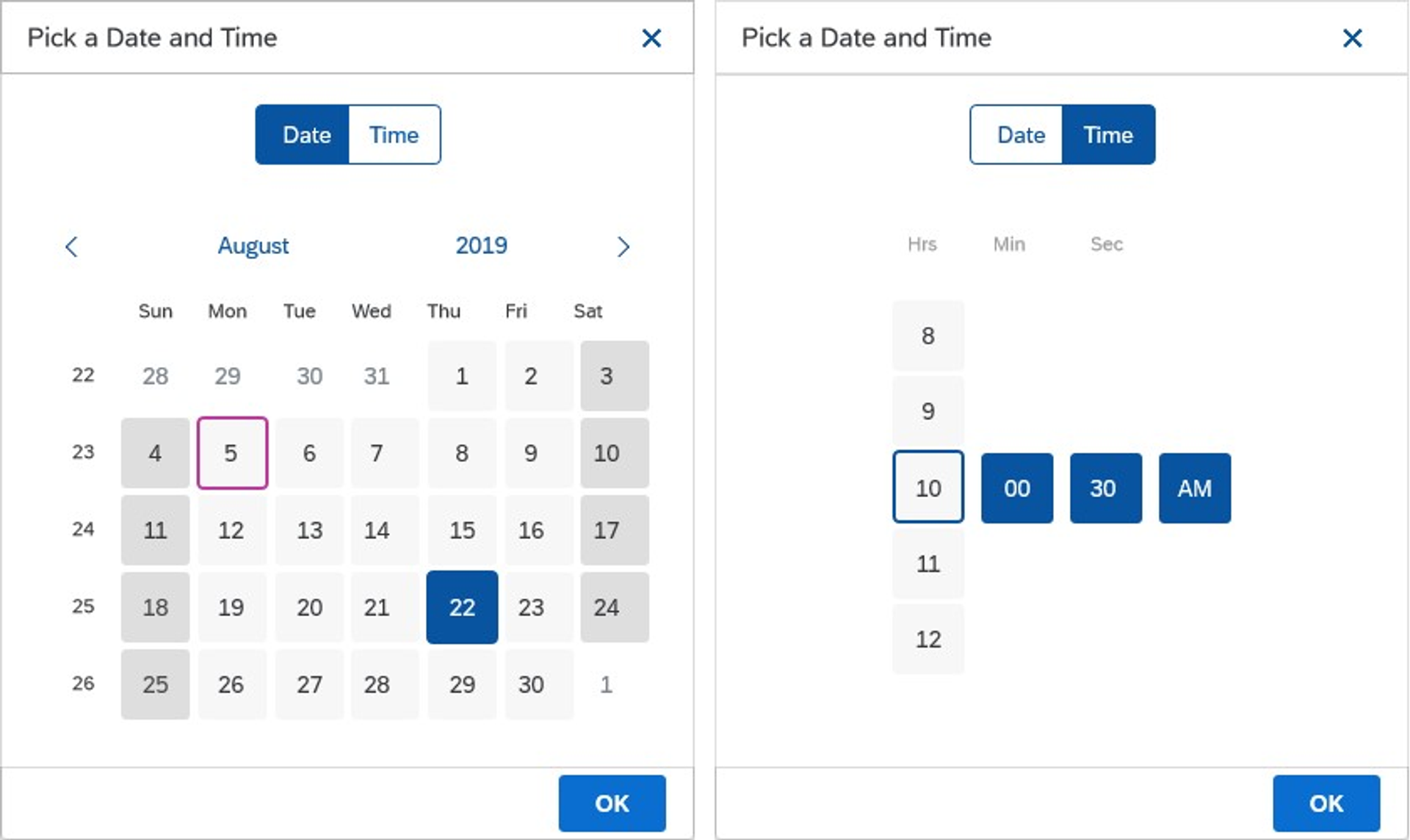
Date and time pickers allow users to select a specific date or time using a graphical interface, minimizing the risk of invalid or inconsistent input. Project management tools like Asana or Trello use date pickers to assign tasks due dates.
Best practices:
- Use a clear and intuitive design that aligns with the platform's standards (e.g., iOS or Android).
- Allow for easy navigation between months or years.
- Provide options for selecting different date formats or time zones when relevant.
- Consider integrating with the device's native date and time pickers for a seamless experience.
Source: SAP
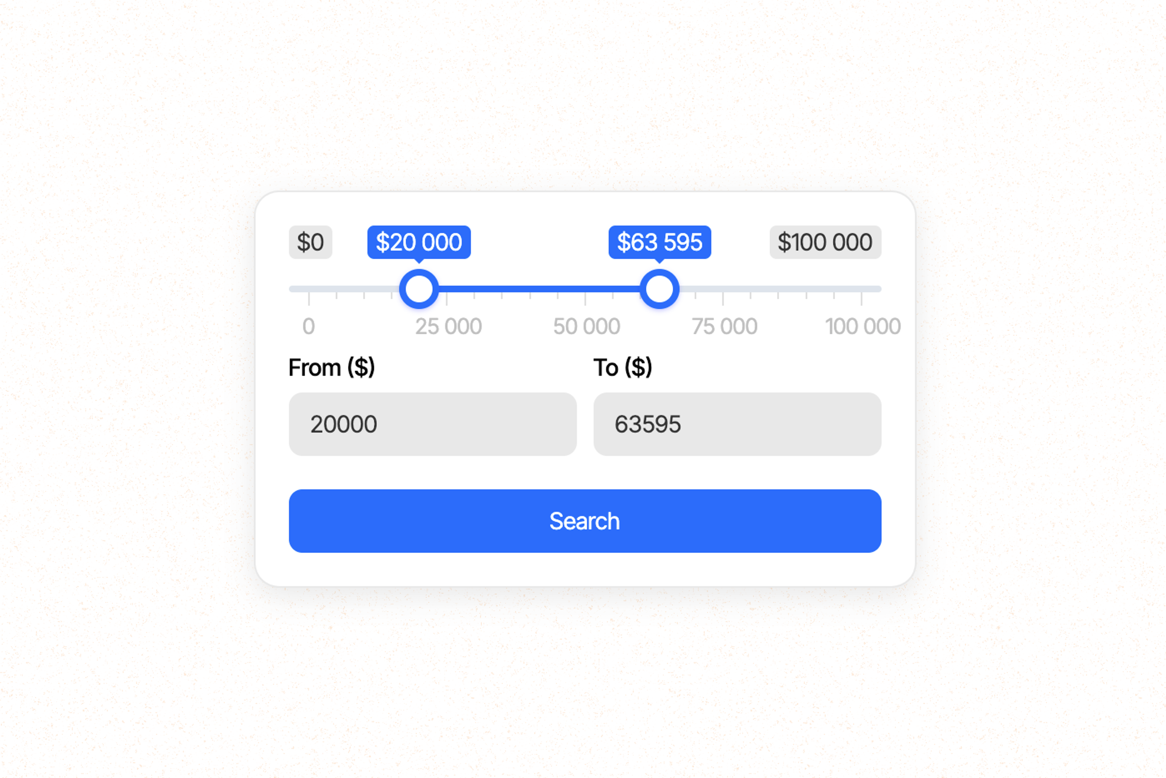
Sliders and range inputs allow users to select a value from a continuous range by dragging a handle along a track. Media players like YouTube or Spotify use sliders to adjust the volume or select a specific point in a video or audio track.
Best practices:
- Clearly label the minimum and maximum values of the range.
- Provide visual feedback on the selected value, such as displaying the numeric value or updating a preview in real-time.
- Ensure the slider is responsive and provides a smooth dragging experience.
- Use stepped sliders when discrete values are more appropriate than a continuous range.
Source: Webflow
Output UI Elements
Output elements provide feedback to users based on their actions or system statuses. They help keep users informed and enhance the overall user experience.
Any output component is a crucial UI element that provides users with information, feedback, and results based on their interactions or system processes. Effective output elements keep users informed, guide their actions, and enhance the user experience. Let's explore some common output elements in detail and examine real-life examples of their implementation.
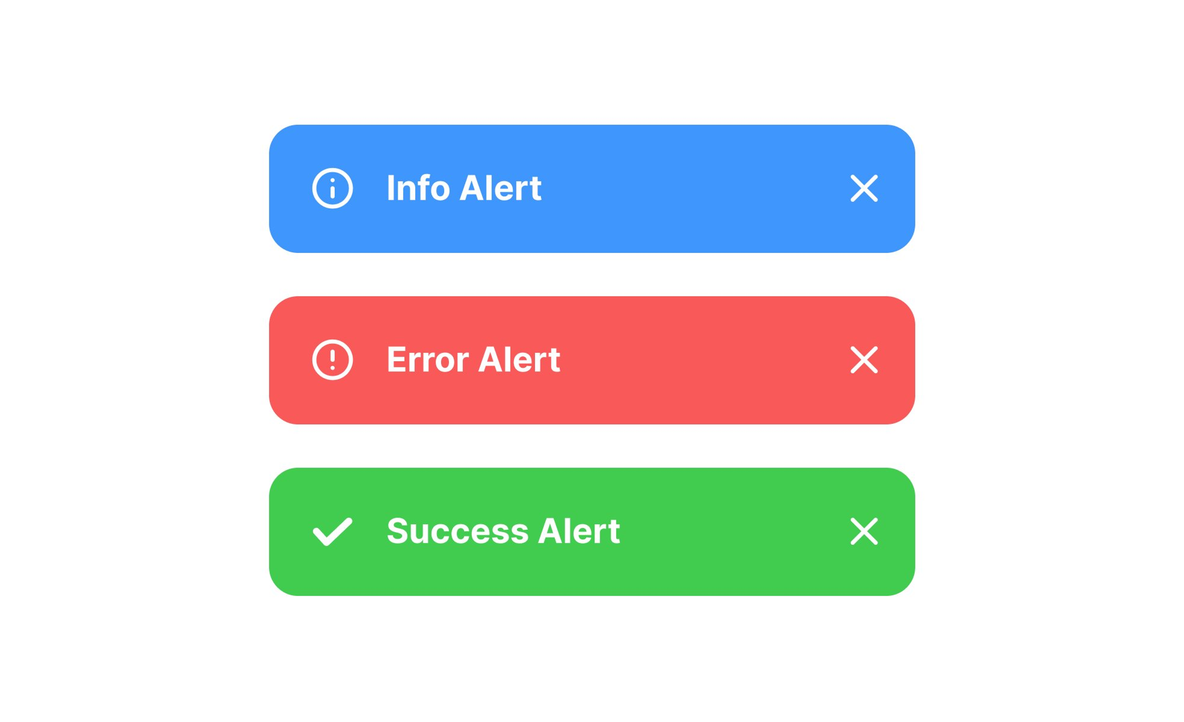
Alerts and notifications inform users about important events, errors, or system status changes. They grab the user's attention and convey crucial information. Social media platforms like Facebook or Twitter use notifications to alert users about new messages, friend requests, or mentions.
Best practices:
- Use clear and concise language to convey the message effectively.
- Use distinct colors or icons to differentiate between different types of alerts (e.g., success, warning, error).
- When appropriate, provide actionable options within the alert, such as "Retry" or "Dismiss."
- Allow users to customize their notification preferences to avoid overwhelming them.
Source: Uxcel
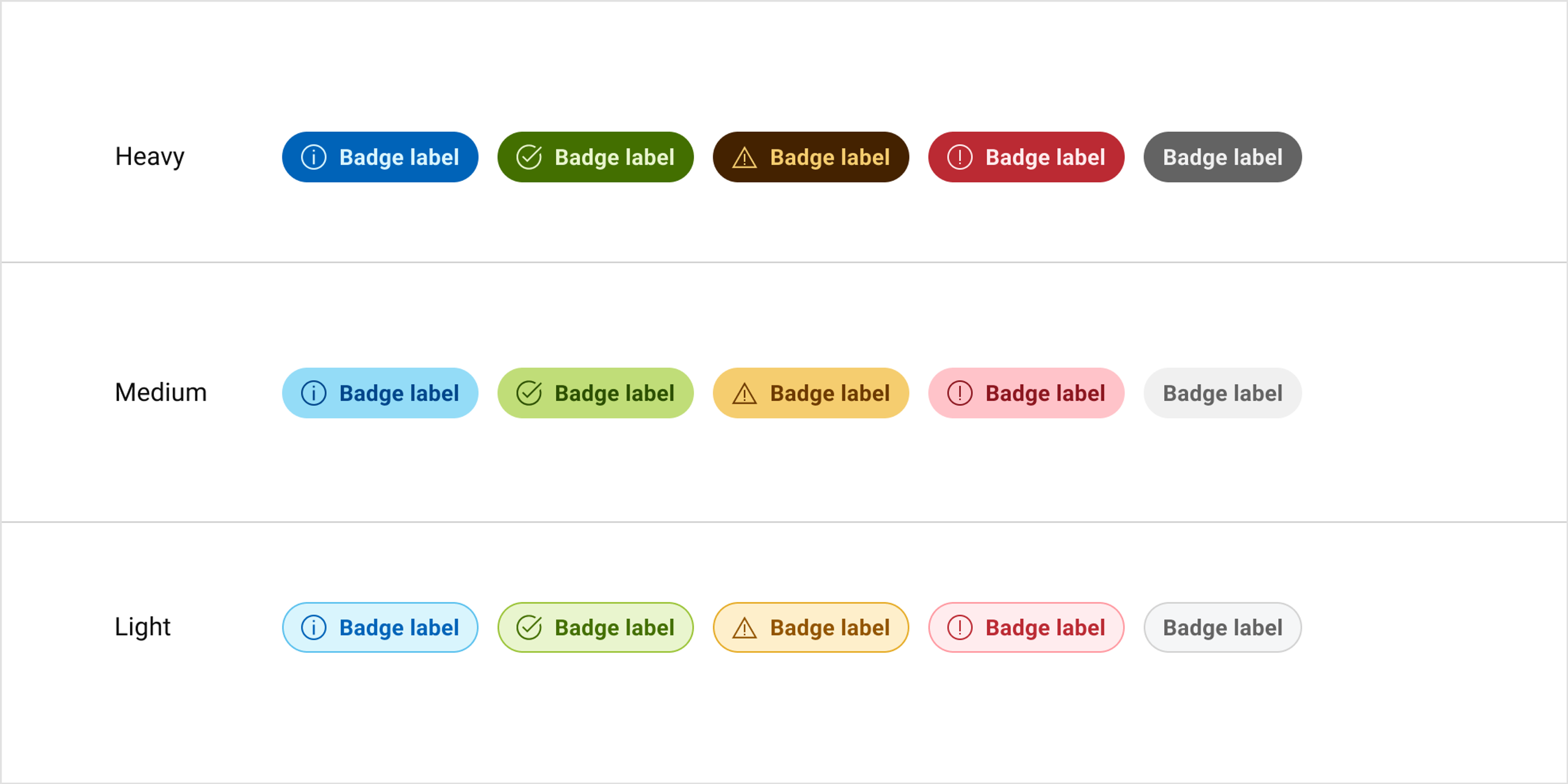
Badges and labels are small visual indicators that convey status, counts, or additional information about an element. E-commerce websites like Amazon use badges to highlight product features, such as "Best Seller" or "Limited Stock."
Best practices:
- Use badges and labels sparingly to avoid visual clutter.
- Ensure the information conveyed is relevant and valuable to the user.
- Place badges and labels near the associated element.
- Use clear and concise text or icons to communicate the intended meaning.
Source: Dell
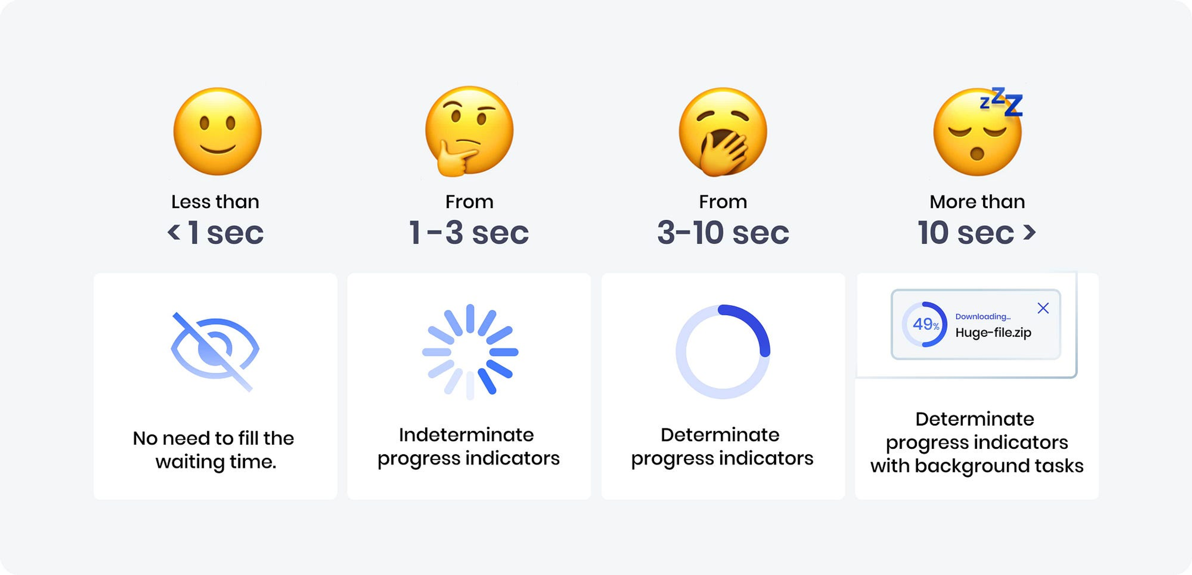
Progress indicators and loading spinners provide visual feedback to users about ongoing processes or loading states. File upload interfaces often use progress bars to show the upload progress and remaining time.
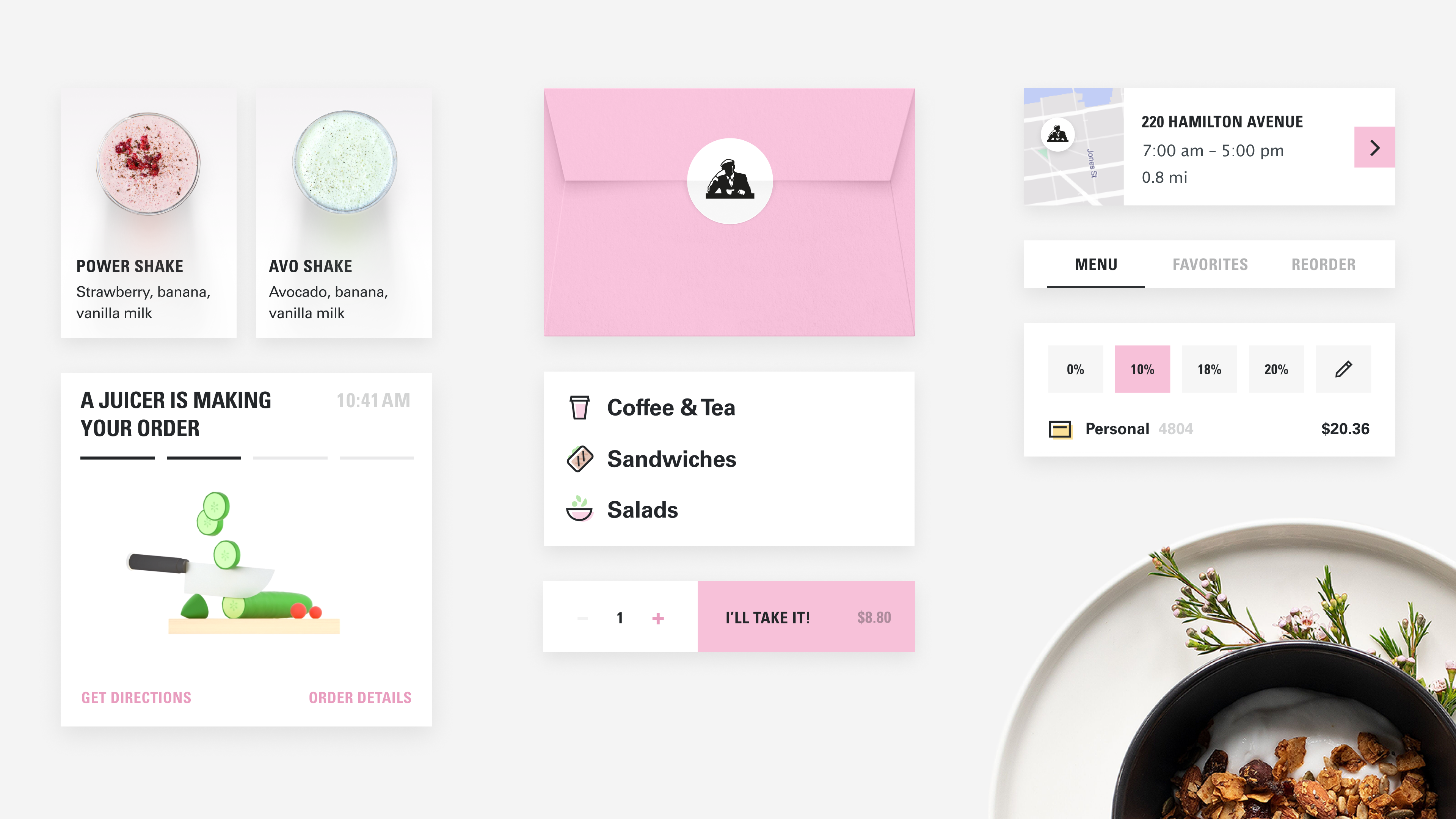
In our collaboration with Joe & The Juice, we focused on improving the digital experience by implementing effective progress indicators and loading counters. These visual feedback tools inform users of ongoing processes, showing progress via percentages or visual completions.
Now, while customers are waiting for pickup or delivery, they are shown an animation illustrating the current stage of their order. We focused on best practices, including using engaging style and animation and providing additional information such as estimated time remaining. This approach resulted in a smoother and more engaging user experience.
Joe & The Juice Elements by Clay
Best practices:
- Use progress indicators for tasks that take over a few seconds to complete.
- Provide a clear indication of the progress, such as a percentage or a visual fill.
- Use appropriate styling and animations to make the progress indicator visually appealing and engaging.
- Consider providing additional information, such as estimated time remaining or current status.
Source: UX Collective
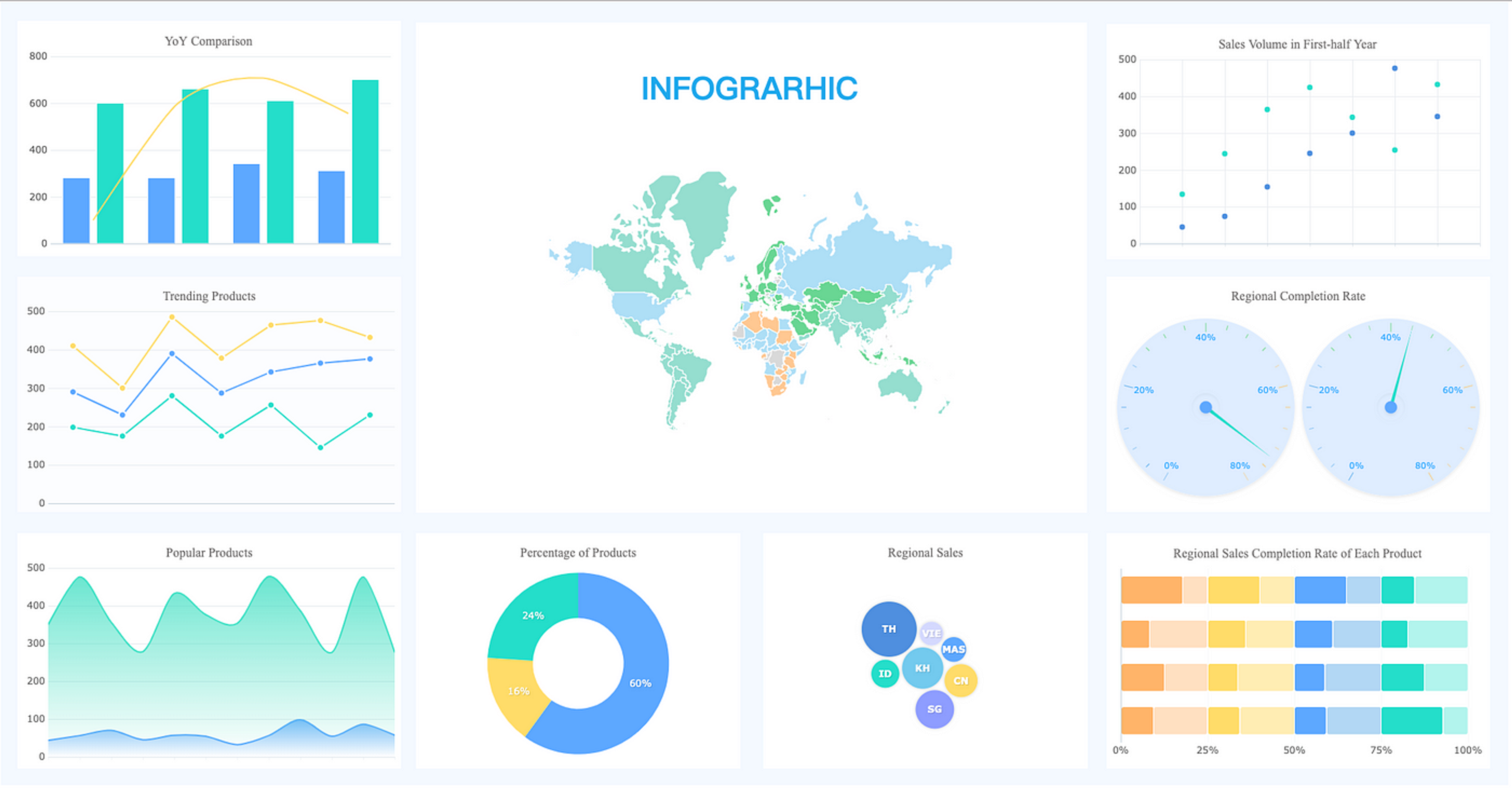
Data visualization and charts present complex information visually and meaningfully. Financial websites like Yahoo Finance use candlestick charts to display stock price movements.
Best practices:
- Choose the appropriate chart type based on the nature of the data and the insights you want to convey.
- Use clear and concise labels, legends, and axis titles to aid understanding.
- Ensure the data is accurate, up-to-date, and properly formatted.
- When appropriate, allow for interactivity, such as zooming, filtering, or hovering for additional details.
Source: UX Planet
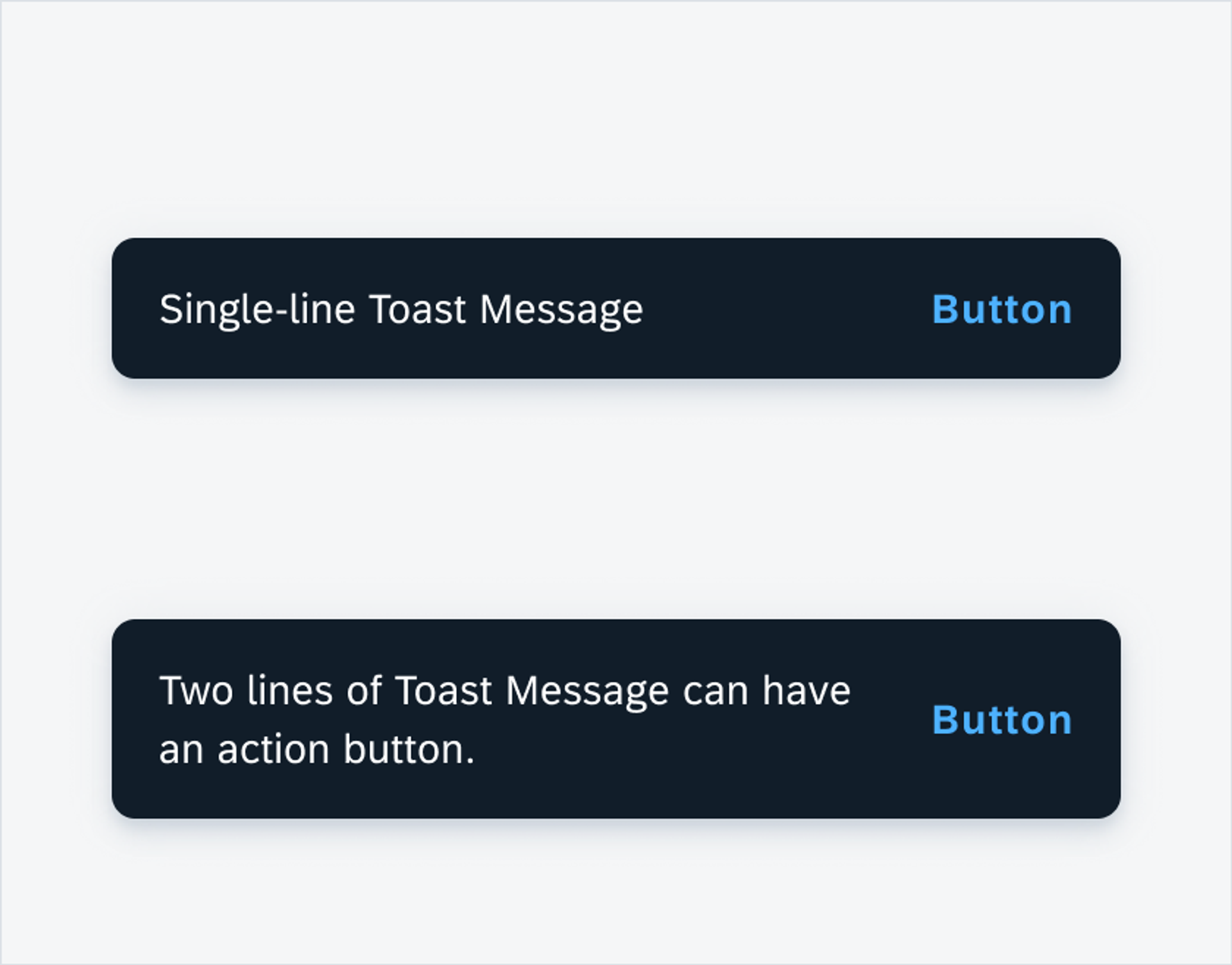
Toasts and snack bars are lightweight, non-intrusive pop-up messages that appear briefly to provide quick feedback or information to users. Google Drive displays a toast message when a file is successfully uploaded or shared.
Best practices:
- Keep the message concise and easily readable.
- Use appropriate colors and icons to convey the message type (e.g., success, warning, info).
- Ensure the toast or snack bar doesn't obstruct important content or interfere with user interactions.
- Provide an option to dismiss the message manually if needed.
Source: SAP
Navigational Components
Navigation elements are essential components of user interfaces that allow users to explore, access, and move between different sections or pages of a website or application. Well-designed navigation elements provide a clear and intuitive structure, making it easy for users to find the information they need and accomplish their goals. Let's explore some common navigation elements and real-life examples of their implementation.
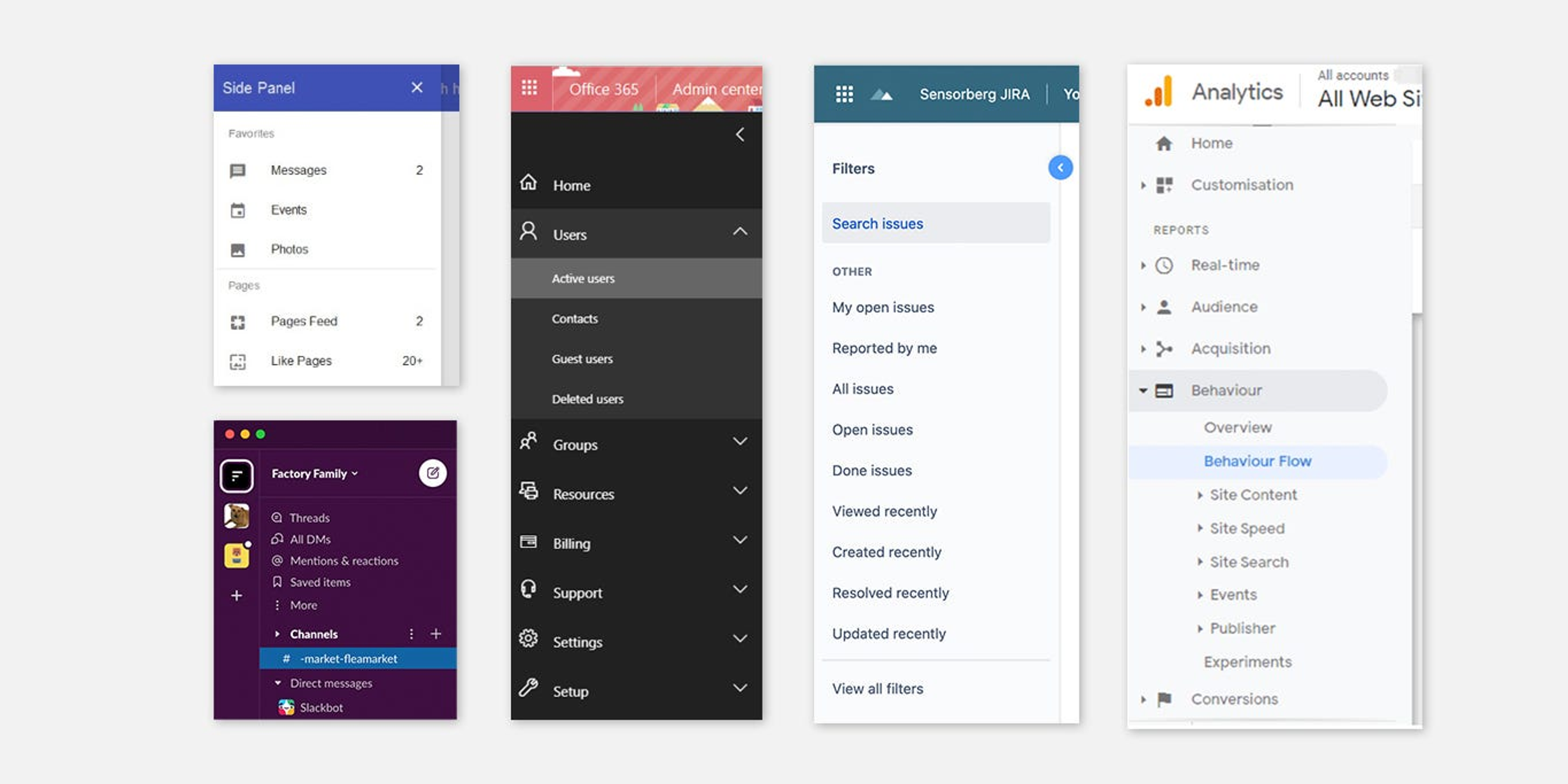
Navigation menus are the primary way to navigate a website or application. They typically appear at the top or side of the interface and contain links to main sections or pages. News websites like CNN or BBC use navigation menus to provide access to different news sections, such as "World," "Business," or "Sports."
Best practices:
- Use clear and descriptive labels for menu items to facilitate understanding.
- Organize menu items logically and group related items together.
- Limit the number of top-level menu items to avoid overwhelming users.
- Use drop-down menus or mega menus for subcategories or additional options.
- Ensure the navigation menu is responsive and adapts to different screen sizes.
Source: Medium
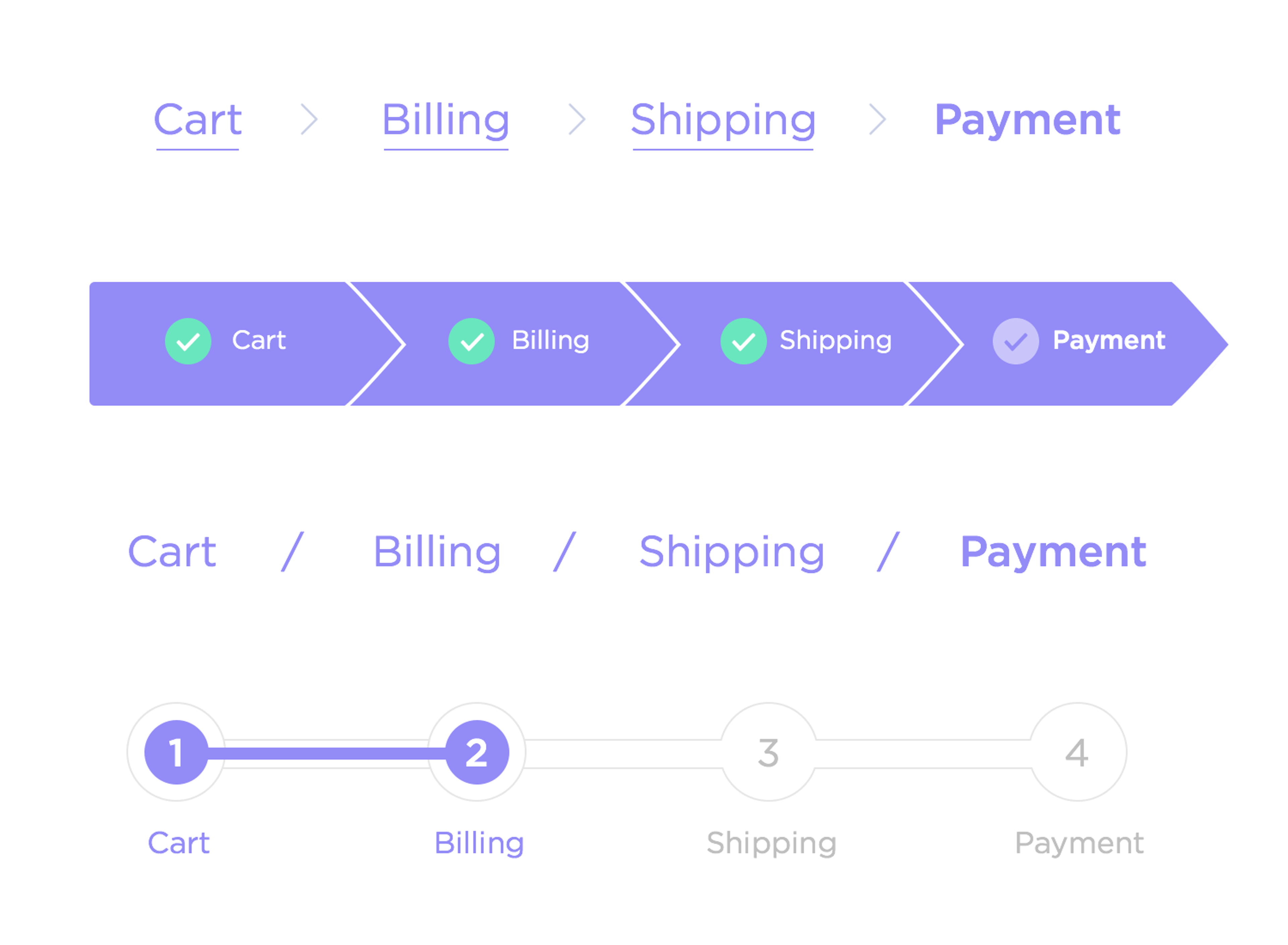
Breadcrumbs are a secondary navigation element that shows the user's current location within the website's hierarchy. They typically appear near the top of the page and provide links to parent or ancestor pages. File explorers in operating systems like Windows or macOS use breadcrumbs to show the directory path, allowing users to navigate back to parent folders.
Best practices:
- Use a clear and consistent separator between breadcrumb levels (e.g., ">" or "/").
- Provide links to each level of the hierarchy to allow easy navigation.
- Keep breadcrumbs concise and avoid excessive levels to maintain readability.
- Place breadcrumbs in a prominent location, typically near the top of the page.
Source: Justinmind
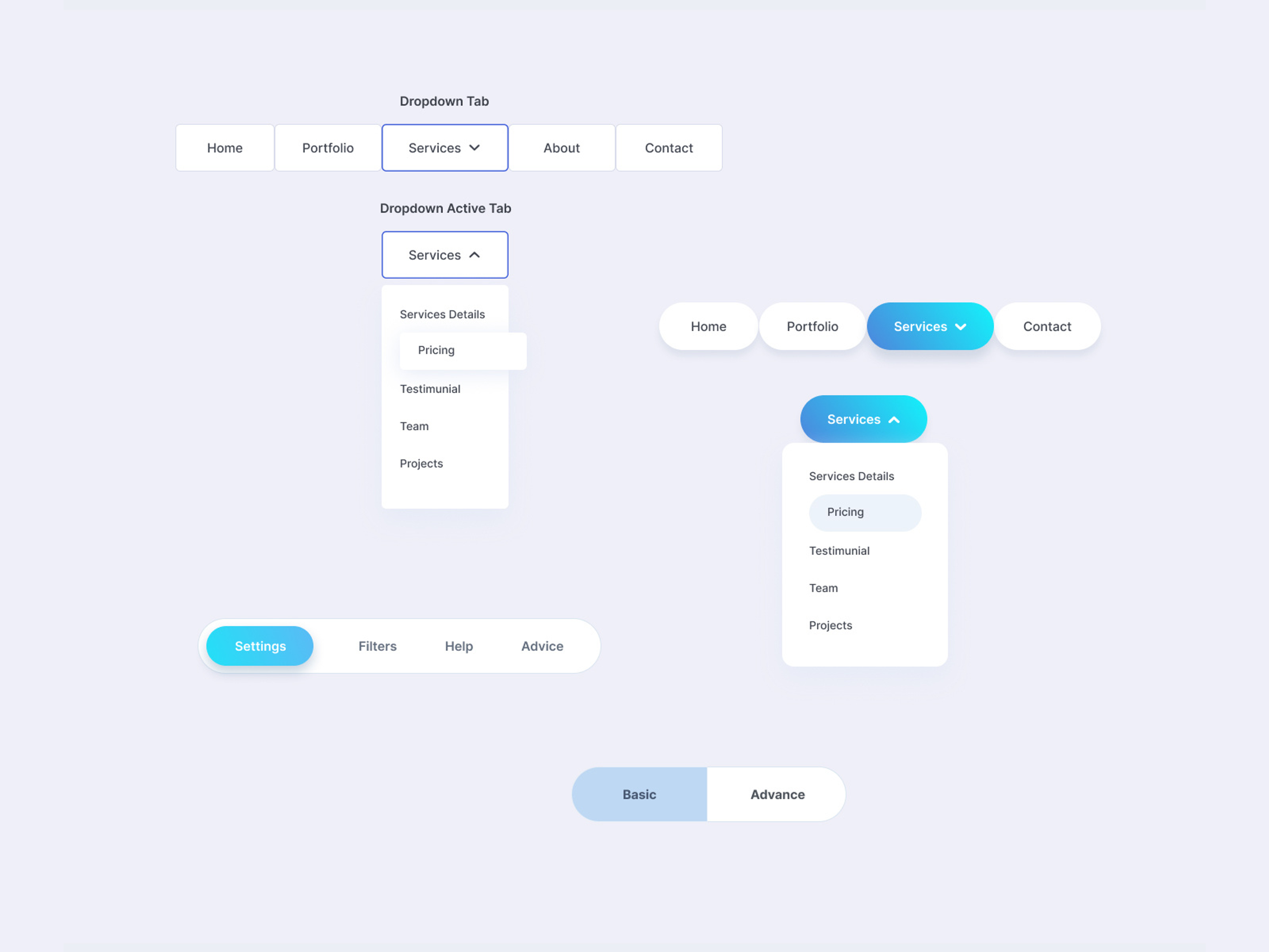
Tabs organize and switch between sections or views within a single page or interface. Web browsers like Google Chrome or Mozilla Firefox use tabs to allow users to switch between multiple web pages within a single window.
Best practices:
- Use clear and concise labels for tab titles to indicate the content or functionality.
- Ensure the active tab is visually distinguished from inactive tabs.
- Provide smooth transitions or animations when switching between tabs to enhance the user experience.
- Consider using icons or visual indicators along with text labels to aid comprehension.
Source: Dribbble
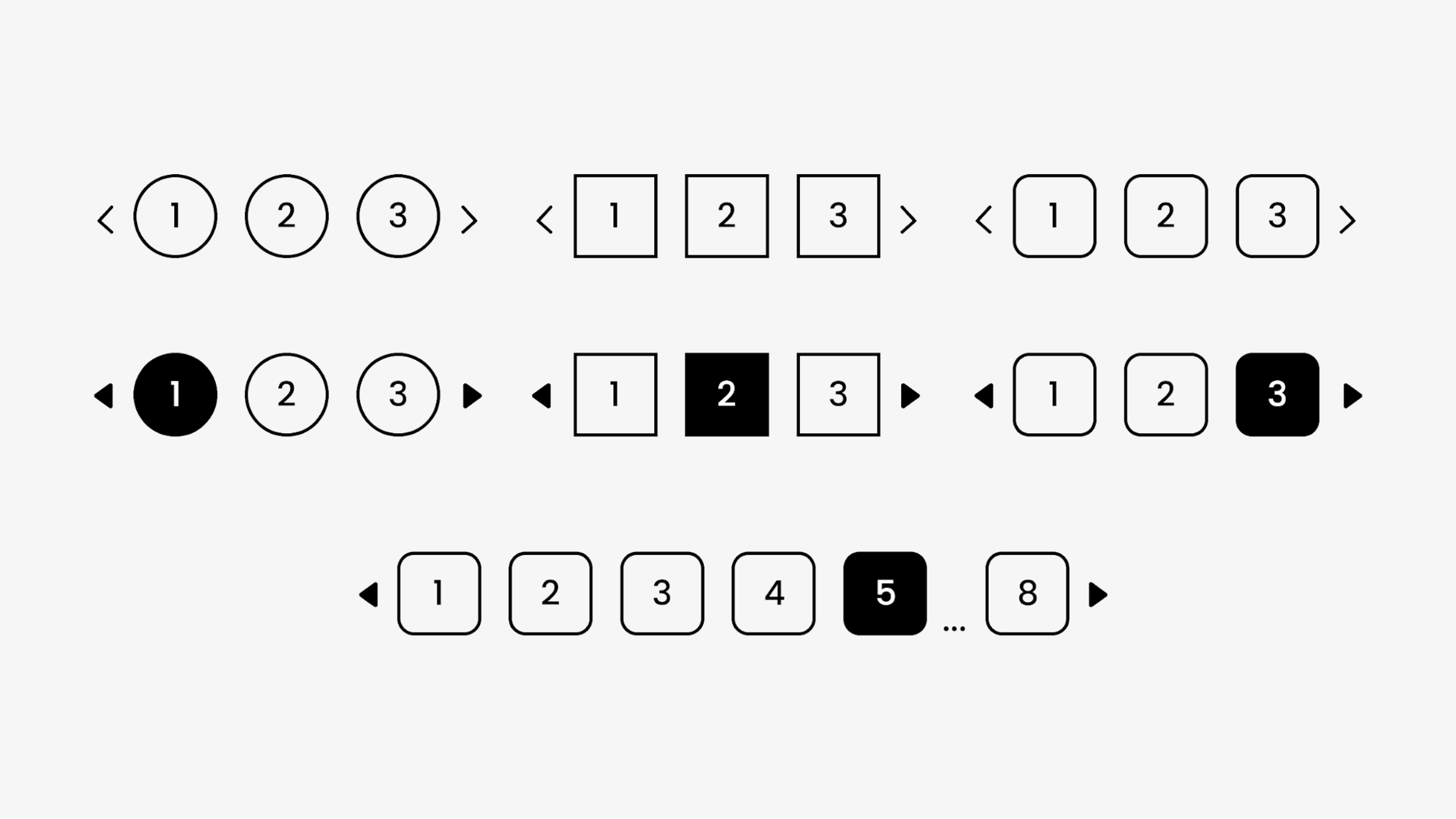
Pagination divides large content sets or search results into smaller, manageable pages. It allows users to navigate through the content by moving between pages. Search engines like Google or Bing use pagination to display search results across multiple pages.
Best practices:
- Provide clear navigation controls, such as "Previous," "Next," or page numbers.
- Display the current page number and total number of pages for context.
- Allow users to adjust the number of items per page when appropriate.
- Ensure the pagination controls are easily accessible and visible.
Source: Think360
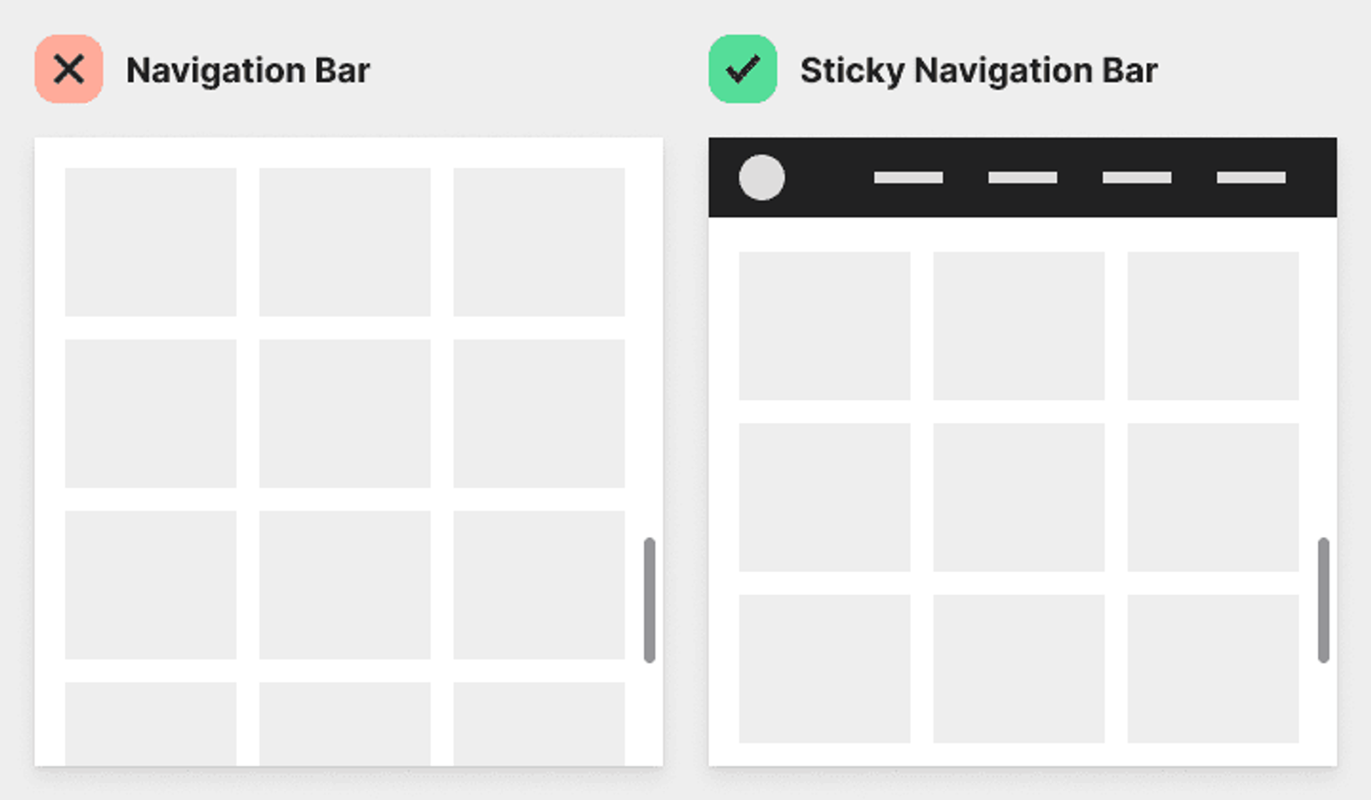
Sticky or fixed navigation refers to navigation elements that remain visible and accessible as the user scrolls through the page. E-commerce websites may use sticky "Add to Cart" or "Buy Now" buttons to encourage conversions throughout the product page.
Best practices:
- Ensure the sticky navigation does not obstruct important content or interfere with user interactions.
- A subtle visual cue or animation indicates the navigation's fixed position.
- Provide a way to dismiss or minimize the sticky navigation if needed.
- Optimize the sticky navigation for different screen sizes and devices.
Source: UX Movement
These are a few examples of navigation elements commonly used in user interfaces. Each element guides users through the interface and facilitates easy access to desired content or functionality.
Informational Elements
Informational elements are UI components that provide users with relevant information, guidance, or context to help them understand and interact with the interface effectively. These elements are crucial in communicating important details, providing instructions, or offering additional insights to enhance the user experience. Let's explore some common informational design elements and examine real-life implementation examples.
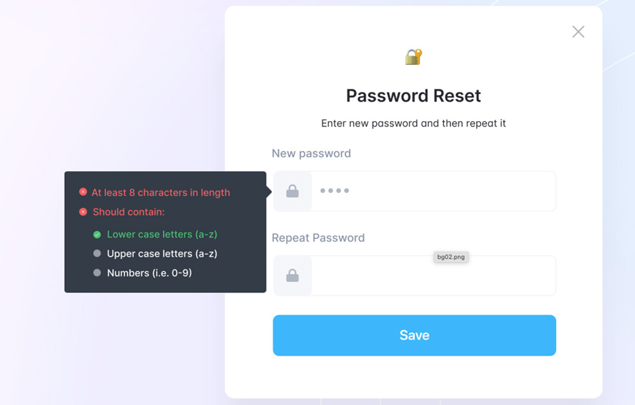
Tooltips are small, informative messages that appear when a user hovers over or focuses on a specific element. They provide additional context or explanations without cluttering the interface. Web forms often use tooltips to guide input formats or requirements, such as "Enter a valid email address" or "Password must contain at least 8 characters."
Best practices:
- Keep the tooltip text concise and clear, focusing on essential information.
- Use a consistent style and placement for tooltips throughout the interface.
- Ensure tooltips are accessible via keyboard navigation and screen readers.
- Avoid using tooltips for critical information that should be visible by default.
Source: UX Pin
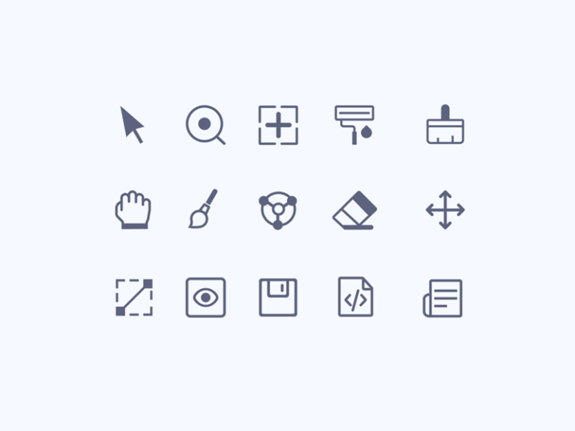
Icons are visual symbols or graphical representations used to convey meaning or functionality quickly and intuitively. Mobile apps use icons to represent different actions or features, such as a camera icon for capturing photos or a magnifying glass icon for search functionality.
Best practices:
- Choose clear, recognizable, consistent icons with the interface's visual language.
- Use icons that are familiar to users and align with common conventions or metaphors.
- Provide text labels or tooltips for icons that may be ambiguous or unfamiliar to users.
- Ensure icons are scalable and maintain clarity across different sizes and resolutions.
Source: UI Garage
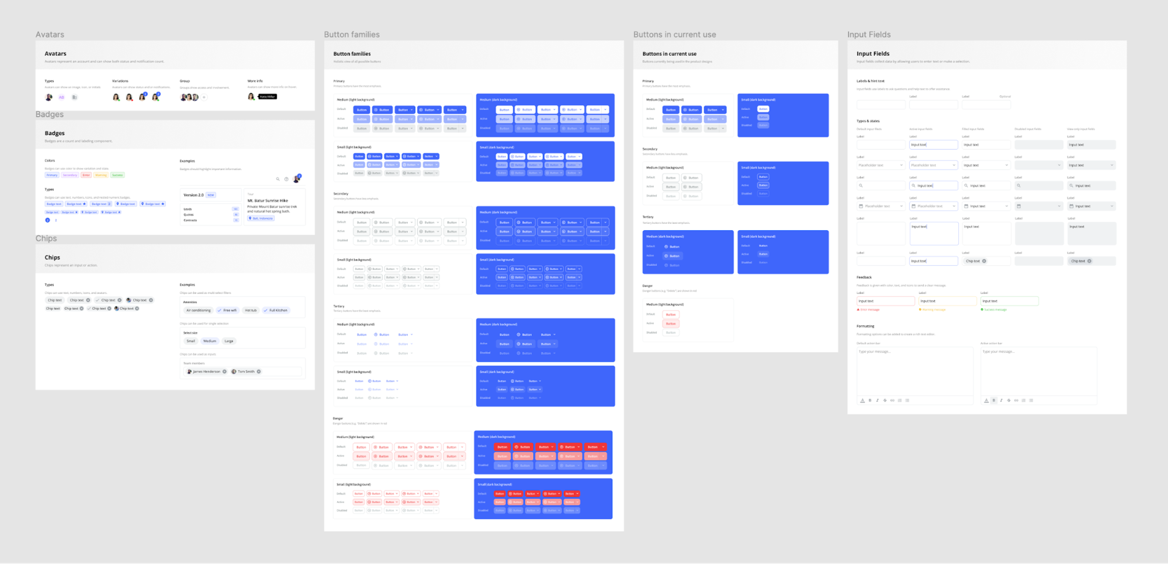
Help and documentation elements provide users with detailed information, instructions, or troubleshooting guides to assist them in using the interface effectively. Websites may provide FAQs (Frequently Asked Questions) sections to address common user queries or concerns.
Best practices:
- Organize help content into clear categories or sections for easy navigation.
- Use plain language and avoid technical jargon to make the content accessible to a wide audience.
- Provide step-by-step instructions or visual aids when explaining complex processes.
- Make help content searchable and easily accessible from relevant parts of the interface.
Source: UI Prep
Empty states are screens or messages that appear when no data or content is displayed. They provide guidance or suggestions to users on how to populate the interface. Social media platforms like Facebook or Instagram show empty state screens when a user's feed or profile has no posts, prompting them to create or share content.
Best practices:
- Use friendly and encouraging language to guide users towards taking action.
- Provide clear instructions or calls to action to help users populate the interface.
- Use visually appealing illustrations or graphics to make the empty state engaging and less intimidating.
- Offer helpful suggestions or tips to inspire users and facilitate content creation.
Source: UINKITS

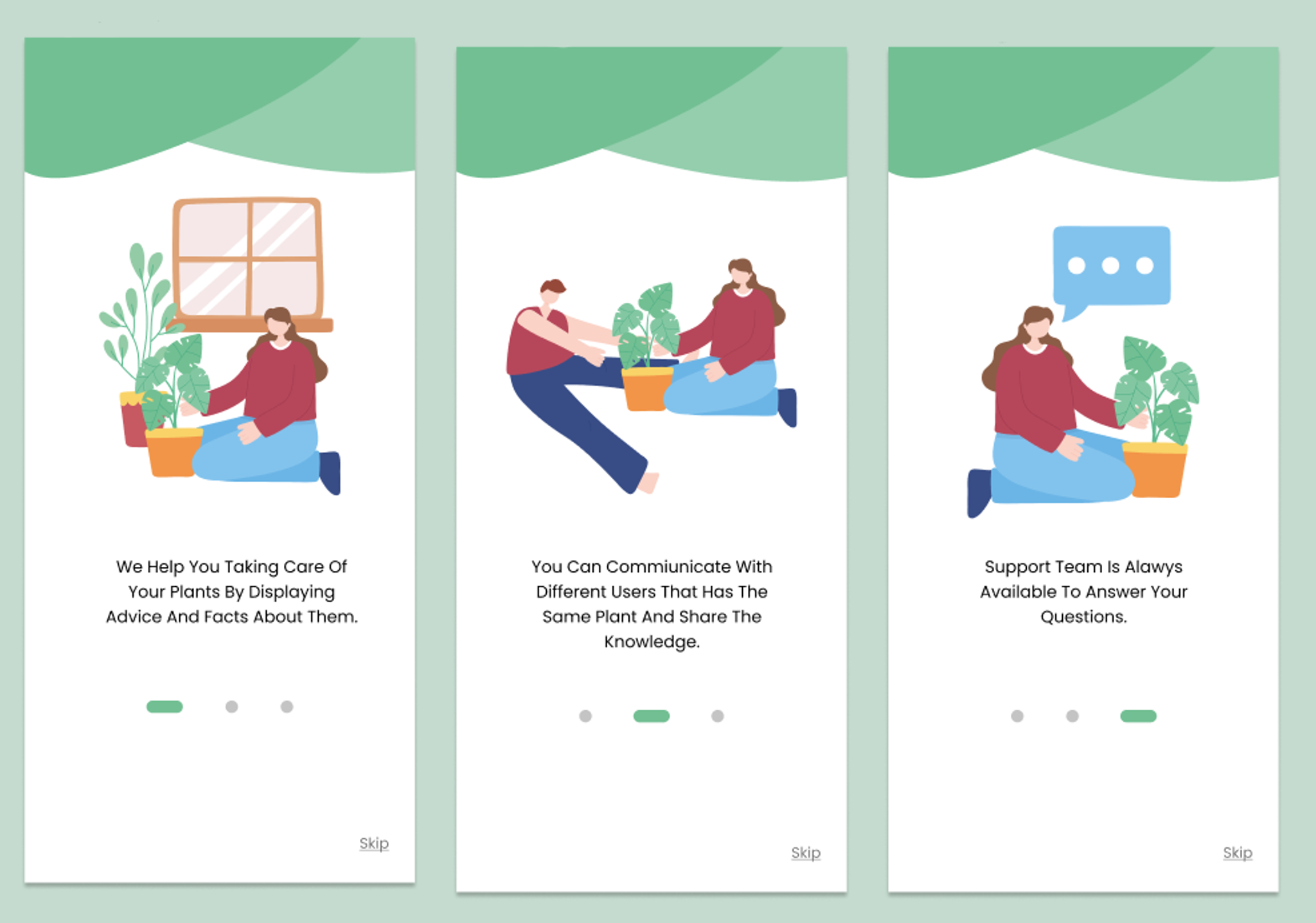
Onboarding and tutorial elements are designed to introduce users to the interface, guide them through key features, and help them get started quickly. Design or coding platforms like Figma or Codecademy use onboarding flows to guide users through the initial setup process and introduce essential tools or concepts.
Best practices:
- Keep onboarding content concise and focused on the most important features or benefits.
- Use a combination of text, visuals, and interactive elements to engage users and facilitate learning.
- Provide options to skip or dismiss onboarding content for experienced users.
- Break down complex workflows into smaller, manageable steps to avoid overwhelming users.
- Offer ongoing support or resources for users who need additional guidance beyond the initial onboarding.
Source: Bootcamp
These are just a few examples of informational elements commonly used in user interfaces. Each element provides users with the necessary information, guidance, or context to interact with the interface effectively.
Container Elements
Container elements are UI components that organize related content, controls, or other UI elements within an interface. They are crucial in structuring the layout, establishing visual element hierarchy, and promoting a clear and intuitive user experience. Let's explore some common container elements and examine real-life implementation examples.
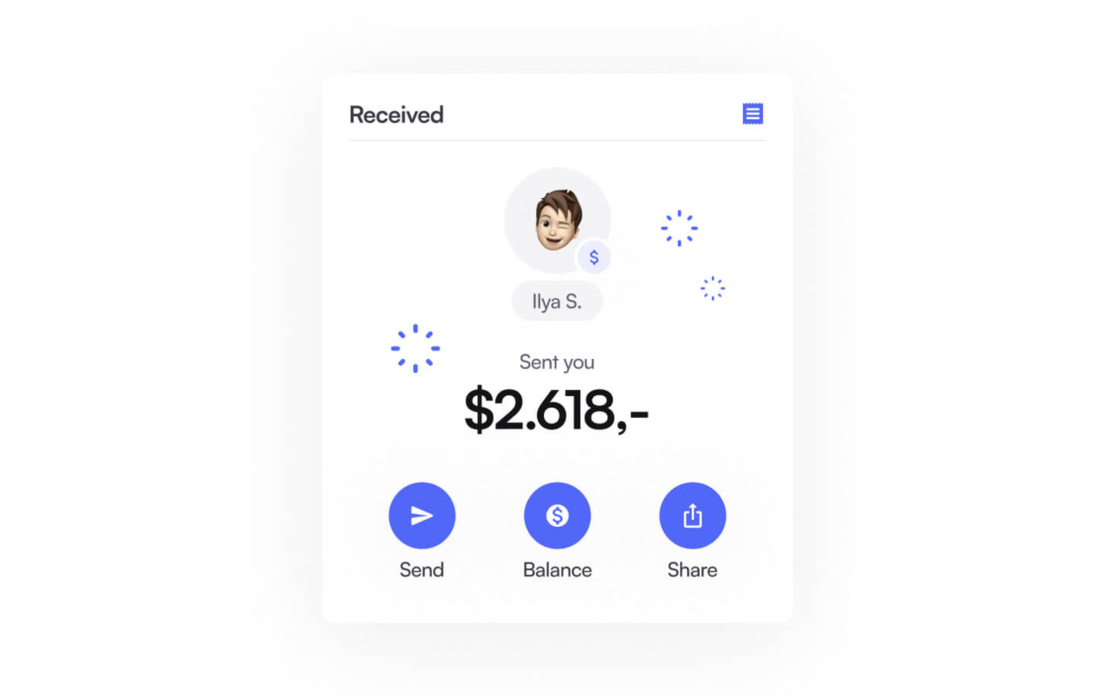
Cards are versatile container elements that encapsulate and present related information, such as text, images, or actions, in a concise and visually appealing format. News websites or blogs often use article cards to present snippets of articles, including headlines, thumbnails, and summaries.
Best practices:
- Use a consistent layout and design for cards throughout the interface to maintain visual coherence.
- Provide clear and concise information within cards, highlighting key details or actions.
- Use appropriate spacing and visual hierarchy to separate and prioritize card content.
- Make cards interactive, allowing users to click or tap on them to access more detailed information or perform actions.
Source: Flowbase
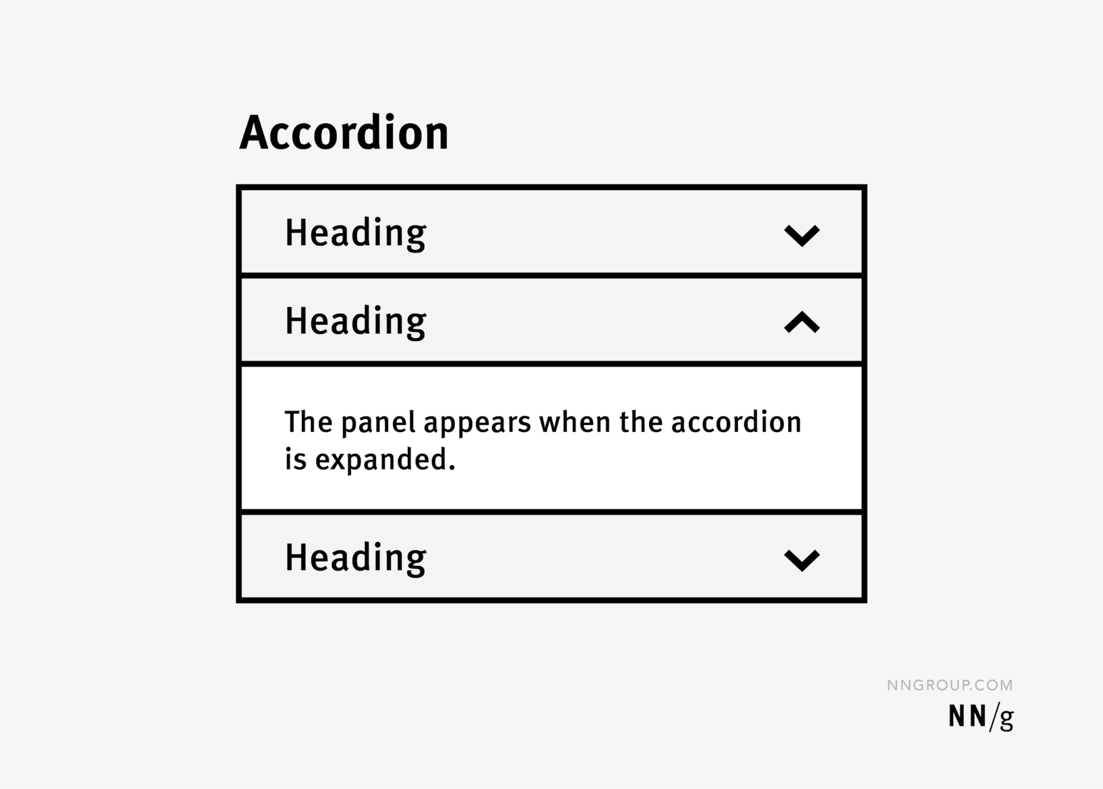
Accordions are container elements that allow users to expand and collapse content sections, providing a space-efficient way to present large amounts of information. Product comparison tables may use accordions to display detailed specifications or features for each product, enabling users to focus on specific aspects they are interested in.
Best practices:
- Use clear and descriptive labels for accordion headers to convey the content within each section.
- Provide visual indicators, such as icons or arrows, to signify accordion sections' expandable/collapsible nature.
- Ensure smooth and intuitive transitions when expanding or collapsing accordion sections.
- Allow users to expand multiple sections simultaneously if the content is not mutually exclusive.
Source: NN Group
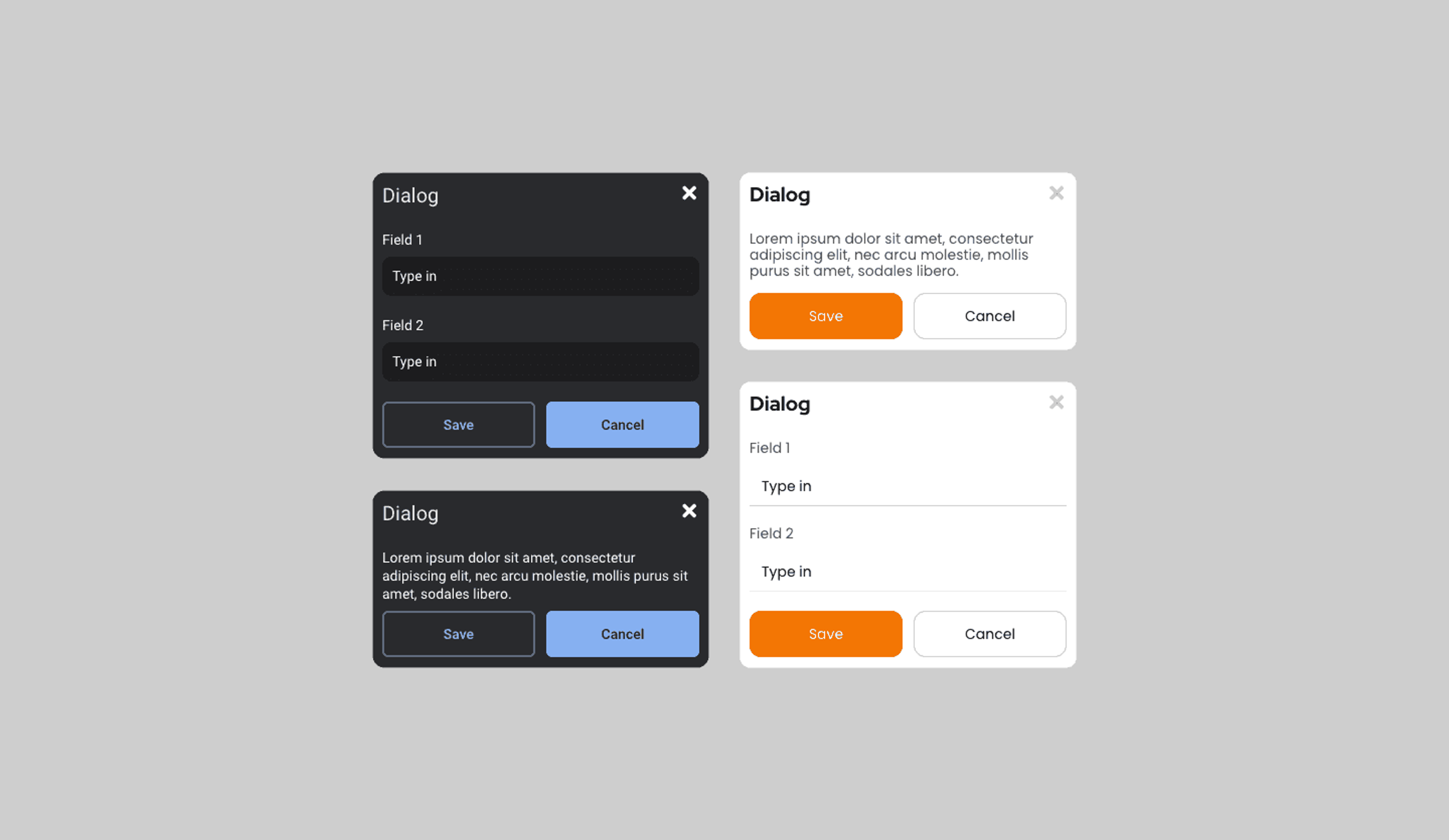
Modals and dialog boxes are container elements that overlay the main interface, presenting focused content or prompting users for input or confirmation. Login or sign-up forms often appear in modal windows, allowing users to enter their credentials without navigating away from the current page.
Best practices:
- Use modals sparingly and only for important or time-sensitive content or actions.
- Provide clear and prominent close buttons or options to dismiss the modal or dialog box.
- Ensure the modal or dialog box is properly centered and sized, avoiding unnecessary scrolling or clutter.
- Use appropriate visual styles and overlays to differentiate the modal content from the underlying interface.
Source: Uizard
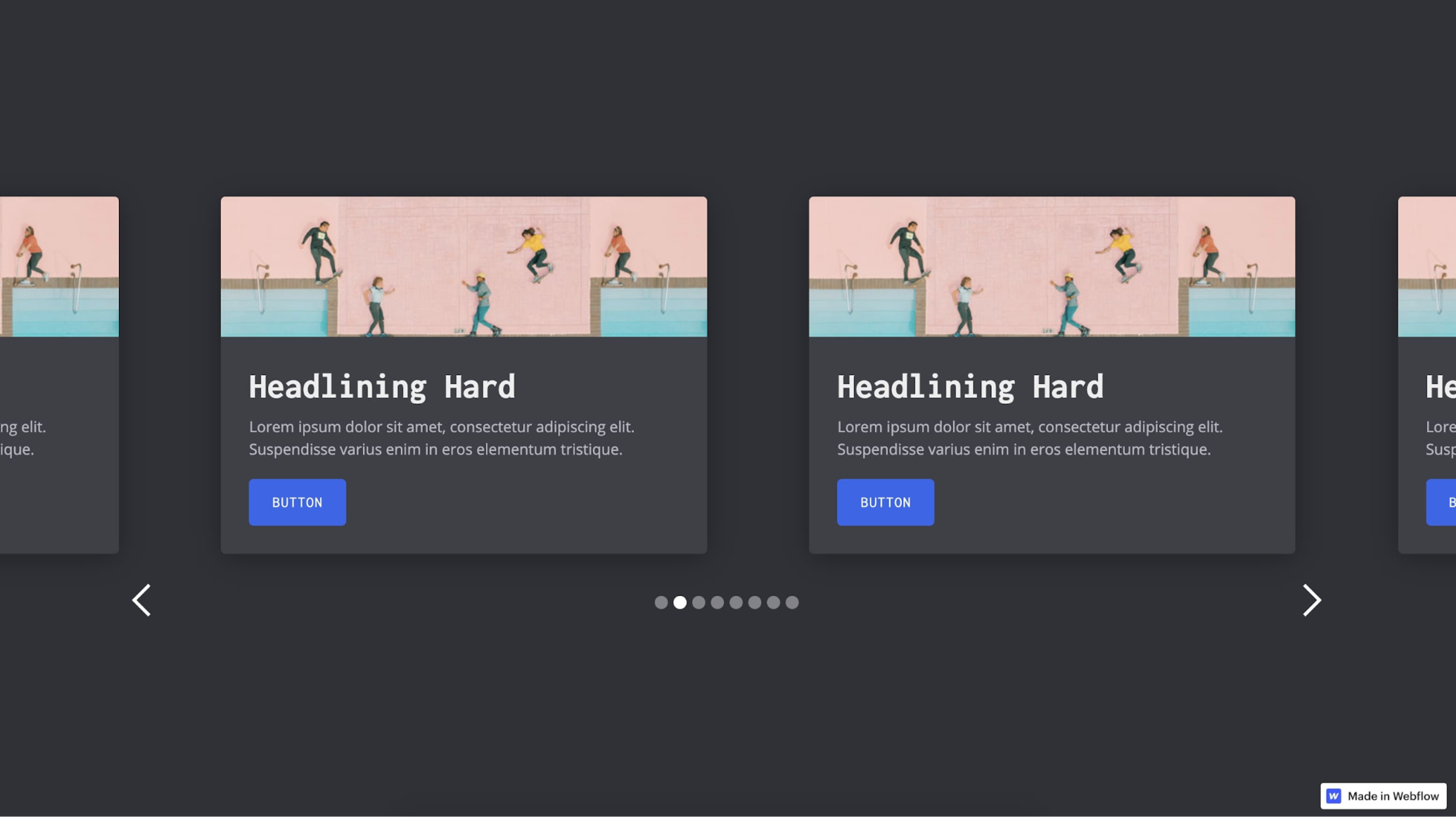
Carousels and sliders are container elements that display a series of content items, such as images or product cards, horizontally scrollable or rotating. E-commerce websites often use product carousels to showcase featured or related products, allowing users to browse through multiple items within a limited space.
Best practices:
- Provide clear navigation controls, such as arrows or dots, so users can manually control the carousel or slider.
- Ensure smooth and responsive transitions between carousel items to enhance the user experience.
- Optimize the size and quality of images or content within the carousel to ensure fast loading times.
- Avoid auto-rotating carousels or provide options to pause or control the rotation speed.
Source: Webflow
Contextual and Responsive Design
Contextual and responsive design are essential in creating user interfaces that adapt and optimize for different devices, screen sizes, and user contexts. By considering the context in which users interact with the interface and ensuring responsive behavior, designers can deliver a seamless and tailored user experience across various platforms. Let's explore these concepts in more detail and examine real-life implementation examples.
Contextual design involves understanding and designing for the specific needs, goals, and environments in which users interact with the interface. Fitness tracking apps may display different information or features depending on the user's current activity, such as showing real-time exercise metrics during a workout or presenting a summary of daily progress on the home screen.
Best practices:
- Conduct user research to understand the different contexts in which users interact with the interface, including their goals, needs, and constraints.
- Prioritize and organize content and features based on users' most common or critical tasks in each context.
- Use contextual cues, such as location data or time of day, to adapt the interface and provide relevant information or functionality.
- Design for interrupted or fragmented attention spans in mobile or on-the-go contexts, ensuring important information is easily accessible and actions can be completed quickly.
Responsive design ensures that the interface adapts and responds to different screen sizes and devices, providing an optimal viewing and interaction experience. News websites often employ responsive design techniques to ensure articles and media content are easily readable and navigable across desktop computers, tablets, and smartphones.
Best practices:
- Use flexible grid systems and relative units (e.g., percentages) to ensure layout elements adapt and scale proportionally to different screen sizes.
- Prioritize content and features based on the available screen real estate, hiding or collapsing less critical elements on smaller screens.
- Optimize images and media for different devices and connection speeds using responsive image techniques and appropriate file formats.
- Test the interface on various devices and screen sizes to ensure consistent functionality, readability, and usability.
Source: NordWood Themes on Unsplash
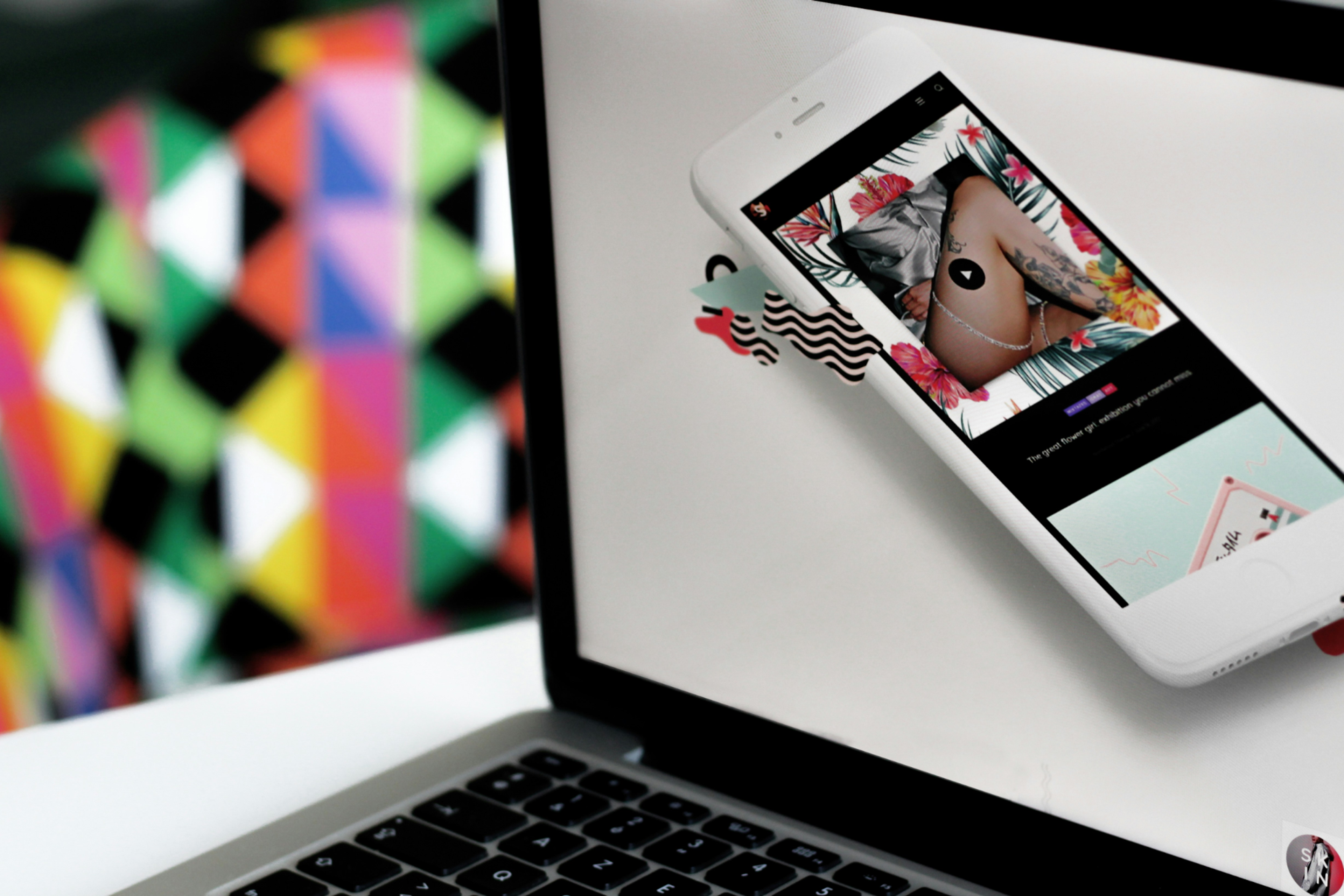
Combining contextual and responsive design. Effective user interface design often combines contextual and responsive design principles to create interfaces that adapt to the user's context and device. Productivity tools may optimize their interfaces for different devices and contexts, such as providing a focused writing mode on mobile devices or offering voice-activated commands for hands-free interaction.
Best practices:
- When designing the interface, consider the interplay between user context and device capabilities, adapting the content, layout, and interactions accordingly.
- Use device features like GPS, camera, or sensors to enhance the contextual experience and provide relevant functionality.
- Design for progressive enhancement, ensuring core functionality and content are accessible across all devices while leveraging advanced features on more capable devices.
- Continuously gather user feedback and analytics to refine and optimize the contextual and responsive aspects of the interface.
Testing and Iteration
Testing and iteration ensure that the interface meets user needs, functions as intended, and provides a positive user experience. Designers can continually refine and enhance the interface by thoroughly testing and iterating based on user feedback and data-driven insights. Let's explore the importance of testing and iteration and examine real-life implementation examples.
Testing involves evaluating the user interface's usability, functionality, and performance to identify and address any issues or areas for improvement.
Usability testing: Many companies, such as Google or Amazon, conduct usability testing sessions in which users interact with the interface while being observed. This provides valuable insights into user behavior and identifies usability issues.
A/B testing: Online platforms, such as e-commerce websites or marketing campaigns, often employ A/B testing to compare different versions of the interface or content, for example, measuring user engagement and conversion rates to determine the most effective design.
Accessibility testing: Government websites and applications are required to meet accessibility standards, such as WCAG (Web Content Accessibility Guidelines), and undergo rigorous testing to ensure the interface is usable by individuals with disabilities.
Iteration involves incremental improvements to the user interface based on testing results, user feedback, and data-driven insights.
User feedback: Mobile apps, such as ride-sharing services or food delivery platforms, often prompt users for feedback after completing a task, using this input to iterate and enhance the user experience.
Analytics-driven optimization: Websites and applications collect user behavior data, such as click-through rates or drop-off points, to identify areas for improvement and make data-driven iterations to the interface.
Continuous improvement: Design systems and UI component libraries used by companies like Airbnb or IBM undergo regular iterations and updates based on user feedback, design trends, and technological advancements.
Read more
Conclusion
Designing intuitive and engaging user interfaces requires a deep understanding of UI elements and their best practices. By carefully considering each element's purpose, placement, and design, UI designers can create interfaces that effectively guide users, provide clear feedback, and enhance the overall user experience and digital interface.
Remember to prioritize usability, consistency, and accessibility throughout the design process. Keep the user's needs and goals at the forefront, and continuously test and iterate based on feedback and data-driven insights.
By mastering the art of UI element design and staying up-to-date with industry trends and best practices, you'll be well-equipped to create exceptional user interfaces that delight and engage users across various digital platforms.


About Clay
Clay is a UI/UX design & branding agency in San Francisco. We team up with startups and leading brands to create transformative digital experience. Clients: Facebook, Slack, Google, Amazon, Credit Karma, Zenefits, etc.
Learn more

About Clay
Clay is a UI/UX design & branding agency in San Francisco. We team up with startups and leading brands to create transformative digital experience. Clients: Facebook, Slack, Google, Amazon, Credit Karma, Zenefits, etc.
Learn more


