How to Measure UX Metrics?
An aspect crucial to any digital product or service is its user experience (UX), a complete summation of user perception and interaction with a brand’s offerings, encompassing everything from its usability to how satisfied customers are with it. By applying measurement metrics to UX, companies can figure out what does and does not work to make future improvements. But how is UX measured, exactly?
Source: UX Collective

Multiple qualitative and quantitative methods are used to work through user feedback regarding the brand products’ design, usability, functionality, performance, ease of access, and the brand’s content delivery and optimization of user experiences.
Companies use interviews, survey answers, A/B testing and heat maps, and other analytical tools to collect useful insights into the customer experience. They then use this information to refine and adjust their products and services to meet customers' needs better.
By analyzing the collected data carefully and thoroughly, organizations then identify areas with shortcomings or customer pain points, giving them a clear picture of what needs to be adjusted and improved to enhance the user experience in the future.
What are UX Metrics?
Definition of UX Metrics
UX metrics are quantitative and qualitative data points collected to track, measure, and compare the user experience of a website or application. They reflect the attitudes and behaviors of real people, providing valuable insights into how users interact with a product or service.
By analyzing these metrics, companies can align customer satisfaction with their business goals, making informed decisions to enhance the user experience.
Whether it’s understanding how users navigate a site or gauging their satisfaction with a product, UX metrics are essential for identifying areas for improvement and ensuring that the user experience is as seamless and enjoyable as possible.
Types of UX Metrics
When we talk about UX (User Experience) metrics, we’re really trying to understand how people feel about using a product, how they interact with it, and whether it meets their needs.
These metrics come in different forms—some are about numbers and data, while others focus more on what users think and feel. To get the full picture, we look at four main types: quantitative, qualitative, behavioral, and attitudinal metrics.
Quantitative metrics are all about the numbers. They give us measurable data, like how many people successfully complete a task, how long it takes them, or how often they make mistakes.
Another important quantitative metric is the user error rate, which quantifies the frequency of mistakes made by users while attempting to complete tasks. Think of it as looking at the stats of how users interact with a product. This data helps us determine whether something is working well or if a problem needs fixing.
Source: CodiLime

On the other hand, qualitative metrics tell us the stories behind the numbers. They give us insight into what users think and feel when using the product.
This could be feedback from a survey, comments from a user interview, or insights from watching someone use the product in real time. These stories help us understand the “why” behind users’ actions, giving us a clearer picture of their needs and frustrations.
Behavioral metrics focus on what users do when interacting with a product. Are they clicking the right buttons, spending time where we want them to, or dropping off at a certain point? These metrics tell us about the journey users take and help us understand which parts of the product work well and which need improvement.
Lastly, attitudinal metrics capture how users feel about their experience—whether they’re happy, frustrated, or somewhere in between. They often come from surveys asking users how satisfied they are or if they’d recommend the product to others. Together, all these metrics help us understand what users are doing and how they feel about it so we can create a product they genuinely love.
Why Measuring UX Is Important
Delivering a positive user experience to customers is essential for a company's health and prosperity. Interfacing with a user requires pertinent insights into how a user interacts with the brand’s products and how the product can be improved to optimize the experience of these interactions.
Companies can gather this insight through surveys, interviews, heat maps, A/B testing, and other analytic methods and use it in areas of necessary adjustment or improvement to measure user experience and increase the customers’ satisfaction with their products.
Source: DePalma Studios
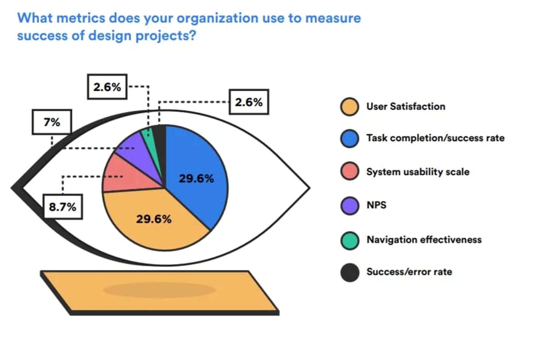
Additionally, evaluating UX enables businesses to develop solutions that more expediently and effectively satisfy customer needs while enhancing accessibility and usability. Businesses can respond promptly to customer feedback and modify products to deliver a positive user experience.
Furthermore, utilizing UX metrics yields useful information regarding customers' feelings about the brand's service or product. Experience optimizations and marketing campaigns can be driven based on the compiled data.
The UX measurements allow businesses to know how to improve their product or service experience by collecting data that reveals areas that could use improvements. By knowing the “chinks in the armor,” companies can then focus their resources on optimizing the problem areas and improving their brand’s overall standing in the eyes of consumers.
Understanding UX Metrics
Quantitative vs. Qualitative Metrics
When it comes to measuring UX, it’s crucial to understand the difference between quantitative and qualitative metrics. Quantitative metrics provide numerical data and statistics, offering a clear picture of user behavior through numbers.
For example, metrics like task completion rates, time on task, and error rates fall into this category. These metrics are invaluable for identifying specific issues and measuring the effectiveness of design changes.
On the other hand, qualitative metrics provide descriptive data and insights into the user experience. This includes user feedback from surveys, interviews, and usability tests.
Qualitative metrics help us understand the “why” behind the numbers, offering context and depth to the numerical data. Together, these metrics provide a holistic view of the user’s journey, allowing designers and developers to create more user-centric products.
Behavioral Metrics (e.g., Time on Task, Average Session Length)
Behavioral metrics track how users interact with a product or service, providing valuable insights into their actions and behaviors. Examples of behavioral metrics include:
- Time on Task: This metric measures the time users spend completing a specific task. It helps identify areas where users may be struggling or where processes can be streamlined.
- Average Session Length: This metric tracks the average time users spend on a website or application during a single session. It provides insights into user engagement and can highlight areas that capture users’ interest.
- Error Rate: This metric counts the number of errors users encounter while using a product or service. A high error rate can indicate usability issues that need to be addressed.
- User Engagement Metrics: These metrics track how actively users interact with a product or service, such as clicks, taps, and scrolls. High engagement levels often correlate with a positive user experience.
By analyzing these behavioral metrics, designers and developers can gain valuable insights into how users interact with a product or service, helping them identify areas for improvement and optimize the user experience.
Attitudinal Metrics (e.g., Net Promoter Score)
Attitudinal metrics capture how users feel about a product or service, providing insights into their satisfaction and loyalty. Examples of attitudinal metrics include:
- Net Promoter Score (NPS): This metric measures user loyalty and satisfaction by asking users how likely they are to recommend a product or service to others. A high NPS indicates strong user satisfaction and loyalty.
- Customer Satisfaction (CSAT): This metric gauges user satisfaction with a product or service, typically through surveys that ask users to rate their experience on a scale. High CSAT scores indicate that users are happy with the product or service.
- User Satisfaction (USAT): Similar to CSAT, this metric measures user satisfaction with a product or service, providing insights into how well it meets their needs and expectations.
- System Usability Scale (SUS): This metric assesses the usability of a product or service through a standardized questionnaire. It provides a reliable measure of user satisfaction with the product’s usability.
Attitudinal metrics offer valuable insights into how users perceive a product or service, helping designers and developers identify areas for improvement and optimize the user experience. By combining these metrics with behavioral data, companies can create a comprehensive understanding of their users’ needs and preferences, leading to more effective and user-centric design decisions.
UX Metrics and KPIs
Measuring Usability
The key question every business must ask is whether their product is intuitive, useful, and user-friendly. Usability metrics, specifically, measure how easy the product is to use. Additionally, they show how well it is designed and how intuitively a user can navigate or interact with it. This type of data consists of 4 primary metric components:
- Percentage of users who completed their tasks with a successful result (completion rate)
- The time it took to complete the task (task time)
- How many errors occurred during the task completion (session errors)
- How satisfied a user was with his or her experience (satisfaction score).
The goal is to provide customers with a smooth product usage experience, and these usability metrics aim to retrieve the data pertinent to achieving that objective. Using these metrics, companies can attack the areas with the lowest metric measurements in ways that can optimize them.
For instance, if the error rates during a session of a user interacting with a product are high, then it might be that the product can use accessibility and navigational improvements. Perhaps the completion rate is too low, indicating that more clarification is needed from the instructions on the product’s use.
Most importantly, if user engagement scores are low, the business needs to investigate the reason for the dissatisfaction.
Source: David Travis on Unsplash

These typical usability testing metrics go a long way, but companies should also consider additional metrics. Some examples include:
- How long it takes for a user to learn to use the product (learnability)
- How simple is it for users to interact with a product after an extended absence of interaction (memorability)
- What paths of navigation do users need to take during use (navigability)
- How complicated is the design for users to comprehend (complexity)
Understanding these more narrowly focused usability factors and combining them into traditional UX metrics could assist businesses in developing a more comprehensive knowledge of customer behavior patterns and usage preferences.
NPS (Net Promoter Score)
Customer experience and loyalty are critical factors in any brand's success. Though this area seems too abstract to collect metrics on, satisfaction can be measured with the net promoter score (NPS).
This metric collection methodology is centered on the premise that loyal customers will advocate (or promote) the brand’s product or service.
These metrics are collected by questioning users to rate how likely they are to recommend the service or product to someone else. They are asked to rate that aspect on a 0 to 10 scale, with those who rate it with a score of 9 or 10 being considered “promoters.” Those who give a score of 7 or 8 are considered “passives,” while anyone who rates it lower is deemed a “detractor.”
Source: Maze

This approach allows companies to quantify customer loyalty and yields much-needed feedback from users about their products. Using this information, organizations can direct their resources to improve the UX for their customers.
The NPS can gauge overall customer satisfaction with the product and the organization on a more macro scale. This leads to even more information about the areas of a business that can be improved to give customers a more positive experience.
One of the key areas in developing a brand is marketing promotion. However, one thing that is not readily available is whether customers respond favorably to marketing efforts and campaigns.
Companies can track how NPS shifts over time, allowing more visibility into how effective marketing efforts garner customer loyalty and increase customer satisfaction.
This, in turn, permits them to make marketing campaign adjustments to make them more efficient. NPS will also yield additional insights into how market competitions are performing so that companies can compare and contrast the offerings of others to their own.
CSAT (Customer Satisfaction)
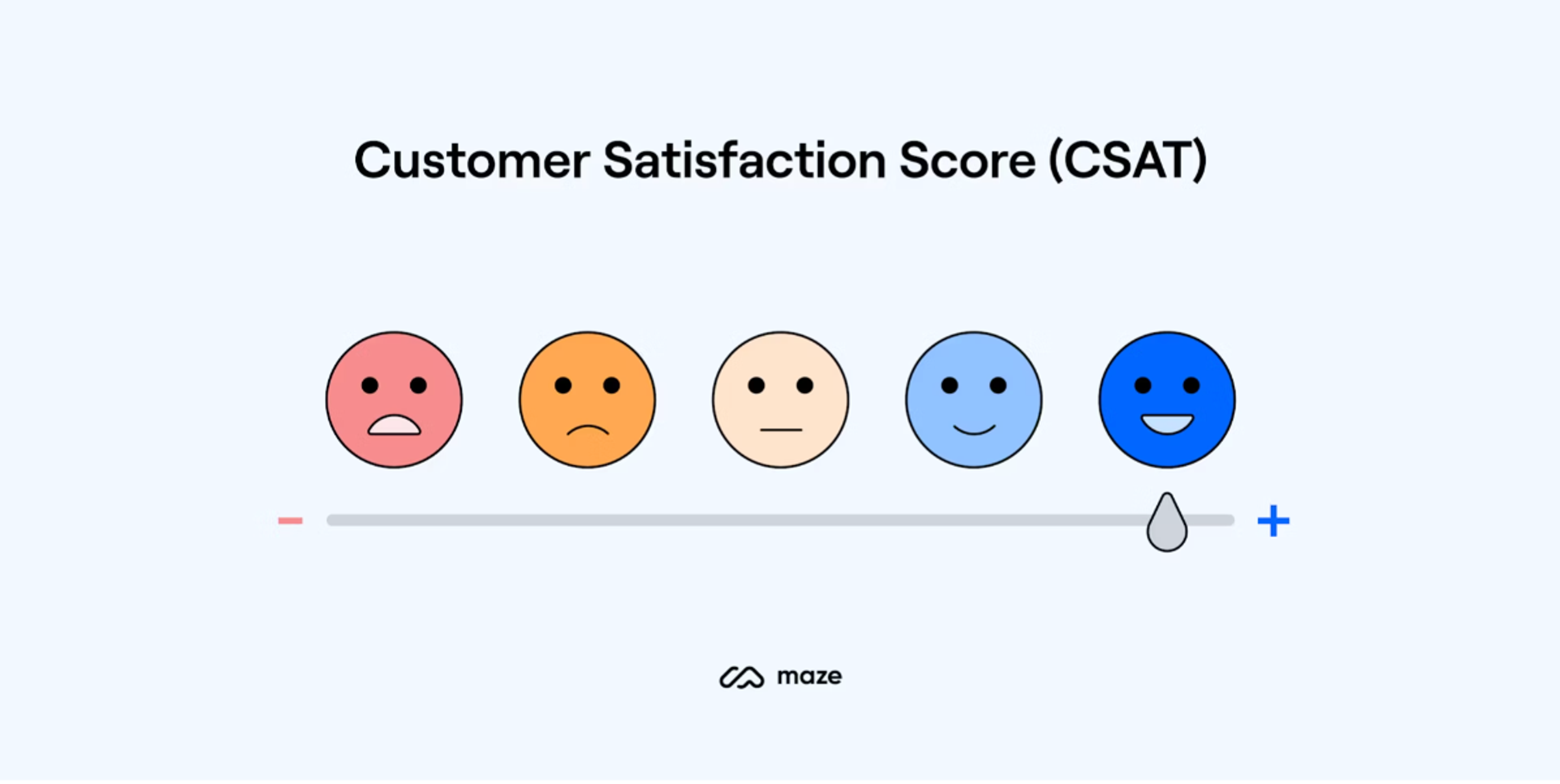
While NPS focuses on how loyal customers feel about referring a company's products to other people, CSAT, a customer satisfaction metric, gauges how happy customers are with the company’s product or service.
This methodology is generally based on customer answers to surveys where respondents are asked to rate, on a scale of 1 through 5 or 6 through 10, their experience with the brand’s products.
Too many low scores indicate customer dissatisfaction, while higher ones indicate that the company is doing things right. The best place to get feedback about areas that could be improved is the people actively using the product, making CSAT a pivotal metric for measuring overall satisfaction with the product’s quality.
Designers may have a different idea of what features of their products are the most valuable than the opinions of those product users. Companies can better understand what to do to meet their customers' expectations by evaluating CSAT.
Source: Maze
It is also important to note that CSAT highlights what the companies are doing well. Conversely, it points to weaker areas that could use some tuneups. Knowing these factors can help companies make better decisions on multiple fronts, including promotion, customer support, pricing, etc.
Based on the collected information, organizations can decide if certain promotions are helpful, if the products would get more traction with a discount if customer service teams need expansion or additional training, and if it is worth investing in certain new product features.
Additionally, CSAT can offer insights into how a company’s UX stacks up against competitors in the same market. If competitors show stronger signs in a company’s weak areas, looking into what is being done right might be a helpful solution to certain problems that customers find with the products.
SUS (System Usability Scale)
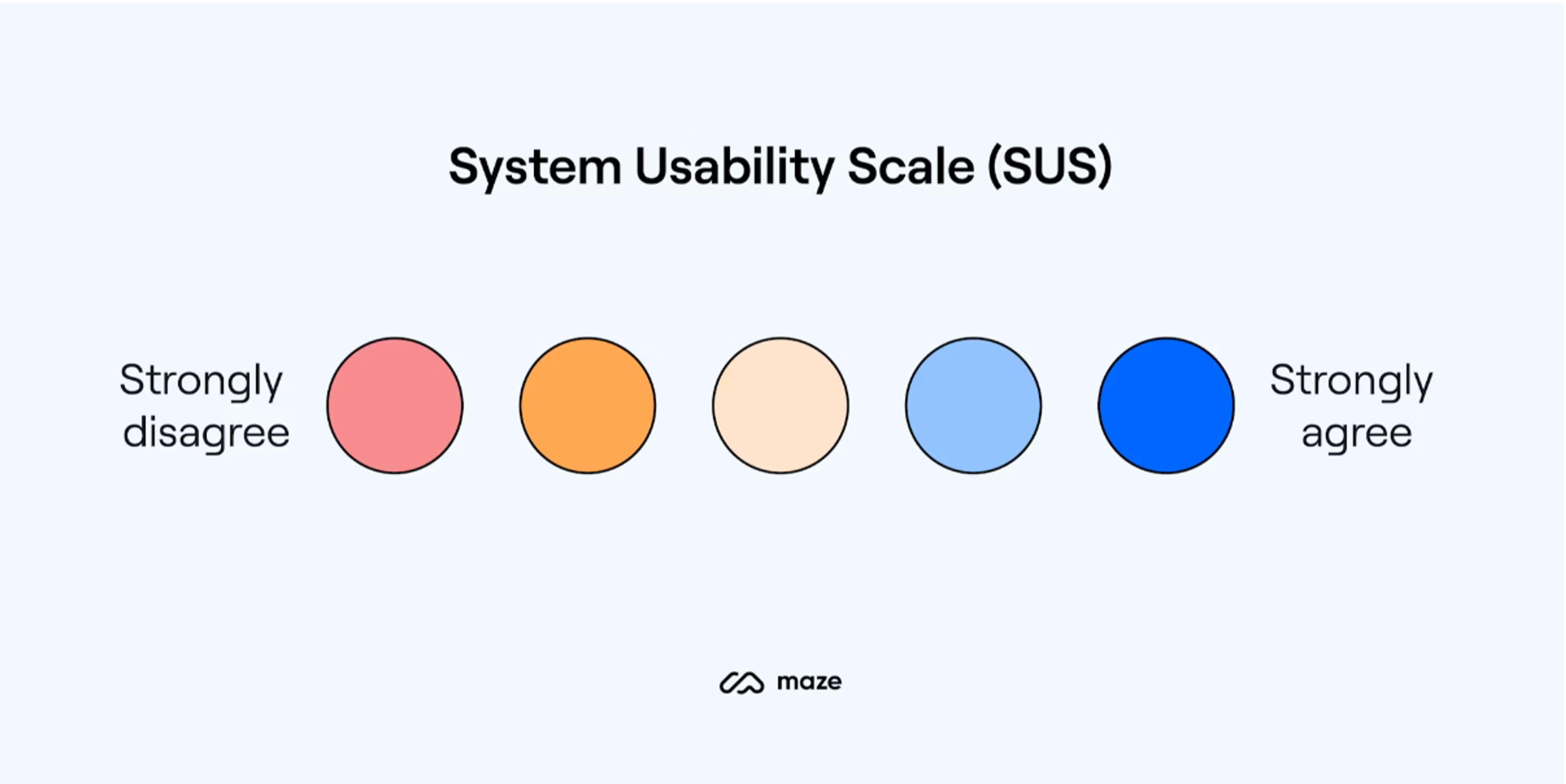
Measuring the overall customer experience is done with SUS, which is short for the system usability scale. This self-reporting method gives customers a 1 through 5 scale (1 indicating strong disagreement, while 5 indicating the opposite).
It offers insights into the perceived utility of the services and products offered. The ratings are answers to particular questions that span a range of usability aspects like learnability, memorability, efficiency, complexity, general impression, and product satisfaction.
Source: Maze
As these factors are evaluated and contextualized by the respondents’ feedback, companies can understand what users want to improve about the product. The SUS method has largely been adopted as the industry's most effective UX measuring tool mainly because its completion requires minimal user effort.
At the same time, its results are reliable and useful, allowing them to be compared against other products rated in similar categories. Beyond that, SUS is considered extremely reliable with a Cronbach’s alpha consistency of .093, producing consistent results even when administered multiple times with multiple users.
CES (Customer Effort Score)
Another important performance area of measurement is the amount of effort customers need to accomplish their objective when using a service or a product. This metric, known as CES (customer effort score), is based on a 1 through 7 scale, with 7 denoting that the effort to use it was minimal and 1 showing that it was very taxing.
This feedback is then used to evaluate the product or service's performance, and the insights about user behaviors it yields are directed at further improving the company’s offerings.
Source: Retently

If particular aspects of a product are confusing or unclear or require many attempts to accomplish, users are likely to be frustrated and are more likely to give a lower CES score. The feedback associated with these scores also reveals which areas are causing the most hardship, allowing companies to focus improvement efforts on those specific aspects.
CES scores on multiple products or services also help to compare which products are more or less user-friendly. That way, companies can look further into retooling some of their products with lower scores and work on minimizing users' effort when using them.
Single Ease Question (SEQ)
The Single Ease Question (SEQ) is a quick and easy way to find out how users feel about completing a specific task in a product. It's a simple question that gets asked right after someone finishes a task, like, "How easy or difficult was it to do this?" Users answer on a scale from 1 to 7, with 1 being "very difficult" and 7 being "very easy." This helps us get a sense of how smoothly things went for them.
What makes the SEQ really useful is its simplicity. Using the same question for different tasks makes it easy to compare which parts of a product are causing trouble and which are working well.
Since the question is asked right after the task, we get fresh feedback in users' minds, giving us an honest look at their experience. This helps us focus on the areas that need improvement to make things easier for users.
Source: MWRIG

Another great thing about the SEQ is that it can be tracked over time. By regularly checking SEQ scores, we can see if the changes we make are actually helping. For example, if we see that the score for completing a checkout process has gone from a 4 to a 6, we know that our updates are making a difference, and users are finding it easier.
Even though it's just one question, the SEQ can tell us a lot, especially when used alongside other usability metrics. It helps us understand whether users can complete a task and how they feel about doing it. This simple approach makes the SEQ a powerful tool for making products better and more user-friendly.
Customer Churn Rate (CCR)
Customer Churn Rate (CCR) is all about understanding how many customers are leaving your product or service over a certain period of time. It's like keeping track of how many people decide not to come back, and it’s a crucial way to know if your customers are happy with what you're offering.
If a lot of people are leaving (high churn rate), it’s a sign that something might need fixing, whether it’s the product itself, customer service, or the value people are getting from it. On the other hand, a low churn rate means your customers are sticking around and finding value, which is a great sign for any business.
To figure out the churn rate, you look at the number of customers you lost during a period compared to how many you had at the start of that period.
For instance, if you start the month with 1,000 customers and lose 50 of them, your churn rate would be 5%. Tracking this number regularly can help spot trends, like a spike in churn after a product update, which might indicate something isn’t working well.
Source: LaunchNotes

CCR doesn’t just tell you how many customers are leaving. It helps you understand why they’re leaving, too. By looking into what types of customers are leaving more often or what they were doing right before they left, you can get clues about what needs improvement. It could be better customer support, improving a feature, or even offering a special deal to keep them around.
Keeping existing customers is usually a lot cheaper and more rewarding than trying to get new ones. A low churn rate means those customers are more likely to stick with you and become loyal advocates of your brand.
So, keeping an eye on the Customer Churn Rate and taking action to improve it is key to building long-lasting relationships and creating a successful, sustainable business.
Customer Lifetime Value (CLV)
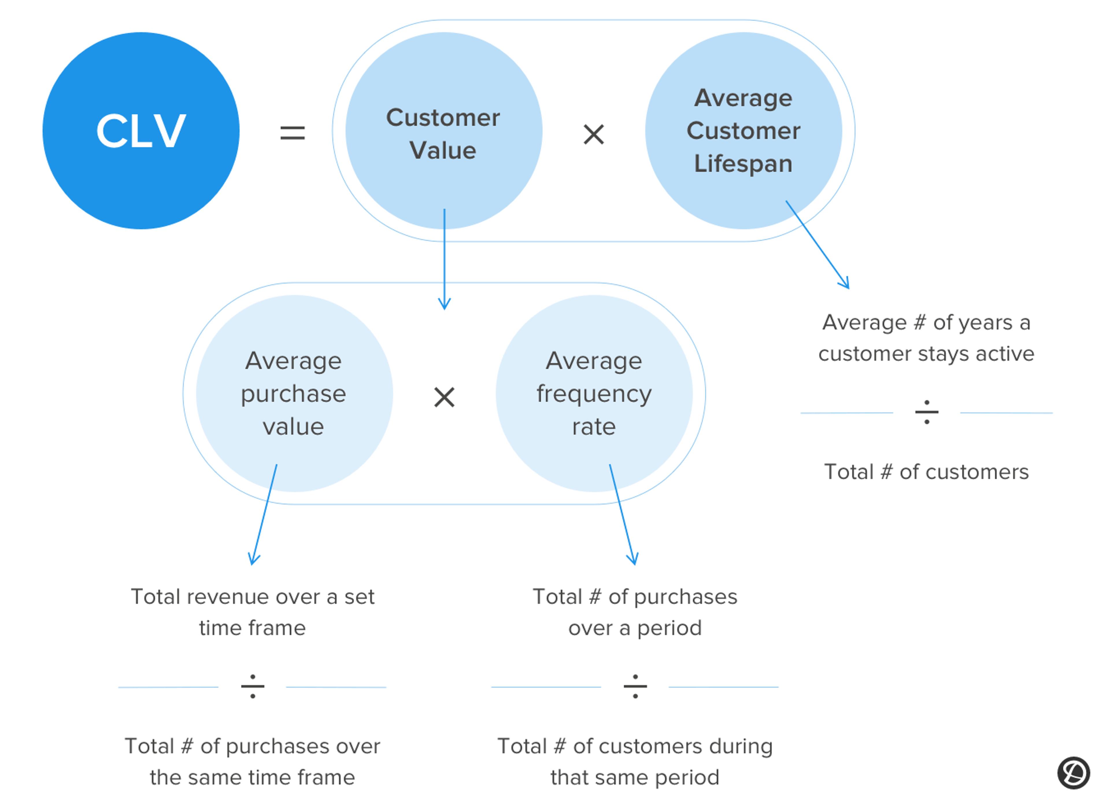
Customer Lifetime Value (CLV) is a way of figuring out how much money a customer will bring to your business over the entire time they stick around.
Instead of just looking at how much they spend on their first purchase, CLV helps you see the bigger picture—how valuable that customer will be over months or even years. It’s like seeing how much a loyal customer is really worth, which can help you decide how much time and money you should invest in keeping them happy.
To calculate CLV, you look at things like how much a customer usually spends, how often they buy, and how long they tend to stay with your business.
For example, if a customer spends around $100 each time they buy something, shop with you five times a year, and stay with you for three years, their lifetime value would be $1,500. Knowing this number helps you see who your most valuable customers are so you can focus on keeping them coming back and encouraging them to spend more.
Source: Delighted
CLV is also super helpful for planning your marketing and customer service strategies. When you know how much a customer will likely be worth over time, you can make smarter decisions about how much to spend on attracting and keeping them.
For instance, if a customer is expected to be worth a lot, offering special promotions or providing extra support might make sense to ensure they stay. This way, you’re not just spending money to get new customers—you’re investing in the ones that will bring real value in the long run.
In the end, understanding CLV is all about focusing on the bigger picture and building lasting relationships with your customers. When you keep them happy and coming back, they’re more likely to spend more and become loyal supporters of your brand. It’s about creating a sustainable business where customers see value and want to stick around, making them more than just a one-time sale.
Time Spent On Page
When the company’s product is digital, specifically a website, certain metrics that don’t correspond with other digital or physical products apply. The time spent on page metric measures how much time users spend on a particular page on a website. This yields valuable information about potentially tougher areas of usage or navigation.
Suppose a user spends a lot of time locating a particular piece of information or has trouble navigating to where they would like to be. In that case, the websites can be reevaluated for a more intuitive redesign.
Source: Google Analytics
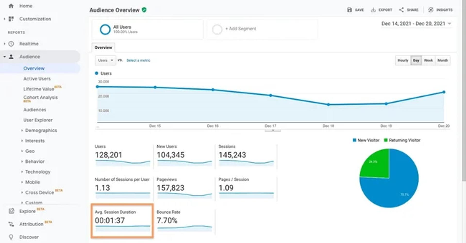
However, that is not the only useful area in this metric. It also illustrates which features are used more frequently and which are less engaging, allowing companies to redesign the pages accordingly. If the engagement on certain pages or sections is minimal, they could be confusing, and companies might consider reworking them.
Source: Wall Street Prep

CES also allows for comparison between pages or websites, helping to determine which work better than others. This can also be done against competitors, allowing developers to find the best functions and use those to better engage their users.
CTR (Click-Through Rate)
Another website-specific metric is the click-through rate or CTR. This measures the frequency with which users click on an ad after seeing it and how often certain links are clicked.
If an ad is rarely clicked, it may be unfit for the page or positioned in a place that is not readily visible to users who might click on it. If a link is not accessed, perhaps it is not interesting, concerning, or just obstructed, so the user does not realize it is there.
With CTR analysis, companies can determine how to improve their websites to help engage visitors better and retain users with their products. It also helps organize marketing efforts, as the evaluation entails evaluating the phrasing and keywords that draw users' attention. With that knowledge, companies can maximize the efficacy of their campaigns, so they spend their promotional efforts more prudently.
Source: Kargo
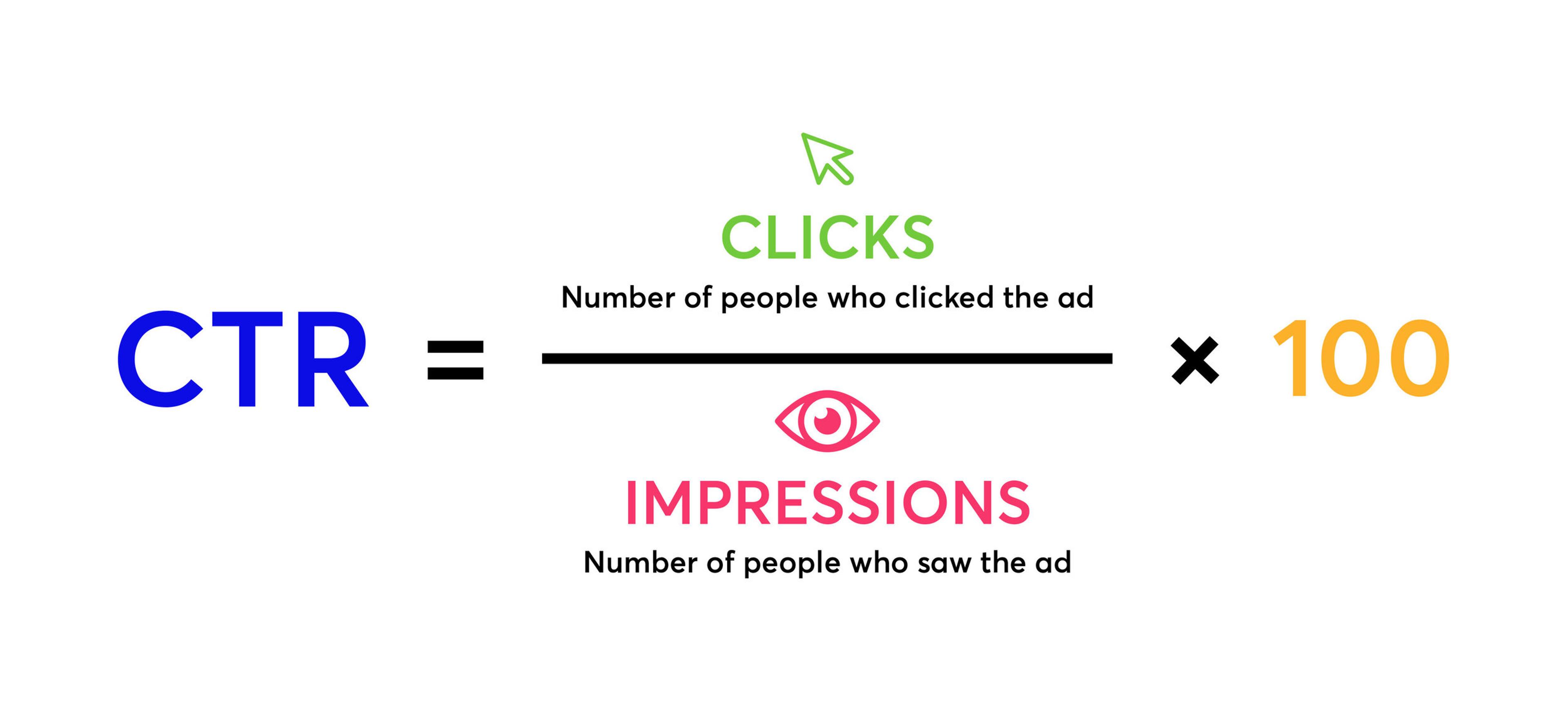
CTR is also used to evaluate a successful service or product by tracking the number of related ads clicked on and the number of conversions (purchases made). This gives organizations a good understanding of how well the offered products appeal to their users.
Bounce Rate
Speaking of making purchases, while CTR tracks the clicks that users may take to make purchases, something needs to track the users who visit a page or a website but then take no meaningful action in their navigation through it, opting to leave it (or “bounce”) instead. This is known as the bounce rate, possibly due to insufficient UX.
Typically, users do not stay on a website for lengthy periods. In that case, it might be because they do not find the content interesting or relevant to their needs or because they find accomplishing their objectives too cumbersome. Therefore, by evaluating the bounce rate, companies can change the pages to bolster user engagement and potentially improve those features that users do not find relevant or engaging enough.
Source: Lido

Bounce rate also helps compare products to determine how the user-friendliness factor stacks up against other websites. If users are making purchases and taking actions more readily on other websites, companies can see what those websites are doing differently and optimize their offerings accordingly.
Additionally, bounce rates can be used to gauge user interest in newly offered services or products from the company. Suppose the newer products are receiving more engagement. In that case, the company can evaluate if these products are more relevant or if the navigation scheme to access them is better than others that are not getting as much attention.
Conversion Rate
A website looking to sell products must know what percentage of its visitors are being converted into paying customers. The same logic can be applied to users creating accounts, showing that the website or product has generated their interest.
This metric is known as a conversion rate, and it aids businesses in understanding which pages or campaigns are the dominant drivers of their conversions. By evaluating the aspects of a website that are more relevant to users, websites can be redesigned so that those features assist in driving conversion rates up for products suffering from lackluster performance.
Companies can increase their sales and stay competitive by improving on the underperforming products. Evaluating what users do on the website leads them to convert to paying customers. This is an important analysis area because it highlights what works, which content is most relevant, which navigation works best, and how companies can adjust their strategies to drive sales.
Source: Wall Street Prep

If new products are not getting the desired attention, conversion rate evaluation could help highlight if the problem is the exposure and information about the new products or if users are having a hard time finding them.
Perhaps the new products are not as interesting to visitors because they don’t know how they differ from their already established counterparts. Conversion rate analysis can find the areas where this aspect may need adjustment.
Understanding competitors' conversion rates can also yield helpful results as a benchmark for conversion numbers. This can help better evaluate how well competitors retain and convert more users and assist companies in making the necessary design changes to do the same.
Retention Rate
The retention rate is the cousin of the conversion rate. It evaluates the percentage of visitors that a website was able to engage with for extended periods and how often these visitors return to interact with the website further. This is a great way for companies to understand what features users find most appealing and relevant and which areas need their designs reconsidered.
Source: Wall Street Prep

Comparing different websites’ retention rates is an effective way of determining which features generate maximum customer loyalty, showing companies which features they should use more to drive better user engagement. So, suppose users are consistently leaving pages and not returning to them.
Companies will want to know this information, analyze the reasons, and adjust accordingly to make visitors' content, navigation, and presentation palatable. The success of products is also an important aspect that retention rate metrics help provide.
By tracking the number of users that have visited a website and continue to do so, companies can better understand which offerings resonate with visitors better than others.
More prudently, high retention rates indicate customer satisfaction with the product. Low retention rates are a sign that something about the pages isn’t working, and efforts to figure out what that is and optimize them are warranted.
How to Choose the Right Methods And Metric
Up to this point, we have discussed several UX measurement methods, all yielding a particularly valuable set of data points. But how does a company choose which is most relevant to their needs? This is based on several considerations, including:
1.
Objectives and goals2.
Audience and context3.
Qualitative vs. quantitative approaches4.
Limitations and biases in understanding
Objective and Goal Determinations
A few important considerations need to be made before deciding on the metrics to be used. The first is the determination of the goals and objectives the measurements will be used to evaluate.
These considerations should involve the state of the market, its current trends, the landscape of competition, the customer base, and other important data points. This information helps to establish where the business is currently relative to the market and to set goals for where it wants to be.
Source: Glenn Carstens-Peters on Unsplash

With this information, a business can decide on the metrics best suited for evaluating its progress-tracking goals. A varying set of performance indicators, including those measuring user engagement and conversions, to name a few, are likely to be required to achieve the goals.
The techniques used need to be those that would be most valuable in achieving the company’s information-gathering objectives. If the company is seeking to learn more about customer preferences and level of satisfaction, they may want to use surveys.
If the goal is to measure how different webpage designs stack up in their efficacy toward engaging customers, businesses can use A/B testing methods.
Context and Audience Understanding
Goals and objectives are unique depending on the customer segment since different customers' needs and expectations of what they are getting from the product or service will vary. A niche product seller only needs to be concerned about catering to the UX of a particular segment of customers.
In contrast, a larger e-commerce store must consider buyers' preferences and purchasing habits. In that regard, metrics should be tailored to be maximally purposeful to the company performing the metric collection and its needs.
Qualitative vs. Quantitative Approaches
Quantitative and qualitative approaches yield important results, but they are not similar, though aimed at accomplishing the same objectives. Therefore, the metric collection process will generally involve some combination of both.
Qualitative metrics, like buyer surveys or focus groups, can offer a more in-depth understanding of preferences and feelings about the product, while the frequency of visits, buying history, time spent on pages, and click-through rates are quantitative metrics that measure how well the business is meeting its intended goals.
Source: John Schnobrich on Unsplash

The right combination of the two approaches can provide a comprehensive understanding of a business’s customers' needs and allow companies to make informed decisions about engaging more effectively through their products.
Knowing Limitations And Biases
While metrics are immensely helpful, the people evaluating them are still human and may approach the analysis with a pre-set of biases. Therefore, certain biases and limitations of the processes must be carefully considered.
Quantitative metrics, for instance, put a number on things. Still, when interacting, they cannot accurately describe how customers feel about a product or their preferences. Customers can be affected by how they engage with products depending on their location, particular demographics, and even the seasons during interaction.
Qualitative measures also depend heavily on the customers surveyed, the questioning, and the sample size, potentially allowing for more bias in the results.
Read More
Final Thoughts
The key metrics for user retention measurements are customer engagement and retention. Still, companies should leverage any number of qualitative and quantitative methods that are useful in understanding their customers' needs and preferences.
No process is perfect; each is subject to limitations and certain inherent biases. With the knowledge of the yields and limitations of all available UX measurement methods, companies can use the compiled data to make informed decisions about optimizing their products or services to best appeal to their target audience.


About Clay
Clay is a UI/UX design & branding agency in San Francisco. We team up with startups and leading brands to create transformative digital experience. Clients: Facebook, Slack, Google, Amazon, Credit Karma, Zenefits, etc.
Learn more

About Clay
Clay is a UI/UX design & branding agency in San Francisco. We team up with startups and leading brands to create transformative digital experience. Clients: Facebook, Slack, Google, Amazon, Credit Karma, Zenefits, etc.
Learn more


