In the context of a company, color plays an integral role in establishing a brand and receiving feedback and recognition. A strategically selected color scheme can invoke certain feelings, represent the beliefs of an organization, and make your company stand out from your competition.
If these colors are consistently applied across all promotional and other marketing materials used, the organization will greatly improve its brand recognition and manage to provide a single cohesive service for the customers.
How Many Colors Should a Brand Have?
When crafting the brand identity of your business, one of the preliminary steps is selecting the appropriate number of colors for the company logo. However, you shouldn't go overboard, as the most successful brands navigate between 3 to 5 colors. Here is my approach to tackling this:
- Primary Color: This is the first color the audience associates with the brand. For example, Facebook is known for its blue, while Coca-Cola is recognized for its red.
- Secondary Colors: These do not overshadow your primary color. Instead, they act as supporting shades. These colors can showcase different brand parts or be reserved for special situations.
- Neutral Colors: Black, white, and gray are usually used to help balance the palette while allowing for more freedom with text, images, and borders.
Source: VistaPrint

Less is always more, and this notion is backed by evidence. If your brand identity uses too many colors, it is likely to get diluted, causing confusion among the audience. This makes careful selection and limited use of shades vital for better brand recognition.
Core Steps for Color Selection
Examine Brand Values and Aesthetics: Devote time to comprehensively analyze your brand's core values, mission, and character. Make sure that the colors you choose embody these attributes for a consistent and honest brand image that connects with your audience.
Know Your Target Market's Wishes: Study your target audience's age, values, and culture about color usage to select color(s) that appeal to them and give them confidence in your brand. This will improve your relationship with them.
Investigate Competitors' Preferred Colors: Identify the prevalent color schemes in your area of focus to pick any applicable patterns and avoid monotony. This will help your brand stay relevant, memorable, and different from the competition.
Try Different Color Blends: Try different blends while focusing on accessibility features for people with low eyesight or color blindness. Always aim for a blend that enhances ease of use for every user.
Technical Considerations
When working on a color strategy, there are key considerations to keep in mind for your branding to remain robust and continuous across all platforms and mediums:
- Adapting Your Palette: Your palette must be adaptable to work for a website, social media, packaging, and print. A flexible sound palette allows the brand to have a strong visual identity. Think about adding different shades and tones for other brand applications.
- Branding Color Levels: If branding comes to mind, primary and secondary levels must be clear. Primary colors should be the core elements of your brand, used heavily, and second colors should act as accents to enhance the design and ensure visual interest. Maintaining this structure provides a balanced and consistent visual identity.
Source: LinkedIn
- Color Adaptation for Screens and Color Print: Colors are omnipresent but can look different, so knowing the difference between what looks good on digital and printed material is key. For digital use, ensure the colors are optimized for RGB, which is for screens, and CMYK, which is for printed pieces, to elevate the accuracy of the piece.
- Code of the Colors and Their Use All Over: It is essential to establish these codes, whether Hex, RGB, or CMYK, for brand integrity in all marketing mediums. These codes ensure accurate color matching of your brands everywhere, from digital platforms to printed forms, building confidence among your audience. This associative thinking makes it easy for the audience to relate these colors with the right brands.
Responsive systems are easier to assemble and maintain, such as brand campaigns or other activities a company might need to do or make in the future. It is one thing for colors to look good and one thing to adapt to a fully functional system. A powerful color strategy sets the stage for your brand's visual image and communication.
Psychology of Color in Business
Understanding the psychology of color is key as it contributes a lot to user behavior and brand image. Every color brings with it certain feelings, which determine how people perceive brands and their products.
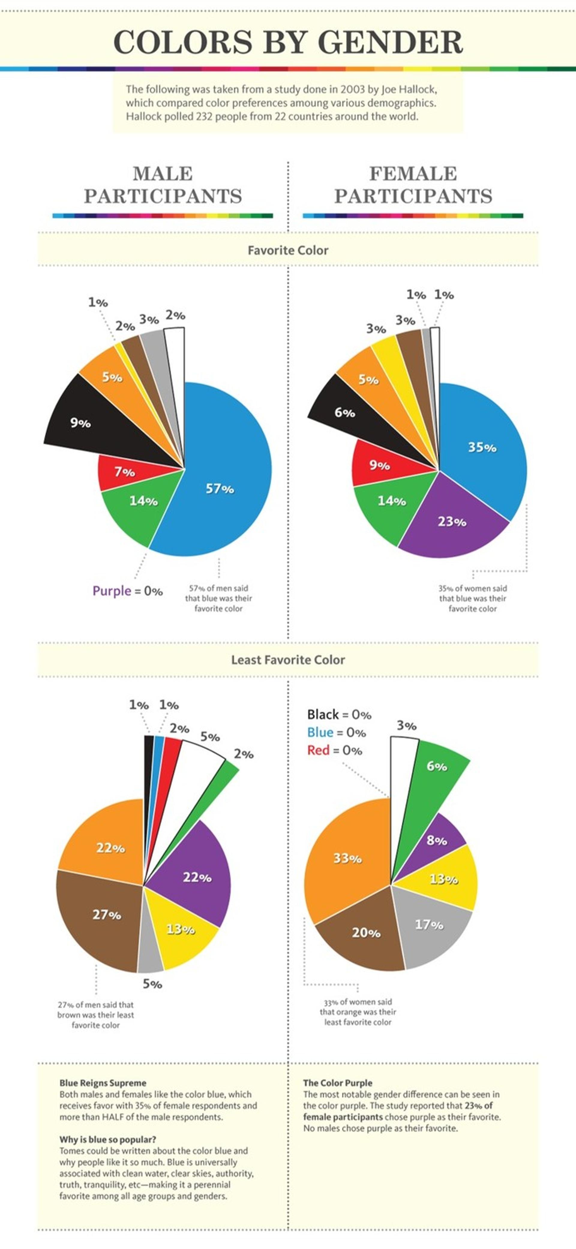
For example, blue is considered a color of trust and professionalism, which is why it is often used in banks. At the same time, red reflects energy and captures people's urgency, thus being used in sales and marketing strategies.
Source: HuffPost

More so, cultural interpretation of color is also a factor as a color that means wealth in one culture could be entirely different in another. This is especially crucial for businesses planning to reach a global audience.
Industry trends also influence color selection. Tech businesses usually select quiet colors such as blue and grey, while green and earthly colors are common in health and wellness brands as they reflect vitality and balance.
A business with color intelligence can explore color meanings to establish branding that strikes an emotional chord, including sustainable impressions, while meeting demands from culture and industry.
Colors And Their Qualities
How people perceive different colors can be subjective and can be impacted by culture and other factors. That is why you need to understand who your customers are, where they are from, etc.
Before choosing the colors you want to use for your branding, you should test them to ensure they are the best choice for your brand identity traits target audience.
- Blue – honesty, competence, trustworthiness, and reliability.
- Red – Attractive, exciting, angry, and loving.
- Green – Money, health, balance, and knowledge.
- Purple – Royalty, respect, creativity, and mystery.
- White – Purity, space, neutrality, and innocence.
- Black – seriousness, sophistication, and intelligence.
- Yellow – Happiness, youth, and adventure.
You need to research and choose your brand and target customers to ensure you make a good decision when choosing the branding colors. You can hire a branding design firm to help you make the correct choices if you need to know which ones to make.
Photo by Mika Baumeister on Unsplash
Choosing Colors for Business
Choosing the correct branding color is going to take a lot of work. Before doing this, you must know what brand message you want to communicate to your customers.
Understanding your brand identity and brand personality traits is crucial before choosing the brand's primary color and brand color. Once you know this, you can choose the primary brand color that helps provoke customers’ emotions.
You need to understand your business stand, brand identity and how you want people to perceive your business. If you have yet to learn this, figure it out before proceeding.
Color combinations and complementary colors you choose matter as well. One color may provoke a specific customer emotion, but combining two colors could change that. The more additional colors that are added, the more complexity will increase.
You must have a strong understanding of color psychology to make the correct decision. That’s why many businesses hire a branding and design agency to help them do all of this.
Photo by Chris Barbalis on Unsplash

When selecting the appropriate colors for your brand, there are several factors to consider:
- Target audience: Before choosing specific hues, consider who you’re trying to reach with your branding efforts. Different demographics respond differently to various shades, and understanding their preferences can help you select a palette that resonates with them emotionally.
- Budget: Colors can be expensive depending on the medium used; if you’re printing materials or creating web designs on a tight budget, you may need to dial back the number of hues included in your branding scheme to stay within budget constraints.
- Brand consistency: Keeping all marketing materials consistent is essential when creating an effective brand identity. By keeping new hues added complementary or slightly contrasting, ensure they do not detract from or confuse existing primary colors.
Ultimately, the number of primary and secondary colors used in a brand’s visual identity depends on the company’s goals and target audience. Some businesses may opt for just one or two primary colors across all marketing materials.
Others may incorporate multiple hues analogous color scheme to differentiate between products or services within the same organization. Regardless of the approach, it’s essential to consider how different shades can influence consumer perception and behavior when selecting appropriate brand colors.
Picking The Colors For Your Brand Identity
There are many ways to pick brand colors. There are different ways to choose the most color meanings the right colors; they are all excellent methods. This is because colors and the emotions they make people feel can be subjective.
Usually, a brand will have up to four primary and secondary colors in its branding. If you choose more, the design can look messy. This will give a wrong first impression to everyone who sees it. If you are having difficulty deciding, remember to keep the design simple.
The base color you choose needs to reflect the essential characteristics of your brand's identity. What do you want people to think about your brand?
Answer this question first, selecting a color that matches your answer. This is the most critical color and will be present in all parts of your branding. You must ensure it looks good and your target customers like it.
The accent color you choose needs to match the base color. These brand colors should complement each other. They will be used together in your branding. Accent colors need to reflect a characteristic of your overall brand identity too, so don't choose any color that looks good. There should be a reason behind all of your choices.
The neutral color will be the primary one used for the background of your branding and designs, as well as your website. It is usually white or gray. If you choose a dark blue or black, you must ensure it doesn't affect the other colors when they are used together.
Before deciding on your own brand palette and colors, you need to test them. Get feedback from your target customers and change the brand color palette if necessary. The various color schemes and combinations you choose need to be liked by your customers.
Read More:
Conclusion
Make sure to use the right colors because they define how good the user experience will be and how strong the brand's image will be. Ensure your brand image is enhanced by blending with your strengths around colors.
Consistency is the trick, as are regular checks for changes in business direction, user negative comments, and industry-first-aided design trends. Under the right conditions, color can positively impact people and their environments, making everything seem better.

About Clay
Clay is a UI/UX design & branding agency in San Francisco. We team up with startups and leading brands to create transformative digital experience. Clients: Facebook, Slack, Google, Amazon, Credit Karma, Zenefits, etc.
Learn moreAbout Clay
Clay is a UI/UX design & branding agency in San Francisco. We team up with startups and leading brands to create transformative digital experience. Clients: Facebook, Slack, Google, Amazon, Credit Karma, Zenefits, etc.
Learn more