Forms play a significant role in user interactions since it is usually through this feature that users can access a given service, make purchases, or gather other relevant and vital information.
A good layout simplifies these interactions, increases customer satisfaction, reduces mistakes, and improves the total rate of completed forms.
As people are more concerned with computer networks, form designing should be an essential focus. Studies conducted in this field have helped determine and articulate better ways of doing user-centered forms.
To make your web design better and neater, read this guide.
Contrast
The contrast is an essential design feature from the point of view of form usability. It consists of differentiating elements in the form by the color, size, or font styles, making the most important element stand out and guiding the viewer's eye through the design.
Proper contrast is also helpful in stressing crucial components on a form or a web interface, such as a call to action button or fields requiring the users to fill out certain information.
Source: invisionapp
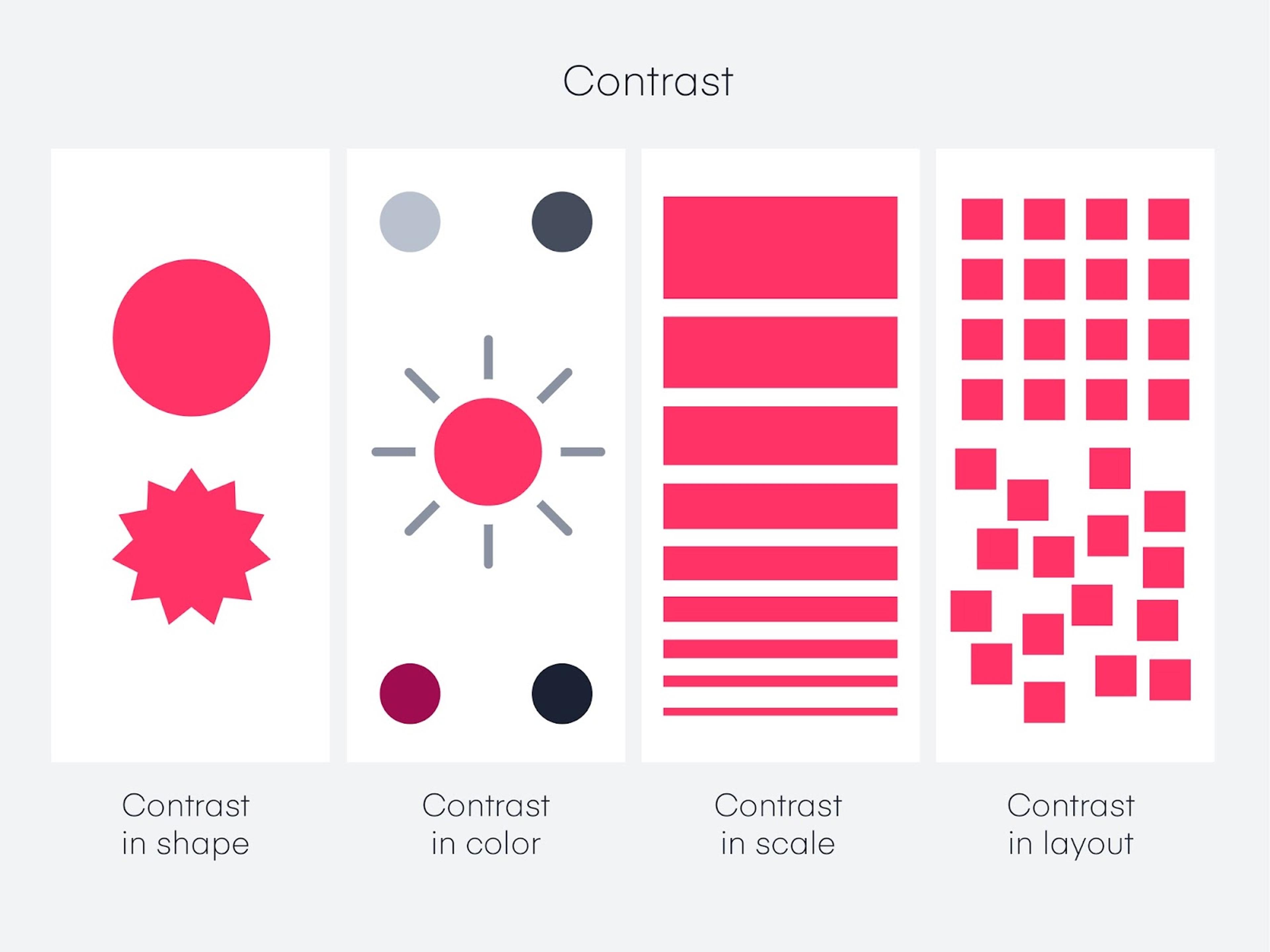
Increasing the contrast of the form’s text and background is critical so that the materials’ legibility is not compromised. A simple example is writing in dark ink on white ground or white ink on black paper to achieve better understanding.
Moreover, buttons can be designed using contrasting colors than the background to make them more conspicuous, persuading the user to click on them. By employing such contrast, it is possible to create forms that are not only beautiful but also amazing.
Single-Column Layout
When it comes to designing forms, using a single-column layout is more beneficial in improving the user experience by enhancing the level of comprehension of text and increasing the rate at which forms are completed.
This type of layout is also closely associated with how most users are accustomed to scrolling and reading content within the form, thus allowing them to go through the form without ignoring any critical details.
Since the fields are displayed in one column, the users can comfortably enter their details in an uninterrupted flow since less effort is required to refocus their eyes on the text as none has been shifted. This uninterrupted flow is similar to how autosuggest provides a single suggestion on the same line that the user is typing on.
In this case, displaying these fields next to each other is more practical and faster as this is how users expect them to be placed. In general, prioritizing users’ single-column layouts and applying exceptions to some predefined fields will give us more user-friendly forms in terms of completion.
Source: websitesetup
Unity
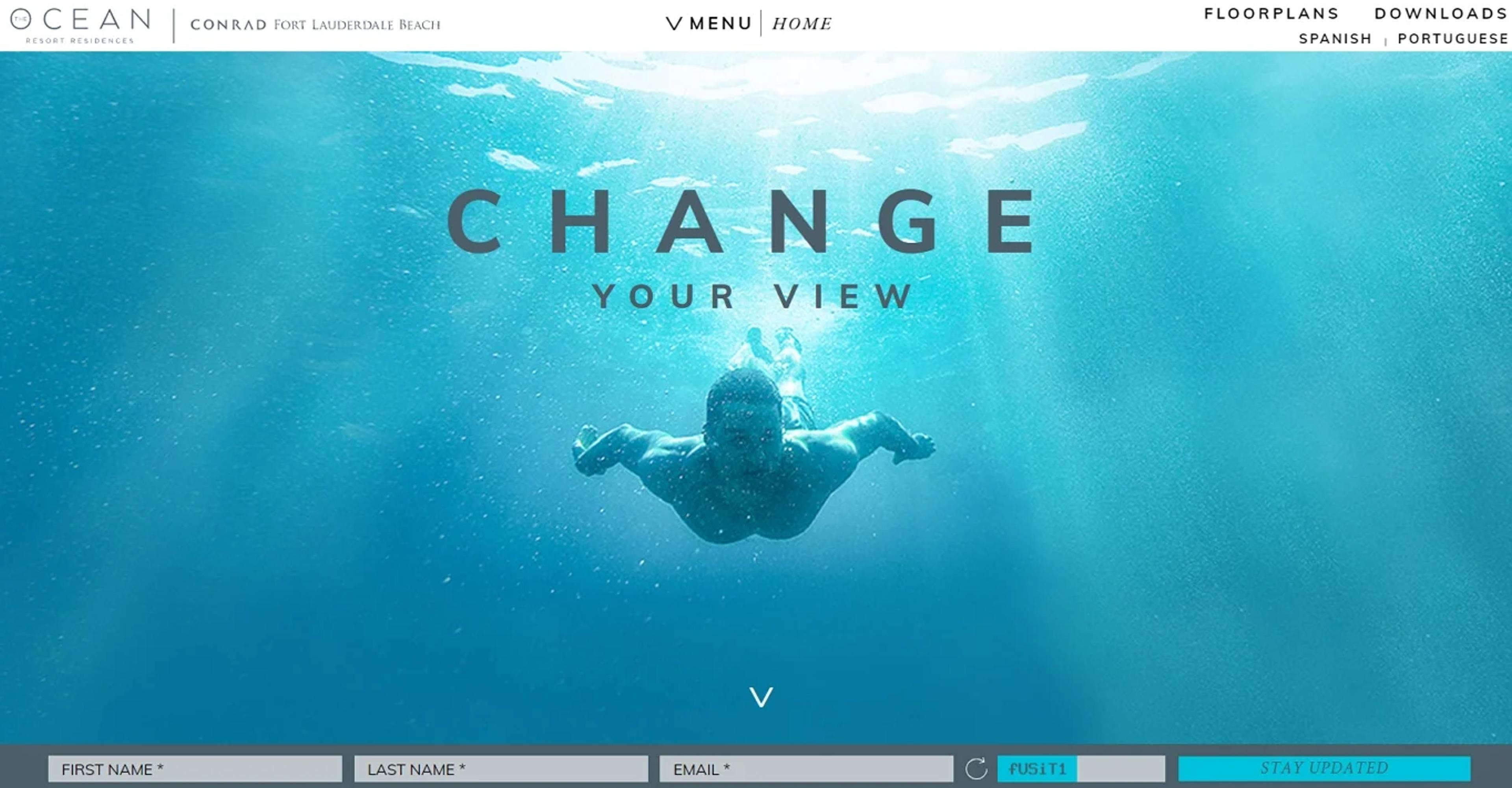
When we speak about unity in form design, we mean the work pocketing all available constituents to give the user a perfect and complete feeling. This concept is essential in composing every element of the form: its colors, typefaces, fields to fill in, buttons, and even the spaces in between.
Adherence to a coherent design language enables the end users to direct their attention to the content rather than the varied styles of the elements, which tend to be misplaced and haphazard.
For instance, using a warm color for a component that forms an integral part of the corporate design strengthens the product brand and helps the user follow the logic of the action on the form.
Unity contributes to dependability and professionalism by providing a smooth and enveloping look and feel. Such nuances give the envisaged users an appearance of bravura about the form and enable them to trust the execution, which translates to a good experience.
Our project for Grayscale demonstrates how unity in design plays a vital role in creating a cohesive digital identity. Every element, from colors and typography to spacing and buttons, is harmonized to give users a seamless experience.
Source: Grayscale webdesign
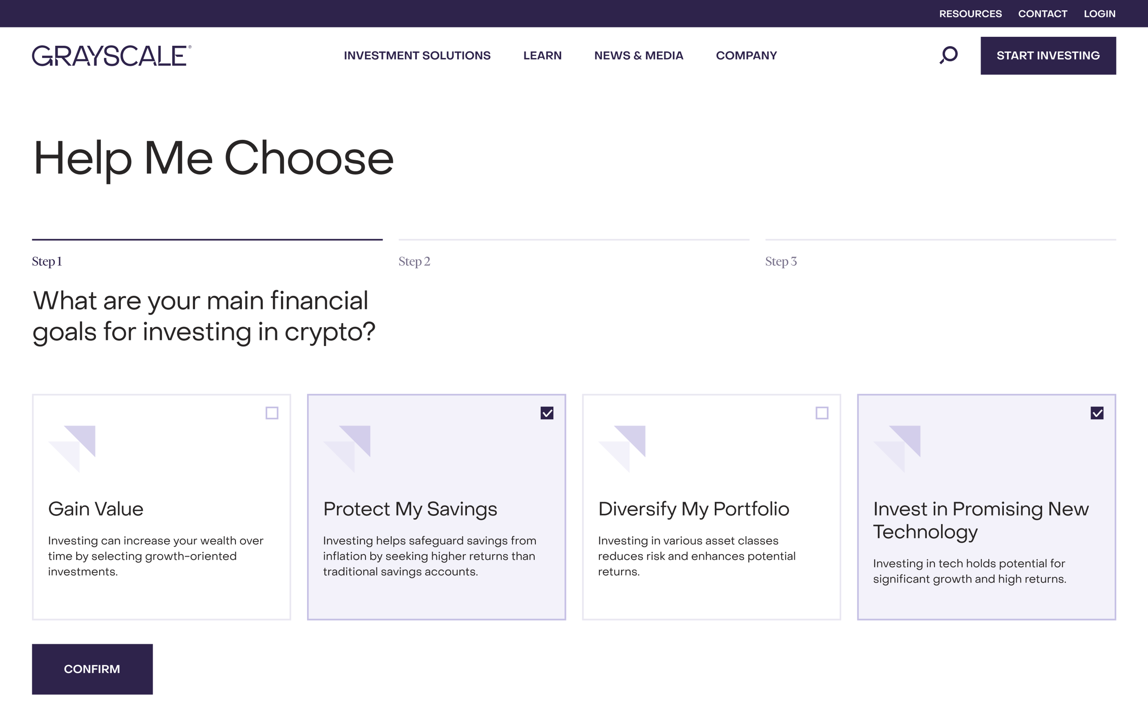
By maintaining consistency across all design aspects, the site directs user focus toward content rather than conflicting styles. This approach strengthens the brand's identity and enhances user trust and engagement, offering a polished and professional interaction.
This approach goes beyond Grayscale. At Clay, we craft immersive, user-focused experiences for the crypto space, blending innovative design with seamless functionality.
By aligning brand identity with user needs, we help businesses build trust, create lasting impressions, and foster meaningful connections with their audience.
Pattern
Focusing on the execution of standard procedures in form design is essential as it brings uniformity and clarity, improving the user experience. Repeating elements, such as the consistent use of navigation buttons and field arrangements, contribute to the overall visual rhythm in design.
Patterns are elements or design standards that a user comes across often enough to expect, including the arrangement of navigation buttons, the arrangement of fields in a form, and the use of particular symbols to denote optional and compulsory fields, among others.
If a form is patterned after something users already know, the users do not have to think much and can merely rely on their experience with other forms to fill out the new one.
Further, some standard solutions, such as requiring a red asterisk on required fields, help greatly eliminate the confusion and the errors associated with forms.
Patterns serve as essential tools of thought that allow in more or less the actual activity of the user, thus diminishing the likelihood that this activity will be done in the first place.
For instance, employing more accessible designs that follow some guidelines enhances the number of forms that get filled out and returned for further processing.
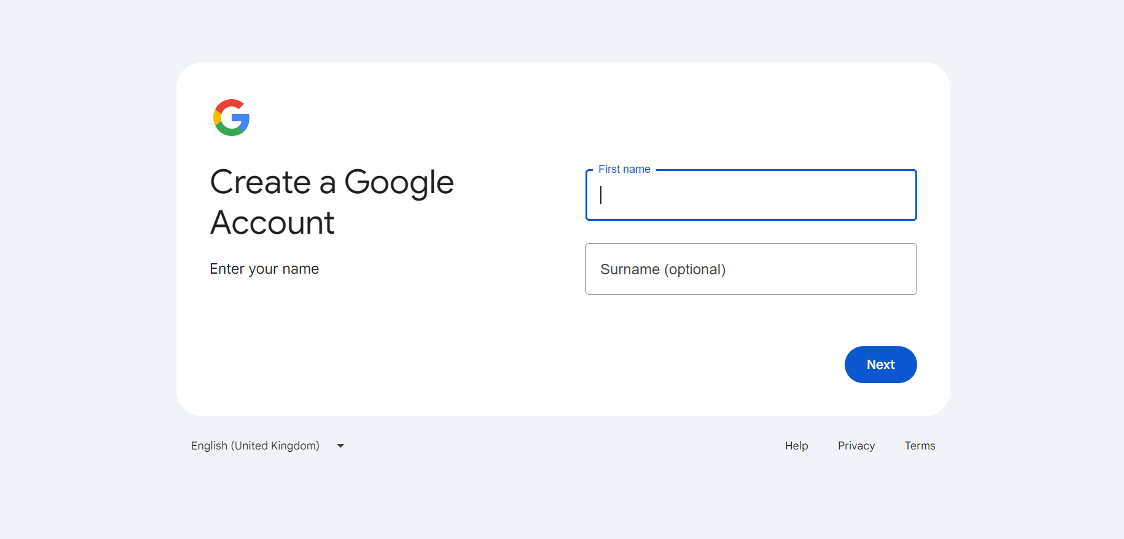
For instance, consider Google's sign-up form, which uses established design patterns like input validation indicators and consistent button placement.
Source: accounts.google
Clear and Concise Labels
The use of effective signs, in particular the labels in the forms, is one of the basic principles that enhances the flow of interaction with users and improves the ease of use of the form. In other words, labels should be precise so that there is no lack of understanding regarding the information in question.
On the contrary, the left-aligned labels are space-conserving but may increase the cognitive load since users often have to shift their focus. Further, one should never use the input fields with inbuilt placeholder text as labels.
The moment the users start to type, the placeholder text is made invisible, and as such, it becomes irritating for the users since there are no guidelines as to what information is required.
Source: m3.material.io
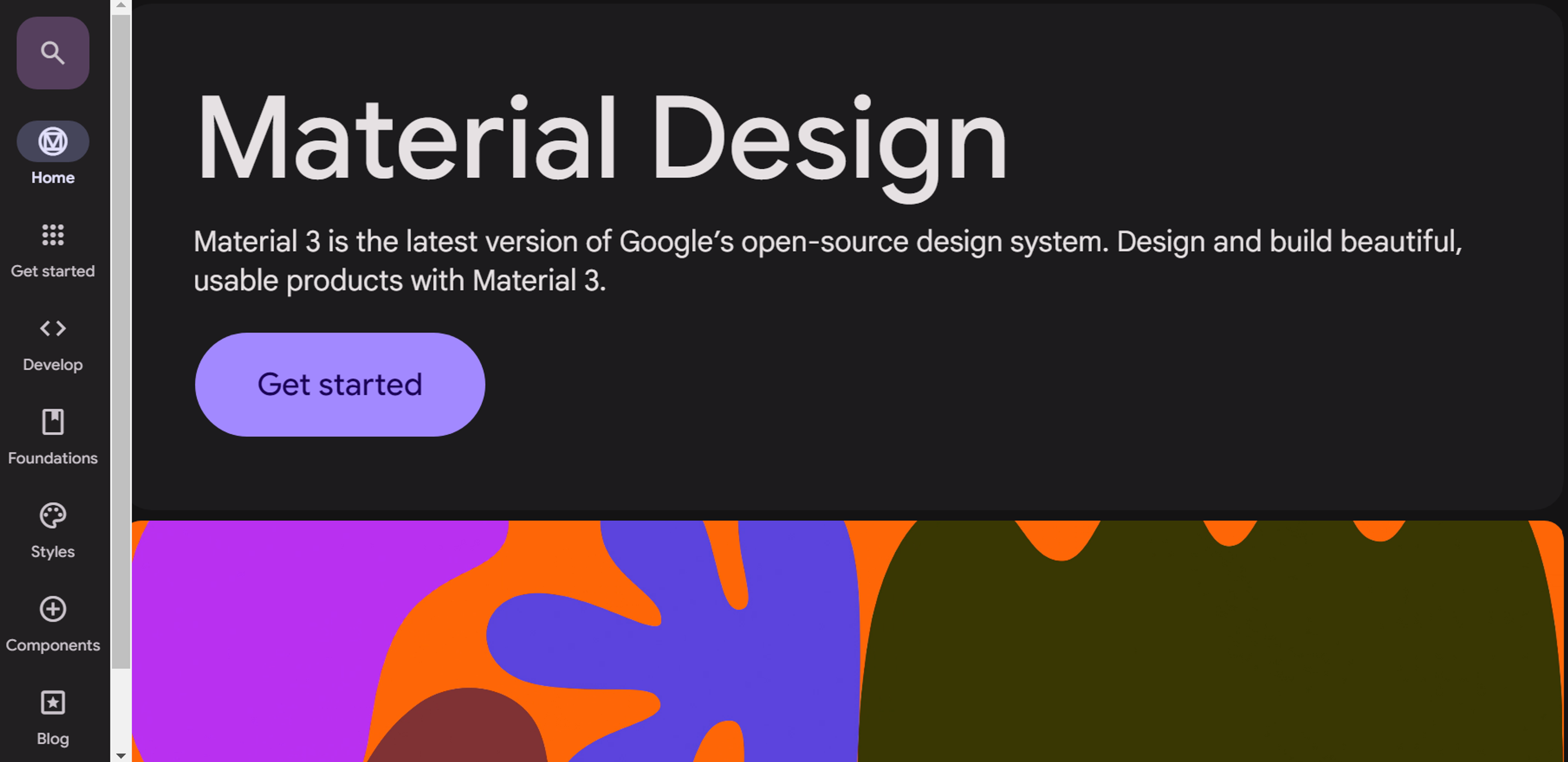
By appropriately depicting information labels, it promotes the aspect of users getting due assistance throughout the interaction with the given form and thus reduces mistakes, leading to an excellent experience.
Scale and Visual Weight
When form design considers scale, it encompasses resizing items to help users navigate their interactions properly. Compared to other factors, scale tends to assist in maintaining the order of importance among objects by making the essential objects stand out and the less critical ones hidden.
For example, more extensive and bolder font sizes can indicate section headers and basic instructions, helping users get their bearings. Likewise, the main action should not be constricted like a ‘submit’ or ‘continue,’ whereas the ‘reset’ would be a secondary action that would be less excessive and somewhat push the users to become engaged in filling out the form.
Source: invisionapp
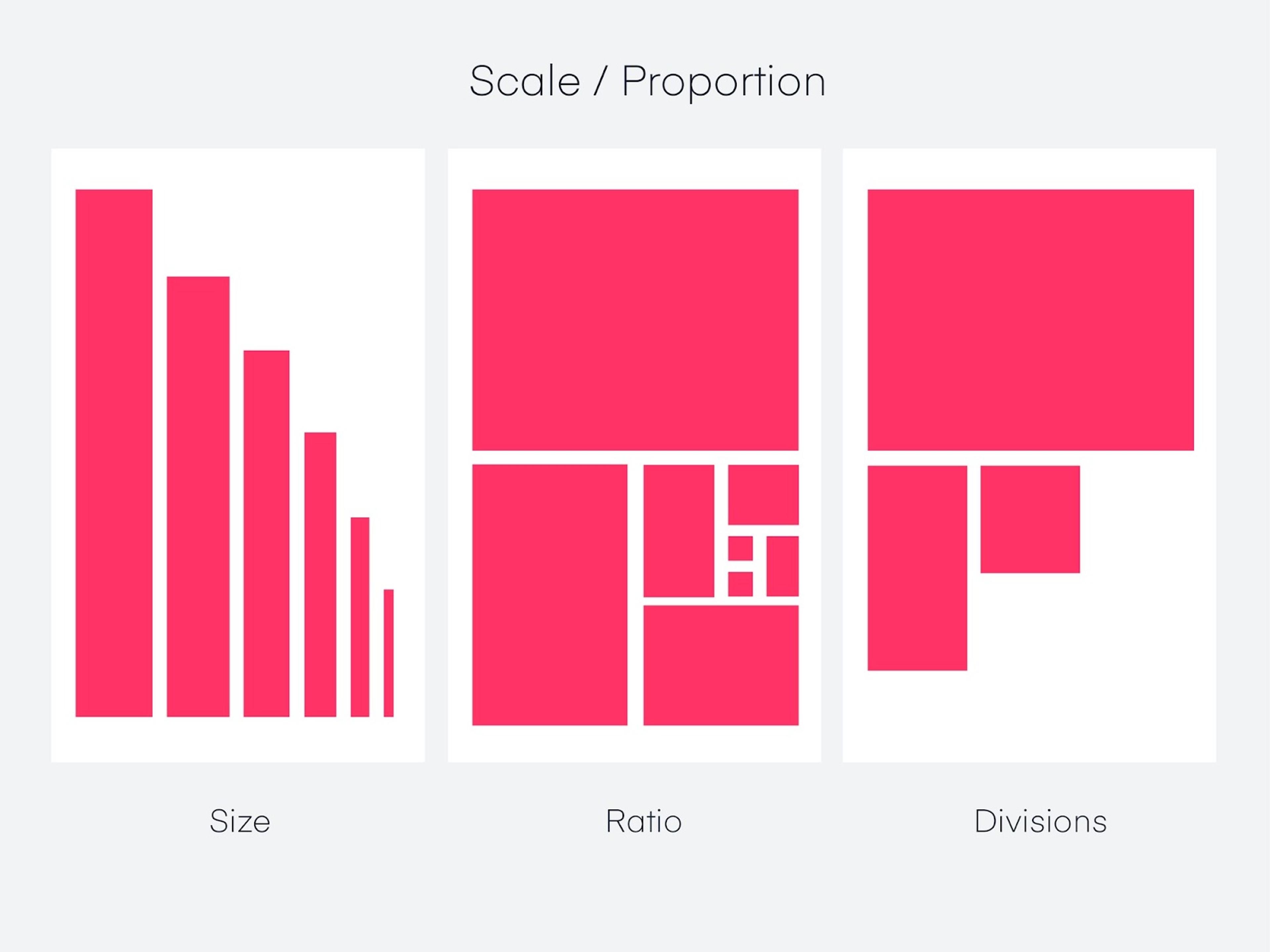
With proper scale, an ergonomic principle is practiced whereby the user feels more comfortable visually orienting themselves around the design. Design enabling adequate regulation for scale can help maintain the flow so that a user remains actively engaged from the point of entry to the point where the required information is submitted.
Appropriate Input Types
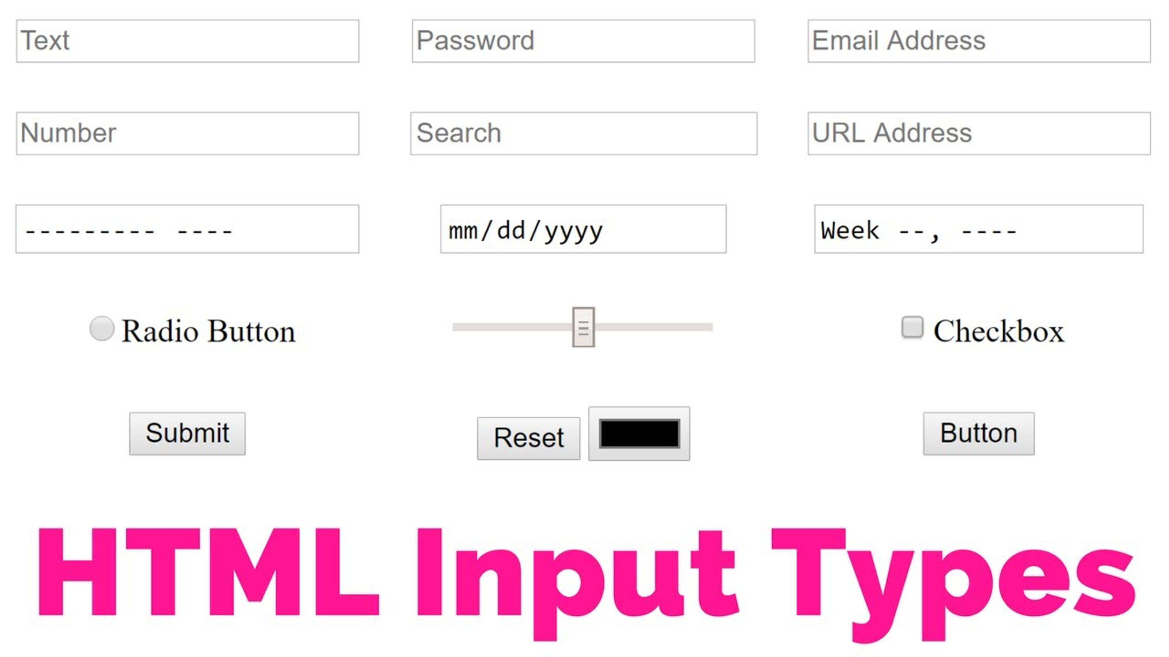
Choosing suitable input types and incorporating effective design elements when designing forms is essential for improving the usability and user experience of the forms.
Furthermore, with the support of HTML5 input types like’, ‘email,’ and ‘tel,’ designers can ensure that the users are shown the target interface to fill in specific details.
The errors are reduced by using these types of input, and the data is more accurate since appropriate input methods are provided, such as a calendar for dates and appropriate keyboards for phone numbers and email addresses. Today, the need to include input conducive to mobile users is also critical, considering that many users fill in the form using portable devices.
It helps broaden the audience because mobile users can easily use the forms within different-sized devices. Selecting input types according to the content to be captured makes a video submission more attractive, efficient, and accomplished.
Source: youtube
Balance
Finding the proper equilibrium in the design of a form means balancing the components of the form so that the form is both pretty and can serve its purpose effectively. Achieving balance in composition revolves around considering form weight, spatial distribution, and alignment between elements.
Proper balance creates room for all elements such that no single element renders the user under-distracted or overstimulated within the layout boundaries.
Designers can achieve balance in the distribution of elements symmetrically or asymmetrically. The symmetric jars create order, while asymmetrical takes of the jars create confusing interest, yet the composition still needs to be understood.
Source: login.mailchimp
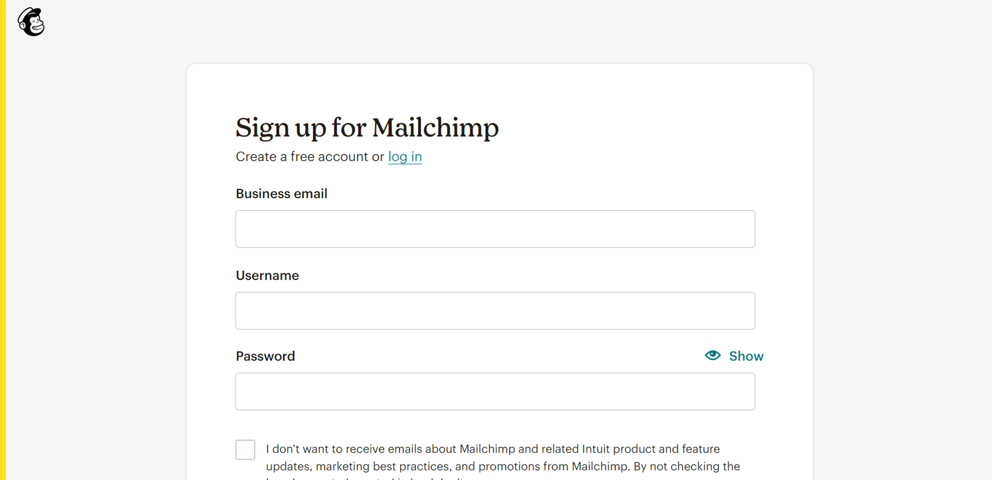
Sufficient spacing between fields avoids overcrowding, thus improving the cognitive load of the form and enticing users. In this way, proper integration of different pieces results in an ergonomic scheme that encourages the users to work with the form, increasing the rate of its completion and ensuring pleasant user feelings.
Variety
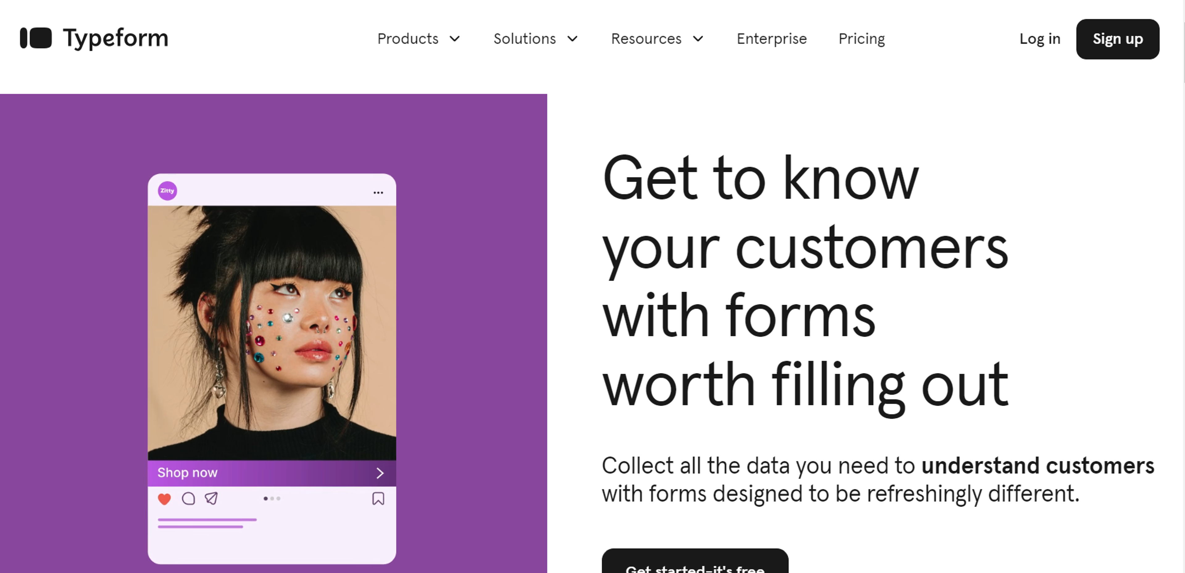
It is essential today in design to have some diversity in the form being used to capture the user’s interest and meet the different user requirements. Much like a musical composition, where the spaces between notes create rhythm, the intervals between design elements establish flow and pattern.
One way to inject variety is by changing the input methods, enabling the use of graphics, and installing interactive features meant to capture the user’s attention.
In this manner, if questions are formatted differently, e.g., multiple choice, sliders, or text fields, the designers will address different information needs of the users, and thus, the process will be smooth.
The same concept applies to visual aspects like colors and font sizes, which tend to conceal the form’s composition and lead a user in an orderly manner to complete the steps of filling the form.
Unique interactions, like swipe or dynamic elements that change depending on users’ answers, increase the feeling of individualism and interactivity.
This careful use of a variety of traditional and non-traditional elements makes the forms more attractive to the users and, at the same time, helps keep the users focused and motivated to finish the forms, improving the user experience.
Incorporating variety in form design is crucial for user engagement and accommodating diverse needs. A great example is Typeform, which uses different input types and interactive elements to keep users interested.
Source: typeform
Optimize Form Length
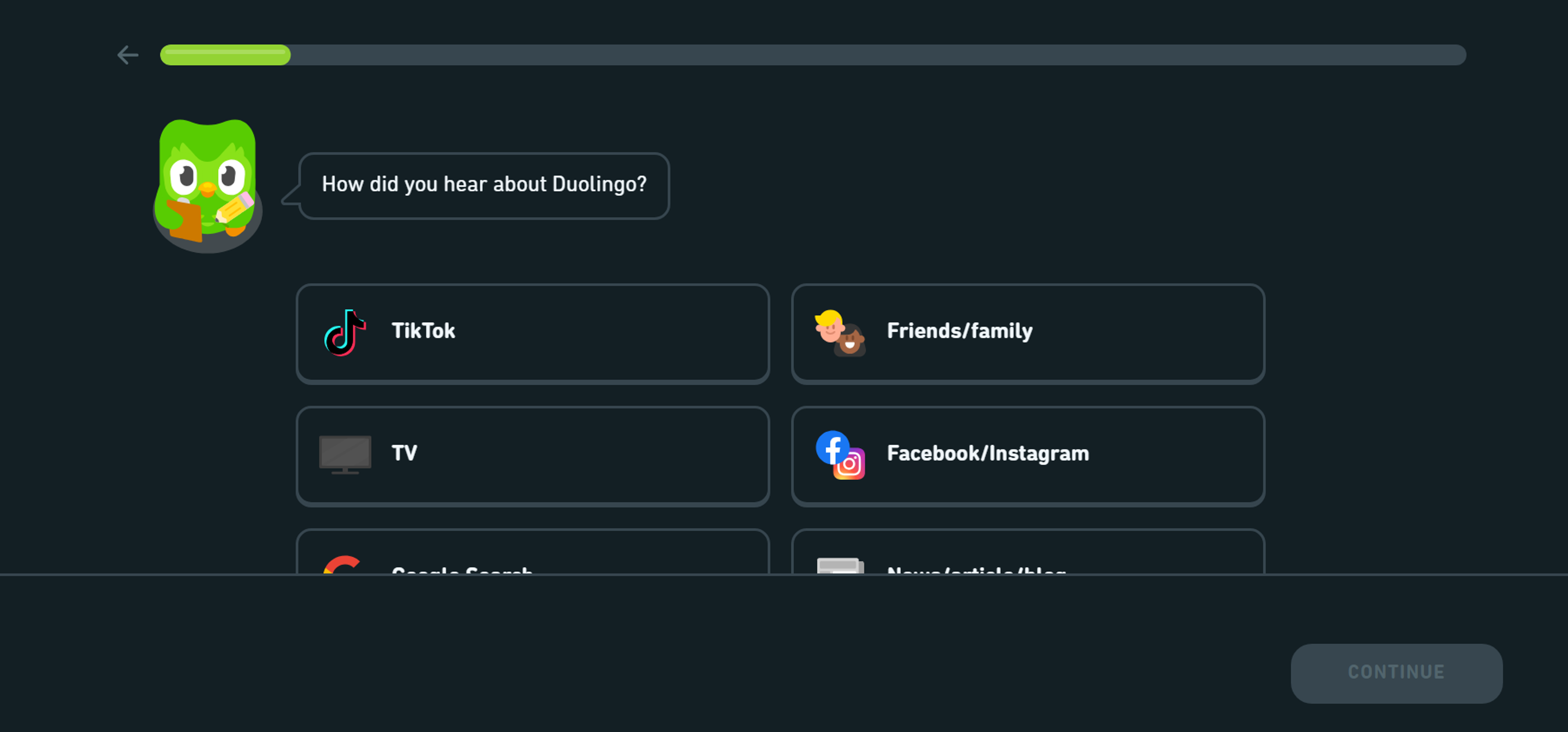
Reducing the length of a form is the most common practice for increasing conversion and satisfaction. Forms that ask for too much information and are shorter can be discouraging and lead to higher rates of abandonment as users could get overwhelmed with the amount of information they are required to fill.
In response, designers should work towards strategies for reducing the number of fields while ensuring that all relevant details that need to be included in the form are included.
For example, an easier way to do this is to split the form into different sections or several steps so the user can handle a long list of fields simultaneously.
This is similar to how space refers to the area in design that is devoid of images, text, or other elements, helping to reduce clutter and improve readability.
They can also incorporate progressive disclosure, where further questions are not asked until relevant information from previous questions has been submitted.
Furthermore, when asking questions, there is a need to orient them so that redundant or non-important information will be avoided, which will help reduce the number of fields the user will fill out.
Source: duolingo
Rhythm
When it comes to form design, producing rhythm means managing the fast flow of information in such a way as to guide the viewer's eye, steering users from one field to another. Rhythm is maintained by ensuring that there is a particular arrangement that is reasonable and adequate.
Spatial relationships of equal height, thickness, and alignment of input fields bring together internal consistency, enabling users to guess the following action without thinking about it.
When constant structures or designs are employed, it is easier to hold the attention span of users, which significantly helps with user satisfaction.
Also, images or lines can function as subjects that help lead the user through the pages. In this way, rhythm helps users get comfortable with the steps, the process becomes faster, and they are more likely to complete all the necessary steps.
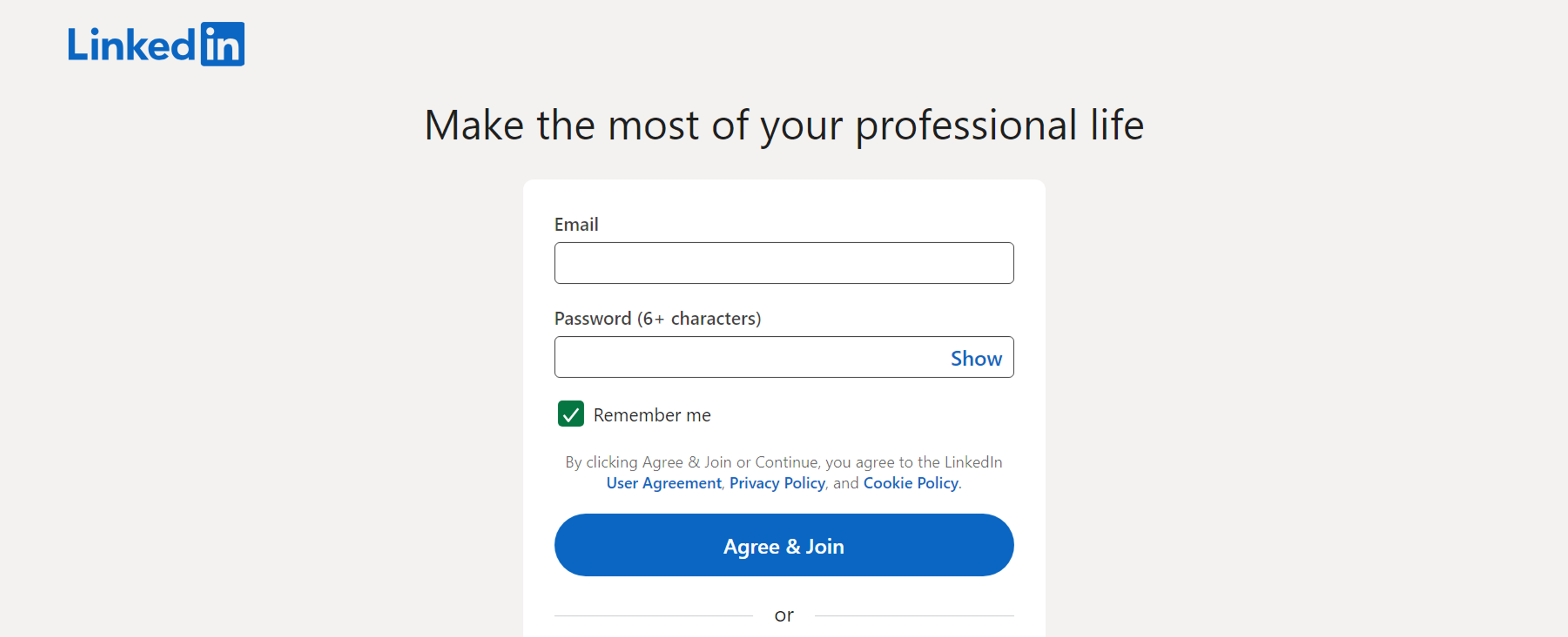
Consider the form design on LinkedIn's sign-up page. The consistent spacing, alignment, and logical sequence of input fields create a smooth flow for users. This rhythm ensures a simple and intuitive experience, keeping users engaged throughout the process.
Source: linkedin
Emphasis
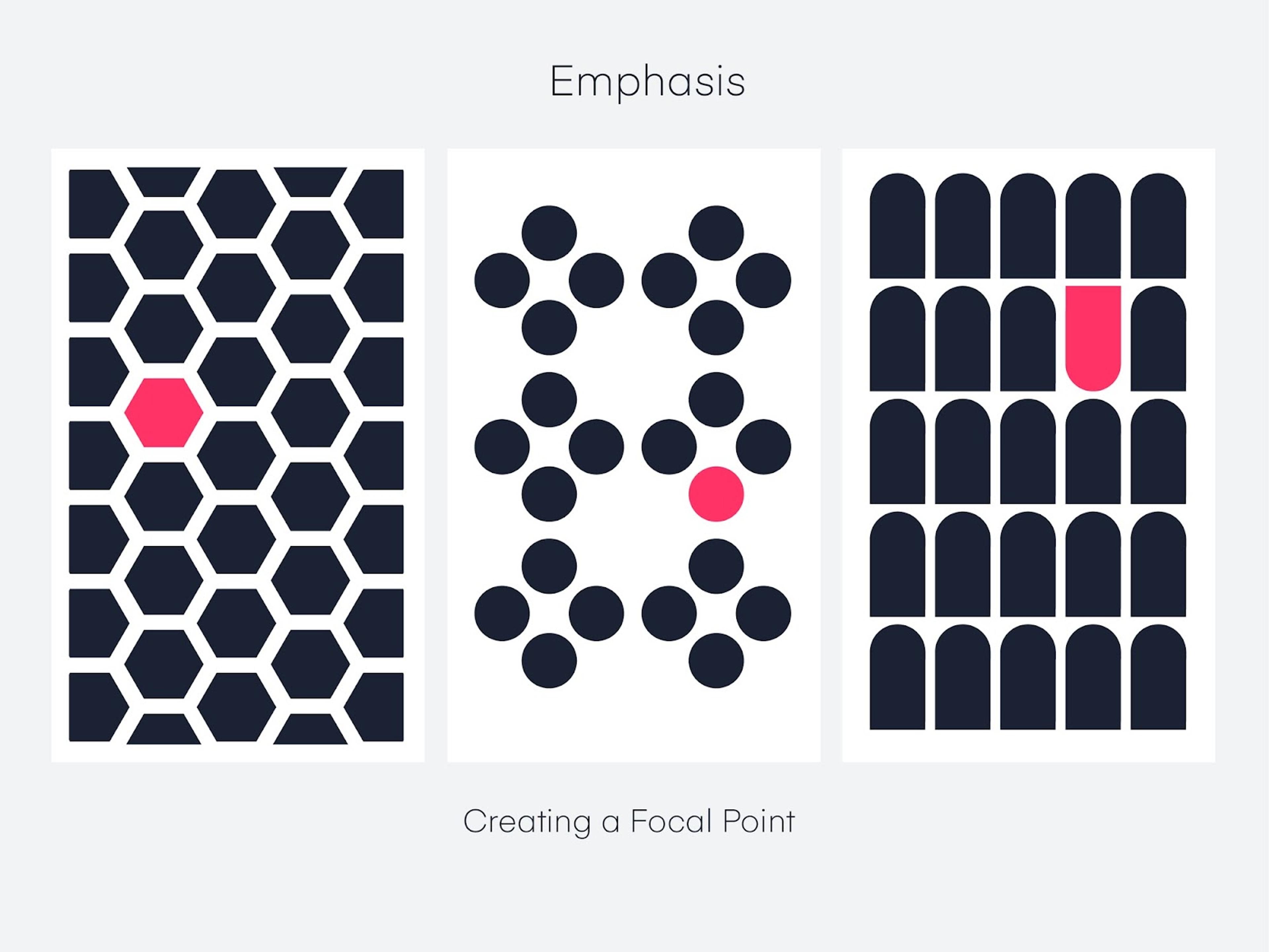
Emphasis in form design, along with other principles, is made for elements that require users' attention for instant completion, allowing them to perform critical tasks or obtain information.
This is accomplished through color, font size, or position, among many others. Bigger or bolder fonts can also help expose crucial instructions or alerts to the users, leading to a better understanding of the information.
Using lucid colors also assists with this. Putting the fields in different colors helps the crucial parts be seen easily in the form. Furthermore, placing these elements in essential places, for instance, the head of the form or next to buttons, makes their visibility and effect more apparent.
Source: invisionapp
An example of effective emphasis in form design can be found on the sign-up page of a well-designed website like Mailchimp. They use color contrasts and larger fonts to highlight key actions, such as the "Sign Up Free" button, ensuring users know where to focus their attention.
Offer Field Focus
Offering field focus is a crucial form design principle, particularly for mobile users. This involves making the active input field prominent and focused, helping users navigate the form more easily and reducing the likelihood of errors.
By using visual elements such as color, typography, and animation, designers can highlight the input field that is currently being edited, ensuring it stands out from the rest of the form.
Field focus not only improves usability but also enhances the overall user experience. Providing clear visual cues and feedback helps users feel more confident and in control as they fill out the form. For instance, changing the border color or background of the active field can signal to users where they should focus their attention.
This approach can lead to increased completion rates and fewer errors, as users are guided smoothly through the form. By prioritizing field focus, especially in mobile form design, you can create a more intuitive and user-friendly experience.
Source: devsquad

Read more:
Conclusion
In conclusion, effective form design relies on several key principles that work in harmony to provide users with a seamless and engaging experience.
Form design best practices serve as essential guidelines for optimizing user input forms, emphasizing the importance of minimizing user effort through smart design choices.
Balance, variety, optimized form length, rhythm, and emphasis are fundamental components that contribute to the functionality and aesthetics of a form. Each element must be carefully considered and implemented to ensure user satisfaction and high completion rates.
Additionally, continuous testing and iteration are vital to address user feedback and evolving needs, allowing for improvements that enhance usability. By integrating these practices, designers can create forms that not only meet user expectations but also foster positive interactions, ultimately leading to successful outcomes for both users and organizations.


About Clay
Clay is a UI/UX design & branding agency in San Francisco. We team up with startups and leading brands to create transformative digital experience. Clients: Facebook, Slack, Google, Amazon, Credit Karma, Zenefits, etc.
Learn more

About Clay
Clay is a UI/UX design & branding agency in San Francisco. We team up with startups and leading brands to create transformative digital experience. Clients: Facebook, Slack, Google, Amazon, Credit Karma, Zenefits, etc.
Learn more


